
Some weeks ago, I noticed that many corona dashboard visualizations focus on the total number of cases, lacking information on what is the current COVID-19 status in the country and making it difficult to compare different countries with each other. Another challenge I faced was that the corona dashboards I tried out were not very user-friendly, let alone mobile-friendly. Annoyed by this, I created an interactive Corona Status Dashboard that lets users examine and compare active (yes, not just total) coronavirus cases between countries and regions relative to the size of the population.
Compare cases between countries and regions from official data sources
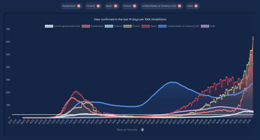
Corona Status lets users compare any countries in the world to each other and see the development of new confirmed cases, recovered cases, and deaths over time. As all values are presented relative to the size of the population, we can display all countries on the same Y-axis and compare countries with each other.
The website lets users choose the data source between Johns Hopkins CSSE and Corona Tracker and displays the values in a user-friendly visual dashboard and data table. Additionally, the website uses THL Open Data for Finnish regions, Zürich Open Government Data for Swiss cantons, and NHS Open Data for Scotland. For global data, the website uses data from Worldometers.
The Corona Status website is updating real-time with the used data sources, which is usually once a day for Johns Hopkins CSSE and more frequently for other data sources. In addition to capturing new cases and deaths based on the latest live data, updates can also be made retrospectively to correct counts on previous days as needed based on subsequent information received. These changes will be visible also on the Corona Status whenever the update happens in the original data source.
I started the project by using public COVID-19 APIs only but after a while when the website started to have more users and/or public APIs were otherwise busy, the app became slow for the users. I solved this by fetching Johns Hopkins CSSE raw data directly from their public Github repository in CSV format and parsing it inside a node.js/express REST API I created, which also gave me more flexibility to return only data that I needed in the format I needed it. For regional data, I could not find a ready APIs, so I am fetching the data from the source in CSV/JSONStat format and then processing that in the backend and sending it to the frontend as JSON. For Corona Tracker data, I did not yet find the raw data yet so it is using still public API and therefore it can be slower than other data sources used on the site.
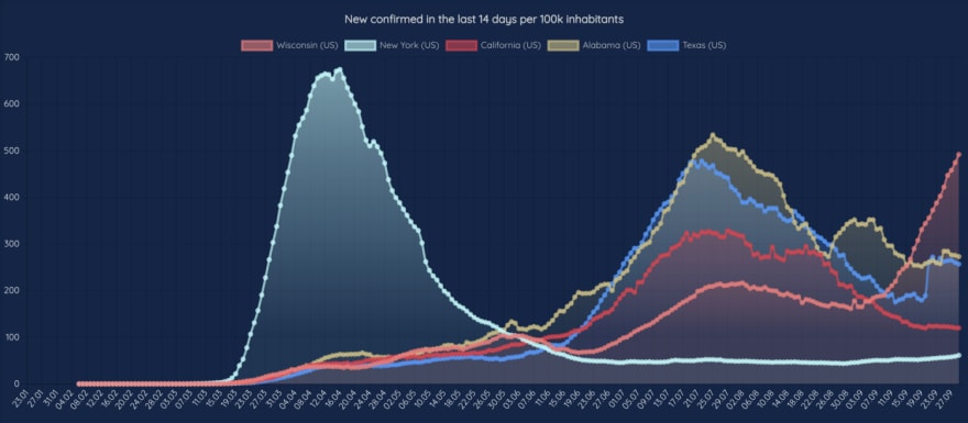
Explore corona waves over time
One feature that early users requested a lot was to allow users to see the history of new coronavirus cases since January 2020 when Johns Hopkins CSSE started officially reporting COVID-19 data. The website shows for example in which countries the new COVID-19 waves are already stronger than the first one and how the waves between different countries correlate with each other. From the visualizations, we can see for example that the second wave in Europe is already higher than the first one in many countries.
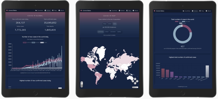
Global Corona Status at a glance
In addition to country comparison, the website also gives an overview of the global COVID-19 status using global graphs and a world map, which can also be used as an inspiration to find interesting countries for the country comparison. This data is sourced from Worldometers as well as from CoronaTracker mentioned earlier, and usually updated multiple times a day. The map has also the option "active", which shows currently active cases in the world instead of focusing just on the total cases.
Designed users in mind
The website is designed using iterative design cycles with user-centered principles in mind and is constantly improved based on user feedback that users can send on the website. The web app is designed for all devices with an internet connection without the need of downloading or signing up and it is optimized for mobile, tablet, laptop, and desktop devices. For convenience, users can save their favorite countries as favorites in their device if they like, so that next time when the same user opens the site on the same device and browser, the website loads these countries from localStorage as default without needing to add the countries again one by one.

Feel free to share feedback on how to improve this site further! Do you know other good data sources for COVID-19 data? Do you have a new cool feature in mind? Let me know, all feedback is much appreciated! ❤️

Oldest comments (0)