
If you want to add any shadow effect around any html element you can use box-shadow. In this Blog we will just see, How it works for different values.
Let's create a card using basic properties.
.card {
    background: white;
    padding: 80px 40px;
    margin: 0 30px;
    font-family: sans-serif;
    color: rgba(0,0,0,0.2);
    font-size: 24px;
    position: relative;
    width: 300px;
}
Let's understand the basic layout of box-shadow.
box-shadow: x y blur color;
.shadow1 {
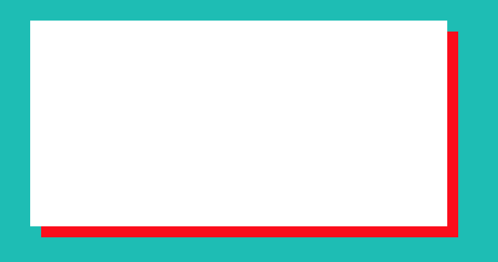
box-shadow: 10px 10px red;
}
Result:
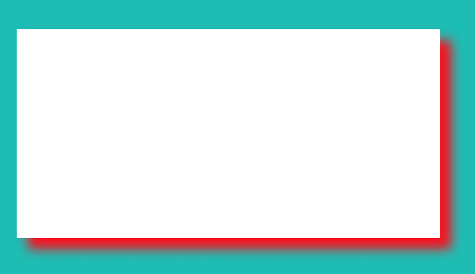
now let's just add blur property to box-shadow.
.shadow2 {
box-shadow: 10px 10px 10px red;
}
Now you can see the shadow become little blur. you can modify the blur pixel and you would understand different shades of it.
Let's try to give box-shadow to card so, it looks little nice.
.shadow1 {

    box-shadow: -30px 30px 30px rgba(0, 0, 0, 0.3);

}
Below, you can see card has little popped up.

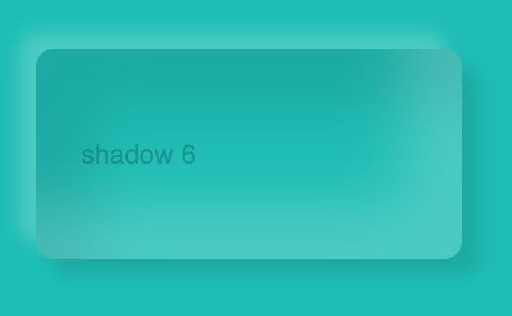
All these box-shadows are outside of the element, you can give box-shadow inside as well.
.shadow1 {
    background:  #00bdb4;
    border-radius: 15px;
    box-shadow: -15px -15px 15px rgba(255, 255, 255, 0.2),
                15px 15px 15px rgba(0,0,0,0.1),
                inset -50px -50px 50px rgba(255, 255, 255, 0.2),
                inset 50px 50px 50px rgba(0,0,0,0.1);
}
In Result, You can see below result.
Checkout different shaded of box-shadow here
https://codepen.io/__akash__19/pen/vYLJMqM

Top comments (0)