
I recently had to develop a component where the interface had to exceed the limit of its container on one side, while the content on the other side remains inside the container.
In addition to breaking the container on one side, the width of the text and image could vary from card to card, as we can see in the figure below.
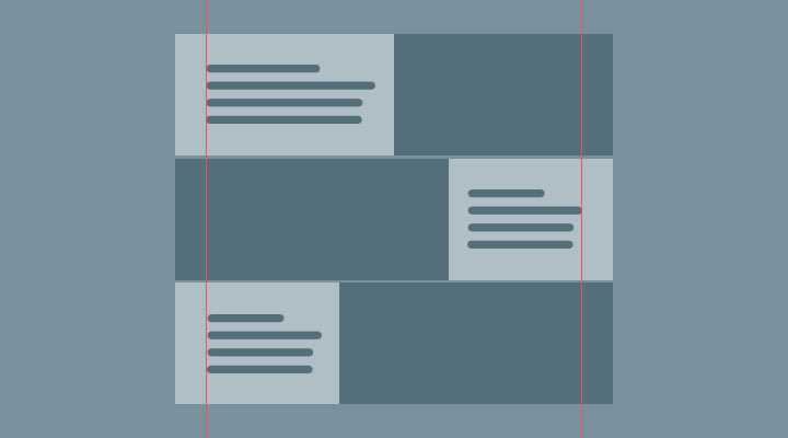
After imagining several different ways that I could do this, I solved the problem with CSS grid. Bearing in mind that the site uses the bootstrap grid, I deconstructed the bootstrap container into columns, where the middle columns correspond to the width of the container at the different breakpoints, and the first and last column corresponds to the rest of the space leftover from the container.
//card container
.cc {
  display: grid;
  grid-auto-flow: column;
  grid-template-rows: 350px;

  @media (max-width: 575.98px) {
    grid-template-columns: 15px repeat(10, 1fr) 15px;
  }

  @media (min-width: 576px) and (max-width: 767.98px) {
    //540px / 10
    grid-template-columns: 1fr repeat(10, 54px) 1fr;
  }

  @media (min-width: 768px) and (max-width: 991.98px) {
    //720px / 10
    grid-template-columns: 1fr repeat(10, 72px) 1fr;
  }

  @media (min-width: 992px) and (max-width: 1199.98px) {
    //960px / 10
    grid-template-columns: 1fr repeat(10, 96px) 1fr;
  }

  @media (min-width: 1200px) {
    //1140px / 10
    grid-template-columns: 1fr repeat(10, 114px) 1fr;
  }
}
Below we can see how to build the card.
<div class="cc">
  <div class="tc tc--7-12">
    <p class="mb-0 text-body mlt">Lorem ipsum dolor sit amet.</p>
  </div>
  <div class="ic ic--1-6">
    <img src="https://images.pexels.com/photos/1287083/pexels-photo-1287083.jpeg?auto=compress&cs=tinysrgb&dpr=2&h=750&w=1260" alt="image">
  </div>
</div>
To give the perception that the image is coming out of the container it can use column 1 to column 13 (-1).
//image container
.ic {
  &--7-13 {
    grid-column: 7 / -1;
  }

  &--1-6 {
    grid-column: 1 / 6;
  }
}
For the text to be within the dimensions of the bootstrap container it can occupy columns 2 to 12.
//text container
.tc {
  align-self: center;
  &--2-6 {
    grid-column: 2 / 6;
  }

  &--7-12 {
    grid-column: 7 / 12;
  }

  //boostrap container padding
  @media (min-width: 576px) {
    padding-left: 15px;
    padding-right: 15px;
  }
}
I am sharing this because who knows, it may be useful for someone, the question is, did I complicate this? to see the complete example: click here

Oldest comments (0)