
A Directory to All You Need to Know About Material UI
Introduction
The use of UI libraries to set up and build beautiful, slick, and exquisite user interfaces (UIs) faster has risen over the years with developers relying heavily on these UI libraries to build the entire UI of their software applications and websites. It is even considered undisputable that every development team needs a UI library.
Almost all major tech companies have their UI library from Material-UI created by Google to Ant Design created by Chinese conglomerate Alibaba, to Twitter's Bootstrap, to visx created by Airbnb, to Fluent (initially called Fabric React) developed by Microsoft, to Headless UI created by Tailwind Labs. The list goes on.
It might not be worth it to build your entire UI library from scratch by trying to reinvent the wheel, except if you have all the resources at your disposal. You will learn everything about Material UI as a library, from its overview to its principles. You will read about the different UI components such as buttons, cards, lists, etc. You will also learn about the features of Material UI and how to set it up in a project. You will also learn about the reasons for using it to build your applications.
Material UI is reportedly the #1 UI component library that offers a set of UI tools to create and deploy new features at speed making it a popular choice among developers.
What is Material UI?
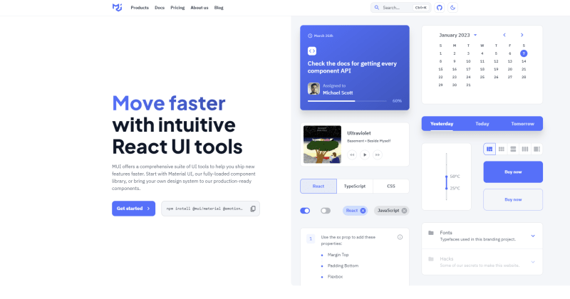
Material UI is a popular open-source ReactJS design system library for building user interfaces with a consistent, intuitive, and visually appealing look and feel. It is based on the principles of Google Material Design, which aims to provide a unified experience across various platforms and devices. To learn more about the principle of Google's Material Design principles, please read here.
It is a comprehensive and well-documented library of pre-designed and pre-coded components. These components can be easily integrated into your web or mobile app. It provides a wide range of customizable elements, including buttons, input fields, navigation bars, and more, that can be easily styled to match your brand and design requirements.

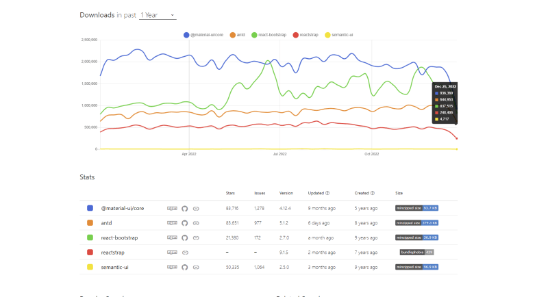
Material UI: Stats
Since its development and release in 2014, Material UI has steadily grown to what it is today - one of the most powerful and popular UI component libraries with the following staggering statistics:
| Feature | Details |
|---|---|
| GitHub stars (Jan. 2023) | 83.7k |
| NPM weekly download | 4M |
| Bundle size (Minified) | 102 kB |
| Twitter followers | 18.2k |
| Open-source contributors | 2.6k |
| Documentation | Developer-friendlydocumentation |
Key Features of Material UI
Flexibility: One of the key features of Material UI is its flexibility and customization options. You can choose from a wide range of pre-designed components, or you can create your custom elements using the library's theming and styling tools. The library also provides support for responsive design, allowing your interfaces to adapt to different screen sizes and devices.
Accessibility: Another notable feature of Material UI is its attention to accessibility. The library follows the Web Content Accessibility Guidelines (WCAG) and provides features such as high contrast mode, keyboard navigation, and screen reader support.
Seamless customization: MUI provides robust and versatile components that give you seamless control over the appearance and style of your project.
Effortlessly implement dark mode: Dark mode is an important feature for modern websites and mobile apps, as it helps to reduce strain on the eyes and makes it easier to use the app at night. Material UI makes it easy to implement dark mode, as it includes two pre-designed palettes for light and dark themes. To switch to the dark theme, you simply need to set the type to dark in the palette object when creating a new theme:
const darkTheme = createMuiTheme({
  palette: {
    type: 'dark',
  },
});
Time-saving: Instead of building your UI elements from scratch, you can use the ready-made components in Material UI to quickly and easily put together a user interface. By using Material UI, you can focus more on the functionality of your ReactJS app or website, rather than spending time on the visual design and implementation of UI elements. Ultimately, Material UI is a valuable tool that can help developers save time and streamline their work.
Material UI offers more amazing features beyond what is outlined in this blog. For even more awesome Material UI features, read 5 React Material UI Features You Might Have Missed.
Getting Started with Material UI
To get started with Material UI in your ReactJS project, you will need to install the library using a package manager such as npm or yarn.
Run the following commands to install the Material UI library:
With NPM
npm install @mui/material @emotion/react @emotion/styled
Or run the following command with Yarn
yarn add @mui/material @emotion/react @emotion/styled
You can then import the components you need into your project and start using them in your code like so:
import { Button } from '@material-ui/core'; // Imports Material UI button component

...
The library also provides a set of guidelines and best practices for using the components effectively, such as proper use of typography and color, and considerations for mobile and accessibility.
Components of Material UI
Material UI provides a variety of pre-designed, customizable components that can be easily integrated into a React web or mobile app. This section will provide a detailed overview of some of the key components offered by Material UI.
Material UI Buttons
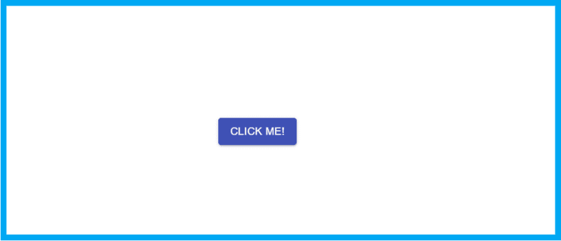
Material UI provides a variety of button styles and options, including raised buttons, flat buttons, and icon buttons.
The Material UI Button component is a versatile and customizable button that can be used in various parts of a user interface. It comes in several styles, such as contained, outlined, and text, and can be customized with options such as color, size, and shape.
import { Button } from '@material-ui/core';

function MyButton() {
  return (
    <Button variant="contained" color="primary">
      Click me!
    </Button>
  );
}
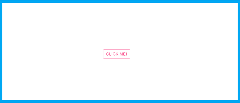
This example creates a contained button with the primary color. The variant and color props can be changed to customize the appearance of the button. For example, this creates a small, outlined button with a secondary color, you can use the following code:
import { Button } from '@material-ui/core';

function MyButton() {
  return (
    <Button variant="outlined" color="secondary" size="small">
      Click me!
    </Button>
  );
}
Material UI Dialog
The Material UI Dialog component is a modal window that displays content and actions on top of the main content of a user interface. It can be used to display a wide range of content, such as forms, text, images, and buttons, and can be customized with options such as layout, color, and shape.
import { Dialog, DialogTitle, DialogContent, DialogContentText, DialogActions, Button } from '@material-ui/core';

function MyDialog() {
  const [isOpen, setIsOpen] = useState(false);

  const handleOpen = () => {
    setIsOpen(true);
  };

  const handleClose = () => {
    setIsOpen(false);
  };

  return (
    <>
      <Button variant="outlined" onClick={handleOpen}>
        Open Dialog
      </Button>
      <Dialog open={isOpen} onClose={handleClose}>
        <DialogTitle>Hello, World!</DialogTitle>
        <DialogContent>
          <DialogContentText>
            This is a simple dialog with some text and a button.
          </DialogContentText>
        </DialogContent>
        <DialogActions>
          <Button onClick={handleClose} color="primary">
            Close
          </Button>
        </DialogActions>
      </Dialog>
    </>
  );
}
This example creates a button that opens a dialog with a title, some text, and a close button. The Dialog component can be customized with various options such as the layout, and color, and this example creates a button that opens a dialog with a title, some text, and a close button. The Dialog component can be customized with various options such as the layout, color, etc.

Further reading: Create an Interactive Material UI Dialog in React
Material UI Input Fields
The Material UI Input Field component is a form element that allows users to input data or text. It comes in various styles, such as filled, outlined, and standard, and can be customized with options such as placeholder text, labels, and error messages.
import { TextField } from '@material-ui/core';

function MyInputField() {
  return (
    <TextField
      variant="outlined"
      label="Name"
      placeholder="Enter your name"
      error={false}
      helperText=""
    />
  );
}
This example creates an outlined input field with a label and placeholder text. The variant, label, and placeholder props can be changed to customize the appearance and functionality of the input field.

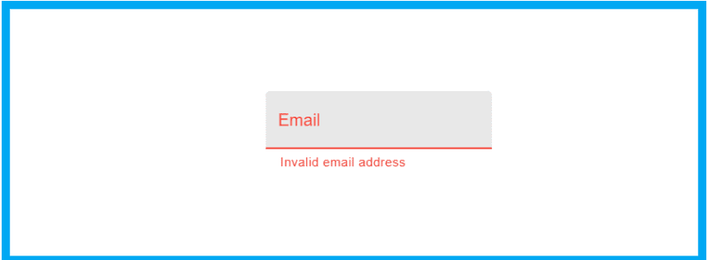
For example, this creates a filled input field with an error message, you can use the following code:
import { TextField } from '@material-ui/core';

function MyInputField() {
  return (
    <TextField
      variant="filled"
      label="Email"
      placeholder="Enter your email"
      error
      helperText="Invalid email address"
    />
  );
}
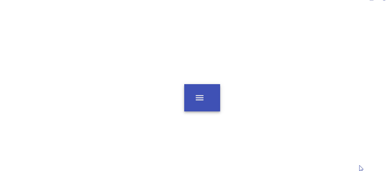
Material UI Navigation
The Navigation component is a group of components that help you create navigation menus and structures in your user interfaces. It includes components such as the App Bar, Drawer, and Tabs, which can be used to create various types of navigation layouts.
import { AppBar, Toolbar, IconButton, Drawer, List, ListItem, ListItemIcon, ListItemText } from '@material-ui/core';
import MenuIcon from '@material-ui/icons/Menu';
import InboxIcon from '@material-ui/icons/Inbox';
import MailIcon from '@material-ui/icons/Mail';

function MyNavigation() {
  const [isDrawerOpen, setIsDrawerOpen] = useState(false);

  const toggleDrawer = (open) => (event) => {
    if (event.type === 'keydown' && (event.key === 'Tab' || event.key === 'Shift')) {
      return;
    }

    setIsDrawerOpen(open);
  };

  const menuList = (
    <div onClick={toggleDrawer(false)} onKeyDown={toggleDrawer(false)}>
      <List>
        <ListItem button>
          <ListItemIcon>
            <InboxIcon />
          </ListItemIcon>
          <ListItemText primary="Inbox" />
        </ListItem>
        <ListItem button>
          <ListItemIcon>
            <MailIcon />
          </ListItemIcon>
          <ListItemText primary="Mail" />
        </ListItem>
      </List>
    </div>
  );

  return (
    <>
      <AppBar position="static">
        <Toolbar>
          <IconButton edge="start" color="inherit" aria-label="menu" onClick={toggleDrawer(true)}>
            <MenuIcon />
          </IconButton>
        </Toolbar>
      </AppBar>
      <Drawer open={isDrawerOpen} onClose={toggleDrawer(false)}>
        {menuList}
      </Drawer>
    </>
  );
}
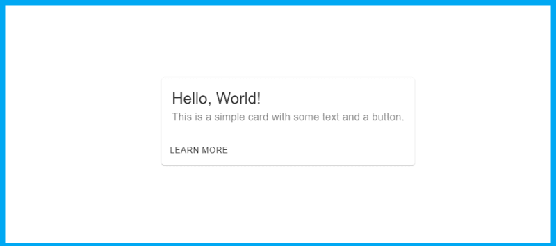
Material UI Cards
The Card component is a container that displays content and actions in a visually appealing way. It can be used to display a wide range of content, such as text, images, lists, and buttons, and can be customized with options such as layout, color, and shape.
import { Card, CardContent, CardActions, Typography, Button } from '@material-ui/core';

function MyCard() {
  return (
    <Card>
      <CardContent>
        <Typography variant="h5" component="h2">
          Hello, World!
        </Typography>
        <Typography color="textSecondary">
          This is a simple card with some text and a button.
        </Typography>
      </CardContent>
      <CardActions>
        <Button size="small">Learn More</Button>
      </CardActions>
    </Card>
  );
}
The typography system is based on a set of pre-defined type styles, ranging from headings and subheadings to body text and captions. These styles are designed to be used in combination with Material UI's layout and spacing utilities to create visually cohesive and easy-to-read interface designs. In addition to the standard type styles, Material UI also includes several utility classes for fine-tuning the appearance of text, such as font-weight, color, and text alignment.
For an even more in-depth guide about Material UI Typography, we wrote an article on how to Create Stunning Text with Material UI Typography. Do check the full code.
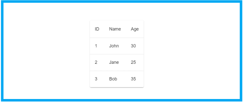
Material UI Table
The Table component is a data table that displays a structured set of data in a grid of rows and columns. It can be used to display a wide range of data, such as lists, tables, and grids, and can be customized with options such as layout, color, and sorting.
import { Table, TableBody, TableCell, TableHead, TableRow, Paper } from '@material-ui/core';

function MyTable() {
  const rows = [
    { id: 1, name: 'John', age: 30 },
    { id: 2, name: 'Jane', age: 25 },
    { id: 3, name: 'Bob', age: 35 },
  ];

  return (
    <Paper>
      <Table>
        <TableHead>
          <TableRow>
            <TableCell>ID</TableCell>
            <TableCell>Name</TableCell>
            <TableCell>Age</TableCell>
          </TableRow>
        </TableHead>
        <TableBody>
          {rows.map((row) => (
            <TableRow key={row.id}>
              <TableCell>{row.id}</TableCell>
              <TableCell>{row.name}</TableCell>
              <TableCell>{row.age}</TableCell>
            </TableRow>
          ))}
        </TableBody>
      </Table>
    </Paper>
  );
}
Material UI Text Field
The Text Field component is a form control that allows users to input text in a user interface. It can be used to input a wide range of data, such as names, emails, passwords, and numbers, and can be customized with options such as layout, color, and validation.
import { TextField } from '@material-ui/core';

function MyTextField() {
  const [value, setValue] = useState('');

  const handleChange = (event) => {
    setValue(event.target.value);
  };

  return (
    <TextField
      label="Enter your name"
      value={value}
      onChange={handleChange}
    />
  );
}
This example creates a text field with a label and allows the user to input text. The Text Field component can be customized with various options such as the layout, color, and validation.
Overall, the Text Field component is a useful tool for allowing users to input text in a user interface. Check out his article on Material UI Table: Material UI Table: A Detailed Guide For Making a Great Table
Material UI Select
The Select component in Material UI is a form control that allows users to select a value from a list of options. It is a versatile component that can be used in a variety of contexts, such as in forms, filters, and dropdown menus.
To use a Select component in your project, you will first need to install Material UI and import the Select component.
Here is an example of how to use a Select component in a React component:
import React, { useState } from 'react';
import { Select, MenuItem } from '@material-ui/core';

export const App = () => {
  const [value, setValue] = useState('');
  const handleChange = event => {
    setValue(event.target.value);
  };

  return (
    <Select value={value} onChange={handleChange}>
      <MenuItem value='option1'>Option 1</MenuItem>
      <MenuItem value='option2'>Option 2</MenuItem>
      <MenuItem value='option3'>Option 3</MenuItem>
    </Select>
  );
};
This example creates a Select component with three options, each with a value and a label. The component uses a state variable to store the selected option and a change handler to update the state when the user selects a new option.
Material UI Icons
Material UI Icons are a comprehensive set of scalable vector icons that can be easily customized and integrated into any web or mobile app. The icons follow the guidelines of Google's Material design principles, which aims to provide a unified experience across various platforms and devices.
To use these icons in your project, you will first need to install the library using a package manager such as npm or yarn. You can then import the icons you need into your project and use them in your code.
import { Icon } from '@material-ui/core';

function MyComponent() {
  return (
    <Icon fontSize="large">favorite</Icon>
  );
}
This example creates an icon component with the "favorite" icon, which is displayed in large size.
You can customize the appearance and behavior of the Icon component using props such as fontSize, color, and edge. You can also use the component prop to use the Icon as a custom component, such as a Link or a Button. It is recommended not to use MUI icons without understanding these things.
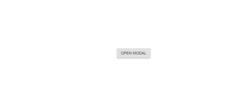
Material UI Modal
A Modal is a component in Material UI that allows you to display a dialog or overlay on top of the current page. Modals are commonly used to display additional content or prompts, such as forms, confirmation dialogs, and notifications.
To use a Modal in your project, you will first need to install Material UI and import the Modal and Button components.
Here is an example of how to use a Modal in a React component:
import { Modal, Button } from '@material-ui/core';

function MyComponent() {
  const [open, setOpen] = useState(false);

  const handleOpen = () => {
    setOpen(true);
  };

  const handleClose = () => {
    setOpen(false);
  };

  return (
    <div>
      <Button variant="contained" onClick={handleOpen}>
        Open Modal
      </Button>
      <Modal
        open={open}
        onClose={handleClose}
      >
        <div style={{ width: '400px', height: '200px', backgroundColor: 'white' }}>
          This is the content of the Modal.
        </div>
      </Modal>
    </div>
  );
}
This example creates a Modal that is displayed when the user clicks the "Open Modal" button. The Modal has a white background and contains some content. For in-depth knowledge on using Material UI Button, check out the complete guide to using the Material UI button in React
You can customize the appearance and behavior of the Modal using props such as open, onClose, disableBackdropClick, and disableEscapeKeyDown. You can also use the PaperProps prop to customize the container of the Modal, such as its size and style.
Here is an example of a Modal with customized size and style:
import { Modal, Button, Paper } from '@material-ui/core';

function MyComponent() {
  const [open, setOpen] = useState(false);

  const handleOpen = () => {
    setOpen(true);
  };

  const handleClose = () => {
    setOpen(false);
  };

  return (
    <div>
      <Button variant="contained" onClick={handleOpen}>
        Open Modal
      </Button>
      <Modal
        open={open}
        onClose={handleClose}
      >
        <Paper style={{ width: '800px', height: '400px', backgroundColor: '#F5F5F5', padding: '20px' }}>
          This is the content of the Modal.
        </Paper>
      </Modal>
    </div>
  );
}
This example creates a Modal with a Paper container that has a custom size, style, and padding.
Modals are a useful component in Material UI that can help you display additional content or prompts in an overlay on the current page. With a wide range of customization options, you can create Modals that match your design requirements and enhance the user experience of your app.
Material UI Colors
One of the key features of Material design principles is its extensive color system, which allows developers to easily incorporate a wide range of colors into their projects.
The Material UI colors are divided into two main categories: primary and secondary colors.
-
Primary colors are used for the main elements in the UI, such as the app bar, buttons, and text fields. Material UI provides the following primary colors:
-
primary.main: The main primary color of your application. -
primary.light: A lighter variant of the primary color. -
primary.dark: A darker variant of the primary color.
-
-
Secondary colors are used for secondary elements in the UI, such as error messages, icons, and helper text. Material UI provides the following secondary colors:
-
secondary.main: The main secondary color of your application. -
secondary.light: A lighter variant of the secondary color. -
secondary.dark: A darker variant of the secondary color.
-
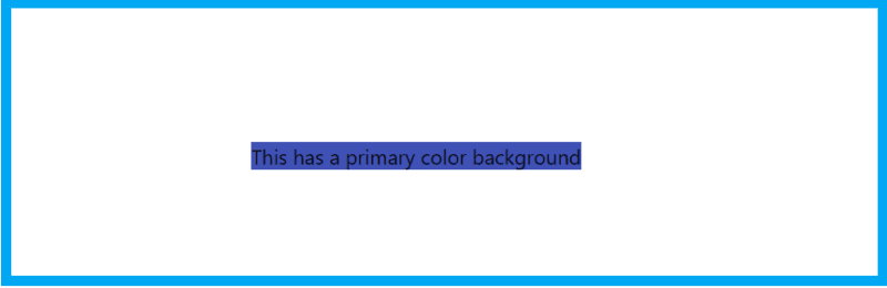
Here's an example of how to use the Material UI colors to change the background color of a component:
import { makeStyles } from '@material-ui/core/styles';

const useStyles = makeStyles((theme) => ({
  root: {
    backgroundColor: theme.palette.primary.main,
  },
}));

export default function ColorExample() {
  const classes = useStyles();
  return <div className={classes.root}>This has a primary color background</div>;
}
The makeStyles hook is used to create a style object that sets the background color of the component to the primary color in the Material UI color palette. The theme.palette object contains the different color palettes available in Material UI. The main property is used to reference the main color of the palette.
You can also use the secondary property to reference the secondary color of the palette, or you can use the error property to reference the error color of the palette.
You can also use the background and color utility classes to set the background and text color of an element respectively:
import { makeStyles } from '@material-ui/core/styles';
import clsx from 'clsx';

const useStyles = makeStyles((theme) => ({
  root: {
    backgroundColor: theme.palette.background.paper,
    color: theme.palette.text.primary,
  },
}));

export default function ColorExample() {
  const classes = useStyles();
  return <div className={clsx(classes.root, 'bg-primary', 'text-secondary')}>This has a primary color background and secondary color text</div>;
}
The clsx function is used to combine the classes from the useStyles hook and the background-primary and text-secondary classes.
You can use predefined colors to create a consistent and visually pleasing color scheme for your application. The Material Design color system provides a set of primary and secondary colors that are designed to work together to create harmonious color combinations.
Material UI Tabs
The Tabs component is used for creating tabbed navigation in your web app. This renders a set of tabs and their associated content, allowing the user to switch between different sections of content.
import React from 'react';
import { Tabs, Tab } from '@material-ui/core';

function Example() {
  const [value, setValue] = React.useState(0);

  const handleChange = (event, newValue) => {
    setValue(newValue);
  };

  return (
  <>
    <Tabs value={value} onChange={handleChange}>
      <Tab label='Tab 1' />
      <Tab label='Tab 2' />
      <Tab label='Tab 3' />
    </Tabs>
    <div>
      {value === 0 && <div>Content of tab 1</div>}
      {value === 1 && <div>Content of tab 2</div>}
      {value === 2 && <div>Content of tab 3</div>}
    </div>
  </>
  );
}
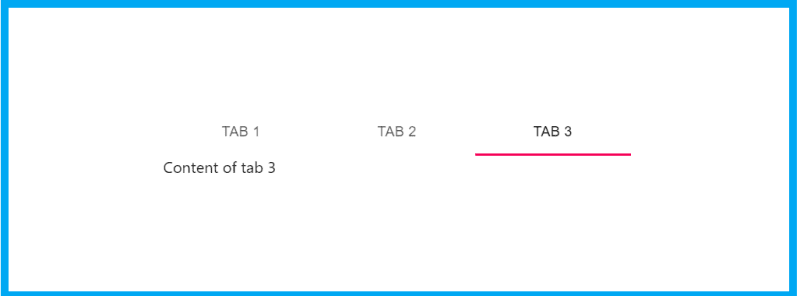
You can see how to define a value and handle change events for the tabs, by doing this the value state will change each time the user changes tabs. Also, you can render different content for each tab by checking the value state, this way when the user changes tabs, the content will change as well.
The Tab component, which is a child of the Tabs component, is used to define the tabs themselves. The label prop is used to define the text that will be displayed on the tab button.
You can also use indicatorColor and textColor props in the Tabs component to change the color of the underline that appears under the selected tab and the text color of the tabs.
Additionally, you can use the scrollButtons prop to enable scrolling in case you have too many tabs to fit on the screen.
<Tabs
  scrollButtons="on"
  indicatorColor="primary"
  textColor="primary"
>
Learn more on How to Build Tabs in React with Material UI Tabs.
Material UI Form
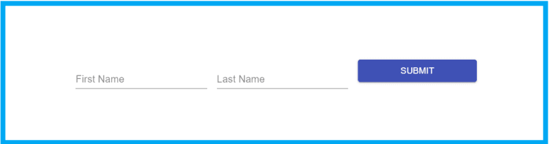
Material UI comes with a set of pre-built form components that makes it easy to create consistent, visually pleasing forms in your application.
Here's an example of a simple form created with Material UI:
import React from 'react';
import { makeStyles } from '@material-ui/core/styles';
import TextField from '@material-ui/core/TextField';
import Button from '@material-ui/core/Button';

const useStyles = makeStyles((theme) => ({
  root: {
    '& > *': {
      margin: theme.spacing(1),
      width: '25ch',
    },
  },
}));

export default function SimpleForm() {
  const classes = useStyles();
  const [values, setValues] = React.useState({
    firstName: '',
    lastName: '',
  });

  const handleChange = (event) => {
    setValues({
      ...values,
      [event.target.name]: event.target.value,
    });
  };

  const handleSubmit = (event) => {
    event.preventDefault();
    console.log(values);
  };

  return (
    <form className={classes.root} onSubmit={handleSubmit}>
      <TextField
        label="First Name"
        name="firstName"
        value={values.firstName}
        onChange={handleChange}
      />
      <TextField
        label="Last Name"
        name="lastName"
        value={values.lastName}
        onChange={handleChange}
      />
      <Button type="submit" color="primary">
        Submit
      </Button>
    </form>
  );
}
This form has two text fields for the user to enter their first and last name, and a submit button. The form uses the TextField component from Material UI for the input fields and the Button component for the submit button. The handleChange function updates the form's state when the user types in the input fields, and the handleSubmit function logs the form values to the console when the user submits the form.
Also, if you want to validate the form and show error messages, you can use the error and helperText props provided by the TextField component.
Read more: A Great Guide To Using Material UI Textfield Efficiently
Also, if you want to validate the form and show error messages, you can use the error and helperText props provided by the TextField component.
import React from 'react';
import { useForm } from 'react-hook-form';
import { TextField } from '@material-ui/core';

export default function FormWithValidation() {
  const { register, handleSubmit, errors } = useForm();

  const onSubmit = (data) => {
    console.log(data);
  };

  return (
   <form onSubmit={handleSubmit(onSubmit)}>
      <TextField
        name='firstName'
        label='First Name'
        inputRef={register({ required: true })}
        error={Boolean(errors.firstName)}
        helperText={errors.firstName && 'This field is required'}
      />
    </form>
  )
};
Material UI Box
Material UI's Box component is a simple container component that provides flexible layout options. It can be used to create a container for other components, apply spacing and alignment, and control the dimensions of the container.
Here's an example of how to use the Box component:
import React from 'react';
import { Box } from '@material-ui/core';

export default function MyComponent() {
  return (
    <Box p={2}>
      <p>This is some content inside a box.</p>
    </Box>
  );
}
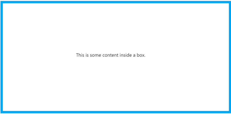
The Box component is used as a container for a paragraph of text. The p prop is used to apply padding of 2 units to the container. Material UI uses a spacing scale of 8 units, so 2 units of padding is equivalent to 16 pixels.
You can also use Box to align the content inside it, for example:
<Box display="flex" alignItems="center" justifyContent="center" p={2}>
      <p>This is some content inside a box.</p>
</Box>
Here, the display prop is set to "flex" to enable flexbox layout for the container. The alignItems prop is set to "center" to center the content vertically within the container, and the justifyContent prop is set to "center" to center the content horizontally.
You can also use Box to define the width and height of the container, for example:
  <Box width={1/2} height={250} p={2}>
    <p>This is some content inside a box.</p>
  </Box>
Here, the width prop is set to 1/2 to make the container take up half of the available width, and the height prop is set to 250 pixels to set the container to a specific height.
In addition to the above example, you can also use Box as a responsive layout using the display prop and the width, height, minWidth, and maxWidth props.
As you can see, the Box component is a powerful and flexible layout tool that can be used to create a wide variety of layouts in your Material UI application.
Material UI Navbar
Material UI's AppBar component can be used as a navigation bar, also known as a navbar, at the top of your application. It provides a consistent visual style and layout and can be customized with various props.
Here's an example of how to create a simple navbar with a title and a menu button:
import React from 'react';
import { AppBar, Toolbar, Typography, IconButton } from '@material-ui/core';
import MenuIcon from '@material-ui/icons/Menu';

export default function Navbar() {
  return (
    <AppBar position="static">
      <Toolbar>
        <IconButton edge="start" color="inherit" aria-label="menu">
          <MenuIcon />
        </IconButton>
        <Typography variant="h6">
          My App
        </Typography>
      </Toolbar>
    </AppBar>
  );
}
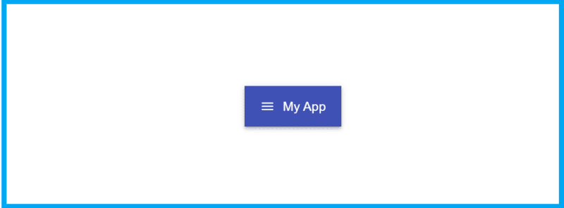
AppBar is used to create the navbar container, the Toolbar component is used to create a container for the navbar content, the IconButton component is used to create a button with a menu icon, and the Typography component is used to create a title for the navbar.
The position prop of the AppBar is set to "static" to make the navbar stay at the top of the screen when the user scrolls the page.
Also, you can add more functionality like adding a menu or links to navigate through the pages, for example:
import React from 'react';
import { Link } from 'react-router-dom'
import { AppBar, Toolbar, Typography, IconButton, makeStyles, Button } from '@material-ui/core';
import MenuIcon from '@material-ui/icons/Menu';

const useStyles = makeStyles((theme) => ({
  root: {
    flexGrow: 1,
  },
  menuButton: {
    marginRight: theme.spacing(2),
  },
  title: {
    flexGrow: 1,
  },
}));

export default function Navbar() {
  const classes = useStyles();
  return (
    <AppBar position="static">
      <Toolbar>
        <IconButton edge="start" className={classes.menuButton} color="inherit" aria-label="menu">
          <MenuIcon />
        </IconButton>
        <Typography variant="h6" className={classes.title}>
          My App
        </Typography>
        <Button color="inherit" component={Link} to='/home'>Home</Button>
        <Button color="inherit" component={Link} to='/about'>About</Button>
      </Toolbar>
    </AppBar>
  );
}
The Button component is used to create a link to navigate to a specific page, and the Link component from react-router-dom is used to link the button to the specific route.
You can use Material UI's AppBar component to create a simple and customizable navbar for your application with the ability to add more functionality and flexibility.
Material UI Core
Material UI Core is a set of pre-built components that implement the Material Design guidelines from Google. It provides a wide variety of components that can be used to create a consistent, visually pleasing user interface for your application.
Here's an example of how to use some of the Material UI Core components to create a simple card:
import React from 'react';
import { makeStyles } from '@material-ui/core/styles';
import Card from '@material-ui/core/Card';
import CardContent from '@material-ui/core/CardContent';
import Typography from '@material-ui/core/Typography';

const useStyles = makeStyles({
  root: {
    minWidth: 275,
  },
  bullet: {
    display: 'inline-block',
    margin: '0 2px',
    transform: 'scale(0.8)',
  },
  title: {
    fontSize: 14,
  },
  pos: {
    marginBottom: 12,
  },
});

export default function SimpleCard() {
  const classes = useStyles();

  return (
    <Card className={classes.root}>
      <CardContent>
        <Typography variant="h5" component="h2">
          My Card
        </Typography>
        <Typography className={classes.pos} color="textSecondary">
          A simple card
        </Typography>
        <Typography variant="body2" component="p">
          Lorem ipsum dolor sit amet, consectetur adipiscing elit.
          Praesent eget risus vitae massa semper aliquam quis mattis quam.
        </Typography>
      </CardContent>
    </Card>
  );
}
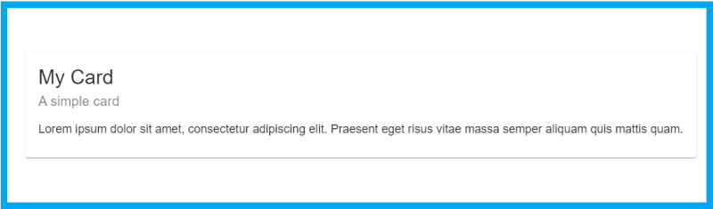
In this Material UI Core example, the Card component is used to create the card container, the CardContent component is used to create a container for the card content, and the Typography component is used to create the title, subtitle, and body of the card. We have demystified everything you need to know about the Material UI Card component in this post on Guide to Creating Cards with Material UI Card.
You can also use other Material UI Core components such as Button, TextField, FormControl, Select, Switch, Checkbox, Radio, Slider, Chip, Badge, Avatar and many more.
Material UI Responsiveness
Material UI provides a set of utilities that allow you to create responsive designs that adapt to different screen sizes and orientations. You can use these utilities to change the layout, spacing, and visibility of your components based on the size of the screen.
One of the most useful utilities provided by Material UI for creating responsive designs is the useMediaQuery hook. This hook allows you to create responsive designs by conditionally rendering components based on the screen size.
Here's an example of how to use the useMediaQuery hook to create a responsive design:
import { useMediaQuery } from '@material-ui/core';

export default function ResponsiveContainer() {
  const matches = useMediaQuery('(min-width:600px)');

  return (
    <div>
      {matches ? (
        <LargeScreenContent />
      ) : (
        <SmallScreenContent />
      )}
    </div>
  );
}
The useMediaQuery hook is used to check if
the screen width is at least 600 pixels. If the screen width is greater than or equal to 600 pixels, the LargeScreenContent component is rendered. If the screen width is less than 600 pixels, the SmallScreenContent component is rendered.
What You Have Learnt
We covered almost every aspect of the Material UI library. You learned about the different components of the library such as Material UI Core, Material UI Button Group, Material UI Input Fields, Material UI Cards, Material UI Dialogs, Material UI Table, the list goes on.
I hope this post serves as a go-to directory for all things Material UI. It will be your reference point for your Material UI project.


![React Material UI Project Tutorial [2022] - YouTube](https://res.cloudinary.com/practicaldev/image/fetch/s--6A8q-KfP--/c_limit%2Cf_auto%2Cfl_progressive%2Cq_auto%2Cw_800/https://img.youtube.com/vi/Xoz31I1FuiY/0.jpg)
Conclusion
In this post, you learned that Material UI is a powerful design system that can help you build user interfaces with a consistent, intuitive, and visually appealing look and feel. Whether you are building a web or mobile application, Material UI has a wide range of customizable components that can be easily integrated into your project and styled to match your brand. With its focus on accessibility and responsive design, Material UI is an excellent choice for building user interfaces that are both functional and visually appealing.
Happy Coding!

Top comments (0)