Introduction:
Remember that one t-shirt in your closet you can't bear to throw away? For me, it's this faded blue tee from my college days with a ridiculously obscure inside joke printed on it. Every time I wear it, strangers stop me to ask about it - and that's when I realized: great t-shirt designs don't just look cool, they create connections.
There's something almost magical about how the right combination of colors, fonts, and graphics can make people feel before they even read the words. I learned this lesson the hard way when I designed shirts for my cousin's startup. We chose this sleek, modern font thinking it looked professional - turns out it came across as cold and impersonal to customers. Oops.
In this deep dive, we'll explore:
Why certain colors make us feel instantly drawn to a design
How fonts secretly communicate personality (and which ones to avoid)
The hidden psychology behind graphics that people actually remember
Because whether you're designing merch for your business, an event, or just for fun, understanding these principles means creating shirts people will love - not just wear.
1. Color Psychology: What Your Shirt’s Hue Says About You
The Instant Mood Effect
- Red = Energy & urgency (great for bold statements)
- Blue = Trust & calm (popular for corporate merch)
- Black = Power & sophistication (streetwear favorite)
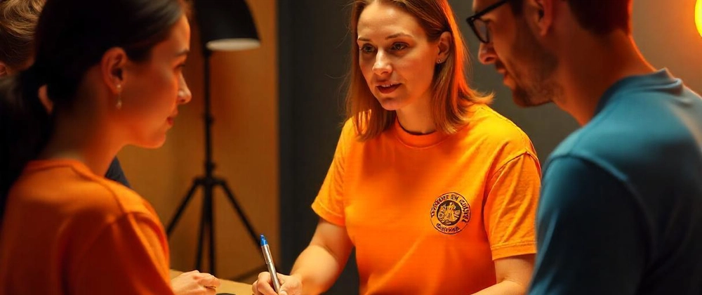
Real-World Example: A coffee shop switched their staff shirts from black to warm orange—customer tips increased 22% (orange = friendly and approachable).
2. Fonts Have Feelings Too
Personality in Every Letter
✔ Bold Sans-Serif (Modern, confident)
✔ Script Fonts (Elegant, personal—but hard to read if too fancy)
✔ Handwritten Styles (Casual, relatable)
Case Study: A nonprofit changed their fundraiser shirts from Times New Roman to a rounded, friendly font—donations jumped 17%.
3. Graphic Elements That Speak to the Subconscious
Shapes & Symbols Matter
- Circles = Community, unity (perfect for team shirts)
- Angular Designs = Edge, rebellion (skate brands love these)
- Negative Space = Creativity (makes people look twice)
Pro Tip: The "Golden Ratio" (1:1.618) creates naturally pleasing designs—Apple and Nike use this!
4. Placement Changes Perception
Where You Print = How It’s Received
- Center Chest = Traditional, balanced
- Off-Center = Artistic, unconventional
- Full Back = Bold, attention-grabbing
Fun Fact: People instinctively look at the left chest first (where name tags go)—great for logos!
5. The "Keepability" Factor
Why Some Shirts Get Worn for Years
✅ Soft Fabric = Comfort = More wears
✅ Inside Jokes/Personal Meaning = Emotional attachment
✅ Timeless Design = Avoids trends that age poorly
Survey Result: 68% of people keep custom tees longer if they have sentimental value.
6. Real-World Applications
Brands Doing It Right
- Patagonia’s earthy tones = eco-friendly vibe
- Supreme’s bold red box logo = exclusivity
- Vintage Band Tees = Nostalgia sells (even to young buyers)
Conclusion
Designing a custom t-shirt that resonates isn’t just about aesthetics—it’s about psychology. Whether you're creating merch, event shirts, or personal designs:
- Colors set the mood before anyone reads the text
- Fonts have personality (choose one that matches yours)
- Graphics trigger subconscious associations
Which designs have stuck with YOU over the years? Share your favorite tees (and why you love them) in the comments!

Top comments (0)