Storybook and Angular
Now, I have a bit more experience about making stories for Angular. I would like to share with you how I write a story for an Angular directive. I have already written an article when I started with storybook. I will make here some adjustments.
Context: Angular 13, StoryBook 6.5.0-alpha.36
First draft
I presume you already have installed storybook, if you don’t just go here.
Let’s use this button directive:
// button.directive.ts
@Directive({
  selector: 'button[groButton]',
host: {
    _class_: 'gro-button',
    '[class.gro-small]': 'size === "small"',
    '[class.gro-medium]': 'size === "medium"',
    '[class.gro-large]': 'size === "large"',
    '[class.gro-outlined]': 'outlined',
    '[class.gro-primary]': 'color === "primary"',
    '[class.gro-accent]': 'color === "accent"',
    '[class.gro-warn]': 'color === "warn"',
  },
})
_export class_ ButtonDirective {
  @Input()
  _public_ size: 'small' | 'medium' | 'large' = 'medium';

  @Input()
  @CoerceBoolean()
  _public_ outlined?: _boolean_;

  @Input()
  _public_ color: 'primary' | 'accent' | 'warn' = 'primary';
}
I know there is a debate about using a directive or a component for button element. But that’s not the point here :-)
Now, this is the minimal story example for it:
// button.stories.ts
_import_ { _Meta_, _Story_ } _from_ '@storybook/angular';
_import_ { ButtonDirective } _from_ './button.directive';

_export default_ {
  title: 'atoms/button',
  component: ButtonDirective,
} _as Meta_<ButtonDirective>;

_const_ template: _Story_<ButtonDirective> = (args: ButtonDirective) => ({
  props: {
    size: args.size,
    outlined: args.outlined,
    color: args.color,
  },
  template: `<button groButton [size]="size" [outlined]="outlined" [color]="color">Click</button>`,
});

_export const_ Default = template.bind({});
With this stories you could test all cases for the button directive.
I suggest you to have a look on the “props” properties for the template. Personally, I use the addon-docs which works with compodoc. It allows to extract the documentation in the “Docs” tab. When you use it, if you set the “props” properties like this:
props: {
  ...args
}
You will get some troubles. In fact, all properties of your directive/component will be overrode, not only the @Input properties. This can lead to some unexpected behaviors. So, you should prefer to only specify the properties you want to set.
That’s what you get with this story:
Final Story
Now, let’s improve this story with some special addons offered by storybook.
addon-controls
Thanks to this addon, we can play with our components/directives from a graphical UI.
// .storybook/main.js
module.exports = {
  stories: [],
  addons: [
    '@storybook/addon-docs',
    '@storybook/addon-essentials', // check this line
  ],
  core: {
    builder: 'webpack5',
  },
  webpackFinal: (config) => {
    _return_ config;
  },
};
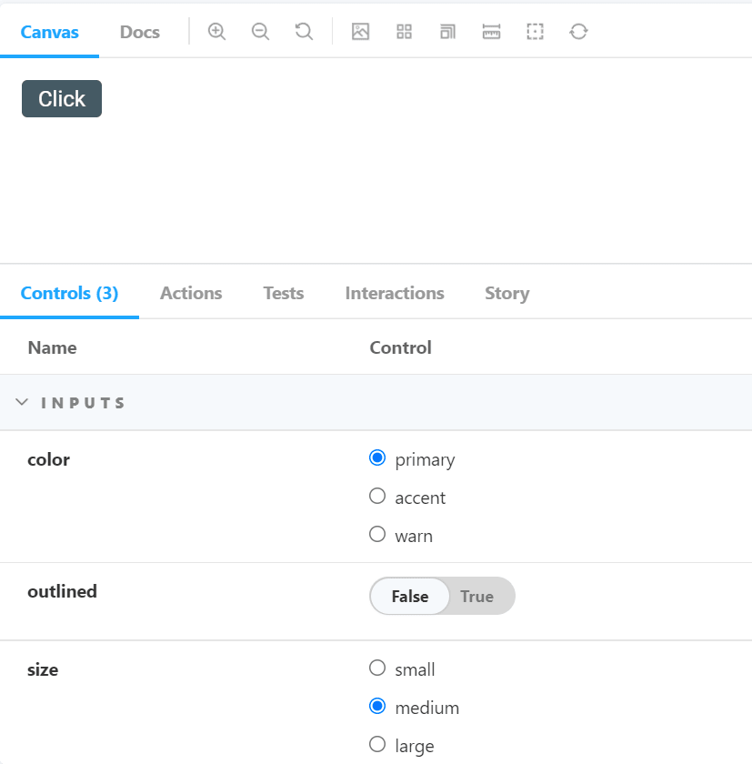
Have a look on the argTypes property:
// button.stories.ts
_export default_ {
  title: 'atoms/button',
  component: ButtonDirective,
argTypes: {
    color: { // directive input name
      control: { type: 'inline-radio' },
    },
    size: { // directive input name
      control: { type: 'inline-radio' },
    },
  },
} _as Meta_<ButtonDirective>;
Thanks to this, that’s what we get in our Storybook:
In all recent version of Storybook, this addon is a part of essentials and is installed by default.
If you want to get more information about it go here.
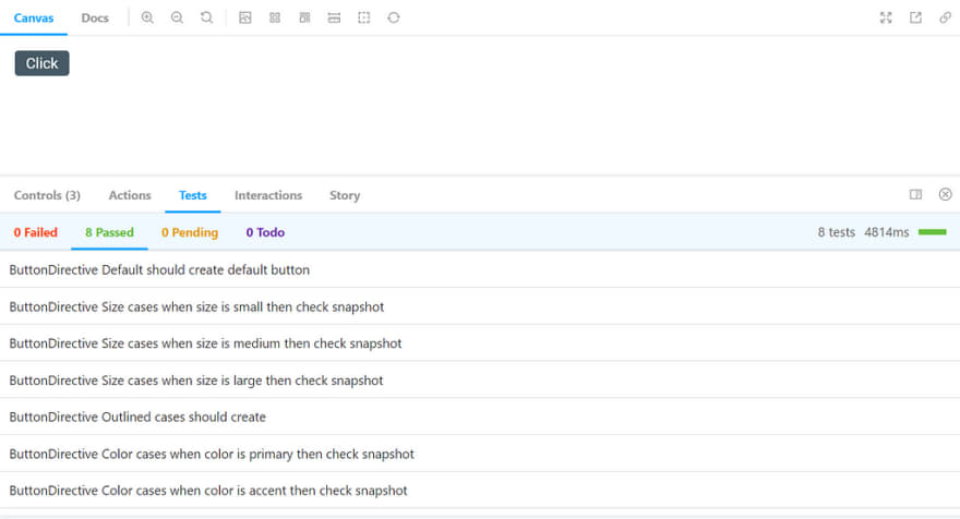
addon-jest
I use Jest to test my code. It’s sometime useful knowing what is tested without going in the code. For this, you have to install the addon-jest.
To install it:
(yarn|npm) (add|install) -D @storybook/addon-jest
Add the addon:
// .storybook/main.js
module.exports = {
  stories: [],
  addons: [
    '@storybook/addon-docs',
    '@storybook/addon-essentials',
    '@storybook/addon-jest', // check here
  ],
  core: {
    builder: 'webpack5',
  },
  webpackFinal: (config) => {
    _return_ config;
  },
};
In package.json file add the following:
// don't forget to add .jest-test-results.json to .gitignore
"scripts": {
  "test:generate-output": "jest --json --outputFile=.jest-test-results.json"
}
Add test at the global level of your Storybook:
// .storybook/preview.js

import { withTests } from '@storybook/addon-jest';

import results from '../.jest-test-results.json';

export const decorators = [
  withTests({
    results,
  }),
];
In your story:
_export default_ {
  title: 'atoms/button',
  component: ButtonDirective,
  parameters: {
    jest: ['button.directive.spec'], // check here
  },
  argTypes: {
    color: {
      control: { type: 'inline-radio' },
    },
    size: {
      control: { type: 'inline-radio' },
    },
  },
} _as Meta_<ButtonDirective>;
You will now can see this:
That’s the minimal setup I can suggest you. There are a lot of other addons that you can check here. All of them cannot be used for Angular but it’s always noticed.
Conclusion
Now you can have a nice Storybook, and more you can improve it with a lot of other addons. In a next chapter, I will show you how to test your Storybook. Why? Because Storybook is really powerful but when you add code into your applications/libraries you couldn’t know if you have broken something…
To be following…
Thanks for reading.

Top comments (0)