
I’ve bounced around various roles in my 13+ year career in software from QA to product management, to project management to consulting. It seems like I always find myself with a similar exercise: manipulating data from various systems in order to find the answers I’m looking for. A recent example is this tricky data analysis and manipulation that I performed, in which I take raw data from an API call, transform it, and display it on a map in Power BI. In this post, I’ll walk you through the tools, tips, and tricks I use to make this type of work much easier. Hopefully, the exercise will appeal to your creative side, demonstrating how we can tie various techniques together to solve specific problems that otherwise seem impossible.
The tools we’ll be using are:
- Postman
- Sublime Text
- Excel
- Power BI Desktop
The challenge
The National Water Quality Monitoring Council maintains a set of web services that provide water quality data for the nation. My client needed visibility into the data monitoring sites across the nation, which provided readings in the first full week of January. The client was going to use this data to decide if they wanted to move forward with the development work to make use of the API in their application, or if they were going to look for another API that provides similar data.
My goal was to understand and plot the locations and relative density of the sites that returned water quality data during that time period, based only on the information provided by these APIs. The APIs provide data about the amount of chemicals in the water, the temperature, the amount of fecal coliform (yuck), among other enthralling details.
As a preview, this is what the end result of my analysis looks like, with the dots being the locations of the site that returned data:

But getting to this simple, sleek visualization takes a few different steps, a fair bit of strategizing, and knowing the tricks behind the various tools that we can use.
Getting Postman to fetch API data
The first step is to understand the multitude of data available in the APIs. Postman is a great free tool for API exploration. It allows you to make API calls to different endpoints and easily change the parameters that are being sent. You can also save the API calls as a collection and share that with other team members to allow them to see the exact call that you were working with.

Here’s what’s happening in the screenshot above, which will lead me to the insights I’m looking for:
- I’m making a POST call to the Result endpoint. I would have expected to make a GET call by REST standards, but the water quality data API documentation recommends a POST.
- In the body of the POST, I’m limiting the data returned to be between 01-05-2020 and 01-11-2020. This is where any set of parameters could be sent with the POST, based on what’s supported by the API.
- The XML response of the API call has been returned and nicely formatted by Postman.
Decoding the data with Sublime Text
Now it’s time to parse that data, which is where Sublime Text can be a powerful tool. Sublime Text is a text editor that has a wealth of features to streamline the process, including multiple cursors and a large package ecosystem. It’s free for evaluation, but if you like it, I’d encourage you to support the team by purchasing a license!
So I go ahead and copy/paste my Postman responses into Sublime Text. But the first thing I notice is that there aren’t any latitude/longitude coordinates.
Womp. This is a problem, because I need those geo-coordinates in order to map the locations and site-density of the water quality monitoring sites. Instead, the data that is returned has a “MonitoringLocationIdentifier,” as seen below.

More data? No problem. Another API call
Ok, time to get creative: If I can get the latitude and longitude coordinates for each MonitoringLocationIdentifier from a separate API, I should be able to find a way to join the two datasets together. In the API documentation referenced earlier, I found the Stations endpoint, which provides additional information about the stations that return water quality data. So I head back to Postman to explore that API

Here’s the fancy footwork I’m pulling in the screenshot above to get those latitude/longitude data points for every MonitoringLocationIdentifier:
- I’m making a GET call to the Station endpoint.
- In the parameters of the GET, I’m requesting the data to be returned in CSV format.
- The CSV response of the API call is displayed.
- I select the option to save the CSV response locally, which is my next step.
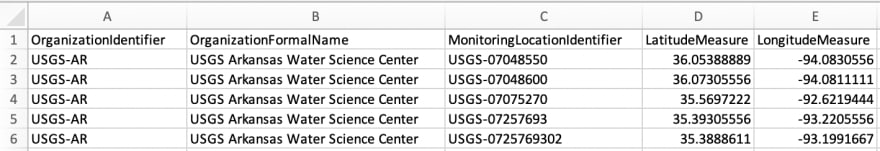
After opening the CSV file in Excel (see below), I verify that it includes the Latitude (column L) and Longitude (column M) for each MonitoringLocationIdentifier (column C).

Now, if I can just get the unique MonitoringLocationIdentifers that were returned in the Results API call into the same Excel file, I can cross-reference with the Stations data. From there, I’ll create a list that includes the latitudes and longitudes of stations that returned data in my desired time period.
Paring down the dataset
So I head back over to Sublime text to parse through the data some more. Here are the steps I take to pull the list of all MonitoringLocationIdentifier records that are in the Results API response:
Step 1 - Highlight the text “MonitoringLocationIdentifer,” then use cmd+ctrl+g command to select all instances of that test in the file. This also creates a cursor at each instance of “MonitoringLocationIdentifier.”

Step 2 - Use the cmd+l command to select all lines that have a cursor. In this case, it will be all lines that include the “MonitoringLocationIdentifier” text highlighted in Step 1.

Step 3 - Use cmd+c and cmd+v to copy and paste the line selections into a new file.

I now have a list of all MonitoringLocationIdentifier rows from the Results API response. Sublime Text makes this a simple operation, but it’s incredibly powerful. I was able to filter a large XML file to show the data I care about, using only a text editor.
The next step will be to remove the duplicate rows and strip out the actual data from the XML syntax. This is where Excel takes over. (I’m using Excel for this walkthrough, but the same features are available in Google Sheets as a free alternative).
Putting formulas to work in Excel
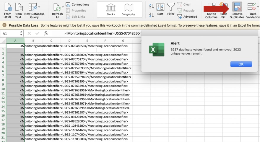
First, we want to remove the duplicate lines.
Step 1 - Copy and paste the MonitoringLocationIdentifier rows into the same Excel file that I opened the Stations.csv file with earlier.
Step 2 - Use the out-of-the-box Remove Duplicates feature.
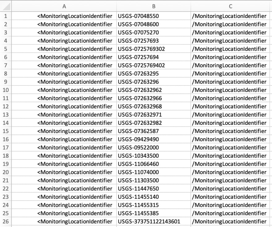
I now have the unique set of MonitoringLocationIdentifier records...but I don’t want the XML syntax.
Step 3 - Use Text to Columns to split out the relevant data (the actual location identifier) into its own column. I use the feature to split the data at the > character. Since the data is in XML format, I know that the text after the first > will be the MonitoringLocationIdentifier that I’m looking for.
Step 4 - Use Text to Columns to split the data again at the < character, because that’s where the MonitoringLocationIdentifier text ends.

We now have only the data we need in column B, and can safely delete the other two columns in the sheet to have the list of unique identifiers.
Bingo! Now I have the full list of data-returning stations that I want to display on my beautiful map. But I need the latitude and longitude values that were in the CSV file I downloaded in order to do that.
For this, I’ll use another handy Excel trick: the VLOOKUP function, which is similar to a JOIN in database terminology. In my opinion, the VLOOKUP, is the single most important Excel function to learn—and it’s the one that I use most often.
This is the stations worksheet that the VLOOKUP is looking in:
The VLOOKUP formula I wrote is =VLOOKUP(A2,stations!C:D,2,FALSE). Let’s break that down to see how it works:
- A2 = The value that we want to lookup in the other table (i.e., the MonitoringLocationIdentifier)
- stations!C:D = I want to look at the data in columns C and D in the stations worksheet to find the MonitoringLocationIdentifier. The first column is where the search will be performed (column C), the other columns are what can be returned from the search.
- 2 = Out of the number of columns that we select in the previous step, we want to send the value to the 2nd column if the A2 lookup is found
- FALSE = Whether we do or don’t want to return an approximate match. Here, we don’t.
So, the VLOOKUP function will look for the MonitoringLocationIdentifer in the list of stations, and it will return the Latitude value if the MonitoringLocationIdentifier is found.
This is the result of the VLOOKUP:

This formula should then be applied to all cells in column B.
Next, we need to write a similar function for column C to bring in the Latitude values, and that function is =VLOOKUP(A2,stations!C:E,3,FALSE). The difference here is that we extended the columns that we are searching for in the stations table to include column E, which has the longitude value, and that’s what we are returning.

After applying our Excel magic, we have the data that we need to display on a map: a list of MonitoringLocationIdentifiers and their corresponding latitudes and longitudes.
Mapping the data in Power BI
Now it’s Power BI’s turn to shine. Power BI is great for quickly visualizing the data in a map-based report. It’s a Microsoft that lets you create local reports for free. If you want to share those reports in a web-based viewer, there’s a licensing cost, but you won’t get charged a dime for the type of data-exploration exercise that we’re working on here.
First, we have to load the data in Power BI Desktop, using the out-of-the-box “Load Excel Data” functionality:

The next task is to create a map-based report and display all of the stations that are in the Excel file we created.
Step 1 - Drag the “Map” visualization onto the report canvas
Step 2 - Drag the Latitude data element onto the visualization field
Step 3 - Drag the Longitude data element onto the visualization field

Easy, right? And now I’ve accomplished my goal of mapping all the water quality monitoring sites that returned data during the dates specified in our original API call.
This creatively configured map will allow my client to actually use the API they were targeting, while understanding the data at a much deeper level. I’ve verified that actual water quality data is being returned by all of the stations that are clearly delineated on this map. Additionally, the map makes it very easy to understand the geographic density of the monitoring stations. I can see that some states are very underrepresented in the data, such as Montana, South Dakota, and Pennsylvania. I can also see that states such as Virginia are reporting larger amounts of water quality data. So, if my client were trying to target South Dakota users with their application, and relying on the water quality data from the API, they would quickly realize that it’s not feasible due to the sparseness of data in that site. I would have saved them upfront investment by helping them to understand the feasibility of an effort before diving into implementation.
So to recap, these are some of the tools, tips, and tricks we discovered in this exercise:
- Postman for API data exploration
- Sublime Text to focus on only one data type from an XML response
- Excel to remove duplicates
- Excel to pull the data out of XML syntax with text to columns
- Excel to join the data from two different API calls with a VLOOKUP
- Power BI to visualize data on a map
Getting creative
Consultants are creative problem solvers, that’s why clients hire us. Knowing how to find answers to the tough questions by switching between platforms and manipulating data can be a huge benefit. The more you know about the data before implementation starts, the better solution you can design and build.
I would encourage you to learn as many tips and tricks as you can and share them with your friends and coworkers. I guarantee that someone else has tried to solve a similar problem that you came up with a creative solution for, and they will be grateful for the ideas!

Latest comments (0)