This tutorial is the third part of our React Native Plant App tutorial series. In the previous part, we successfully implemented all the components in our ‘./components’ folder. This tutorial is the continuation of the same tutorial from where we left off in the last part. So, it is recommended to go through the previous part in order to get insight and knowledge of the overall project.
In case of wanting to learn from the beginning, all the parts for this tutorial series are available below:
As mentioned in the previous parts, this tutorial series was inspired by the React Native App Templates that accommodates a wide variety of mobile application templates written in React Native and powered by universal features and design. These app templates allow us to implement our own apps and even start our own startups. And, this third part is also the continuation of coding implementations and designs from the Youtube video tutorial by React UI Kitfor the Plant App. The video tutorial delivers the coding implementation of the overall app very thoroughly but without any verbal guidance. This tutorial series is the implementation of the same coding style and designs in the form of the article. Thus, the learners can go through each step and take their time understanding the implementations.
Overview
In this third part of this tutorial series, we are going to implement some UI portions of the Welcome Screen. The idea is to start by implementing the Welcome Screen Header/Slogan section. Then, we are going to section out the different UI sections that we are going to implement in the Welcome screen in the form of functions. Lastly, we are going to add different buttons on the Welcome screen along with the navigation config.
So, let us begin!!
Implementation of Welcome Screen
Here, we are going to implement some of the UI sections of the Welcome screen in the Welcome.js file. First, we are going to set the header or slogan section of the Welcome screen. For that, we need to use the code from the following code snippet in the render() function of Welcome.js file:
render(){
   return (
     <Block>
       <Block center bottom flex={0.4}>
         <Text h1 center bold>
           Your Home.
           <Text h1 primary> Greener.</Text>
         </Text>
         <Text h3 gray2 style={{ marginTop: theme.sizes.padding / 2 }}>
           Enjoy the experience.
         </Text>
       </Block>
       <Block center middle>
         <Text>Welcome</Text>
       </Block>
     </Block>

   );
 }
Here, we have used the Block component as well as some Text components. These components are not from the react-native package. Hence, these are the pre-defined custom components that we implemented in the earlier tutorial part. We have also assigned some props to the components which are already configured inside the component files. Thus, we need to import the constant theme.js file to the Welcome.js file:
import { theme } from '../constants';
Hence, we will get the following result in the emulator screen:
As we can see, we have got the slogan section on our Welcome screen which looks very appealing. Now, we are going to section our the different UI sections on the Welcome screen. So, the code becomes clearer for each section and it will be easier for us to implement as well.
Separating Different UI sections in Welcome Screen
Here, we are going to separate two UI sections. One is the Illustrations Section and the other is Steps(Delimiter Dots) Section. We are going to implement separate functions for both these sections. The function will return the template for these sections.
Illustrations Section
This section will contain the images which will be horizontally scrollable. For now, we are just going to separate it out with the renderIllustrations() function as shown in the code snippet below:
renderIllustrations(){
   return(
     <Block>
       <Text>Image</Text>
     </Block>
   )
 }
Steps Section
This section will contain the Delimiter Dots as per the number of Illustrations. The idea is to animate to active dot whenever we scroll the Illustrations. For this, we are going to use the function called renderSteps() which is provided in the code snippet below:
renderSteps(){
   return(
     <Block>
       <Text>\* \* \*</Text>
     </Block>
   )
 }
Now, we need to call both the functions into our render() function as shown in the code snippet below:
render(){
   return (
     <Block>
       <Block center bottom flex={0.4}>
         <Text h1 center bold>
           Your Home.
           <Text h1 primary> Greener.</Text>
         </Text>
         <Text h3 gray2 style={{ marginTop: theme.sizes.padding / 2 }}>
           Enjoy the experience.
         </Text>
       </Block>
       <Block center middle>
         {this.renderIllustrations()}
         {this.renderSteps()}
       </Block>
     </Block>

   );
 }
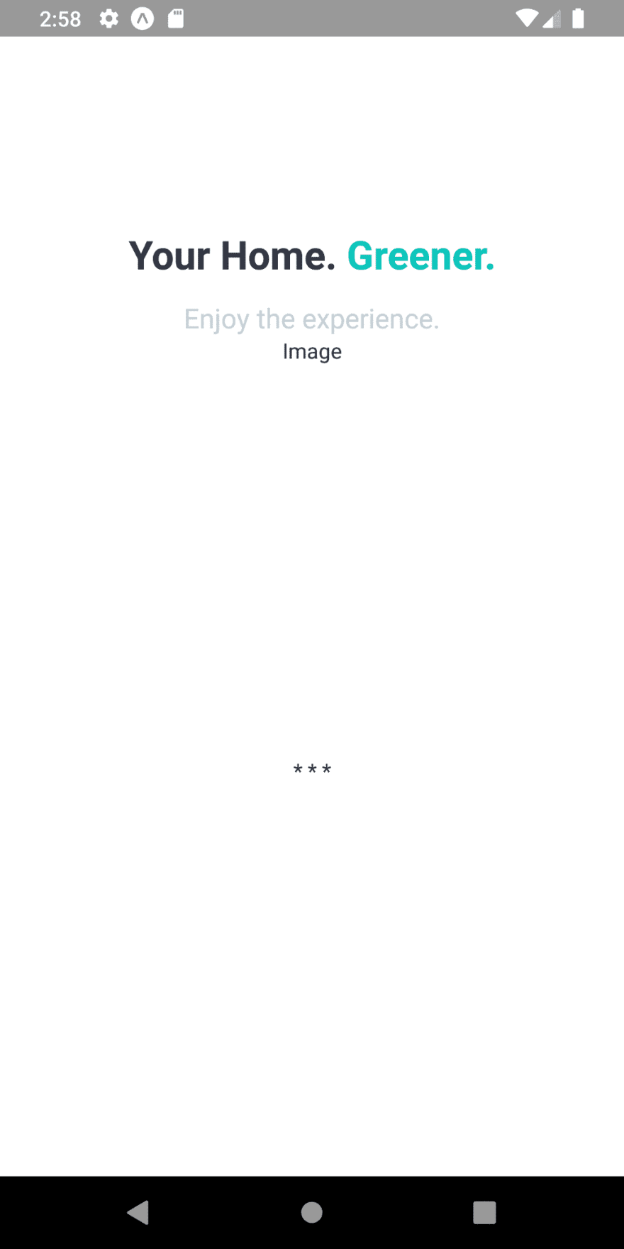
Here, we have replaced the Text component having 'Welcome' text with the function calls. Hence, we will get the following result in our emulator screen:
As we can see, we have separated out the two UI sections. The Illustrations section marked by ‘Image’ text. And, the Steps section marked by three asterisks.
Implementing Buttons sections
Here, we are going to add buttons to the bottom of the Welcome screen just below the Steps section. We are going to add three buttons for Login, Sign up and Terms and Conditions(TOC). For that, we need to use the code from the following code snippet in the render() function:
<Block center middle>
  {this.renderIllustrations()}
  {this.renderSteps()}
</Block>
<Block middle flex={0.5} margin={[0, theme.sizes.padding \* 2]}>
  <Button>
    <Text center>Login</Text>
  </Button>
  <Button>
    <Text center>Signup</Text>
  </Button>
  <Button>
    <Text center>Terms of service</Text>
  </Button>
</Block>
Here, we have added another Block component below the Block component wrapping function calls. This Block component wraps the three Button components with Text components. Hence, we will get the following result in our emulator screen:
As we can see, we have got the button in the form of text-only which does not seem appealing. So, we are going to add some styles to them in order to make them look appealing.
Styling the Buttons
Before applying style props to the Button and Text component, we need to make a slight configuration to the Button.js file of the './components/' folder. For that, we need to install the package called expo-linear-gradient. This package provides a React component that renders a gradient view. Now, we are going to import this package as LinearGradient in the Button.js file as shown in the code snippet below:
import { LinearGradient } from 'expo-linear-gradient';
Note that we installed this package because the expo package that provided the LinearGradient component was already separated out to this package. Now, we are going to add some style props to the Button components as shown in the code snippet below:
<Block middle flex={0.5} margin={[0, theme.sizes.padding \* 2]}>
  <Button gradient>
    <Text center semibold white>Login</Text>
  </Button>
  <Button shadow>
    <Text center semibold>Signup</Text>
  </Button>
  <Button>
    <Text center caption gray>Terms of service</Text>
  </Button>
</Block>
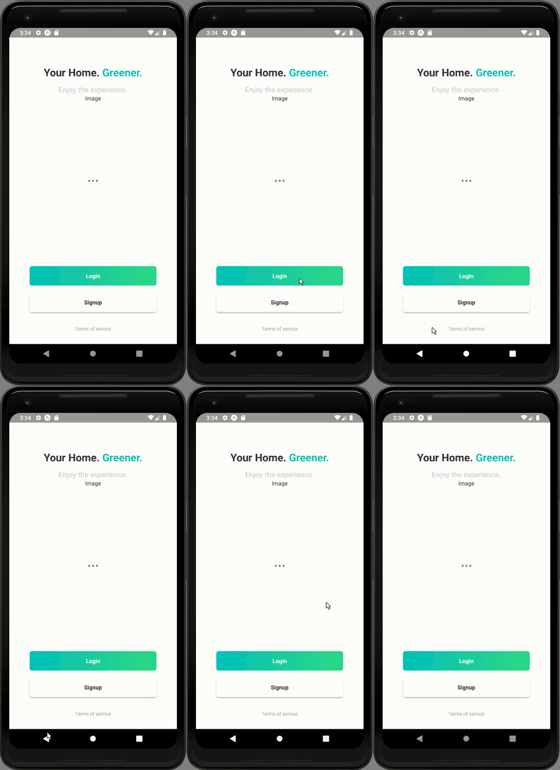
Here, we have added gradient and shadow prop to our buttons. We have also styled our Text components with some color and position props. Hence, we will get the following result in our emulator screen:
As we can see, we have got beautiful buttons in our Welcome screen. The Login button has a gradient color to it and the Signup button has a shadow style. Now, we should already have guessed that these two buttons navigate to the Login and Signup screen. So, we are going to add the navigation configuration to them now.
Adding Navigation to Buttons
Here, we are going to add the navigation configuration to buttons. For that, we are going to use the navigate() function provided by the navigation prop as shown in the code snippet below:
<Block middle flex={0.5} margin={[0, theme.sizes.padding \* 2]}>
  <Button gradient onPress={() => this.props.navigation.navigate('Login')}>
    <Text center semibold white>Login</Text>
  </Button>
  <Button shadow onPress={() => this.props.navigation.navigate('SignUp')}>
    <Text center semibold>Signup</Text>
  </Button>
  <Button onPress={() => {}}>
    <Text center caption gray>Terms of service</Text>
  </Button>
</Block>
Here, we have added the navigation config to onPress event of the Button component. But, we might remember that we have commented out the Login and SignUp screens in our index.js file of the './navigation' folder. Now, it is now time to uncomment the Login and SignUp screen in the index.hs file of the './navigation/' folder. Now, we need to add a simple React NativeTemplate to these two screens. In Login.js file, we are going to use the code from the following code snippet to implement a simple template:
import React from 'react';
import { StyleSheet } from 'react-native';

import { Button, Block, Text } from '../components';

export default class Welcome extends React.Component {

 static navigationOptions = {
   header : null
 }

 render(){
   return (
     <Block middle>
       <Text>Login</Text>
     </Block>

   );
 }
 }

const styles = StyleSheet.create({

});
Same goes for SignUp screen in the Signup.js file:
import React from 'react';
import { StyleSheet } from 'react-native';

import { Button, Block, Text } from '../components';

export default class Welcome extends React.Component {

 static navigationOptions = {
   header : null
 }

 render(){
   return (
     <Block middle>
       <Text>Sign Up</Text>
     </Block>

   );
 }
 }

const styles = StyleSheet.create({

});
Now, we can test if the navigation to these two screens works if we click their respective buttons in our Welcome screen. Hence, we will get the following result in our emulator screen:
As we can see, we have successfully configured the Navigation to Login and SignUp screen when we click their respective buttons on the Welcome screen. With this, we have come to the end of this part of the tutorial.
Finally, we have successfully implemented the slogan and buttons section of the Welcome screen in our React Native Plant app.
Conclusion
This tutorial is the third part of the React Native Plant App tutorial series. In this part, we continued from where we left off in the second part of this tutorial series. In this part of the tutorial, we implemented the slogan section of our Welcome screen by using our predefined custom components. Then, we separated out the functions which will return the templates for Illustrations and Steps section. Lastly, we learned how to make use of the Button component to implement buttons and style them with different props as well as configure them with the navigation features.
In the next part of this tutorial series, we are going to implement the Illustrations and Steps section that we separated out in this tutorial part.
So, Stay Tuned folks!!!


Top comments (0)