
This tutorial is the second part of our React Native Plant App tutorial series.
In the previous part, we successfully set up the overall project structure, navigations, constants and also implemented image caching. This tutorial is the continuation of the same tutorial from where we left off in the last part. So, it is recommended to go through the previous part in order to establish the basis and get insight into the overall project.
As mentioned in the previous part, the motivation to implement this UI series
came from the React Native App Templates that
accommodates a wide variety of mobile application templates written in React
Native and powered by universal features and design. These app templates allow
us to implement our own apps and even start our own startups. And, this second
part is also the continuation of coding implementations and designs from the
Youtube video tutorial by React UI Kit
for
the Plant App. The video tutorial delivers the coding implementation of the
overall app very thoroughly. This tutorial series is the implementation of the
same coding style and designs in the form of the article. Thus, the learners can
go through each step and take their time understanding the implementations.
Overview
In this second part of this tutorial series, we are going to implement all the
components that we are going to use in developing this Plant app. We are going
to set up all the component files in the ‘./components/’ folder. We consider
these files as predefined custom components that we are going to use in our
upcoming tutorials. So, we are just going to copy the coding implementation for
the necessary component into its respective component file.
So, let us begin!!
Implementing Different component files
Here, we are going to implement all the components that are required in order to
develop this project. All the components are predefined. So, we are just going
to copy the coding implementation of a specific component into its component
files. We might remember from the previous tutorial that we have already set up
the component files in the ‘./components’ folder. Now, all we need to do is to
add the required code in all the components so that we can import these
components in the different screens and implement them.
Here, all the components are implemented with required prop configurations. By
setting up these components now, we can use them easily in our upcoming
tutorials. We can simply import the ‘index.js’ file in the ‘./components’ folder
in which all our components are already imported and thus exported as well. Now,
we are going to copy the codes given in the code snippet below into the
respective components files:
In the Block.js file of ‘./components’ folder
Here, we are going to implement the Block component. The overall coding
implementation for the Block component is provided in the code snippet below:
    import React, { Component } from 'react'
    import { StyleSheet, View, Animated } from 'react-native'
    import { theme } from '../constants';
    export default class Block extends Component {
      handleMargins() {
        const { margin } = this.props;
        if (typeof margin === 'number') {
          return {
            marginTop: margin,
            marginRight: margin,
            marginBottom: margin,
            marginLeft: margin,
          }
        }
        if (typeof margin === 'object') {
          const marginSize = Object.keys(margin).length;
          switch (marginSize) {
            case 1:
              return {
                marginTop: margin[0],
                marginRight: margin[0],
                marginBottom: margin[0],
                marginLeft: margin[0],
              }
            case 2:
              return {
                marginTop: margin[0],
                marginRight: margin[1],
                marginBottom: margin[0],
                marginLeft: margin[1],
              }
            case 3:
              return {
                marginTop: margin[0],
                marginRight: margin[1],
                marginBottom: margin[2],
                marginLeft: margin[1],
              }
            default:
              return {
                marginTop: margin[0],
                marginRight: margin[1],
                marginBottom: margin[2],
                marginLeft: margin[3],
              }
          }
        }
      }
      handlePaddings() {
        const { padding } = this.props;
        if (typeof padding === 'number') {
          return {
            paddingTop: padding,
            paddingRight: padding,
            paddingBottom: padding,
            paddingLeft: padding,
          }
        }
        if (typeof padding === 'object') {
          const paddingSize = Object.keys(padding).length;
          switch (paddingSize) {
            case 1:
              return {
                paddingTop: padding[0],
                paddingRight: padding[0],
                paddingBottom: padding[0],
                paddingLeft: padding[0],
              }
            case 2:
              return {
                paddingTop: padding[0],
                paddingRight: padding[1],
                paddingBottom: padding[0],
                paddingLeft: padding[1],
              }
            case 3:
              return {
                paddingTop: padding[0],
                paddingRight: padding[1],
                paddingBottom: padding[2],
                paddingLeft: padding[1],
              }
            default:
              return {
                paddingTop: padding[0],
                paddingRight: padding[1],
                paddingBottom: padding[2],
                paddingLeft: padding[3],
              }
          }
        }
      }
      render() {
        const {
          flex,
          row,
          column,
          center,
          middle,
          left,
          right,
          top,
          bottom,
          card,
          shadow,
          color,
          space,
          padding,
          margin,
          animated,
          wrap,
          style,
          children,
          ...props
        } = this.props;
        const blockStyles = [
          styles.block,
          flex && { flex },
          flex === false && { flex: 0 }, // reset / disable flex
          row && styles.row,
          column && styles.column,
          center && styles.center,
          middle && styles.middle,
          left && styles.left,
          right && styles.right,
          top && styles.top,
          bottom && styles.bottom,
          margin && { ...this.handleMargins() },
          padding && { ...this.handlePaddings() },
          card && styles.card,
          shadow && styles.shadow,
          space && { justifyContent: `space-${space}` },
          wrap && { flexWrap: 'wrap' },
          color && styles[color], // predefined styles colors for backgroundColor
          color && !styles[color] && { backgroundColor: color }, // custom backgroundColor
          style, // rewrite predefined styles
        ];
        if (animated) {
          return (
            <Animated.View style={blockStyles} {...props}>
              {children}
            </Animated.View>
          )
        }
        return (
          <View style={blockStyles} {...props}>
            {children}
          </View>
        )
      }
    }
    export const styles = StyleSheet.create({
      block: {
        flex: 1,
      },
      row: {
        flexDirection: 'row',
      },
      column: {
        flexDirection: 'column',
      },
      card: {
        borderRadius: theme.sizes.radius,
      },
      center: {
        alignItems: 'center',
      },
      middle: {
        justifyContent: 'center',
      },
      left: {
        justifyContent: 'flex-start',
      },
      right: {
        justifyContent: 'flex-end',
      },
      top: {
        justifyContent: 'flex-start',
      },
      bottom: {
        justifyContent: 'flex-end',
      },
      shadow: {
        shadowColor: theme.colors.black,
        shadowOffset: { width: 0, height: 2 },
        shadowOpacity: 0.1,
        shadowRadius: 13,
        elevation: 2,
      },
      accent: { backgroundColor: theme.colors.accent, },
      primary: { backgroundColor: theme.colors.primary, },
      secondary: { backgroundColor: theme.colors.secondary, },
      tertiary: { backgroundColor: theme.colors.tertiary, },
      black: { backgroundColor: theme.colors.black, },
      white: { backgroundColor: theme.colors.white, },
      gray: { backgroundColor: theme.colors.gray, },
      gray2: { backgroundColor: theme.colors.gray2, },
    })
Here, all the required configuration along with styles are already predefined
and implemented. We can use this component to create a block in the screen
layout. It also allows different props as well.
In the Badge.js file of ‘./components’ folder
Here, we are going to implement the Badge component. The overall coding
implementation for the Badge component is provided in the code snippet below:
    import React, { Component } from 'react'
    import { StyleSheet } from 'react-native'
    import Block from './Block';
    import { theme } from '../constants';
    export default class Badge extends Component {
      render() {
        const { children, style, size, color, ...props } = this.props;
        const badgeStyles = StyleSheet.flatten([
          styles.badge,
          size && {
            height: size,
            width: size,
            borderRadius: size,
          },
          style,
        ]);
        return (
          <Block flex={false} middle center color={color} style={badgeStyles} {...props}>
            {children}
          </Block>
        )
      }
    }
    const styles = StyleSheet.create({
      badge: {
        height: theme.sizes.base,
        width: theme.sizes.base,
        borderRadius: theme.sizes.border,
      }
    })
This Badge component allows us to add a badge to our screens.
In the Button.js file of ‘./components’ folder
Here, we are going to implement the Button component. The overall coding
implementation for the Button component is provided in the code snippet below:
    import React, { Component } from 'react';
    import { StyleSheet, TouchableOpacity } from 'react-native';
    import { LinearGradient } from 'expo';
    import { theme } from '../constants';
    class Button extends Component {
      render() {
        const {
          style,
          opacity,
          gradient,
          color,
          startColor,
          endColor,
          end,
          start,
          locations,
          shadow,
          children,
          ...props
        } = this.props;
        const buttonStyles = [
          styles.button,
          shadow && styles.shadow,
          color && styles[color], // predefined styles colors for backgroundColor
          color && !styles[color] && { backgroundColor: color }, // custom backgroundColor
          style,
        ];
        if (gradient) {
          return (
            <TouchableOpacity
              style={buttonStyles}
              activeOpacity={opacity}
              {...props}
            >
              <LinearGradient
                start={start}
                end={end}
                locations={locations}
                style={buttonStyles}
                colors={[startColor, endColor]}
              >
                {children}
              </LinearGradient>
            </TouchableOpacity>
          )
        }
        return (
          <TouchableOpacity
            style={buttonStyles}
            activeOpacity={opacity || 0.8}
            {...props}
          >
            {children}
          </TouchableOpacity>
        )
      }
    }
    Button.defaultProps = {
      startColor: theme.colors.primary,
      endColor: theme.colors.secondary,
      start: { x: 0, y: 0 },
      end: { x: 1, y: 1 },
      locations: [0.1, 0.9],
      opacity: 0.8,
      color: theme.colors.white,
    }
    export default Button;
    const styles = StyleSheet.create({
      button: {
        borderRadius: theme.sizes.radius,
        height: theme.sizes.base * 3,
        justifyContent: 'center',
        marginVertical: theme.sizes.padding / 3,
      },
      shadow: {
        shadowColor: theme.colors.black,
        shadowOffset: { width: 0, height: 2 },
        shadowOpacity: 0.1,
        shadowRadius: 10,
      },
      accent: { backgroundColor: theme.colors.accent, },
      primary: { backgroundColor: theme.colors.primary, },
      secondary: { backgroundColor: theme.colors.secondary, },
      tertiary: { backgroundColor: theme.colors.tertiary, },
      black: { backgroundColor: theme.colors.black, },
      white: { backgroundColor: theme.colors.white, },
      gray: { backgroundColor: theme.colors.gray, },
      gray2: { backgroundColor: theme.colors.gray2, },
      gray3: { backgroundColor: theme.colors.gray3, },
      gray4: { backgroundColor: theme.colors.gray4, },
    });
This Button component enables us to add buttons to our screen with different
style and prop configurations.
In the Card.js file of ‘./components’ folder
Here, we are going to implement the Card component. The overall coding
implementation for the Card component is provided in the code snippet below:
    import React, { Component } from 'react';
    import { StyleSheet } from 'react-native';
    import Block from './Block';
    import { theme } from '../constants';
    export default class Card extends Component {
      render() {
        const { color, style, children, ...props } = this.props;
        const cardStyles = [
          styles.card,
          style,
        ];
        return (
          <Block color={color || theme.colors.white} style={cardStyles} {...props}>
            {children}
          </Block>
        )
      }
    }
    export const styles = StyleSheet.create({
      card: {
        borderRadius: theme.sizes.radius,
        padding: theme.sizes.base + 4,
        marginBottom: theme.sizes.base,
      },
    })
This Card component enables us to add cards to our screen with different prop
configurations and size style properties.
In the Divider.js file of ‘./components’ folder
Here, we are going to implement the Divider component. The overall coding
implementation for the Divider component is provided in the code snippet
below:
    import React, { Component } from 'react';
    import { StyleSheet } from 'react-native';
    import Block from './Block';
    import { theme } from '../constants';
    export default class Divider extends Component {
      render() {
        const { color, style, ...props } = this.props;
        const dividerStyles = [
          styles.divider,
          style,
        ];
        return (
          <Block
            color={color || theme.colors.gray2}
            style={dividerStyles}
            {...props}
          />
        )
      }
    }
    export const styles = StyleSheet.create({
      divider: {
        height: 0,
        margin: theme.sizes.base * 2,
        borderBottomColor: theme.colors.gray2,
        borderBottomWidth: StyleSheet.hairlineWidth,
      }
    })
This Divider component enables us to add a horizontal divider with prop style
configurations.
In the Input.js file of ‘./components’ folder
Here, we are going to implement the Input component. The overall coding
implementation for the Input component is provided in the code snippet below:
    import React, { Component } from 'react'
    import { StyleSheet, TextInput } from 'react-native'
    import { Icon } from 'expo';
    import Text from './Text';
    import Block from './Block';
    import Button from './Button';
    import { theme } from '../constants';
    export default class Input extends Component {
      state = {
        toggleSecure: false,
      }
      renderLabel() {
        const { label, error } = this.props;
        return (
          <Block flex={false}>
            {label ? <Text gray2={!error} accent={error}>{label}</Text> : null}
          </Block>
        )
      }
      renderToggle() {
        const { secure, rightLabel } = this.props;
        const { toggleSecure } = this.state;
        if (!secure) return null;
        return (
          <Button
            style={styles.toggle}
            onPress={() => this.setState({ toggleSecure: !toggleSecure })}
          >
            {
              rightLabel ? rightLabel :
                <Icon.Ionicons
                  color={theme.colors.gray}
                  size={theme.sizes.font * 1.35}
                  name={!toggleSecure ? "md-eye" : "md-eye-off"}
              />
            }
          </Button>
        );
      }
      renderRight() {
        const { rightLabel, rightStyle, onRightPress } = this.props;
        if (!rightLabel) return null;
        return (
          <Button
            style={[styles.toggle, rightStyle]}
            onPress={() => onRightPress && onRightPress()}
          >
            {rightLabel}
          </Button>
        );
      }
      render() {
        const {
          email,
          phone,
          number,
          secure,
          error,
          style,
          ...props
        } = this.props;
        const { toggleSecure } = this.state;
        const isSecure = toggleSecure ? false : secure;
        const inputStyles = [
          styles.input,
          error && { borderColor: theme.colors.accent },
          style,
        ];
        const inputType = email
          ? 'email-address' : number
          ? 'numeric' : phone
          ? 'phone-pad' : 'default';
        return (
          <Block flex={false} margin={[theme.sizes.base, 0]}>
            {this.renderLabel()}
            <TextInput
              style={inputStyles}
              secureTextEntry={isSecure}
              autoComplete="off"
              autoCapitalize="none"
              autoCorrect={false}
              keyboardType={inputType}
              {...props}
            />
            {this.renderToggle()}
            {this.renderRight()}
          </Block>
        )
      }
    }
    const styles = StyleSheet.create({
      input: {
        borderWidth: StyleSheet.hairlineWidth,
        borderColor: theme.colors.black,
        borderRadius: theme.sizes.radius,
        fontSize: theme.sizes.font,
        fontWeight: '500',
        color: theme.colors.black,
        height: theme.sizes.base * 3,
      },
      toggle: {
        position: 'absolute',
        alignItems: 'flex-end',
        width: theme.sizes.base * 2,
        height: theme.sizes.base * 2,
        top: theme.sizes.base,
        right: 0,
      }
    });
This Input component is similar to InputText component provided by
react-native. But, this Input component provides more features and easy
configuration of props.
In the Progress.js file of ‘./components’ folder
Here, we are going to implement the Progress component. The overall coding
implementation for the Progress component is provided in the code snippet
below:
    import React, { Component } from 'react'
    import { StyleSheet } from 'react-native'
    import { LinearGradient } from 'expo';
    import Block from './Block';
    class Progress extends Component {
      render() {
        const { startColor, endColor, value, opacity, style, ...props } = this.props;
        return (
          <Block row center color="gray3" style={[styles.background, styles]} {...props}>
            <LinearGradient
              end={{ x: 1, y: 0 }}
              style={[styles.overlay, { flex: value }]}
              colors={[startColor, endColor]}
            >
              <LinearGradient
                end={{ x: 1, y: 0 }}
                colors={[startColor, endColor]}
                style={[styles.active, { flex: value }]}
              />
            </LinearGradient>
          </Block>
        )
      }
    }
    Progress.defaultProps = {
      startColor: '#4F8DFD',
      endColor: '#3FE4D4',
      value: 0.75,
      opacity: 0.2,
    }
    export default Progress;
    const styles = StyleSheet.create({
      background: {
        height: 6,
        marginVertical: 8,
        borderRadius: 8
      },
      overlay: {
        height: 14,
        maxHeight: 14,
        borderRadius: 7,
        paddingHorizontal: 4,
      },
      active: {
        marginTop: 4,
        height: 6,
        maxHeight: 6,
        borderRadius: 7,
      }
    })
This Progress component allows us to add a progress bar with gradient
configurations to our screen.
In the Switch.js file of ‘./components’ folder
Here, we are going to implement the Switch component. The overall coding
implementation for the Switch component is provided in the code snippet below:
    import React from 'react';
    import { Switch, Platform } from 'react-native';
    import { theme } from '../constants';
    const GRAY_COLOR = 'rgba(168, 182, 200, 0.30)';
    export default class SwitchInput extends React.PureComponent {
      render() {
        const { value, ...props } = this.props;
        let thumbColor = null;
        if (Platform.OS === 'android') {
          thumbColor = GRAY_COLOR;
          if (props.value) thumbColor = theme.colors.secondary;
        }
        return (
          <Switch
            thumbColor={thumbColor}
            ios_backgroundColor={GRAY_COLOR}
            trackColor={{
              // false: GRAY_COLOR,
              true: theme.colors.secondary
            }}
            value={value}
            {...props}
          />
        );
      }
    }
This Switch component allows us to add switch buttons to our screens.
In the Text.js file of ‘./components’ folder
Here, we are going to implement the Text component. The overall coding
implementation for the Text component is provided in the code snippet below:
    // just copy this code from the driving repo :)
    import React, { Component } from "react";
    import { Text, StyleSheet } from "react-native";
    import { theme } from "../constants";
    export default class Typography extends Component {
      render() {
        const {
          h1,
          h2,
          h3,
          title,
          body,
          caption,
          small,
          size,
          transform,
          align,
          // styling
          regular,
          bold,
          semibold,
          medium,
          weight,
          light,
          center,
          right,
          spacing, // letter-spacing
          height, // line-height
          // colors
          color,
          accent,
          primary,
          secondary,
          tertiary,
          black,
          white,
          gray,
          gray2,
          style,
          children,
          ...props
        } = this.props;
        const textStyles = [
          styles.text,
          h1 && styles.h1,
          h2 && styles.h2,
          h3 && styles.h3,
          title && styles.title,
          body && styles.body,
          caption && styles.caption,
          small && styles.small,
          size && { fontSize: size },
          transform && { textTransform: transform },
          align && { textAlign: align },
          height && { lineHeight: height },
          spacing && { letterSpacing: spacing },
          weight && { fontWeight: weight },
          regular && styles.regular,
          bold && styles.bold,
          semibold && styles.semibold,
          medium && styles.medium,
          light && styles.light,
          center && styles.center,
          right && styles.right,
          color && styles[color],
          color && !styles[color] && { color },
          // color shortcuts
          accent && styles.accent,
          primary && styles.primary,
          secondary && styles.secondary,
          tertiary && styles.tertiary,
          black && styles.black,
          white && styles.white,
          gray && styles.gray,
          gray2 && styles.gray2,
          style // rewrite predefined styles
        ];
        return (
          <Text style={textStyles} {...props}>
            {children}
          </Text>
        );
      }
    }
    const styles = StyleSheet.create({
      // default style
      text: {
        fontSize: theme.sizes.font,
        color: theme.colors.black
      },
      // variations
      regular: {
        fontWeight: "normal",
      },
      bold: {
        fontWeight: "bold",
      },
      semibold: {
        fontWeight: "500",
      },
      medium: {
        fontWeight: "500",
      },
      light: {
        fontWeight: "200",
      },
      // position
      center: { textAlign: "center" },
      right: { textAlign: "right" },
      // colors
      accent: { color: theme.colors.accent },
      primary: { color: theme.colors.primary },
      secondary: { color: theme.colors.secondary },
      tertiary: { color: theme.colors.tertiary },
      black: { color: theme.colors.black },
      white: { color: theme.colors.white },
      gray: { color: theme.colors.gray },
      gray2: { color: theme.colors.gray2 },
      // fonts
      h1: theme.fonts.h1,
      h2: theme.fonts.h2,
      h3: theme.fonts.h3,
      title: theme.fonts.title,
      body: theme.fonts.body,
      caption: theme.fonts.caption,
      small: theme.fonts.small
    });
This Text component is similar to that of the Text component provided by the
react-native package. This Text component provides an additional range of props
to configure the text on our screen.
Using Some of these Components
Here, we are going to use the components that we implemented earlier in the
App.js as well as the Welcome screen.
Using in App.js file
In the App.js file, we are going to use the Block component in order to
display every screen in our app as a block.
First, we need to import the Block component as shown in the code snippet below:
    import { Block } from './components';

Now, in the `render()` function of the App.js file:

    return (
          <Block white>
            <Navigation />
          </Block>
        );
Here, we have used the Block component with white prop configuration. The
white prop configuration automatically sets the block color property to white.
Using in Welcome.js file
In the Welcome.js file, we are going to use the Block and Text components
with some prop configurations. The overall coding implementation in the
Welcome.js file is shown in the code snippet below:
    import { StyleSheet } from 'react-native';
    import { Button, Block, Text } from '../components';
    export default class Welcome extends React.Component {
      static navigationOptions = {
        header : null
      }
      render(){
        return (
          <Block center middle>
            <Text>Welcome</Text>
          </Block>
        );
      }

    }
Here, we have imported the Button, Block and Text component from the
index.js file of the './components' folder. We have also set the header config
to null using navigationOptions. Then, we have returned the Block parent
component wrapping the Text component. Both the components are our predefined
components not from any other package. We have also used the center and
middle prop in Block component which sets the content inside the Block to
the center of the screen.
Hence, we will get the following result in our emulator screen:
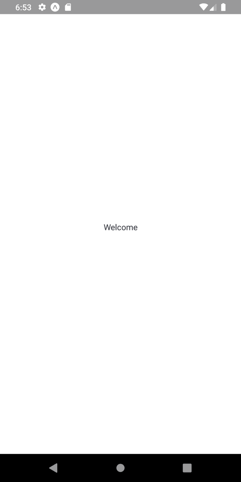
As we can see, we have got the text at the center of the screen just by using
some props in the Block component. We have not used any custom style
properties. With this, we have come to the end of this part of the tutorial.
Finally, We have successfully added all the components necessary to implement
this React Native Plant App.
Conclusion
This tutorial is the second part of the React Native Plant App tutorial series.
In this part, we continued from where we left off in the first part of this
tutorial series. In this part of the tutorial, we implemented all the components
in our ‘./components/’ folder. All the components can be considered as
predefined custom components that we are going to use to implement different UI
sections in the App. After setting up all the components, we also learned how to
make use of these components in the Welcome screen along with prop
configurations.
In the next part of this tutorial series, we are going to start implementing
some of the UI sections of our Welcome screen.
So, Stay Tuned folks!!!

Top comments (0)