
Here we have a problem: How to implement a grid that displays a single row and the number of columns should be based on a predetermined number that corresponds to the dynamic change of the winner width. Or a more better explanation is that the items being rendered should fit within the html node and displayed as single row but number of items to be rendered should be based on the size of the width. Each single item should have the same width and height and it should have a 16/9 (video caption).
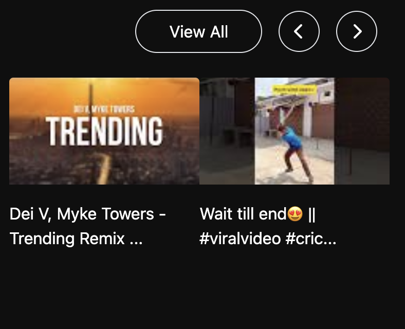
I will explain this functionality giving an example of an interface you might encounter either using Netflix or youtube. So, we want have 1 row where we display this history of videos the user watched. The display should be only 1 row. Below is a screen shot of what we want to implement

What happens if we do not control the number of items to be displayed ?
So lets try out:
In this example, I will be using React-TypeScript and TailwindCSS. Supposedly we grab our array of items and we map the array on a div. If we set as a flex row, depending on how many items you have, it will shrink so all items can fit.
    <div className="flex flex-row">
          {loading && <SpinningCircle />}
          {videosWatched.length > 0 &&
            !loading &&
            !error &&
            videosWatched.map((video) => (
              <div key={`${video.id}-${video.__typename}`} className="flex flex-col w-full  gap-4 rounded overflow-hidden">
                <div className="aspect-video">
                  <img alt="" src={video.thumbnailDefault ?? ''} className=" h-full w-full object-cover " />
                </div>
                <div> {sliceText({ s: video.title })}</div>
              </div>
            ))}
        </div>

we can not set a height or width for the div that controls height and width of the thumbnails because if we do so then elements will collapse. Using the aspect video class it will increase the width as the window.innerWidth gets larger. the problem is we rendering all and when the inner.width for example is below < 480px and we have many items, it will shrink. we could simply set a height and width and would null out the aspect video and use the overflow-x-scroll class provided by TailwindCss. That way we would have a fixed size and user could scroll. But thats not what we want. The UI should maintain an aspect video and when the window.innerWidth gets smaller we want to display a certain number of videos so we still maintain a predetermined size handled by the aspect video class. If we slice the array to only 2 items when the inner width is for example less than 480 pixel we can get an idea of each item being rendered
<div className="flex flex-row">
{loading && <SpinningCircle />}
{videosWatched.length > 0 &&
!loading &&
!error &&
videosWatched.slice(0,2).map((video) => (
<div key={`${video.id}-${video.__typename}`} className="flex flex-col w-full gap-4 rounded overflow-hidden">
<div className="aspect-video">
<img alt="" src={video.thumbnailDefault ?? ''} className=" h-full w-full object-cover " />
</div>
<div> {sliceText({ s: video.title })}</div>
</div>
))}
</div>
Here we are splitting evenly the positive space of the parent component to each item. if we increase the window inner width, we want more items to be rendered. In this case, at full width of the innerWidth we would want 5 items to be displayed.
The question is how can we do so while preventing from capturing every time user changes the width to make the application more optimal. One thing comes in mind is using a throttle function. Using a throttle function we can prevent the event listener from being triggered multiple times. In addition, we could have an object with key and values where a key is the size of the width and the value is number of items to display.
export const videosPerRowDisplayValues = {
  display_less_480: 1,
  display_481_699: 2,
  display_700_899: 2,
  display_900_1124: 3,
  display_1125_1420: 3,
  display_1421_1739: 4,
  display_1740_1920: 5,
  display_full: 5,
};
with the object in place, we could pass as a prop to a hook where we would have a function that will call the window event listener for the inner width
import { useEffect, useState } from 'react';
import { useThrottle } from './useThrottle.ts';

interface VideoGridProps {
  display_less_480?: number;
  display_481_699?: number;
  display_700_899?: number;
  display_900_1124?: number;
  display_1125_1420?: number;
  display_1421_1739?: number;
  display_1740_1920?: number;
  display_full?: number;
}

function getVideosPerRowFromWidth(props: VideoGridProps, width: number): number {
  const { display_less_480, display_481_699, display_700_899, display_900_1124, display_1125_1420, display_1421_1739, display_1740_1920, display_full } = props;

  if (width <= 480) return display_less_480 ?? 1;
  if (width >= 481 && width <= 699) return display_481_699 ?? 1;
  if (width >= 700 && width <= 899) return display_700_899 ?? 2;
  if (width >= 900 && width <= 1124) return display_900_1124 ?? 3;
  if (width >= 1125 && width <= 1420) return display_1125_1420 ?? 3;
  if (width >= 1421 && width <= 1739) return display_1421_1739 ?? 4;
  if (width >= 1740 && width <= 1920) return display_1740_1920 ?? 5;
  return display_full ?? 5;
}

export const useVideoGrid = (props: VideoGridProps): number => {
  const [videosPerRow, setVideosPerRow] = useState<number>(() => (typeof window !== 'undefined' ? getVideosPerRowFromWidth(props, window.innerWidth) : (props.display_full ?? 1)));

  const determineVideosToShow = () => {
    setVideosPerRow(getVideosPerRowFromWidth(props, window.innerWidth));
  };

  const throttleVideosToShowPerRow = useThrottle(determineVideosToShow, 50);

  useEffect(() => {
    const handleVideosToShow = () => {
      throttleVideosToShowPerRow();
    };

    window.addEventListener('resize', handleVideosToShow);
    return () => window.removeEventListener('resize', handleVideosToShow);
  }, [throttleVideosToShowPerRow]);

  return videosPerRow;
};
import { useRef } from 'react';

export const useThrottle = <T extends (...args: any[]) => void>(callBack: T, interval: number) => {
  const lastExecuted = useRef<number>(0);

  return (...args: Parameters<T>) => {
    const now = Date.now();

    if (now - lastExecuted.current < interval) return;

    lastExecuted.current = now;

    return callBack(...args);
  };
};
We pass the object as a prop and we have a helper function that takes 2 parameters: the object with the predetermined values for the width and the actual window width. Based on the condition statement we return a value. Fall back is 5 items.
the custom hook useThrottle returns the call back function. Here we wrapping in another function that wraps the determinedVideosToShow callback. We then call the function in the useEffect and use as a dependency; That way, it will be called whenever we have a new value and the call back is only triggered within the interval declared in the throttle hook.
Returning back to our component we now can use the value returned by the hook
const videosPerRow = useVideoGrid(videosPerRowDisplayValues);
<div className="grid grid-flow-col gap-4" style={{ gridTemplateColumns: `repeat(${videosPerRow}, 1fr) ` }}>
We now using a dynamic value to change the number of columns.


This will handle different width and devices
Finally, we need now to implement the slicing logic. Supposedly we an array and the length of array does not matter but as the value not to go out of boundary. We starting from index 0 and what should be the end index ? Well, we know that the end index it should not be more than the length of array. If it is we simply return. If we use start index + videosPerRow we get the following
EndIndex:= StartIndex + VideosPerRow
if start index is 0 and videos per row is 1 then start index will be 0 and end index will be one. So, we will be sliding one video at the time. Then we move the previous value of start index to the index of the endIndex and the end index to the value of the start index + VideosPer Row. That way, when we increment we will have a window slide of 1 video. And the slide depth will change accordingly to the number of videosPerRow
  const [startIndex, setStartIndex] = useState<number>(0);

  const handleScrollUp = () => {
    if (startIndex + videosPerRow >= videosWatched.length) return;

    setStartIndex(startIndex + videosPerRow);
  };

  const handleScrollDown = () => {
    if (startIndex - videosPerRow < 0) return;
    setStartIndex(startIndex - videosPerRow);
  };


      <div className="grid grid-flow-col  gap-4" style={{ gridTemplateColumns: `repeat(${videosPerRow}, 1fr) ` }}>
          {loading && <SpinningCircle />}
          {videosWatched.length > 0 &&
            !loading &&
            !error &&
            videosWatched.slice(startIndex, startIndex + videosPerRow).map((video) => (
              <div key={`${video.id}-${video.__typename}`} className="flex flex-col w-full  gap-4 rounded overflow-hidden">
                <div className="aspect-video">
                  <img alt="" src={video.thumbnailDefault ?? ''} className=" h-full w-full object-cover " />
                </div>
                <div> {sliceText({ s: video.title })}</div>
              </div>
            ))}
        </div>
That resolves our problem and it allow us to slide through the content while maintaining an appealing interface and keeping the code optimal.

About Me:
I am Mohamed Sharif and I have an undergraduate degree in computer science from San Francisco State University. I am currently starting a master degree towards machine learning and artificial intelligence through Drexel University. Since graduation I started to focus on full stack development. I enjoy writing blogs and currently implementing a full stack clone of youtube application. I reside in the San Francisco Bay area near silicon valley. I am open full full stack development roles. If you would like to connect, send me an invite on linkedin.

Top comments (0)