In the modern era of frontend writing responsive styling became one of the essential skill for all developer. Some times to perform simple things developers write a lot of lines of code which become really difficult to read in future. In this article we will gonna learn how we can write complex layouts in one line of Css.
Centering a child
Centering content is one of the common things that we usually do in day to day life.
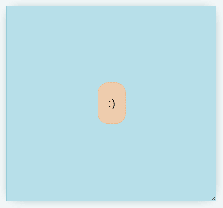
Let’s assume we have two divs like this and we want to make child centered always.
<div class="parent" >
  <div class="child" contenteditable>:)</div>
</div>
We can achieve this using the grid.
.parent {
    display: grid;
    place-items: center;
  }
Deconstructed Pancake
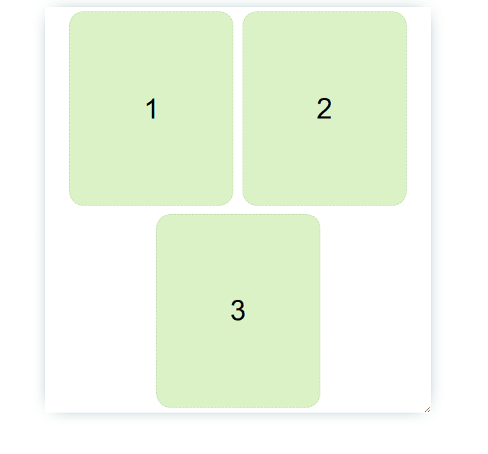
Now we have a parent with 3 child and we want them to be responsive. They can take a static size or they can take full size according to available space.
For this we will gonna use flex: <grow> <shrink> <baseWidth>
  <div class="parent white">
    <div class="box green">1</div>
    <div class="box green">2</div>
    <div class="box green">3</div>
  </div>
For no stretching we can make grow 0;
flex: 0 1 150px;
For stretching we can make grow 1;
flex: 1 1 150px;
I hope you have learn how to write complex layouts in one line of Css.
Checkout more complex layout here.


Top comments (0)