Thanks to the Panel library from HoloViz (previously PyViz), it’s now relatively simple to create an interactive dashboard of plots in Python, similar to an R Shiny app. This is a short tutorial-by-example that walks you through a very basic dashboard, created in a Jupyter Notebook.
TL;DR: See the dashboard which includes a button to view all the code
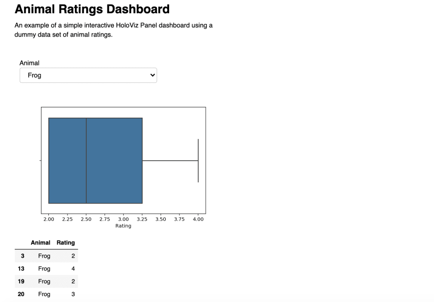
Using a small dummy data set of animal ratings data, the interactive dashboard will allow the user to choose an animal and view a box plot & data table for the ratings for that animal.
I’m not going to spend much time explaining individual lines of code or underlining mechanisms, as my intention is to provide a very quick and simple end-to-end deployable example that can be copy-pasted to get you started, rather then getting bogged down and confused in abstract details that you may not be interested in yet. You can then build your knowledge from there by playing around with this sample code and improving on it using the HoloViz documentation and other tutorials.
Libraries and Set-Up
import param
import pandas as pd
import matplotlib.pyplot as plt
import seaborn as sns
import panel as pn
pn.extension()

# make plots static
%matplotlib inline
Many python users will be used to using pandas, matplotlib and seaborn, but the new elements for the interactive dashboard are:
-
import param, -
import panel, pn.extension()
You may have to install these if you’ve not used them before. (In Jupyter Notebook, I used !pip install param etc)
Data
# create a simple dataframe of animal ratings
df = pd.DataFrame({'Animal':['Pig', 'Goat','Sheep', 'Frog',
                             'Goat', 'Goat', 'Pig', 'Sheep',
                             'Octopus', 'Goat', 'Pig',
                             'Sheep', 'Octopus', 'Frog',
                             'Goat', 'Goat', 'Pig', 'Pig',
                             'Sheep', 'Frog', 'Frog',
                             'Octopus', 'Octopus'],
                 'Rating':[3, 10, 3, 2, 9, 10, 4, 1,
                           1, 8, 5, 6, 2, 4, 10, 9,
                           5, 5, 3, 2, 3, 1, 1]})
The code above creates a simple 2-column (Animal and Rating) pandas data frame with 23 ratings for 5 animals (Pig, Goat, Sheep, Frog, Octopus).
Class of Dashboard Elements
The first step for creating a dashboard is to create a class containing the data elements that will appear in the dashboard. In this case, the elements are:
- an ‘Animal’ drop down to allow the user to choose the animal
- a subset of the data containing the ratings for the chosen animal
- a seaborn box plot of the ratings for the chosen animal (using the subset of data)
- a data table output of the chosen animal (using the subset of data)
This class can be called anything you like. I called it RatingsDashboard. A more meaningful name such as DashboardDataElements may have been more representative but thats quite a long name.
The dashboard will contain more than the 4 things defined in this class, but those other things are not data-specific (e.g. dashboard title and description) and so will be defined outside of the class, later.
It’s important to note that any plots should be closed before they’re returned. E.g: plt.close()
If you forget this step then the plot may not update when the user chooses a different animal in the drop down.
Also, the plot’s figure (not the axis) should be returned.
return ax.figure is correct
return ax will not display the plot when the dashboard is displayed.
(I learnt this the hard way and had to post on StackOverflow to resolve the issue.)
# create a class containing an animal selector drop-down,
# various plots, and a data table output
class RatingsDashboard(param.Parameterized):

    # drop down selector widget containing the list of
    # animals, with the default being 'Goat'
    Animal = param.ObjectSelector(default='Goat',
                             objects=list(df.Animal.unique()))

    # create data set containing only the data applicable
    # to the animal in the drop down selector
    def get_data(self):
        class_df = df[(df.Animal==self.Animal)].copy()
        return class_df

    # seaborn box plot for the chosen animal
    def box_view(self):
        data = self.get_data()
        ax = sns.boxplot(data['Rating'])
        plt.close()
        return ax.figure

    # table of data for the chosen animal
    def table_view(self):
        data = self.get_data()
        return data
Create Class Instance
The next step is to create an instance of the class. I called it rd. This will be used in the next step to access the data-related elements within the class when the dashboard layout is defined.
# create an instance of the class
rd = RatingsDashboard(name='')
Define Dashboard Layout & Content
# create a title for the dashboard
dashboard_title = '# Animal Ratings Dashboard'

# create some text describing the dashboard
dashboard_desc = 'An example of a simple interactive HoloViz
Panel dashboard using a dummy data set of animal ratings.'

# create a dashboard, defining the layout as one column containing the
# dashboard title, dashboard description, 'Animal' drop down selector,
# box plot, and data table
dashboard = pn.Column(dashboard_title,
                      dashboard_desc,
                      rd.param,       # 'Animal' drop down selector
                      rd.box_view,    # box plot
                      rd.table_view   # data table
                     )
pn.Column is just one way of doing this. If you’d like to explore more layouts, there’s also pn.Row, pn.Tabs and more. I wanted to keep it simple for this beginner’s tutorial so chose a single column, which also has the added advantage that the dashboard will be more readable on a mobile device.
Display Dashboard in Jupyter Notebook
The easiest way to display this dashboard is to just type it’s name, like you would for a data frame or another variable:
dashboard
If you’re only creating the dashboard for you and/or other Jupyter Notebook users then you could stop here. This will let you view and interact with the dashboard to check that it’s working. However, if you want to share the dashboard with others, perhaps via an html page, then embedding the data with the dashboard is one way to achieve that…
Display Dashboard With Data Embedded
Use dashboard.embed() to embed the data with the dashboard. I used this as follows:
# show the dashboard with the data embedded
# (for using in an html download of the notebook so that
# no 'callback' is required from the browser to get the data)
dashboard.embed(max_opts = 5)
This will display the dashboard in the notebook in exactly the same way as just calling the dashboard variable. However, the advantage is that when you download the notebook as html and view the dashboard in the html file, choosing another animal from the drop down will update the plot, and there is no need for any ‘back-end’ to be called to get the data for the plot.
max_opts = 5 is used so that all 5 animals are available in the drop down widget. If this parameter wasn’t defined, and the brackets were empty, the default of 3 would be used and only 3 of the animals would be available to choose from in the drop down. The default is probably low for performance reasons, since the data is being embedded. More info on this function and its parameters are in the ‘Deploy and Export’ section of the user guide.
Download as HTML
To download the dashboard to an html file, go to File > Download as > html

Save the html file and view the dashboard by opening the html file in your browser. I made the html version of the dashboard publicly available by adding it to the ‘Projects’ page on my website which is hosted for free on GitHub but that’s not the only option of course.
Add Show Code/Hide Code Button
When you share the html version of your Notebook, it will display the code as well as the dashboard. If you want to hide the code by default but make it possible for the user to view the code if they wish, then you could add a Show Code / Hide Code button with some JavaScript.

To add this button and hide the code by default, create 2 new cells in your Notebook, one at the top (the very 1st cell) and one at the bottom (the very last cell) and make both cells of type Raw NBConvert:

In the top cell, copy-paste the following code:
<!–– Hide code cells and show a button to allow user to show/hide code cells ––!>
<script>
  function code_toggle() {
    if (code_shown){
      $('div.input').hide('500');
      $('#toggleButton').val('Show Code')
    } else {
      $('div.input').show('500');
      $('#toggleButton').val('Hide Code')
    }
    code_shown = !code_shown
  }

  $( document ).ready(function(){
    code_shown=false;
    $('div.input').hide()
  });
</script>
<form action="javascript:code_toggle()"><input type="submit" id="toggleButton" value="Show Code"></form>
In the bottom cell, copy-paste this:
<!–– Hide JupyterNotebook cell numbers etc ––!>
<script>
  $(document).ready(function(){
    $('div.prompt').hide();
    $('div.back-to-top').hide();
    $('nav#menubar').hide();
    $('.breadcrumb').hide();
    $('.hidden-print').hide();
  });
</script>
<footer id="attribution" style="float:right; color:#999; background:#fff;">
Attribution: Created with Jupyter. Code toggle possible thanks to github.com/csaid.
</footer>
This includes an attribution to the GitHub account of the person (Chris Said) who created this code.
That’s it! That’s all you need to create the interactive dashboard and deploy it as html!
If you wanted to add another plot you just need to:
- add it to the
classin the same way as the existing plot - add it in the
dashboard = pn.Columns(…)code in the position you want it displayed
…and as long as the plot uses the subset of code based on the selected animal, the new plot will also update along with the original plot, whenever you choose a new animal.
Complete Code and Dashboard
The complete code and dashboard can be viewed at https://foxnic.github.io/simple_dashboard.html
Other python (and R) code examples created by me are on my Projects page.
More Examples & Tutorials
The HoloViz Panel website contains a gallery of examples with code, as well as a Getting Started guide and User Guide which includes a section on how to customise the style of the dashboard.
I discovered this functionality thanks to the following YouTube videos:
- Turn Any Notebook Into a Deployable Dashboard (~30 mins SciPy 2019 Talk by James Bednar)
- Visualize any Data Easily, from Notebooks to Dashboards (~3 hour ScipPy 2019 Tutorial by James Bednar)

Top comments (2)
Really nice intro tutorial.
Checkout awesome-panel.org for live apps, code and other resources.
Thanks Marc 🤗