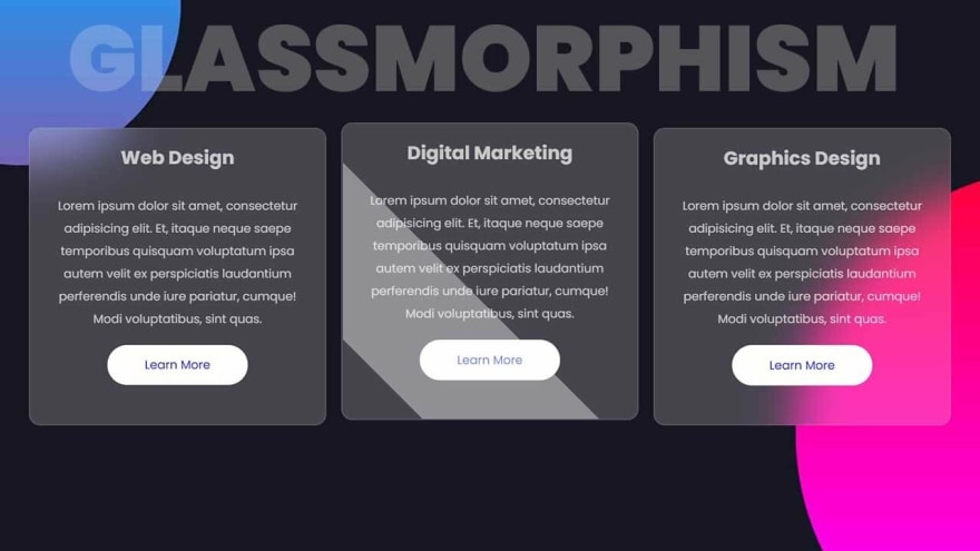
To make a very simple blurry glass like effect we can make use of some pretty simple css to add this styling .
Glassmorphism makes use of background blur with bright colors and some transparency and a very subtle border
4 lines of CSS is all it takes :
 backdrop-filter: blur(20px) saturate(200%);
    -webkit-backdrop-filter: blur(20px) saturate(200%);
    background-color: rgba(0, 0, 0, 0.44);
    border: 1px solid rgba(255, 255, 255, 0.125);
We blur the background and set the saturation to 200% to make the colors of the background pop
Here I have also put a border , as I would be using this style on a card to be displayed on my website
So I will use a subtle border to seperate it from the background
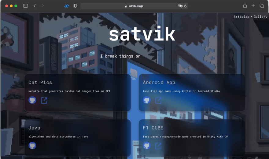
This is what it looks like in my website
You can change the look of this effect by changing the values of blur and saturation according to your taste


Top comments (0)