
Responsive UX Design with React Native Reflect (Part 3)
Description
The following tutorial explains step by step how to create a responsive photo album app with React Native and React Native Reflect that works on Web and Native devices.
Our photo album app will display images in a grid with variable number of columns, image aspect ratio, grid separation, etc. all in a responsive manner. We'll also create several responsive, theme-based UI components, including conditional rendering based on screen size.
This is a tutorial series, you need to complete Part 2 to be able to continue from here
Theming
On Part 2 of this tutorial series we finished building an image grid component with responsive number of columns, grid spacing and aspect ratio. On Part 3 we will add the option to query different images and create theme-based, responsive components using Reflect's styled() method.
Add the following lines to our App() component and look at the logged output.
import { useStyled, defaultTheme } from "react-native-reflect";
console.log(defaultTheme);
Notice the following properties of defaultTheme:
-
breakpoints: screen width dimensions at which responsive values change (an abbreviated way to define media queries). -
sizes: theme values forwidth,height, etc. -
space: theme values forpadding,maring, etc. - You get an idea of what the other properties are for. A complete guide to Reflect's theme can be found here: Reflect / Theme
We'll create our own theme object by extending defaultTheme and use it with ThemeProvider to set a global theme for our application. Modify App.tsx as follows:
import { useStyled, defaultTheme, ThemeProvider } from "react-native-reflect";

const theme: Theme = {
  ...defaultTheme,
  colors: { lightGray: "#EAEBEE", highlight: "#E9F0FE" },
  space: [0, 2, 4, 8, 16, 20, 32, 64, 128, 256],
  sizes: [0, 2, 4, 8, 16, 20, 32, 64, 128, 256],
  radii: [0, 15, 30],
};
Finally, wrap the return value of App() with <ThemeProvider value={theme}:
return (
  <ThemeProvider value={theme}>
    ...
  </ThemeProvider>
);
Now, we'll be able to access our theme from Reflect's styled() or useStyled() methods. For example if we create a component using const Container = styled(View, { padding: 2}), the value 2 of padding will be interpreted as as an index of theme.space array, as follows:theme.space[2] which is equal to 4.
Extending App's Functionality and UX
So far our app is displaying images based on a fixed query. Let's extend it by providing various predefined search queries. The new search queries will be rendered as buttons, once we tap on a button, the search query will update, the images will be rendered, and the rest of the buttons will hide. After we tap the active button again, the search query will clear and all the other buttons will show again.
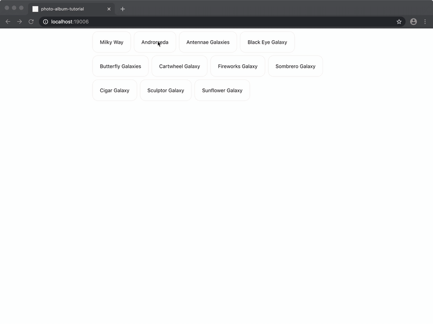
This is how our app will look after we add the search terms buttons:
On Web:
On Mobile:
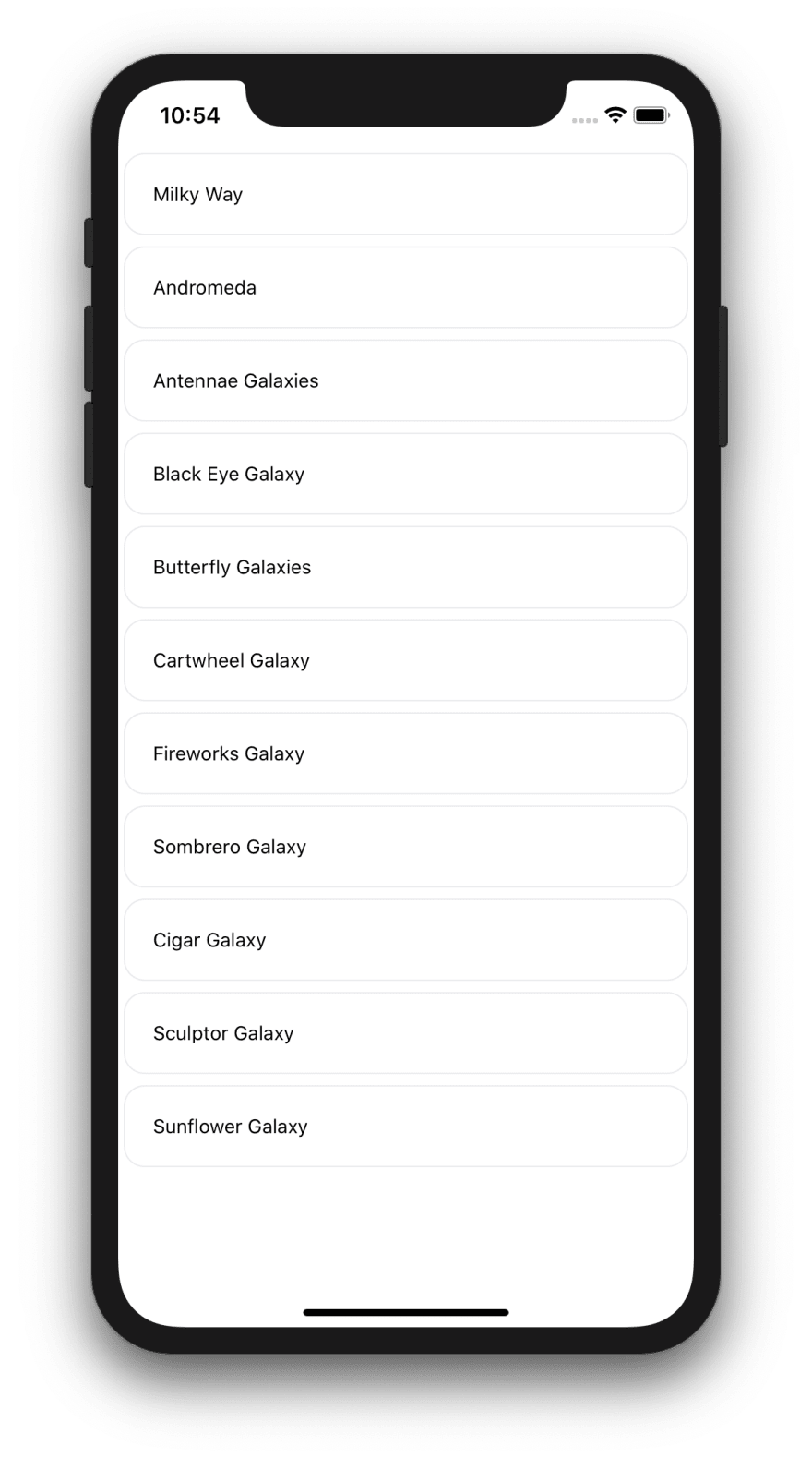
As you can see from the screen recordings above, we'll also make our buttons layout responsive. They will display as single full width rows (flexDirection: "columns") on smaller screens and as wrapped boxes on larger screens (flexDirection: "row", flexWrap: "wrap")
To style these new components we'll use Reflect's styled() function. Let's get started!
Create a new file: src/SearchTerms.tsx, add the following lines to it, and follow the comments in the code for an explantion of the concepts and methods used.
Container is the simplest component we are creating using Reflect's styled().
Button is a more complex component, it takes an active prop which changes it's color, an onPress callback and a title. When creating more complex components with styled(), just wrap it with a functional component and add all the necessary logic, composition, etc. there.
src/SearchTerms.tsx:
import React, { useState, useEffect } from "react";
import _ from "lodash";
import { Text, View, TouchableOpacity } from "react-native";
import { styled } from "react-native-reflect";

const SEARCH_TERMS = [
  "Milky Way",
  "Andromeda",
  "Antennae Galaxies",
  "Black Eye Galaxy",
  "Butterfly Galaxies",
  "Cartwheel Galaxy",
  "Fireworks Galaxy",
  "Sombrero Galaxy",
  "Cigar Galaxy",
  "Sculptor Galaxy",
  "Sunflower Galaxy",
];

type OnPress = () => void;
type ButtonProps = { title: string; onPress: OnPress; active: boolean };
type SearchTermsProps = { onChange: (term: string) => void };

/**
 * Renders search terms buttons as follows:
 * - smaller screens: full width columns (one search term per column)
 * - larger  screens: wrapped rows (search termns next to each other in a row)
 */
const Container = styled(View, {
  // flex: 1,
  // themed value -> 3 -> theme.space[3] = 8
  marginTop: 3,
  // "column" on smaller screens, "row" on larger screens
  flexDirection: ["column", "row"],
  // "nowrap" on smaller screens, "wrap" on larger screens
  flexWrap: ["nowrap", "wrap"],
});

/**
 * Renders single search term item as a styled TouchableOpacity component.
 *
 * Button style values are responsive and theme-based, look at
 * comments below for more info
 */
const Button = ({ title, onPress, active }: ButtonProps) => {
  const Styled = styled(TouchableOpacity, {
    // themed value -> 5 -> theme.space[5] = 20
    padding: 5,
    // smaller screens: 0 -> no marginRight, since button will be full width
    // larger  screens: themed value -> 3 -> theme.space[3] = 8
    marginRight: [0, 3],
    marginBottom: 3,
    borderRadius: 1,
    borderWidth: 0,
    borderColor: "lightGray",
    backgroundColor: active ? "highlight" : undefined,
  });

  return (
    <Styled onPress={onPress}>
      <Text>{title}</Text>
    </Styled>
  );
};

/**
 * Renders search terms as a list of buttons.
 * - Tapping on a button, selects it and hides all other buttons
 * - Tapping on a selected button, de-selects it and shows all other buttons
 * - onChange(term) gets called on term selection updates with the updated term
 */
export default function SearchTerms({ onChange }: SearchTermsProps) {
  const [selected, setSelected] = useState(-1); // index of selected search term

  const onPress = (index: number) => {
    if (selected > -1) return setSelected(-1); // reset selection
    setSelected(index); // set selection
  };

  useEffect(() => {
    // onChange is called with the selected term or "" if no term is selected
    onChange(selected < 0 ? "" : SEARCH_TERMS[selected]);
  }, [selected]);

  // <  0 will render all search terms
  // >= 0 will render only selected term
  const renderData = selected < 0 ? SEARCH_TERMS : [SEARCH_TERMS[selected]];

  return (
    <Container>
      {_.map(renderData, (title, index) => (
        <Button
          title={title}
          onPress={() => onPress(index)}
          active={selected > -1}
          key={index}
        />
      ))}
    </Container>
  );
}
Now, replace the contents of App.tsx with the following. Again, following the comments in the code for the necessary explanations.
App.tsx:
import React, { useEffect, useState } from "react";
import { View, SafeAreaView, ActivityIndicator } from "react-native";
import Axios from "axios";
import {
  styled,
  useStyled,
  defaultTheme,
  ThemeProvider,
  Theme,
} from "react-native-reflect";

import ImageGrid from "./src/ImageGrid";
import SearchTerms from "./src/SearchTerms";

const theme: Theme = {
  ...defaultTheme,
  colors: { lightGray: "#EAEBEE", highlight: "#E9F0FE" },
  space: [0, 2, 4, 8, 16, 20, 32, 64, 128, 256],
  sizes: [0, 2, 4, 8, 16, 20, 32, 64, 128, 256],
  radii: [0, 15, 30],
};

// Items used by ImageGrid, contains list of images.
type Items = { links: [{ href: string }] }[];

// Data returned by HTTP request
type AxiosData = {
  collection: {
    items: Items;
  };
};

const Container = styled(View, {
  // small  screens: 2 -> theme.space[2] = 4
  // medium screens: 7 -> theme.space[7] = 64
  // medium screens: 9 -> theme.space[9] = 256
  marginRight: [2, 7, 9],
  marginLeft: [2, 7, 9],
});

// marginTop: 7 = theme.space[7] = 64
const MyActivityIndicator = styled(ActivityIndicator, { marginTop: 7 });

export default function App() {
  const [isLoading, setLoading] = useState(false);
  const [data, setData] = useState<Items>([]);
  const [query, setQuery] = useState("");

  // Create and set search query using terms argument
  const createQuery = (terms: string) => {
    if (!terms) return setQuery("");

    const encodeTerms = terms.replace(/\s/g, "%20");
    setQuery(
      `https://images-api.nasa.gov/search?q=${encodeTerms}&media_type=image`
    );
  };

  // Get our data
  useEffect(() => {
    if (!query) {
      setData([]);
      setLoading(false);
      return;
    }

    setLoading(true);
    Axios.get<AxiosData>(query)
      .then(({ data }) => {
        setData(data.collection.items);
      })
      .catch((error) => console.error(error))
      .finally(() => setLoading(false));
  }, [query]);

  // Responsive values
  const { attrs, styles } = useStyled({
    styles: {
      // small  screens: 2 -> theme.space[2] = 4
      // medium screens: 3 -> theme.space[7] = 8
      // medium screens: 4 -> theme.space[9] = 16
      gridGap: { margin: [2, 3, 4] },
    },
    attrs: {
      // 1 on small screens, 3 on medium screens, 4 on large screens
      numColumns: [1, 3, 4],
      // 4/3 on small screens, 1 on medium and large screens
      imageAspectRatio: [4 / 3, 1],
    },
  });

  // After loading is done "isLoading", we render our images using <ImageGrid/>
  return (
    <ThemeProvider value={theme}>
      <SafeAreaView>
        <Container>
          <SearchTerms onChange={createQuery} />
          {isLoading ? (
            <MyActivityIndicator />
          ) : (
            <ImageGrid
              data={data}
              numColumns={attrs.numColumns}
              aspectRatio={attrs.imageAspectRatio}
              gridGap={styles.gridGap.margin as number}
            />
          )}
        </Container>
      </SafeAreaView>
    </ThemeProvider>
  );
}
Launch your application on a native device (or simulator) and on a web browser. The app you should look like the screen recordings above.
That's all for Part 3! in this section we defined a global theme object for our application and created several components with styled() that derive their styling values from the theme. We also creatd different layouts for smaller and larger screens, including conditional content that only gets rendered on larger screens.
Next Steps
On Part 4, we will finish creating our UI, we'll add a navigation bar, a better layout and improve the overall design of our app.
Links
- Tutorial's source code: https://github.com/sntx/photo-album-tutorial
- React Native Reflect: https://sntx.github.io/react-native-reflect

Top comments (0)