
TL;DR: Let’s see how to analyze stock trends using the .NET MAUI Toolkit Candle Chart. We’ll fetch historical stock data, structure it, and visualize open, high, low, and close prices. The chart supports interactive features like zooming, panning, and real-time updates. We’ll enhance it with a secondary Y-axis, DateTime Range Selector, and Segmented Control for dynamic data exploration.
Welcome to our Chart of the Week blog series!
Understanding market trends is crucial in finance. Stock charts help us to visualize price movements and trends elegantly. Syncfusion® .NET MAUI Toolkit Cartesian Chart allows users to create clear, interactive stock charts. With the support for Line, Candle, and OHLC chart types, it helps us to identify patterns and trends over time.
Today, we’ll analyze Amazon’s stock prices using the .NET MAUI Toolkit Candle Chart to gain insights into market trends and price movements. The Candle Chart helps visualize open, high, low, and close (OHLC) values, making it easier to track price fluctuations and trading volume.
Refer to the following image.
Step 1: Gather data
Before creating the chart, we need relevant data. For this blog, we’ll retrieve historical data for Amazon’s (AMZN) stock prices from Yahoo Finance.
Step 2: Preparing the data for the chart
Next, we need to structure the stock data properly. We’ll define a StockModel class containing essential properties such as Date, Open, High, Low, Close, and Volume.
Refer to the following code example.
public class StockModel
{
    public DateTime Date {get;}
    public double Open {get;}
    public double High {get;}
    public double Low {get;}
    public double Close {get;}
    public double Volume {get;}

    public StockModel(DateTime date, double open, double high, double low, double close, double volume)
    {
        Date = date;
        Open = open;
        High = high;
        Low = low;
        Close = close;
        Volume = volume;
    }
}
To generate the data collection, we’ll use the StockViewModel class and StockPrices property. We’ll also create the ReadCSV method to convert the CSV data into a collection of stock data and store it in the StockPrices property.
The RangeStart and RangeEnd properties define the date range for the stock data.
Refer to the following code example.
public class StockViewModel : INotifyPropertyChanged
{
    private ObservableCollection<StockModel>? _stockPrices;
    private DateTime _rangeStart = new DateTime(2024, 1, 1);
    private DateTime _rangeEnd = new DateTime(2024, 6, 30);

    public DateTime RangeStart
    {
        get => _rangeStart;
        set
        {
            if (_rangeStart != value)
            {
                _rangeStart = value;
                OnPropertyChanged(nameof(RangeStart));
            }
        }
    }

    public DateTime RangeEnd
    {
        get => _rangeEnd;
        set
        {
            if (_rangeEnd != value)
            {
                _rangeEnd = value;
                OnPropertyChanged(nameof(RangeEnd));
            }
        }
    }

    public ObservableCollection<StockModel>? StockPrices
    {
        get => _stockPrices;
        set
        {
            if (_stockPrices != value)
            {
                _stockPrices = value;
                OnPropertyChanged(nameof(StockPrices));
            }
        }
    }

    public StockViewModel()
    {
        StockPrices = new ObservableCollection<StockModel>(
            ReadCSV("StockChart.Resources.Raw.amazon.csv").Reverse()
        );
    }

    public ObservableCollection<StockModel> ReadCSV(string resourceStream)
    {
        var executingAssembly = typeof(App).GetTypeInfo().Assembly;
        using var inputStream = executingAssembly.GetManifestResourceStream(resourceStream)
            ?? throw new FileNotFoundException($"Resource {resourceStream} not found.");

        var lines = new List<string>();
        using (var reader = new StreamReader(inputStream))
        {
            string? line;
            while ((line = reader.ReadLine())!= null)
            {
                lines.Add(line);
            }
        }

        var formats = new[] {"MM/dd/yyyy", "M/d/yyyy", "M/dd/yyyy", "MM/d/yyyy"};
        return new ObservableCollection<StockModel>(
            lines.Select(line =>
            {
                var data = line.Split(',');

                if (data.Length < 6) return null;

                if (DateTime.TryParseExact(data[0], formats, CultureInfo.InvariantCulture, DateTimeStyles.None, out var date))
                {
                    return new StockModel(
                        date,
                        Convert.ToDouble(data[1]),
                        Convert.ToDouble(data[2]),
                        Convert.ToDouble(data[3]),
                        Convert.ToDouble(data[4]),
                        Convert.ToDouble(data[5]) / 1000000
                    );
                }

                return null;
            })
            .Where(stock => stock!= null)
            .ToList()!
        );
    }

    protected virtual void OnPropertyChanged(string propertyName)
    {
        PropertyChanged?.Invoke(this, new PropertyChangedEventArgs(propertyName));
    }

    public event PropertyChangedEventHandler? PropertyChanged;
}
Step 3: Configure the layout
In this demo, we’ll use the following three essential controls:
- Cartesian Charts: For stock visualization.
- Segmented Control: To select different periods.
- DateTime Range Selector: To adjust the displayed date range.
Refer to the following code example to design the layout to position these controls and enhance the UI.
XAML
<!-- Border for all controls -->
<Border Margin="15" StrokeThickness="2" Stroke="#79747E">
    <Border.StrokeShape>
        <RoundRectangle CornerRadius="10"/>
    </Border.StrokeShape>

    <Grid RowDefinitions="1.5*,6.5*,2*" ColumnDefinitions="*,*" Margin="10,-10,20,15">
        --------
        --------
    </Grid>
</Border>
Step 4: Configure the .NET MAUI Toolkit Cartesian Chart
Let’s configure the .NET MAUI Toolkit Cartesian Chart control by following the official documentation.
<charts:SfCartesianChart>
    <charts:SfCartesianChart.XAxes>
        <charts:DateTimeAxis />
    </charts:SfCartesianChart.XAxes>
    <charts:SfCartesianChart.YAxes>
        <charts:NumericalAxis />
    </charts:SfCartesianChart.YAxes>
</charts:SfCartesianChart>
Step 5: Add a secondary Y-Axis to visualize the stock volume
Now, add a secondary Y-axis to the Cartesian Chart to highlight the volume of stock prices using a Column series.
Refer to the following code example.
<charts:SfCartesianChart.YAxes>
    <charts:NumericalAxis />
    <charts:NumericalAxis />
</charts:SfCartesianChart.YAxes>
Step 6: Binding data to .NET MAUI Candle and Column Series
Next, we’ll bind the stock data to the Candle and Column Charts series. Before doing this, we need to set the ViewModel as the BindingContext for the ContentPage. This allows us to access the ViewModel across the entire page.
If we bind the ViewModel only to SfCartesianChart, we won’t be able to access it globally within the page, which is necessary for other controls.
Refer to the following code example.
<ContentPage.BindingContext>
    <local:StockViewModel x:Name="viewModel"></local:StockViewModel>
</ContentPage.BindingContext>

…

<chart:SfCartesianChart.Series>
    <chart:CandleSeries x:Name="stockseries"
                         ItemsSource="{Binding StockPrices}"
                         XBindingPath="Date"
                         Open="Open"
                         High="High"
                         Low="Low"
                         Close="Close"/>

    <chart:ColumnSeries x:Name="volumeSeries"
                         ItemsSource="{Binding StockPrices}"
                         XBindingPath="Date"
                         YBindingPath="Volume"/>
</chart:SfCartesianChart.Series>
Step 7: Configure the secondary Y-axis
To properly configure the secondary Y-axis for the volume data, we must:
- Specify a name to the axis using the Name property.
- Set the CrossAt value.
- Mention the axis name in the YAxisName property of the ColumnSeries.
Refer to the following code example.
<chart:SfCartesianChart.YAxes>
    <chart:NumericalAxis>
    </chart:NumericalAxis>

    <chart:NumericalAxis Name="volumeAxis"
                         CrossesAt="2023-11-08"
                         IsVisible="False">
    </chart:NumericalAxis>
</chart:SfCartesianChart.YAxes>

<chart:ColumnSeries x:Name="volumeSeries"
                     ItemsSource="{Binding StockPrices}"
                     XBindingPath="Date"
                     YBindingPath="Volume"
                     YAxisName="volumeAxis"/>
Step 8: Add interactive features to the chart
To enhance the user experience, we can add interactive features like the trackball, which allows users to see precise data points when hovering over the chart.
Refer to the following code example.
<chart:SfCartesianChart.TrackballBehavior>
  <chart:ChartTrackballBehavior ShowMarkers="False"></chart:ChartTrackballBehavior>
</chart:SfCartesianChart.TrackballBehavior>
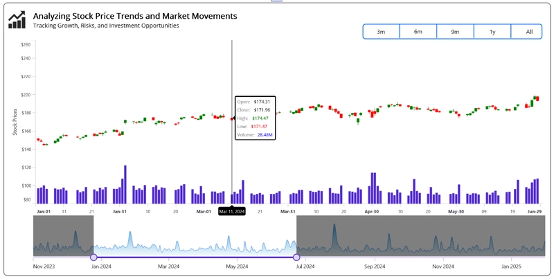
Refer to the following image.
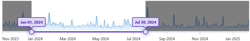
Step 9: Add the .NET MAUI DateTime Range Selector
Then, add the .NET MAUI DateTime Range Selector control to zoom in and select the specific date ranges in the chart.
Configure the .NET MAUI DateTime Range Selector
First, we need to configure the DateTimeRangeSelector in our ContentPage because this is a separate control from the Syncfusion .NET MAUI suite.
<sliders:SfDateTimeRangeSelector x:Name="Selector"
                                  Grid.Row="2"
                                  Grid.ColumnSpan="2"
                                  RangeStart="2024-01-01"
                                  RangeEnd="2024-06-30"
                                  Minimum="2023-11-08"
                                  Maximum="2025-02-07"
                                  IntervalType="Months"
                                  Interval="2"/>
In the SfDateTimeRangeSelector, we specify the data range by setting the following properties:
- Minimum, Maximum: Define the entire date range.
- RangeStart, RangeEnd: Set the currently selected range.
- Interval,IntervalType: Specify the interval details for date selection.
Add the Cartesian Chart inside the DateTime Range Selector
Now, add the SfCartesianChart inside the DateTimeRangeSelector. The chart’s height and width depend on the SfDateTimeRangeSelector’s width and height.
<sliders:SfDateTimeRangeSelector x:Name="Selector">
    <chart:SfCartesianChart>

        <chart:SfCartesianChart.XAxes>
            <chart:DateTimeAxis IsVisible="False"
                                ShowMajorGridLines="False"/>
        </chart:SfCartesianChart.XAxes>

        <chart:SfCartesianChart.YAxes>
            <chart:NumericalAxis IsVisible="False"
                                 ShowMajorGridLines="False"/>
        </chart:SfCartesianChart.YAxes>

        <chart:SfCartesianChart.Series>
            <chart:SplineAreaSeries ItemsSource="{Binding StockPrices}"
                                     XBindingPath="Date"
                                     YBindingPath="Volume">
            </chart:SplineAreaSeries>
        </chart:SfCartesianChart.Series>

    </chart:SfCartesianChart>
</sliders:SfDateTimeRangeSelector>
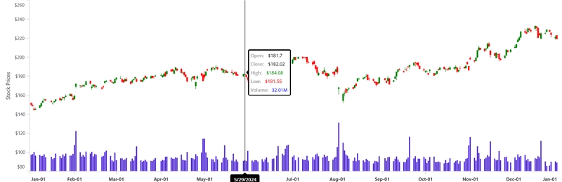
Step 10: Connect the DateTime Range Selector to the Candle Chart
In our case, we use the SfDateTimeRangeSelector to easily select a specific date range. To achieve this, we bind the RangeStart and RangeEnd properties of the SfDateTimeRangeSelector to the Minimum and Maximum values of the Candle Chart’s X-axis.
Refer to the following code example.
<Grid RowDefinitions="1.5*,6.5*,2*" ColumnDefinitions="*,*" Margin="10,-10,20,15">

    <chart:SfCartesianChart Grid.Row="1" Grid.ColumnSpan="2">
        <chart:SfCartesianChart.XAxes>
            <chart:DateTimeAxis x:Name="xAxis"
                                 Minimum="{Binding RangeStart, Mode=TwoWay}"
                                 Maximum="{Binding RangeEnd, Mode=TwoWay}">
            </chart:DateTimeAxis>
        </chart:SfCartesianChart.XAxes>

        --------------
        --------------

    </chart:SfCartesianChart>

    <sliders:SfDateTimeRangeSelector x:Name="Selector"
                                      Grid.Row="2"
                                      Grid.ColumnSpan="2"
                                      RangeStart="{Binding RangeStart, Mode=TwoWay}"
                                      RangeEnd="{Binding RangeEnd, Mode=TwoWay}"
                                      Minimum="2023-11-08"
                                      Maximum="2025-02-07"
                                      IntervalType="Months"
                                      Interval="2"/>
</Grid>
Refer to the following image.
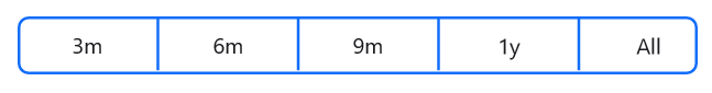
Step 12: Add Segmented Control to customize ranges
We use the Segmented Control to switch between different time ranges, such as 3 months, 6 months, 9 months, 1 year, and all data for Amazon’s stock from November 2023 to January 2025. This allows users to visualize the stock price data based on the selected range.
Refer to the following code example.
<HorizontalStackLayout Grid.Row="0"
                        Grid.Column="1"
                        HorizontalOptions="End"
                        VerticalOptions="End"
                        Spacing="5">

    <segmentedControl:SfSegmentedControl x:Name="segmentedControl">

        <segmentedControl:SfSegmentedControl.ItemsSource>
            <x:Array Type="{x:Type x:String}">
                <x:String>3m</x:String>
                <x:String>6m</x:String>
                <x:String>9m</x:String>
                <x:String>1y</x:String>
                <x:String>All</x:String>
            </x:Array>
        </segmentedControl:SfSegmentedControl.ItemsSource>

    </segmentedControl:SfSegmentedControl>

</HorizontalStackLayout>
Refer to the following image.
Step 13: Customize the appearance of the Charts and other elements
Let’s customize the appearance of the .NET MAUI Column and Candle Charts and the DateTime Range Selector to enhance their readability .
Customizing the chart title
To customize the chart title, refer to the following code example.
<Grid>
    <HorizontalStackLayout Grid.Row="0"
                            Grid.Column="0"
                            Margin="{ OnPlatform iOS='0,0,2,40', Android='0,0,2,40', Default='-20,0,0,0'}">

        <Image Source="stockchart.png"
               WidthRequest="{OnPlatform Android=60, Default=90, iOS=60}"
               HeightRequest="{OnPlatform Android=60, Default=90, iOS=60}"/>

        <VerticalStackLayout VerticalOptions="Center">
            <Label Text="{OnPlatform Default='Analyzing Stock Price Trends and Market Movements',
                                  Android='Analysis Stock Trends and Market Movements',
                                  iOS='Analysis Stock Trends and Market Movements'}"
                   FontSize="{OnPlatform Default=22, Android=14, iOS=14}"
                   VerticalOptions="Center"
                   FontAttributes="Bold"
                   TextColor="Gray"/>

            <Label Text="Tracking Growth, Risks, and Investment Opportunities"
                   LineBreakMode="WordWrap"
                   HorizontalOptions="Start"
                   FontSize="{OnPlatform Default=16, Android=11, iOS=11}"
                   VerticalOptions="Center"
                   TextColor="Gray"/>
        </VerticalStackLayout>

    </HorizontalStackLayout>

    ………….
    ………….

</Grid>
Customizing the Candle Series
To customize the appearance of the CandleStick series, we’ll set the following properties:
Refer to the following code example.
<chart:CandleSeries x:Name="stockseries"
                     ItemsSource="{Binding StockPrices}"
                     XBindingPath="Date"
                     Open="Open"
                     High="High"
                     Low="Low"
                     Close="Close"
                     EnableSolidCandle="True"
                     BearishFill="Red"
                     BullishFill="Green"
                     ShowTrackballLabel="True"
                     TrackballLabelTemplate="{StaticResource trackballLabelTemplate}"/>
Let’s customize the chart trackball using the TrackballTemplate property. This allows us to change the layout, colors, fonts and displayed data within the trackball.
Refer to the following code example.
<chart:SfCartesianChart Grid.Row="1" Grid.ColumnSpan="2">

    <chart:SfCartesianChart.Resources>
        <DataTemplate x:Key="trackballLabelTemplate">
            <VerticalStackLayout Spacing="6" Background="White" Padding="4" Margin="-2.5,-2,-2,-2">

                <HorizontalStackLayout Spacing="8">
                    <Label Text="Open:" FontSize="12" FontAttributes="Bold" TextColor="DarkGray"/>
                    <Label Text="{Binding DataItem.Open, StringFormat=' ${0}'}" FontSize="12" TextColor="Black"/>
                </HorizontalStackLayout>

                <HorizontalStackLayout Spacing="8">
                    <Label Text="Close:" FontSize="12" FontAttributes="Bold" TextColor="DarkGray"/>
                    <Label Text="{Binding DataItem.Close, StringFormat=' ${0}'}" FontSize="12" TextColor="Black"/>
                </HorizontalStackLayout>

                <HorizontalStackLayout Spacing="8">
                    <Label Text="High:" FontSize="12" FontAttributes="Bold" TextColor="DarkGray"/>
                    <Label Text="{Binding DataItem.High, StringFormat=' ${0}'}" FontSize="12" TextColor="Green"/>
                </HorizontalStackLayout>

                <HorizontalStackLayout Spacing="8">
                    <Label Text="Low:" FontSize="12" FontAttributes="Bold" TextColor="DarkGray"/>
                    <Label Text="{Binding DataItem.Low, StringFormat=' ${0}'}" FontSize="12" TextColor="Red"/>
                </HorizontalStackLayout>

                <HorizontalStackLayout Spacing="8">
                    <Label Text="Volume:" FontSize="12" FontAttributes="Bold" TextColor="DarkGray"/>
                    <Label Text="{Binding DataItem.Volume, StringFormat='{0:F2}M'}" FontSize="12" TextColor="Blue"/>
                </HorizontalStackLayout>

            </VerticalStackLayout>
        </DataTemplate>
    </chart:SfCartesianChart.Resources>

    ……………
    ……………
    ……………

</chart:SfCartesianChart>
Customizing the Column series
To customize the appearance of the ColumnSeries, let’s configure the following properties:
Refer to the following code example.
<chart:ColumnSeries x:Name="volumeSeries"
                     ItemsSource="{Binding StockPrices}"
                     XBindingPath="Date"
                     YBindingPath="Volume"
                     ShowTrackballLabel="False"
                     Fill="#512BD4"
                     YAxisName="volumeAxis"/>
Customizing the chart Axis
Then, customize the X- and Y-axes by setting the following properties:
- Title
- LabelStyle
- ShowMajorGridLines
- ShowMinorGridLines
- EnableSideBySideSeriesPlacement
- EdgeLabelsDrawingMode
- LabelCreated event
Refer to the following code example.
<chart:SfCartesianChart Grid.Row="1" Grid.ColumnSpan="2" EnableSideBySideSeriesPlacement="False">

    <chart:SfCartesianChart.XAxes>
        <chart:DateTimeAxis x:Name="xAxis"
                            Minimum="{Binding RangeStart, Mode=TwoWay}"
                            Maximum="{Binding RangeEnd, Mode=TwoWay}"
                            ShowTrackballLabel="True"
                            ShowMajorGridLines="False"
                            LabelCreated="Primary_LabelCreated">
        </chart:DateTimeAxis>
    </chart:SfCartesianChart.XAxes>

    <chart:SfCartesianChart.YAxes>
        <chart:NumericalAxis x:Name="yAxis"
                             Minimum="80"
                             Interval="20"
                             ShowMajorGridLines="False"
                             ShowMinorGridLines="False"
                             EdgeLabelsDrawingMode="Shift">
            <chart:NumericalAxis.LabelStyle>
                <chart:ChartAxisLabelStyle LabelFormat="$0"/>
            </chart:NumericalAxis.LabelStyle>
            <chart:NumericalAxis.Title>
                <chart:ChartAxisTitle Text="Stock Prices">
                </chart:ChartAxisTitle>
            </chart:NumericalAxis.Title>
        </chart:NumericalAxis>

        <chart:NumericalAxis Name="volumeAxis"
                             Minimum="0"
                             Maximum="500"
                             Interval="50"
                             IsVisible="False"
                             EdgeLabelsDrawingMode="Shift"
                             ShowMajorGridLines="False"
                             ShowMinorGridLines="False"
                             CrossesAt="2023-11-08">
        </chart:NumericalAxis>
    </chart:SfCartesianChart.YAxes>

    ------------
    ------------

</chart:SfCartesianChart>
Customizing the DateTime Range Selector
To enhance the appearance of the DateTime Range Selector, configure its properties as follows:
<sliders:SfDateTimeRangeSelector x:Name="Selector"
                                  Grid.Row="2"
                                  Grid.ColumnSpan="2"
                                  RangeStart="{Binding RangeStart, Mode=TwoWay}"
                                  RangeEnd="{Binding RangeEnd, Mode=TwoWay}"
                                  Margin="50,0,-25,0"
                                  Minimum="2023-11-08"
                                  Maximum="2025-02-07"
                                  DateFormat="MMM yyyy"
                                  IntervalType="Months"
                                  Interval="2"
                                  ShowLabels="True"
                                  ShowTicks="True"
                                  LabelsPlacement="OnTicks"
                                  EdgeLabelsPlacement="Inside"
                                  DragBehavior="Both"
                                  EnableDeferredUpdate="False">

    <sliders:SfDateTimeRangeSelector.TrackStyle>
        <sliders:SliderTrackStyle ActiveFill="#512BD4"
                                  InactiveFill="#DFD8F7" />
    </sliders:SfDateTimeRangeSelector.TrackStyle>

    <sliders:SfDateTimeRangeSelector.Tooltip>
        <sliders:SliderTooltip DateFormat="MMMM dd, yyyy"
                                Fill="#DFD8F7"
                                Stroke="#512BD4"
                                StrokeThickness="2"
                                TextColor="#512BD4"
                                FontSize="{OnPlatform Default=14,Android=10,iOS=10}"
                                FontAttributes="Bold"
                                Padding="{OnPlatform Default='12,12',Android='5,5',iOS='5,5'}"/>
    </sliders:SfDateTimeRangeSelector.Tooltip>

    <sliders:SfDateTimeRangeSelector.ThumbStyle>
        <sliders:SliderThumbStyle StrokeThickness="2"
                                   Stroke="#512BD4"
                                   Fill="#DFD8F7" />
    </sliders:SfDateTimeRangeSelector.ThumbStyle>

</sliders:SfDateTimeRangeSelector>
Customizing the Segmented Control
To customize the appearance of the Segmented Control, set the following properties:
Refer to the following code example.
<segmentedControl:SfSegmentedControl x:Name="segmentedControl"
                                      SegmentWidth="{OnPlatform Android=30, iOS=30, Default=100}"
                                      WidthRequest="{OnPlatform WinUI=500, MacCatalyst=500}"
                                      Stroke="#FF116DF9"
                                      StrokeThickness="2"
                                      CornerRadius="8"
                                      SelectionChanged="SfSegmentedControl_SelectionChanged">

    <segmentedControl:SfSegmentedControl.SelectionIndicatorSettings>
        <segmentedControl:SelectionIndicatorSettings SelectionIndicatorPlacement="Fill"/>
    </segmentedControl:SfSegmentedControl.SelectionIndicatorSettings>

    -------------------
    -------------------

</segmentedControl:SfSegmentedControl>
These customizations enhance the readability and visual appeal of your charts and controls, making the data easier to interpret and analyze.
After executing these code examples, we’ll get the output that resembles the following image.
GitHub repository
For more details, refer to stock price analysis using the .NET MAUI Toolkit Candle Chart GitHub demo.
Conclusion
Thank you for reading! In this blog, we’ve explored how to analyze prices and market trends using the Syncfusion® .NET MAUI Toolkit Candle Chart. We encourage you to follow the steps outlined in this blog. Stay tuned for next week’s Chart of the Week!
If you require assistance, please don’t hesitate to contact us via our support forum, support portal, or feedback portal. We are always eager to help you!

Top comments (0)