I had some great success critiquing/roasting your websites on Twitter, and I'd love to help tell you why your website sucks
As a CRO Consultant, I have a lot of experience in improving our client's products.
So show me your website, and I'll give you at least one point to improve!
😄


Latest comments (64)
my portfolio -> jaid.tech
and my blog -> blogs.jaid.tech
Great to hear! You can always make some yourself using your phone camera and setting up some lights around the house 😄 All the best in your career!
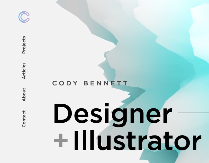
Starting of, this is a beautiful website. I can see you put a lot of attention to detail in every single corner of the pages. Everything looks great from animations to accessibility. There are two minor things that I think will improve the usability/experience of your website.
1 Navigation

The vertical navigation looks great, but my experience tells me that there's a reduced change of people using it accordingly when it doesn't meet their expectations. I'd recommend for it to be placed horizontally on top of the page.
2 A personal touch

At the bottom of your page, you tell a little bit about yourself as a person. Something very important to do. I think this section could be greatly improved and add a little more personal connection by using a (professional) image of yourself.
Besides these small points, a great website! I'd love to see more of your articles on your own website 😄
microtica.com/
Thanks for sharing Sara! This site looks great! A lot of attention to detail and all the information provided to the user is beautifully visualized.
One thing I noticed is an inconsistency in the button styling currently on the website. It seems like the white CTAs look like they are "raising" when a user hovers on them, while the green one actually "descends/lowers". A small tweak in my eyes.
Besides that, a great example of a SaaS company. I especially like the CTA changing on the homepage hero changing its action based on if the user is on mobile or desktop 😄
Thank you so much, Twan! Really appreciate it :)
rahmanfadhil.com
Right here!
Thanks for sharing your website! 2 Thing I noticed:
1 About
An about section is a great place to tell and show a little more of yourself and your personality. A small, but great addition, would be to add a (professional) image of yourself! Just a little personal touch which will bring a more human connection to your website.
2 Youtube
Make sure that whenever you send a user to another page that isn't your website and there isn't an incentive on that new page to go back to your website, to open it in a new tab. This ensures that the user can take its time on the other website/platform and (maybe) return to your website when finished.
Go on... pimenta.co/
codewithghazi.com
Thanks for sharing Ghazi! Really cool page, especially the blog.
One point of improvement I noticed, is that on a blog post, all the share functionalities overlap the main content if the viewport is between 769px - 1218px.
Thanks Twan, for giving your time to review my website. I'll fix this :)
dev.localtvads.com/
Mine - elangovan.in
Thanks for sharing your website 😄 2 things I noticed:
1 homepage icons
Your blog icon currently doesn't have a discernible icon
2 Blog style
Your blog looks very cool, but it isn't very original. It matches almost 100% with Dan Abramov's blog called "Overreacted". It's a theme from Gatsby if I remember correctly, nothing wrong with that, but it would be nice to add your own touches to it.
Thanks for sharing and good luck!
jethromay.com/
Thanks for sharing your website, Jethro! All in all, it looks very clean.
Something I noticed though, is that you're currently showing all your blog posts on the homepage and also on the "posts" page. Currently, the "posts" page doesn't add any extra features or functionality to the user. Think about showing less (maybe 3) posts on your homepage, or completely remove the "posts" page if you want to show all posts on the homepage
Very true, thanks for looking at it will address that. :)