
Introduction
Web components are one of the most useful, built-in, standardized (W3C), browser features added recently. Even though it certainly is all those things it's still not widely used. As such not all browser vendors have taken advantage of all of its capabilities (list of browsers that support the specification) but with the help of polyfills, their use can be extended on the majority of browsers.

Web components contain 4 sub-specifications that describe the available possibilities regarding DOM element manipulation. The first two, Custom elements and Shadow DOM, are more important and we'll talk about them further.
Custom elements ⚙️
Custom elements give the ability to create a new or extending an already available HTML element.
Custom elements: Creating a new element
Creating a new element is described as defining a completely new HTML tag which will be added to the page like every other HTML element we already know and use: <div></div> <a></a> <my-element></my-element>
The Pure Javascript method
The Pure Javascript approach implies defining the structure, design, and behavior of the custom element using only modern javascript. A short example of how this would look for a simple sentence element:
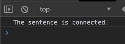
class VpSentence extends HTMLElement {
constructor() {
super();
console.log("The sentence is connected!");
}
connectedCallback() {
this.innerHTML = `
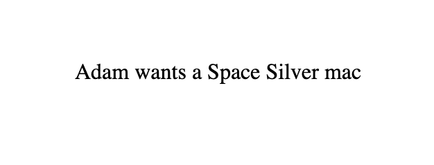
<span>wants a Space Silver mac</span>
`;
}
}
window.customElements.define("vp-sentence", VpSentence);
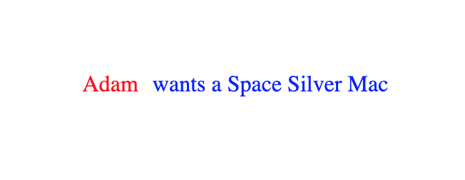
If we have a simple index.html which looks like this:
And then we add our custom component like this:
<!DOCTYPE html>
<html>
<head>
<script type="text/javascript" src="vp_sentence_component.js"></script>
</head>
<body>
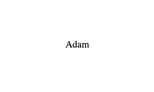
<div style="padding-left: 100px; padding-top: 100px">
<span>Adam</span>
<vp-sentence></vp-sentence>
</div>
</body>
</html>
We'll get the following index.html output:

Note: When templating is done inside Javascript it's necessary to use ES2015 template literals which are done using the grave accent also known as the backtick. Also, the name of the component needs to have a dash in its name ("my-element", "vp-sentence") so the browser can recognize that is is a custom component. A good practice is adding a prefix like your or your companies initials (vp = Vernes Pendić).
Custom elements: extending built-in elements
Extending built-in elements means adding new or customizing default behavior or properties of an already existing element such as div, anchor, span, etc. An example of how to change the default behavior of the tag adding the "is" attribute:
<!DOCTYPE html>
<html>
  <head>
    <style type="text/css">
      .container {
        display: flex;
        align-items: center;
        justify-content: center;
        height: 100vh;
      }

      .container span {
        margin-right: 5px;
      }
    </style>
    <script>
      class CustomSpan extends HTMLSpanElement {
        connectedCallback() {
          this.style.color = "red";
        }
      }
      window.customElements.define("red-span", CustomSpan, { extends: "span" });
    </script>
  </head>
  <body>
    <div class="container">
      <span is="red-span">Adam</span>
    </div>
  </body>
</html>
The output we get:
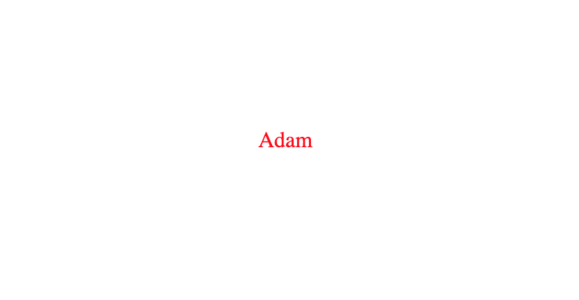
Defining custom behavior of built-in elements doesn't differentiate much from creating new custom elements but it's application does. While new custom elements are being used as independent units that can be used anywhere with a specific purpose, custom built-in elements extend functionality to already available browser elements.
Shadow DOM 👻
Shadow DOM represents some kind of encapsulation. The purpose of adding a shadow on an element is the "protection" of the styling, structure, and behavior of already existing application code, as well as preventing application-defined rules of affecting the shadow element. The shadow can be attached to an already existing tag (example below) as well as in combination with web components (example). An example of attaching a shadow on an element:
<!DOCTYPE html>
<html>
  <head>
    <style type="text/css">
      .container {
        display: flex;
        align-items: center;
        justify-content: center;
        height: 100vh;
      }

      .container span {
        margin-right: 10px;
        color: red;
      }

      span {
        color: red;
      }
    </style>
  </head>
  <body>
    <div class="container">
      <div><span>Adam</span></div>
      <div id="shadow"></div>
    </div>
    <script>
      let $div = document.querySelector("#shadow");
      $div.attachShadow({ mode: "open" });
      $div.shadowRoot.innerHTML = `
        <style>
          span {
            color: blue;
          }
        </style>
        <span>Adam</span>
      `;
    </script>
  </body>
</html>
The output:

Usually, when defining CSS like above we would expect all span elements text on the page to be red but the shadow prevents it in this case. The definition of new classes inside the shadow DOM will not affect other elements on the page that are not encapsulated with the shadow (and vice versa). This means that classes with the same names can exist inside and outside the shadow with their styling not mixing or causing any conflicts.
This is very important in combination with custom elements. If a custom element is being shared across multiple projects or is provided as a plugin where naming conventions can't be followed (the latter is the main use-case of the shadow DOM).
Additional functionalities: Attributes
One way to send data to web components is accomplished by using attributes. Useful for allowing the consumer some flexibility while at the same time preventing the need for source code changes (an example would be changing the background theme of an element).
An edited example of the vp-sentence custom component:
class VpSentence extends HTMLElement {
  constructor() {
    super();
    console.log("The sentence is connected!");
    this._color = null;
  }

  connectedCallback() {
    this.innerHTML = `
      <p>wants a Space Silver Mac</p>
    `;
    this._setColor(this.getAttribute("color"));
  }

  _setColor(value) {
    this.style.color = value;
  }
}

window.customElements.define("vp-sentence", VpSentence);
HTML:
<!DOCTYPE html>
<html>
  <head>
    <style type="text/css">
      .container {
        display: flex;
        align-items: center;
        justify-content: center;
        height: 100vh;
      }

      .container span {
        margin-right: 10px;
        color: red;
      }

      span {
        color: red;
      }
    </style>
    <script src="vp_sentence_component.js" ></script>
  </head>
  <body>
    <div class="container">
      <div><span>Adam</span></div>
      <vp-sentence color="blue"></vp-sentence>
    </div>
  </body>
</html>
Output:
If the color attribute is set to the color blue after page refresh we will get the above output. If the need for changing the theme without refreshing the page is required there is a solution. Adding the observedAttributes() method and naming all the attributes which need to be tracked for live changes. Furthermore, it is required to add one of the available callbacks: attributeChangedCallback(name, oldValue, newValue)
In order to refresh the value of color:
class VpSentence extends HTMLElement {
  constructor() {
    super();
    console.log("The sentence is connected!");
    this._color = null;
  }

  connectedCallback() {
    this.innerHTML = `
      <p>wants a Space Silver Mac</p>
    `;
    this._setColor(this.getAttribute("color"));
  }

  _setColor(value) {
    this.style.color = value;
  }

  static get observedAttributes() {
    return ["color"];
  }

  attributeChangedCallback(name, oldValue, newValue) {
    this._setColor(newValue);
  }
}

window.customElements.define("vp-sentence", VpSentence);
Additional functionalities: Properties
Another way of sending data to web components are properties. Aside from that it is possible to receive data from components. Properties are in fact advanced attributes in that it is possible to only send data in string format through attributes while using properties it is possible to send arrays and objects. This is accomplished using getters and setters:
class VpComponents extends HTMLElement {
  constructor() {
    super();
    this._data = null;
  }

  set data(data) {
    if (this._data === data) return;
    this._data = data;
    //refresh();
  }

  get data() {
    return this._data;
  }
}

window.customElements.define("vp-component", VpComponent);
In this context, data can be anything and inside the refresh(); you can do anything depending on the expected data format.
This is my first post here so don't refrain from adding any suggestions to formating or any rules I broke. 🙏🏻
Reference links:
- https://app.pluralsight.com/player?course=vanilla-web-components-practical-guide&author=leon-revill&name=vanilla-web-components-practical-guide-m0&clip=0&mode=live
- https://w3c.github.io/webcomponents/
- https://developer.mozilla.org/en-US/docs/Web/Web_Components
- https://alligator.io/web-components/attributes-properties/

Oldest comments (4)
Fun and Useful, thank you <D
Very nice overview of the basics.
For your next project, try one of the lightweight libraries that provide useful additions to the bare specs, like templating and observed properties.
lit-element
hybrids
stencil
Great article🌻
Pretty excited to see where JavaScript will be heading in next few years❤️
FYI, extendable built-ins aren't supported in Safari.