
Introduction
When creating a new website within a tiny amount of time or with a small development team most people look towards Bootstrap to help with the design. Taking into account the ease of use, an abundance of documentation and plenty of predefined css components it is not a mystery why Bootstrap is so popular.
However, when the project gets bigger and more users start using the application concerns of page load and developer performance arise. While using Bootstrap it is very unlikely that all available utility classes are going to be used resulting in a considerable amount of css bloat as well as unused components. Enter Tailwind.

Tailwind is a CSS framework for rapid-fire UI development. When mentioning CSS frameworks first thing that comes to mind is Bootstrap, Material Design or even Bulma. However, even though Tailwind is considered a framework it doesn't fit under the same philosophy as the others. Tailwind is primarily a utility 🛠 framework or rather a utility bundle.
Tailwind doesn't provide a default theme or any predefined UI components. Also, with Tailwind, it is rather unlikely to get two similarly looking pages. This is due to there being no imposed design decisions (like with vanilla css, the limit is our imagination).

Tailwind provides tools for rapid development 🏃🏼♀️💨, while at the same time allowing the developer to maintain identity. Even though there is no limit to imagination with Tailwind, designing is structured in a way so that the developer can make a self-imposed ruleset to avoid css bloat or repeated properties (i.e. making 10 colors that all look similar).
There are three main approaches when CSS and UI design is in question. Every one of them has pros and cons shown below:
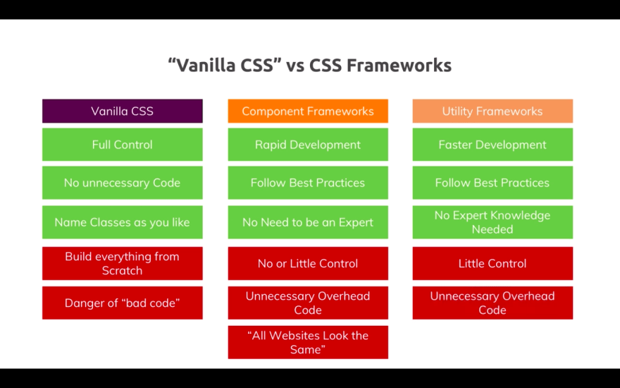
The table above has an error in the Utility frameworks column. The error is that it suggests that the Utility frameworks have "Little Control" which is not true in the case of Tailwind because inside it everything is configurable.
Utility classes
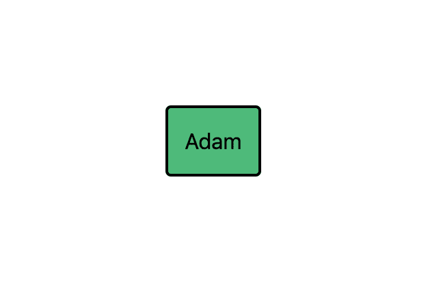
When taking into account that the main goal of Tailwind is not providing users predefined components but tools for rapid component development it is clear why we won't find a ".btn" class like in Bootstrap. Instead, we will find utility classes. All predefined utility classes can be found in the official documentation and in the configurable javascript file tailwind.config.js in the root of the project after installation. Every available class can be configured for individual purposes or the purposes of a larger project. An example of styling a button using tailwind:
<!DOCTYPE html>
<html>
  <head>
    <link href="https://cdn.jsdelivr.net/npm/tailwindcss/dist/tailwind.min.css" rel="stylesheet">
  </head>
  <body>
    <div class="flex h-screen justify-center items-center">
      <button type="button" class="bg-green-500 p-3 border-2 outline-none border-black rounded">
        Adam
      </button>
    </div>
  </body>
</html>
vs Bootstrap:
<!DOCTYPE html>
<html>
  <head>
    <link rel="stylesheet" href="https://stackpath.bootstrapcdn.com/bootstrap/4.1.3/css/bootstrap.min.css" integrity="sha384-MCw98/SFnGE8fJT3GXwEOngsV7Zt27NXFoaoApmYm81iuXoPkFOJwJ8ERdknLPMO" crossorigin="anonymous">
  </head>
  <body>
    <div class="d-flex justify-content-center align-items-center" style="height: 100vh;">
      <button type="button" class="btn btn-primary">Adam</button>
    </div>
  </body>
</html>
Output:
| Tailwind CSS | Bootstrap |
|---|---|
 |
 |
Using Bootstrap a predefined button design is achieved. To achieve a custom look we need to write custom css. While using utility classes it is possible to achieve any look and feel of the button without writing any css.
This is important for reasons below:
- There won't be 10 different colors that look the same
- The application will have a uniform look (i.e. same padding for lists or containers)
- The ability to create a personal UI design, identity, branding without writing a bunch of custom CSS (we don't have to be CSS experts)
- Speed 🏎🏎🏎💨💨💨
Utility first 🥇
In the above example of the button, there is a large number of added classes in order to achieve the wanted look. One of the reasons for this is the recommended way of creating components, and that is the utility first method. In short, this means:
- Add an appropriate HTML element
- Add appropriate utility classes
- Profit 💰?
This method achieves the main goal of Tailwind: Rapid UI development. This means making the UI components look as intended without adding any custom styling. Of course, sometimes it is inevitable to write CSS, but with this approach, it is reduced to a minimum.
Looking at the above mentioned button example:
<button type="button" class="bg-green-500 p-3 border-2 outline-none border-black rounded">
  Adam
</button>
One thing that immediately sticks out is the number of classes needed to create this button. Sometimes it looks unreadable and seems like clutter. This is a problem when taken into account real scenarios in which there might be multiple buttons or other repeating components on the same page.
Extracting components
Extracting components is a process of extracting utility classes into new, clearly defined and readable classes. Two things give meaning to this process:
- The problem of bloating HTML with utility classes
- Separation of concerns or reusable components
Again, when looking at the above mention button, there is no need to extract the utility classes into a new class if we are looking at the button as a single occurring component. However, if we look at the button in the context of a bigger project which will certainly have more than one similarly or identically looking button then copying a large number of utility classes seems like an unnecessary obstacle. Besides, if there is a need to change the style of a certain UI component that is repeated it would be a major problem.
How to extract utility classes? Tailwind gives us a very useful function for this: "@apply". In the example below we have the CSS for the same button as above but with extracted classes:
<button type="button" class="btn-wizard">Adam</button>

<style>
  .btn-wizard {
    @apply bg-green-500 p-3 border-2 outline-none border-black rounded;
  }
</style>
The output:
As you can see the output is the same as before, but the HTML is cleaner and more readable. The .btn-wizard class can now be used multiple times across the website.
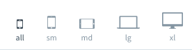
Responsiveness
Every Tailwind utility class has its responsive behaviour. This allows for effortless creation of responsive components without writing additional CSS. Tailwind provides a simple method of putting already existing utility classes into a responsive context. Using the prefix {screen}:{class}. If we look at the above example of the button and want to change its color depending on the screen size (i.e. if it is a monitor, laptop or mobile screen) we have to add the following:
<button type="button" class="bg-green-500 sm:bg-red-500 p-3 border-2 outline-none border-black rounded">
  Dagi
</button>
We will get the appropriate output.
Tailwind responsiveness implies that the page is going to be created for mobile screens first. Adding the sm:bg-red-500 tells the background of the element changes to red if the size of the screen is larger than the predefined value (which is configurable). If the size of the screen is smaller than the size which the "sm:" represents the colors of the background go back to the default, in this case, green.
There are a couple of predefined screen size options in Tailwind:
Flexbox
When comparing the responsiveness of Tailwind and Bootstrap there is one convenience lacking in Tailwind. That's the Grid functionality that we are so used to with Bootstrap. Tailwind doesn't come with predefined grid classes but provides the tools to achieve the same thing using Flexbox (additional resource) and Tailwind width utility. An example of a grid using a combination of flexbox and tailwind:
<!DOCTYPE html>
<html>
  <head>
    <link href="https://cdn.jsdelivr.net/npm/tailwindcss/dist/tailwind.min.css" rel="stylesheet">
  </head>
  <body>
    <div class="flex h-64">
      <div class="w-1/2 bg-grey-500"></div>
      <div class="w-1/2 bg-pink-500"></div>
    </div>
    <div class="h-16"></div>
    <div class="flex h-64">
      <div class="w-1/3 bg-grey-500"></div>
      <div class="w-1/3 bg-pink-500"></div>
      <div class="w-1/3 bg-grey-500"></div>
    </div>
  </body>
</html>
Output:

The divs above are completely responsive. It is possible to create an endless amount of columns while Bootstraps grid is limited to 12.
Elements inside the div that have display: flex; follow the x or y-axis for direction (x is the default). This means that the direction of elements inside the flex div can be changed by adding a simple "flex-col" class. This changes the above example to look like this:
<!DOCTYPE html>
<html>
  <head>
    <link href="https://cdn.jsdelivr.net/npm/tailwindcss/dist/tailwind.min.css" rel="stylesheet">
  </head>
  <body>
    <div class="flex h-64">
      <div class="w-1/2 bg-grey-500"></div>
      <div class="w-1/2 bg-pink-500"></div>
    </div>
    <div class="h-16"></div>
    <div class="flex flex-col">
      <div class="p-6 bg-grey-500"></div>
      <div class="p-6 bg-pink-500"></div>
      <div class="p-6 bg-grey-500"></div>
    </div>
  </body>
</html>
Output:

Configurability
One of the biggest strengths of Tailwind is its configurability. In the center of every Tailwind project is the tailwind.config.js JavaScript file located in the root of the project (by default). It contains all the configurable utility classes and colors. This file doesn't exist unless the user opts to generate it. If there is no config file the utility classes are the same as mentioned in the official documentation.
By default, Tailwind provides a very useful configuration with predefined values to start with. These values are fully configurable and are not required to be used. The documentation, as well as the creator of Tailwind, encourages changing the default values to fit the individual design needs.
Note: Unlike other CSS frameworks, the Tailwind configuration is not co-dependent. This means that any utility class can be deleted without affecting the rest of the configuration.
The configuration file is divided into parts depending on the CSS options it affects. The example bellow shows how a set of utility classes looks for the height property and how to use it inside HTML:
 /*
  |-----------------------------------------------------------------------------
  | Height                                  https://tailwindcss.com/docs/height
  |-----------------------------------------------------------------------------
  |
  | Here is where you define your height utility sizes. These can be
  | percentage based, pixels, rems, or any other units. By default
  | we provide a sensible rem based numeric scale plus some other
  | common use-cases. You can, of course, modify these values as
  | needed.
  |
  | Class name: .h-{size}
  | CSS property: height
  |
  */

  height: {
    'auto': 'auto',
    'px': '1px',
    '1': '0.25rem',
    '2': '0.5rem',
    '3': '0.75rem',
    '4': '1rem',
    '5': '1.25rem',
    '6': '1.5rem',
    '8': '2rem',
    '10': '2.5rem',
    '12': '3rem',
    '16': '4rem',
    '24': '6rem',
    '32': '8rem',
    '48': '12rem',
    '64': '16rem',
    'full': '100%',
    'screen': '100vh',
  },
On top of the configuration for the height property there is a short example of how to use the utility. In order to set the height to '4rem' inside HTML we will add the "h-16" class to the element. If inside the configuration we don't have the desired value, lets say '1.75rem' we can add it and name it however we please. Following the already set pattern it would make sense to call this value '7', but you can use whatever you want:
 /*
  |-----------------------------------------------------------------------------
  | Height                                  https://tailwindcss.com/docs/height
  |-----------------------------------------------------------------------------
  |
  | Here is where you define your height utility sizes. These can be
  | percentage based, pixels, rems, or any other units. By default
  | we provide a sensible rem based numeric scale plus some other
  | common use-cases. You can, of course, modify these values as
  | needed.
  |
  | Class name: .h-{size}
  | CSS property: height
  |
  */

  height: {
    'auto': 'auto',
    'px': '1px',
    '1': '0.25rem',
    '2': '0.5rem',
    '3': '0.75rem',
    '4': '1rem',
    '5': '1.25rem',
    '6': '1.5rem',

    '7': '1.75rem', //<------This was added

    '8': '2rem',
    '10': '2.5rem',
    '12': '3rem',
    '16': '4rem',
    '24': '6rem',
    '32': '8rem',
    '48': '12rem',
    '64': '16rem',
    'full': '100%',
    'screen': '100vh',
  },
On top of the configuration file there is a colour section. It doesn't affect the generated CSS, but provides a way of centralising all colours without the need for a separate file containing only colours. The colours can be used with every utility with which it makes sense to use them:
    colors: {
 |       transparent: 'transparent',
 |
 |       black: '#000',
 |       white: '#fff',
 |
 |       gray: {
 |         100: '#f7fafc',
 |         200: '#edf2f7',
 |         300: '#e2e8f0',
 |         400: '#cbd5e0',
 |         500: '#a0aec0',
 |         600: '#718096',
 |         700: '#4a5568',
 |         800: '#2d3748',
 |         900: '#1a202c',
 |       },
 |       red: {
 |         100: '#fff5f5',
 |         200: '#fed7d7',
 |         300: '#feb2b2',
 |         400: '#fc8181',
 |         500: '#f56565',
 |         600: '#e53e3e',
 |         700: '#c53030',
 |         800: '#9b2c2c',
 |         900: '#742a2a',
 |       },
 |       orange: {
 |         100: '#fffaf0',
 |         200: '#feebc8',
 |         300: '#fbd38d',
 |         400: '#f6ad55',
 |         500: '#ed8936',
 |         600: '#dd6b20',

 ...
Again, looking at the button we created, if we want to change its colour to be a bit darker we can use one of the following colours:
<button type="button" class="bg-red-700 p-3 border-2 outline-none border-black rounded">
  Adam
</button>
Summary
It is simple, professionally made, well documented and worth your try. It certainly made my workflow faster, made my UI more uniform and reduced the amount of CSS I wrote over the course of using it. None of my web pages using Tailwind look the same. Additionally, the creator of Tailwind is an experienced guy in the industry and is continuously improving Tailwind. He also wrote a useful book for anyone interested in design (highly recommend!).
NOTE: This post applies to the current version of Tailwind which at the time of writing is v.1.1.2.
Reference:

Top comments (2)
Some things I forgot to mention. Obviously, Bootstrap is not a bad framework by any means. I just put Bootstrap as a comparison since it is the most popular css framework out there. I have had experience with Bootstrap, Material Design as well as Tailwind. Often people that are looking at Tailwind ask about the bloat that utility classes generate in the HTML and ask: "Why not use inline styling then?". There is a number of reasons why:
frontstuff.io/in-defense-of-utilit...
dev.to/michi/utility-first-css-you...
In my experience the most important reason for using utility classes over inline styling is page uniformity. You wouldn't want repeating components to have different paddings, colors etc. Also, you don't have to remember the exact pixel or rem size. Over time the utility classes will become second nature.
Another equally important fact is speed. The ease with which you build visually pleasing, aesthetic and responsive apps is incredible.
Good overview of key characteristics and major benefits of Tailwind, thank you.