In this post, we will:
- add the viewport meta tag
- define responsive design
- create media queries three ways
- learn to use the Chrome device toolbar
This is the sixteenth and final post and video for part one of a series on learning web development for beginners. Learn more about the series and see the post schedule >
You may watch the following video or follow along with the expanded transcript that follows.
To begin this lesson, open the starter project you began in episode 1, or review the source files from episode 15.
To begin this lesson, open our project in VSCode.
If you are just joining us you can download the starter project to catch up, see the link in the video description.
In the Terminal, type the start command npm run start to run the project.
We're going to start by opening up Inspector.
Then, we're going to open up the Device toolbar with this icon that looks like a phone:

Now the inside of the Chrome browser has been updated and it is wrapping our webpage in a constrained window.
At the top, you'll see a new toolbar that has a dropdown to select from preset dimensions of common devices, or set to "Responsive" and then you can drag to resize from the corner. Or you can enter your own dimensions. Then the percentage is the viewing percentage if you need to adjust that. Following that is the ability to simulate bandwidth or download speed, and finally is an icon to simulate rotating the device, which is essentially flipping the dimensions.
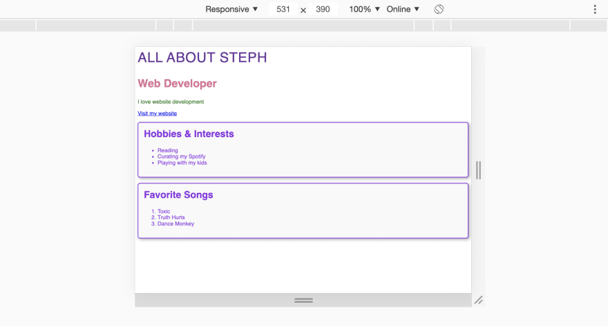
Let's select one of the iPhone models, I'm going with the iPhone 6/7/8.

As you can see, our content is pretty hard to read. The reason isn't just that the dimensions are small, but that we need to add a special tag within our HTML.
Go to VSCode and then open the index.html file. In the <head>, we need to add the viewport meta tag:
<meta name="viewport" content="width=device-width, initial-scale=1">
We actually discussed this in our second episode, but let's recap.
The viewport meta tag is necessary for our site to adjust it's size appropriately whether it's displayed on a large desktop monitor or a mobile phone. There are a few ways to define the behavior through the content attribute. What we have defined is the most recommended which says to set the HTML document width to match the browser window width, and to not impact the scaling of items on the page as a default.
Save, and let's see how it looks in the device simulator now.

Much better! The viewport meta tag is the first step towards creating responsive designs.
Responsive design is a term coined by Ethan Marcotte to describe the behavior of content adapting to the resolution of the rendering device.
As we saw before adding the viewport meta tag, the device was not aware that the content should be adapted. So instead, it rendered it assuming a desktop context which would have caused viewers to pinch and zoom to be able to read the content.
Before we move on, let's add the viewport meta tag to the rest of our HTML files.
In this lesson, we are going to learn the basics of implementing responsive design by updating our blog and card layouts.
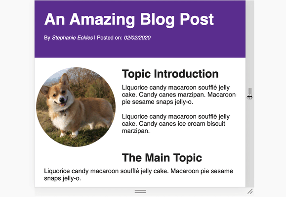
Let's start with the blog, and first, we'll see how it looks with just the meta tag added. Update the browser URL to include /blog-layout.html.

Thanks to the fact we're only serving basic text content for most of this page, it's not too far from ideal. The main thing to adjust is the image alignment versus the first part of the blog content.
In the Device toolbar, let's switch to the "Responsive" option, and do a manual resize out slowly. You can see how the content shifts as the window expands.

In the toolbar, you can also see the precise pixel width, and we're going to use that information to create our first CSS media query.
A media query is a CSS method to attach to characteristics such as viewport width, as well as a few selected device preferences and features.
In VSCode, let's open blog-layout.css and scroll to the end of the file where we've defined the img--align-left class.
Now, the float value was ideal on larger desktop viewports, but as we saw it was not desirable on mobile viewports.
Let's add our first media query, which is defined with the @ symbol followed directly by the word "media". Then in parenthesis, we define what the media query is targeting.
@media ()
Let's go back to the browser and resize the simulated viewport until the headline starts to break more than we'd like - which is around 400px. Now, we will not really be able to predict how long the headline will be for future posts. So instead, it is advisable to break this according to what is predictable, which is device size.
If we go down the list of preset device sizes, they range from 320 - 414. But we also have to consider our content's "comfort level", so let's go with 460 for a nice even number.
This number has a term in responsive design which is called "breakpoint", as in the point at which the layout breaks.
We will now use that number back in our media query to define the following in the parenthesis: (max-width: 460px) which means the rules we define will be applied below a width of 460px.
We then open up curly braces like when we define a regular CSS rule, and then we need to redefine our image class.
    @media (max-width: 460px) {
      .img--align-left {

      }
    }
Below this width, we want to remove the float behavior and instead align the image to the center of the viewport. We can accomplish that with:
    float: none;
    display: block;
    margin-left: auto;
    margin-right: auto;
First we remove the float, then we switch the display to block because images are inline elements by default and the margin wouldn't apply correctly if we left it inline. We then apply auto margins to center the image, a technique we learned in episode 13 when we did the initial blog CSS.
Save, and then switch back to "Responsive" mode. Let's resize slowly to see how the media query causes the image to transition its styles. Pretty nice!
Turn off the device toolbar, and then update the browser url to /card-layout.html.
With Inspector positioned on the side of the browser window, we can also use it to resize the viewport, so let's try that. As we get smaller, the cards start to shrink below what is reasonable for their content, even causing the price to overflow the card.
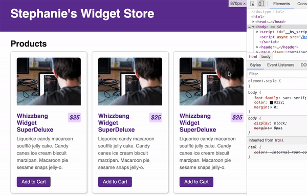
Similar to our blog title, we can't predict how long the product titles may be, so we might want to adjust the card widths pretty early, and maybe resize the card headline text a bit to help future-proof our adjustments a bit more. A commonly recommended breakpoint thanks to iPad portrait mode is 768px so we'll use that for our media query.
Open card-layout.css in VSCode, and we first want to add a media query for the card-row class because it is controlling the card widths.
Now, for our blog layout, we added a media query using the idea of a max-width, but we can also use min-width which promotes the idea of "mobile-first design".
"Mobile-first design" is when you define your initial rule assuming the smallest, or mobile sized, viewport, and then above a certain width, you define desktop rules within your media queries.
On the smallest viewport, we want no columns of cards and instead for the cards to just stack. So we'll actually wrap our entire existing rule in a media query as:
@media (min-width: 768px)
Save, and then as we use the Inspector panel to drop the viewport below 768px, we lose the columns.
Now, it does feel a bit early to drop all the way to one column, so let's copy this rule above the current one and adjust the width used to 460px and then update to grid-template-columns: 48% 48% and save.
@media (min-width: 460px)
That's feeling better!

Media queries are subject to the CSS cascade, so we can actually remove the display and justify-content rules from our second media query because it will inherit those from the first rule.
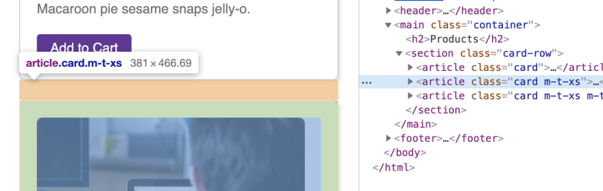
Let's switch back on the device toolbar, and check the preset mobile viewports. The single card viewports are pretty good, except the cards are too close to each other. We need to add a bit of margin, but we only want it on this lowest size.
One strategy is to create responsive spacing utility classes, so that way when you need a little extra spacing you can add it with a class instead of creating extra rules. This is also useful if you want to apply the spacing to one card, for example, and not all cards.
At the bottom of our CSS file, we'll add:
    @media (max-width: 460px) {
      // `m` = margin, `t` = top
      // `xs` to denote this is applied at the "extra small" viewport
      .m-t-xs {
        margin-top: 24px;
      }
    }
Then we need to add this class to the second and third card in card-layout.html. We won't add it to the first because that would add extra space that we don't really need.
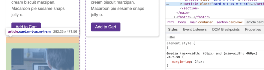
Save, and that looks better. But if we go to the "Responsive" setting and resize until we have two column cards, the third card now needs extra space. So let's add one more utility media query class, but this time we'll attach it to both a min-width and a max-width to give it a range to apply between:
    // Apply between our xs breakpoint and our "medium" breakpoint
    @media (min-width: 460px) and (max-width: 768px) {
      .m-t-sm {
        margin-top: 24px;
      }
    }
Then we need to add this class to the third card only in our HTML, and save.
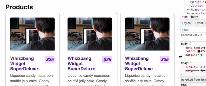
We can manually resize to review, and it's pretty good except right before it drops to the xs viewport the price starts to be pretty cozy with the headline around 520px. Using Inspector, we see that the h3 size is inherited from our global stylesheet and is 20px. We don't want to overly resize it since we want it to still be larger than the body text, so we can go down to 18px.
Let's add one more media query for the .card h3 which we'll place right below that rule.
On small viewports we want a smaller font size, so we'll do a max-width media query to make it smaller, making our media query:
    @media (max-width: 520px) {
      .card h3 {
        font-size: 18px;
      }
    }
Excellent! You've just created your first responsive design using media queries!
And if you've been following this series, you've completed learning about the basics of HTML and CSS, so congrats! 🎉
Stay tuned for the capstone project series where you will build and publish your first complete website!

Oldest comments (2)
Aprendiendo css. Muy útil. Gracias.
Thank you very much for your great work.
You deserve so much attention....
Regards