In this post, we will begin to learn about CSS layout, including block elements, inline elements, and what is called the box model.
This is the ninth post and video in a series on learning web development. Learn more about the series and see the post schedule >
You may need to check out the first post to learn how to get set up to begin coding:

You may watch the following video or follow along with the expanded transcript that follows.
To begin this lesson, open the starter project you began in episode 1, or review the source files from episode 8.
To begin this lesson, open our project in VSCode.
If you are just joining us you can download the starter project to catch up, see the link in the video description.
In the Terminal, type the start command npm run start to run the project.
Let's copy the index.html as a starting point, and name the copy css-box-model.html
We're going to create an outline of today's lesson so that this becomes a reference for you as we continue learning CSS.
First up, an h1 for our title of "CSS Box Model". Then an h2 for "Block Elements", and one for "Inline Elements".
<body>
  <h1>CSS Box Model</h1>
  <h2>Block Elements</h2>
  <h2>Inline Elements</h2>
</body>
Next, we're going to use a different method for including CSS styles . In the head, remove the link to the style.css file. In it's place, we'll add <style> opening and closing tags. All the CSS we'll write today will go within this block.
  <style>

  </style>
Now it's time to add our first block element, which will be a <div>. We have used a div before in our HTML lessons. Include the text "div" to identify it visually on the rendered page in the browser.
<h2>Block Elements</h2>
<div>div</div>
Within the style tags, we'll add what's called a comment, which is designated with a /* followed by your comment text, and closed with an */ . Our comment will be /* Block Elements */ to serve as a reminder of the significance of this CSS rule.
  <style>
    /* Block Elements */
  </style>
Below the comment, we'll write a rule for div that will make it visible in the browser:
/* Block Elements */
div {
  outline: 1px solid red;
}
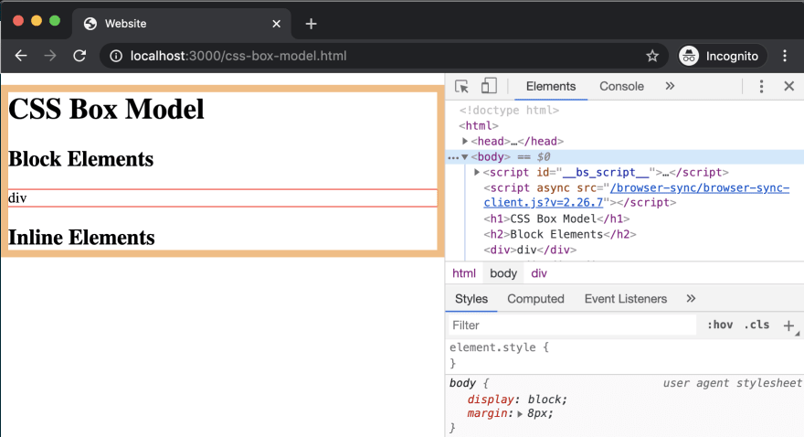
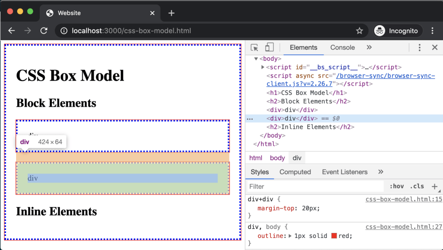
Save, and let's view it in the browser. You'll see there is now a red border around the boundary of the div element, which goes nearly from edge to edge of the browser window.

This is what makes div a "block element". Block elements, by default, fit like full width blocks on the page. Let's open the Inspector to review the styles inherited by the browser.
You'll see our rule for the outline, and a separate rule that is noted as "user agent stylesheet" which means the inherited browser styles. The one definition in the browser rule is display: block.
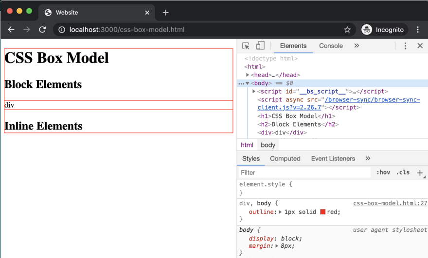
However, this rule by itself doesn't explain why it's not touching each edge of the browser. So let's travel up to the nearest ancestor of the div, which is the body tag.
Ah ha! With the body tag highlighted with Inspector, you can see an orange border which fits the gap between the div and the browser window. Under the "user agent stylesheet" styles for body, there is a definition being inherited that defines margin: 8px.
Margins are one property involved in the box model, and a margin defines the space around an element. Margins can be applied:
- to all four sides of an element at once, such as the single
8pxin the browser definition, - to one side at a time such as
margin-top: 8px, - to each side via shorthand within the
margindefinition such asmargin: 8px 10pxwhere the first number is the vertical value, so8pxfor top and bottom, and the second number is the horizontal value, so10pxfor left and right
We'll get more familiar with assigning values to margin as we continue the CSS lessons.
Let's expand the rule we assigned to div to also apply the outline on body. We can do this by adding a comma after "div", and including "body". Save, and check it out in the browser.
The outline applied to body is now surrounding all the content on the page, and is flush with the outline applied to the div. You can also see it has the same gap between the outline and the browser window because the outline property sits on the boundary of the element. If we use Inspector on the body now, you can see how the margin is the space outside the boundary of the body.
The corresponding property of margin for the CSS box model is called padding. Padding is applied inside of the element's boundary, whereas margin is applied to the outside.
In our style block, let's add a new comment as the first thing with the content /* Box Model */. Then, let's add the following rule:
/* Box Model */
body {
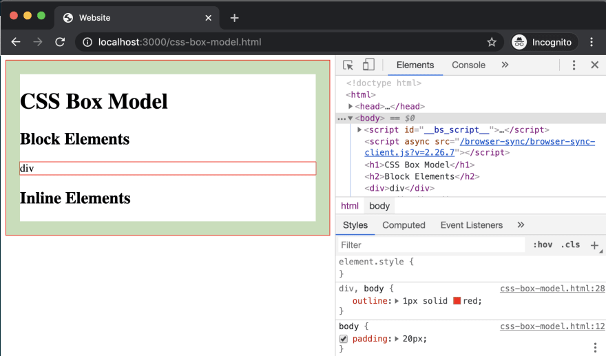
padding: 20px;
}
Now there is space between the outline of body and the outline designating the div boundary. Open Inspector, and you'll see it has added a helpful green highlight to the space created by the padding rule we added.
Like margin, padding can also be applied to all four sides with a single value, or one side like padding-left, or via the shorthand method just like margin.
There's one more rule to complete the box model which is border. This is the preferred property over outline for styling an element's boundary, but we'll leave the outline for demonstration purposes.
Let's add a border definition for body:
/* Box Model */
body {
  padding: 20px;
  border: 3px dotted blue;
}

The border has been applied to the inside of body in comparison to the outline, with the padding being applied between the border and the content of body. We can select body in Inspector again to have it's highlighting help identify the space from padding in green.
Let's include div in the rule we have for body to have it receive the padding and border definitions.
/* Box Model */
body,
div {
  padding: 20px;
  border: 3px dotted blue;
}
Then, let's copy a second <div> after our first, and save. You'll see the two divs have their outlines appearing merged. This is due to not having any margin definitions on our div.
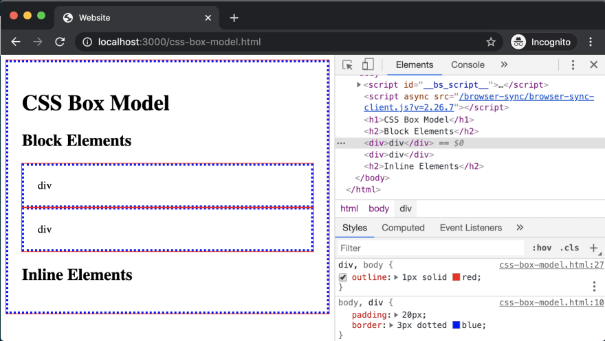
We can add a new rule, and we'll include what's called the adjacent sibling CSS selector, which is the +. Using this, we can write div + div as our selector for this rule, which means "apply the following definitions to a div only if it's directly following - aka adjacent - to another div". Then, we'll define margin-top: 20px;.
div + div {
  margin-top: 20px;
}
Save, and let's see what happened in the browser.
If we highlight our first div, you'll see no margin rule has been added. If we select the second one, the Inspector reveals an orange highlight for the margin-top rule.
The take home here is:
- use
marginfor space between elements - use
paddingfor space within elements
Now you know the basics about the box model!
To round out this lesson, let's identify a few more block elements, and then review common inline elements.
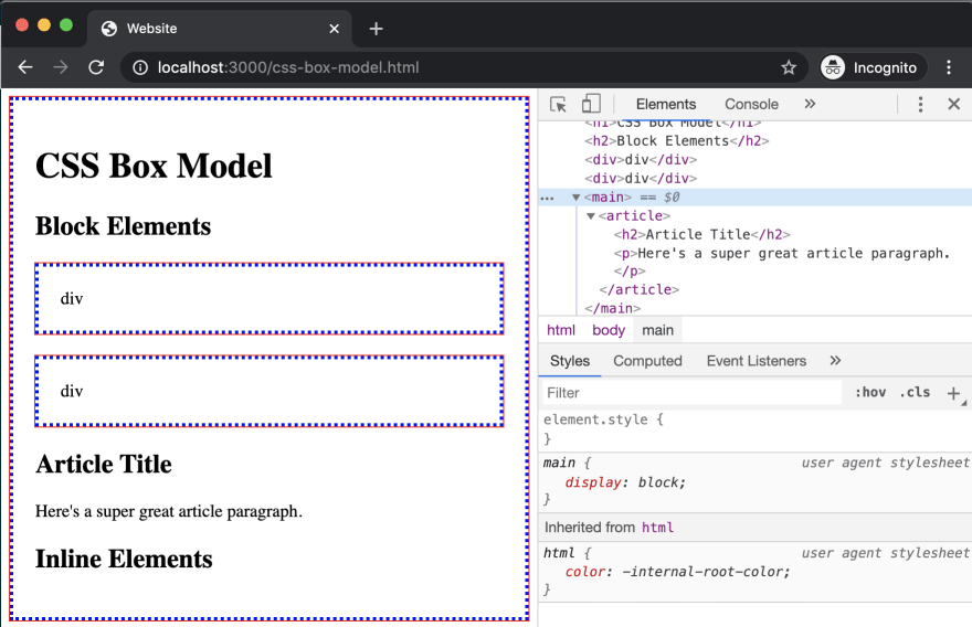
Building on our HTML lessons, let's add the other block items you have learned - main, article, and typography elements. We'll add them semantically, so first up is our <main> tag, which will enclose the <article>, and within that will be an <h2> for "Article Title" and a single paragraph, use any text you like.
    <main>
      <article>
        <h2>Article Title</h2>
        <p>Here's a super great article paragraph.</p>
      </article>
    </main>
Save, and check it out in the browser. At this point, you may have been able to anticipate that there wouldn't be any visual indication of the nesting of these block elements.
Just to emphasize it for this lesson, let's write a rule and use the universal selector * to quickly select all elements found within the main tag. So the selector will be main, main * which says "the main tag and also any elements within main", with the following definition:
main,
main * {
  outline: 1px solid red;
  padding: 20px;
}
Save, and you'll see this has applied the outline and padding to main, article, and the h2 and p tags.
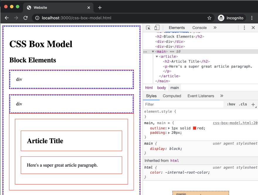
In addition, if we inspect the h2 and p tags, you'll notice they have inherited margin rules set by the browser. During our future capstone lessons, we will cover what's commonly known as a style reset that is often included to remove or reset styles like that margin.
Ok, now let's switch to inline elements. The first of these is the <span> tag, so let's add that as the first item under our h2 for "Inline Elements", and include the content of "span".
Then let's create a new comment and rule in our style block:
/* Inline Elements */
span {
  outline: 1px solid green;
}
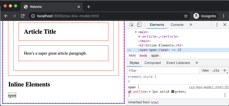
After saving, you'll see that the span has been added, and the difference from block elements is pretty clear. Inline elements default to taking up only the max-width of their content, and will break onto multiple lines if the content is long.
If we inspect this span, you'll see that there isn't actually a rule defined for display: inline. That's because inline is the assumed display value if none other is defined.
Let's copy the span a couple more times then save and see what happens. The spans have stayed in a line relative to each other, with the space in-between essentially equaling the size of a space character.
Like our block elements, we can apply padding and margin, so let's try that by adding the following to our span rule:
/* Inline Elements */
span {
  outline: 1px solid green;
  padding: 5px;
  margin: 10px;
}
Then save and let's review the outcome.
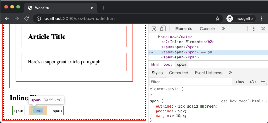
Using inspector, we can highlight each span and see how the margin and padding have been applied. But something seems off about the top and bottom margin - it seems they don't exist?
This is a quirk of inline elements, which is that vertical margins are not applied due to the algorithm that creates the virtual "line" for inline elements to live within. We'll look at how to change this behavior in future lessons.
Additional inline elements that were introduced in the HTML lessons include text formatting tags such as <strong> and <em> as well as the <a> tag for links, so let's add those:
<strong>strong</strong>
<em>em</em>
<a href="#">link</a>
Save, and as you may have guessed, these have continued along the same line as our existing span tags.

As we proceed with our CSS lessons, we will continue to learn about the box model and additional display properties that enable layout within CSS.
Next up in Episode 10: Essential CSS Properties and the Class Selector

Top comments (0)