This article is rubbish and promotes wrong techniques and the title is nothing but a clickbait.
It's important to note why this is a bad idea:
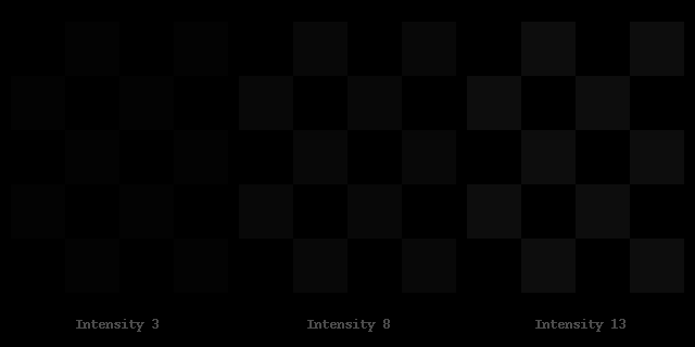
The eye perceives the lighter shades with much better contrast than the darker shades. Simply inverting changes the balance of the ratios!
Simply put: What you distinguish as multiple shades with good contrast when using lighter shades will look like a single color when using darker shades and therefore you will lose the UI elements.
This is basically the same image, but inverted. Notice the loss of detail when inverting White UI to Black UI.
source: simandl.cz/stranky/fotky/kalibrace...
For further actions, you may consider blocking this person and/or reporting abuse
We're a place where coders share, stay up-to-date and grow their careers.

This article is rubbish and promotes wrong techniques and the title is nothing but a clickbait.
It's important to note why this is a bad idea:
The eye perceives the lighter shades with much better contrast than the darker shades. Simply inverting changes the balance of the ratios!
Simply put: What you distinguish as multiple shades with good contrast when using lighter shades will look like a single color when using darker shades and therefore you will lose the UI elements.
This is basically the same image, but inverted. Notice the loss of detail when inverting White UI to Black UI.

source: simandl.cz/stranky/fotky/kalibrace...