
Components
1) ApplicationProvider
It is a top level Wrapper for your Application.Generraly, wrap the root level of your App
export default () => (
  <ApplicationProvider {...eva} theme={eva.light}>
    <HomeScreen />
  </ApplicationProvider>
);
2) Layout
Layout is just like the View element of the React Native or Container in the Native Base. Layout has some styling as per the Level of the Layout you are using, and its Background color changes as the theme of the app changes. Wrap each screen with the Layout as it will come usefull when you later on add theme to your application.
There are 4 levels of the layout and can be configured using the level props.

When we changes the theme of the app, then automatically the background changes to dark theme.
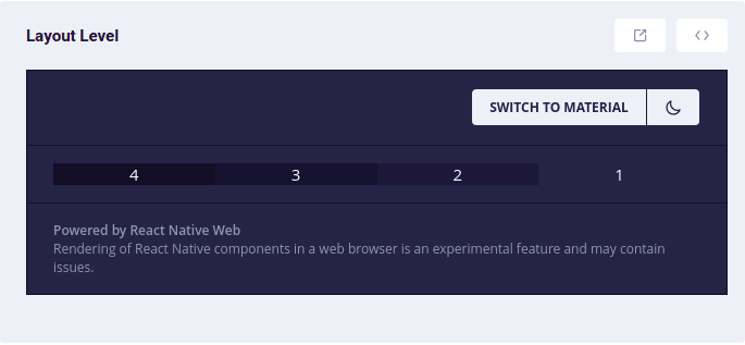
Example Code for Layout
<Layout style={styles.layout} level='1'>
      <Text>1</Text>
 </Layout>
3) Text
The text component in the UI Kitten was same as Text in React Native with some basic styling passed via the props. We can have multiple types of text style from h1 to h6 by passing the props category.
<Text category='h1'>H1</Text>

3) Icon
If you had created your application by using ui-kitten template, then you can use the Icon otherwise you need to add an additional package.
To use Icon component, first you need to import the Icon like below
import { Icon } from '@ui-kitten/components';
and then you need to just pass the Icon name,color and size.
<Icon
    style={styles.icon}
    fill='#8F9BB3'
    name='star'
  />
You can also add icons to button by passing accessoryLeft or accessoryRight props to the Button component of the UI Kitten
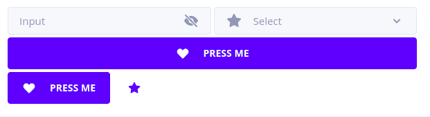
<Button
      style={styles.button}
      accessoryLeft={HeartIcon}
      onPress={toggleMenu}>
      PRESS ME
 </Button>
const HeartIcon = (props) => (
  <Icon {...props} name='heart'/>
);
3) Button
Button can be used in the UI kitten by importing component. We can pass some of the props like appearance, status, size

<Button  size='medium' appearance='filled'  status='warning'>
      FILLED
</Button>
More component will be dicsussed in the Next part of this blog.
Thanks for Reading.

Top comments (0)