
Written by Idorenyin Obong✏️
Like most programming languages, native CSS now has support for variables, and they’re here to stay.
If you know a bit of CSS, chances are you’ve heard of CSS preprocessors such as Sass and Less. You’ve probably used them in your projects regardless of your frontend framework of choice. Or maybe you haven’t and you’ve just used plain old CSS.
Either way, the major selling point of those preprocessors was that you could use variables just like you would in a programming language. You declare a variable, assign it a value, and use it across the document to make maintainability a breeze.
In this tutorial, we’ll provide a soft introduction to this concept by first demystifying CSS variables and then building two simple projects that utilize it. If you’re eager to get in on the action as soon as possible, you can find the code to both projects on CodePen (here and here).
Some basic CSS knowledge is required to follow along with this tutorial. Without further ado, let’s dive in!
What we will build
To solidify our knowledge about CSS variables, we’ll build two very simple projects. The first will demonstrate how to create button variations. This concept is popular in Bootstrap, where certain elements share CSS rules that give them a default design but are differentiated by colors or other properties. The second project will be a theme-based design — specifically, a light-and-dark theme manipulated by JavaScript.

How to use CSS variables
Also referred to as custom properties or cascading variables, CSS variables have myraid use cases. One of the most common is managing websites in which numerous values are similar to those in the document. This helps to reduce the friction associated with refactoring or updating your code.
The basics
To declare a variable in CSS, come up with a name for the variable, then append two hyphens (–) as the prefix.
element {
  --bg-color: #405580;
}
The element here refers to any valid HTML element that has access to this CSS file.
The variable name is bg-color, and two hyphens are appended. To access a variable, use the var() notation and pass in the variable name.
body {
  background-color: var(--bg-color);
}
The background-color will take the value of bg-color that we declared earlier. More often than not, developers declare all their variables in the :root element of the document.
:root {
  --primary-color: #0076c6;
  --blur: 10px;
}
Declaring your variables here renders them globally scoped and available to the whole file.
CSS variables inheritance
Just like traditional CSS, CSS variables are cascading in nature — i.e., they inherit. The value of an element is inherited from its parent if no custom property is defined.
HTML:
<div class="container">
  <span class="container-inner"></span>
  <article class="post">
    <h1 class="post-title">Heading text</h1>
    <p class="post-content">Paragraph text</p>
  </article>
</div>
CSS:
.container {
  --padding: 1rem;
}
.container-inner {
  padding: var(--padding);
}
.post {
  --padding: 1.5rem;
}
.post-content {
  padding: var(--padding);
}
The padding of the .container-inner and .post-content classes will be different because, by default, the target selector will inherit from its nearest parent. In this case, the .post-content selector inherits padding value from its direct parent, .post, with the value of 1.5rem rather than 1rem.
Fallback and invalid values
When using custom properties, you might reference a custom property that isn’t defined in the document. You can specify a fallback value to be used in place of that value. The syntax for providing a fallback value is still the var() notation. Add a list of comma-separated values after the first value. Anything after the first comma is treated as a fallback value.
:root {
  --light-gray: #ccc;
}

p {
  color: var(--light-grey, #f0f0f0, #f9f9f9) /* No --light-grey, so #f0f0f0 is
  used as a fallback value */
}
Did you notice that I misspelled the value --light-gray? This should cause the value to be undefined, in which case the browser would use the first fallback value. If, for some reason, it can’t find the fallback value, the next value would kick in, and so on. The browser will use the initial default color if it can’t find any of the provided values.
Another use case for fallback values is when a value isn’t valid to a property that is provided.
:root {
  --text-danger: 16px;
}

body {
  color: var(--text-color);
}
In this snippet, the --text-danger custom property was defined with a value of 16px, which isn’t technically wrong. But when the browser substitutes the value of --text-color in place of var(--text-color), it tries to use a value of 16px, which is not a valid property value for color in CSS.
The browser treats it as an invalid value and checks whether the color property is inheritable by a parent element. If it is, it uses it. Otherwise, it falls back to a default color (black in most browsers).
Now let’s dig into our first project.
Project 1: Building a button variation
In CSS frameworks such as Bootstrap, variables make sharing a base design across elements much easier. Take the .bg-danger class, which turns an element’s background color to red and its own color to white. In this first project, you’ll build something similar.
Start by creating a project folder. In your terminal, you can run these commands one after the other.
# create a base project folder
mkdir css-variables-pro

# change directory to the created folder
cd css-variables-pro

# create a new folder for the first project
mkdir button-variations

# change directory to the new folder
cd button-variations

# create two files
touch variations.html variations.css
This will create a project folder called css-variables-pro. This folder will house the two projects you’ll build. Next, created a subfolder called button-variations and two files for the first project.
Paste the following snippet in the variations.html file you created.
<!-- css-variables-pro/button-variations/variations.html -->
<!DOCTYPE html>
<html lang="en">
  <head>
    <meta charset="UTF-8" />
    <meta name="viewport" content="width=device-width, initial-scale=1.0" />
    <meta http-equiv="X-UA-Compatible" content="ie=edge" />
    <title>CSS Variables - Button Variations</title>
    <link rel="stylesheet" href="variations.css" />
  </head>
  <body>
    <section>
      <div class="container">
        <h1 class="title">CSS Color Variations</h1>
        <div class="btn-group">
          <button class="btn primary">Primary</button>
          <button class="btn secondary">Secondary</button>
          <button class="btn link">Link</button>
          <button class="btn success">Success</button>
          <button class="btn error">Error</button>
        </div>
      </div>
    </section>
  </body>
</html>
The structure of this markup is pretty standard. Notice how each button element has two classes: the btn class and a second class. We’ll refer to the btn class, in this case, as the base class and the second class as the modifier class.
Paste this snippet in your variations.css file:
/* css-variables-pro/button-variations/variations.css */

* {
 border: 0;
}
:root {
 --primary: #0076c6;
 --secondary: #333333;
 --error: #ce0606;
 --success: #009070;
 --white: #ffffff;
}
/* base style for all buttons */
.btn {
 padding: 1rem 1.5rem;
 background: transparent;
 font-weight: 700;
 border-radius: 0.5rem;
 cursor: pointer;
 outline: none;
}
/* variations */
.primary {
 background: var(--primary);
 color: var(--white);
}
.secondary {
 background: var(--secondary);
 color: var(--white);
}
.success {
 background: var(--success);
 color: var(--white);
}
.error {
 background: var(--error);
 color: var(--white);
}
.link {
 color: var(--primary);
}
The btn class contains the base styles for all the buttons and the variations come in where the individual modifier classes get access to their colors, which are defined at the :root level of the document. This is extremely helpful not just for buttons, but for other elements in your HTML that can inherit the custom properties.
For example, if tomorrow you decide the value for the --error custom property is too dull for a red color, you can easily switch it up to #f00000, and voila: all elements using this custom property are updated with a single change. I don’t know about you, but that sounds like a stress-reliever to me.
Here’s what your first project should look like:
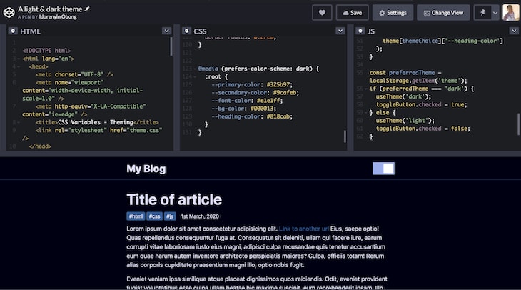
Project 2: Building a sitewide theme
In the second project, we’ll build a light-and-dark theme. The light theme will take effect by default unless the user already has their system set to a dark theme. On the page, we’ll create a toggle button that allows the user to switch between themes.
Open the css-variables-pro folder you created earlier. Inside the folder, create another folder for your second project and name it theming. Or, you can use this command:
# create a new folder called theming
mkdir theming
Next, move into the theming folder.
cd theming
Create three new files.
# create three files namely theme.html, theme.css, and theme.js
touch theme.html theme.css theme.js
This part involves a bit of JavaScript_._ First, open your theme.html and paste the following markup.
<!-- theme.html -->
<!DOCTYPE html>
<html lang="en">
  <head>
    <meta charset="UTF-8" />
    <meta name="viewport" content="width=device-width, initial-scale=1.0" />
    <meta http-equiv="X-UA-Compatible" content="ie=edge" />
    <title>CSS Variables - Theming</title>
    <link rel="stylesheet" href="theme.css" />
  </head>
  <body>
    <header>
      <div class="container">
        <div class="container-inner">
          <a href="#" class="logo">My Blog</a>
          <div class="toggle-button-container">
            <label class="toggle-button-label" for="checkbox">
              <input type="checkbox" class="toggle-button" id="checkbox" />
              <div class="toggle-rounded"></div>
            </label>
          </div>
        </div>
      </div>
    </header>
    <article>
      <div class="container">
        <h1 class="title">Title of article</h1>
        <div class="info">
          <div class="tags">
            <span>#html</span>
            <span>#css</span>
            <span>#js</span>
          </div>
          <span>1st March, 2020</span>
        </div>
        <div class="content">
          <p>
            Lorem ipsum dolor sit amet consectetur adipisicing elit.
            <a href="#">Link to another url</a> Eius, saepe optio! Quas
            repellendus consequuntur fuga at. Consequatur sit deleniti, ullam
            qui facere iure, earum corrupti vitae laboriosam iusto eius magni,
            adipisci culpa recusandae quis tenetur accusantium eum quae harum
            autem inventore architecto perspiciatis maiores? Culpa, officiis
            totam! Rerum alias corporis cupiditate praesentium magni illo, optio
            nobis fugit.
          </p>
          <p>
            Eveniet veniam ipsa similique atque placeat dignissimos
            quos reiciendis. Odit, eveniet provident fugiat voluptatibus esse
            culpa ullam beatae hic maxime suscipit, eum reprehenderit ipsam.
            Illo facilis doloremque ducimus reprehenderit consequuntur
            cupiditate atque harum quaerat autem amet, et rerum sequi eum cumque
            maiores dolores.
          </p>
        </div>
      </div>
    </article>
    <script src="theme.js"></script>
  </body>
</html>
This snippet represents a simple blog page with a header, a theme toggle button, a dummy article, and links to both the corresponding CSS and JavaScript files.
Now, open the theme.css file and paste the following.
:root {
 --primary-color: #0d0b52;
 --secondary-color: #3458b9;
 --font-color: #424242;
 --bg-color: #ffffff;
 --heading-color: #292922;
 --white-color: #ffffff;
}
/* Layout */
* {
 padding: 0;
 border: 0;
 margin: 0;
 box-sizing: border-box;
}
html {
 font-size: 14px;
 font-family: -apple-system, BlinkMacSystemFont, 'Segoe UI', Roboto, Oxygen,
  Ubuntu, Cantarell, 'Open Sans', 'Helvetica Neue', sans-serif;
}
body {
 background: var(--bg-color);
 color: var(--font-color);
}
.container {
 width: 100%;
 max-width: 768px;
 margin: auto;
 padding: 0 1rem;
}
.container-inner {
 display: flex;
 justify-content: space-between;
 align-items: center;
}

/* Using custom properties */
a {
 text-decoration: none;
 color: var(--primary-color);
}
p {
 font-size: 1.2rem;
 margin: 1rem 0;
 line-height: 1.5;
}
header {
 padding: 1rem 0;
 border-bottom: 0.5px solid var(--primary-color);
}
.logo {
 color: var(--font-color);
 font-size: 2rem;
 font-weight: 800;
}
.toggle-button-container {
 display: flex;
 align-items: center;
}
.toggle-button-container em {
 margin-left: 10px;
 font-size: 1rem;
}
.toggle-button-label {
 display: inline-block;
 height: 34px;
 position: relative;
 width: 60px;
}
.toggle-button-label .toggle-button {
 display: none;
}
.toggle-rounded {
 background-color: #ccc;
 bottom: 0;
 cursor: pointer;
 left: 0;
 position: absolute;
 right: 0;
 top: 0;
 transition: 0.4s;
}
.toggle-rounded:before {
 background-color: #fff;
 bottom: 4px;
 content: '';
 height: 26px;
 left: 4px;
 position: absolute;
 transition: 0.4s;
 width: 26px;
}
input:checked + .toggle-rounded {
 background-color: #9cafeb;
}
input:checked + .toggle-rounded:before {
 transform: translateX(26px);
}
article {
 margin-top: 2rem;
}
.title {
 font-size: 3rem;
 color: var(--font-color);
}
.info {
 display: flex;
 align-items: center;
 margin: 1rem 0;
}
.tags {
 margin-right: 1rem;
}
.tags span {
 background: var(--primary-color);
 color: var(--white-color);
 padding: 0.2rem 0.5rem;
 border-radius: 0.2rem;
}
This snippet can be divided into two main sections: the layout section and the custom properties section. The latter is what you should focus on. As you can see, the variables are applied above in the link, paragraph, heading, and article elements.
The idea behind this approach is that, by default, the website uses a light theme, and when the box is checked, the values for the light theme get inverted to a dark variant.
Since you can’t trigger these sitewide changes via CSS, JavaScript is critical here. In the next section, we’ll hook up the JavaScript code necessary to toggle between the light and dark themes.
Alternatively, you could trigger a change automatically via CSS using the prefers-color-scheme media query to detect whether the user requested a light or dark theme. In other words, you can directly update the website to use the dark variants of the light theme.
Add the following snippet to all the CSS code you just wrote.
/* theme.css */
@media (prefers-color-scheme: dark) {
 :root {
  --primary-color: #325b97;
  --secondary-color: #9cafeb;
  --font-color: #e1e1ff;
  --bg-color: #000013;
  --heading-color: #818cab;
 }
}
We are listening to the user’s device settings and adjusting the theme to dark if they’re already using a dark theme.
Update the theme.js file by adding this snippet:
// theme.js
const toggleButton = document.querySelector('.toggle-button');
toggleButton.addEventListener('change', toggleTheme, false);

const theme = {
 dark: {
  '--primary-color': '#325b97',
  '--secondary-color': '#9cafeb',
  '--font-color': '#e1e1ff',
  '--bg-color': '#000013',
  '--heading-color': '#818cab'
 },
 light: {
  '--primary-color': '#0d0b52',
  '--secondary-color': '#3458b9',
  '--font-color': '#424242',
  '--bg-color': '#ffffff',
  '--heading-color': '#292922'
 }
};

function toggleTheme(e) {
 if (e.target.checked) {
  useTheme('dark');
  localStorage.setItem('theme', 'dark');
 } else {
  useTheme('light');
  localStorage.setItem('theme', 'light');
 }
}

function useTheme(themeChoice) {
 document.documentElement.style.setProperty(
  '--primary-color',
  theme\[themeChoice\]['--primary-color']
 );
 document.documentElement.style.setProperty(
  '--secondary-color',
  theme\[themeChoice\]['--secondary-color']
 );
 document.documentElement.style.setProperty(
  '--font-color',
  theme\[themeChoice\]['--font-color']
 );
 document.documentElement.style.setProperty(
  '--bg-color',
  theme\[themeChoice\]['--bg-color']
 );
 document.documentElement.style.setProperty(
  '--heading-color',
  theme\[themeChoice\]['--heading-color']
 );
}

const preferredTheme = localStorage.getItem('theme');
if (preferredTheme === 'dark') {
 useTheme('dark');
 toggleButton.checked = true;
} else {
 useTheme('light');
 toggleButton.checked = false;
}
Now let’s break down the current state of the website.
A user visits the page. The media query prefers-color-scheme determines whether the user is using a light or dark theme. If it’s a dark theme, the website updates to use the dark variants of the custom properties. Let’s say a user isn’t using a dark theme or their OS doesn’t support a dark theme. The browser would default to the light theme, allowing the user to control that behavior by checking or unchecking the box.
Depending on whether the box is checked or unchecked, the useTheme() function is called to pass in the theme variant and save the user’s current selection to local storage. You’ll see why it’s saved in a minute.
The useTheme() function is where all the magic happens. Based on the theme variant passed, a lookup is performed on the theme constant and used to switch between light and dark modes.
The last piece of the puzzle is persisting the current theme, which is achieved by reading the last preferred theme from local storage and setting it automatically when the user revisits the website.
You may be thinking of a million other ways to achieve this. Feel free to go through the code and make as many changes as you see fit.
Here’s what your second project should look like:

Conclusion
By building these simple projects, you can learn how to use CSS variables like a pro. There’s certainly more to them than I explained, so feel free to mess around with the code to explore further.
CSS variables help simplify the way you build websites and complex animations while still allowing you to write reusable and elegant code. To learn more, refer to the documentation on MDN.
Is your frontend hogging your users' CPU?
As web frontends get increasingly complex, resource-greedy features demand more and more from the browser. If you’re interested in monitoring and tracking client-side CPU usage, memory usage, and more for all of your users in production, try LogRocket.

LogRocket is like a DVR for web apps, recording everything that happens in your web app or site. Instead of guessing why problems happen, you can aggregate and report on key frontend performance metrics, replay user sessions along with application state, log network requests, and automatically surface all errors.
Modernize how you debug web apps — Start monitoring for free.
The post How to use CSS variables like a pro appeared first on LogRocket Blog.

Top comments (5)
Pro 😎
Great!
Great article. I didn't know CSS now supports variables! Keep up the great work 👍😊
That's great 👍
Awesome post for anyone with just a bit of CSS and JS knowledge, quite useful. Thanks a lot.