Written by Maks Akymenko✏️
As developers, we often spend a lot of time styling elements. Whether it’s a simple website or a complex application, we can’t make it great without a good deal of CSS. It’s not always as simple as it seems, and some tasks are quite complex. However, if you have the right skills, you can come up with solutions to these problems relatively easily. That’s why practice makes perfect.
One way to practice CSS is to recreate pictures, icons, or drawings with pure CSS. In this tutorial, we’ll create a yin-yang symbol with pure CSS and only one line of HTML. We’ll review the usage of pseudo-classes and different border properties, and you’ll see how easy a task like this can be if you hone your skills and practice regularly.
1. Create a shape
Let’s start with the shape of our yin-yang. As I mentioned before, this exercise requires only one line of HTML:
<div class="yinyang"></div>
Now let’s dive into styling.
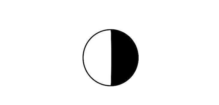
We need to create a round shape and add black and white colors to differentiate the two sides of our yin-yang body. To do so, we’ll use a simple trick with the border-width property:
.yinyang {
  position: relative;
  background: #fff;
  height: 100px;
  border-color: #000;
  border-style: solid;
  width: 50px;
  border-width: 2px 50px 2px 2px;
  border-radius: 50%;
}
We’ll use position: relative to add more shapes inside our body. The tricky part, however, is that we specified our width as a 50px and also set the border-width to 2px 50px 2px 2px.
The border-width property allows us to specify the width of each individual side: top, right, bottom, and left, respectively. You’ll see that we set the right side to 50px, which, combined with the width, adds up to a total of 100px, equal to our height property.
Now we’ve got a square, so we’ll set the border-radius to 50% to make it a circle.
The left side is white because of the background property, and the white side is black because the border-color is set to black.
Pro tip: to center the shape horizontally, just use the flex property on the body, as shown below.
 body {
  display: flex;
  justify-content: center;
}
2. Build inner circles
The concept behind both circles is the same; we’ll use CSS pseudo-elements, such as :before and :after, for that. Pseudo-elements allow you to create elements that are not on the DOM and style a specific part of an element’s content. Best of all, they enable you to add extra styling to a website without adding extra markup.
Let’s start with :before.
.yinyang:before {
  content: '';
  position: absolute;
  top: 0;
  left: 50%;
  background: #fff;
  border: 18px solid #000;
  border-radius: 50%;
  width: 14px;
  height: 14px;
}
Remember, always add a content property to get the pseudo-element to work.
We positioned our first inner circle absolutely, and because our parent has position: relative, the properties top and left are set relative to it. This allows us to center the first inner circle. If you take a closer look, you’ll see that it’s just a white circle with a bold (18px) border around it.
The next step is to do the same with our bottom circle. The only difference is that we’ll invert the colors to generate a black circle with a white border using the :after pseudo-element.
.yinyang:after {
  content: '';
  position: absolute;
  top: 50%;
  left: 50%;
  background: #000;
  border: 18px solid #fff;
  border-radius: 50%;
  width: 14px;
  height: 14px;
}
As you can see, the styling looks almost identical, with the only difference being the colors.
3. Add simple animation
Now we’ll create a simple animation to make our work more interactive. If we want to make it a spinner, for instance, we can add some rolling animation using @keyframes.
We’ll only need two lines of code to make the symbol roll. We’ll call our animation roll and define two properties inside: from as the initial point and to as the finish point.
@keyframes roll {
  from {
    transform:rotate(0deg);
  }
  to {
    transform:rotate(3600000deg);
  }
}
Obviously, we start from 0deg, and we don’t want our animation to ever stop. The huge number ensures that our yin-yang will roll forever.
The last step is to add the animation property to our element, which is actually a shorthand for many different properties, such as animation-name, animation-duration, etc. So let’s add the animation to our .yinyang class.
animation: roll 40000s infinite;
Conclusion
Now you have a finished, continuously rolling yin-yang composed entirely of CSS. More importantly, you’ve learned something new and sharpened your CSS styling skills from this exercise.
Feel free to modify this element or use it as a foundation to create something even cooler. That’s another fun and effective way to polish your CSS skills. If you know the basics, you’ll feel more comfortable when working on complex projects.
Is your frontend hogging your users' CPU?
As web frontends get increasingly complex, resource-greedy features demand more and more from the browser. If you’re interested in monitoring and tracking client-side CPU usage, memory usage, and more for all of your users in production, try LogRocket.
LogRocket is like a DVR for web apps, recording everything that happens in your web app or site. Instead of guessing why problems happen, you can aggregate and report on key frontend performance metrics, replay user sessions along with application state, log network requests, and automatically surface all errors.
Modernize how you debug web apps — Start monitoring for free.
The post How to create a yin-yang symbol with pure CSS appeared first on LogRocket Blog.


Top comments (0)