React Select is a library that can be very helpful when creating select elements in your React application.
It offers a variety of useful features; the one I will be going over is the multi-select option, in particular its use with controlled components.
A multi-select allows a user to choose more than one of the options available to them. Although it is definitely possible to create a regular <select> element that allows multiple options to be selected, doing so can be complicated and cumbersome. (For instance, adding the attribute multiple={true} to <select> does allow a user to select multiple options, but only if they hold down Ctrl or CMD and click, which is decidedly not user friendly.)
React Select simplifies this process, giving you access to a fully functional, already styled multi-select component that is ready to be used in your application.
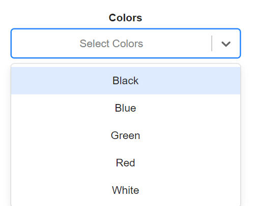
Here is an example of what a multi-select looks like without any additional styling:
Installation
To install react-select, run npm i --save react-select or yarn add react-select.
Implementation
import React from 'react'
import Select from 'react-select'
You can use the default export, Select, in any of your components after importing it from react-select. If you are going to need several similar selects in your application, it can be simpler and cleaner to create your own select component and reuse that, as I have done in the example below. (Although the following is a very basic implementation of Select, using Select in your own reusable component like this gives you the flexibilty to modify your component later and have these modifications apply to every Select in your application.)
function SelectOption({ options }) {
    return(
        <Select
            isMulti
            options={options}
        />
    )
}

export default SelectOption
The options passed into Select as props are the options that a user is able to select. The options must have the following format with both a value and a label specified:
options={[
    { value: 'black', label: 'Black' },
    { value: 'blue', label: 'Blue' },
    { value: 'green', label: 'Green' },
    { value: 'red', label: 'Red' },
    { value: 'white', label: 'White' }
]}
The label is what the user will actually see when choosing an option.
A variety of other props can also be specified in order to further customize Select. One you want to be sure to include if you are creating a multi-select is isMulti. This is a boolean that has a default value of true, but can also be specified as either true or false. (If you do not need a multi-select, you can simply omit use of isMulti.)
Other useful props that can be specified include:
-
isClearable: allows a user to clear the input field with one click instead of removing each element individually -
placeholder: sets text to display before any option is selected -
isSearchable: allows a user to search for options -
className: sets the outer component's className attribute -
classNamePrefix: gives any inner components a prefixed className attribute, which is useful when styling with CSS -
required: makes the selection of an option a requirement for form submission
There are many more props that you can explore if you have the chance. Check out the React Select documentation to see a full list of props and proper usage.
Using Multi-Select in a Controlled Component
When using Select, you are able to specify the props value and onChange, which allows you to use Select as part of a controlled component.
First, you will need to import the useState hook and initialize state within your component.
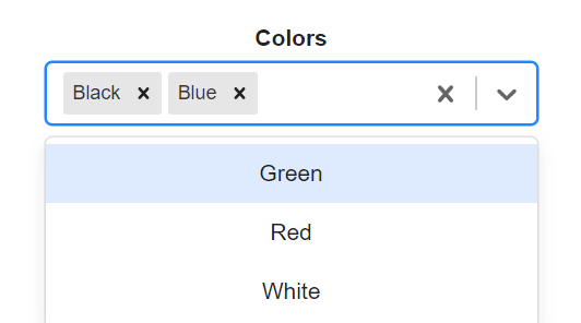
It is important to note that the format of the value of Select when using multi-select will be an array of objects.
You should also note that you do not need to use e.target.value to access the value of Select in your onChange handler. Instead of an event, the new value is passed in to the funtion provided. (React Select also allows you to pass in a second argument that specifies what kind of change event has been fired, allowing for more control over how these events are handled.)
Here is a basic example:
import React, { useState } from "react"
import Select from "react-select"

function Form({ options }) {
    const [selectedOptions, setSelectedOptions] = useState(null)

    return(
        <Select
            isMulti
            options={options}
            value={selectedOptions}
            onChange={setSelectedOptions}
        />
    )
}

export default Form
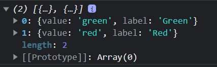
If you are using a multi-select in a form, you might need to reformat your data. Often, you will need an array of the values instead of an array of objects that inclue a value and a label. If you only need the values, the map() method is an easy and convenient way to access the data that you need.
selectedOptions.map(color => color.value)
It is important to note that you cannot change the format in the state that actually controls the component, since the value that Select accepts as props must be an array of objects. You will either need to use a separate piece of state for the modified data or modify the data when the form is submitted.
Conclusion
The features of that I have gone over here are merely the tip of the iceberg that is React Select. There is also the Async component that can load options from an outside source, as well as the Creatable component that allows users to create new options. I strongly encourage you to explore all that this library has to offer.

Top comments (0)