DEV Community

Gaurav Soni
Gaurav Soni

Posted on

2 1

How to override ngx-charts tooltip styles with angular-material theme?

In this article, we will see how we can use angular material with ngx-charts.

What is ngx-charts?

ngx-charts is the charting library built with angular and D3. It is used for data visualizations. It is using Angular to render and animate the SVG elements with all of its binding and speed goodness and uses d3 for the excellent math functions, scales, axis, and shape generators.

ngx-charts come with some default styles for the tooltip, labels, legends, etc.

In this article, we will override the tooltip styles to make it look like as in the material data-visualization guidelines.

Let’s start by creating a new material theme. We are assuming that angular material is already installed. We can create our custom angular theme as follow:-

@import "~@angular/material/theming";
@include mat-core();
$primary: mat-palette($mat-indigo);
$accent: mat-palette($mat-pink, A200, A100, A400);
$theme: mat-light-theme(
(
color: (
primary: $primary,
accent: $accent
)
)
);
@include angular-material-theme($theme);
view raw style.scss hosted with ❤ by GitHub

As a next step, we will create scss mixin which will accept the angular material theme and override the tooltip style for us.
The mixin is like below:-

$white: #fff;
$black: #000;
$chart-tooltip-border-radius: 5px;
$chart-caret-size: 7px solid $white !default;
@mixin charts-tooltip($theme) {
$typography: mat-typography-config();
$foreground: map-get($theme, foreground);
.chart__tooltip-sub-label {
color: mat-color($foreground, secondary-text);
font-size: mat-font-size($typography, body-2);
}
.ngx-charts-tooltip-content.type-tooltip {
@include mat-elevation(3);
background-color: $white !important;
border-radius: $chart-tooltip-border-radius !important;
color: $black !important;
padding: 8px !important;
}
.ngx-charts-tooltip-content.type-tooltip {
background-color: $white !important;
color: $black !important;
}
.ngx-charts-tooltip-content.type-tooltip .tooltip-caret.position-top {
border-top: $chart-caret-size !important;
}
.ngx-charts-tooltip-content.type-tooltip .tooltip-caret.position-right {
border-right: $chart-caret-size !important;
}
.ngx-charts-tooltip-content.type-tooltip .tooltip-caret.position-bottom {
border-bottom: $chart-caret-size !important;
}
.ngx-charts-tooltip-content.type-tooltip .tooltip-caret.position-left {
border-left: $chart-caret-size !important;
}
}
@include charts-tooltip($theme);
view raw style.scss hosted with ❤ by GitHub

We are assuming here the tooltip is consistent throughout the application. So we are good to override the style with !important.
As you can see, we have access to angular material typography, mixins variables, etc. A couple of points to notice:-
  • We are targetting the .ngx-charts-tooltip directly. But we can wrap it in our custom class wrapper to avoid collision with some other components in case we are writing a library. * As the tooltip caret is separate from the tooltip box so we need to override the background color for carets separately(.tooltip-caret.position-right etc). * We are using mat-elevation mixin from angular material to provide the box-shadow to the tooltip. You can read more about it here. * We are also using the secondary-text color from the material theme to make the sub-label looks like the secondary. * We are also getting the font-size from the material typography and making the sub-label as per the material data-visualization guidelines. Although we can also apply the mat-body-2 class in HTML(on span tag in below HTML file) as well I believe it's better to put the related code in the same class as have access to it. We can also override the other things axis labels, legend labels, etc with the material typography and theme.

The basic idea is to have the charts consistent with the material theme. So that if we implement multiple themes, then we can have our ngx-charts styles according to the other themes as well.

Our HTML file will look like:-

<div style="width: 350px; height: 300px">
<ngx-charts-line-chart [results]="data" [xAxis]="true" [scheme]="colorScheme" [showGridLines]="true">
<ng-template #tooltipTemplate let-model="model">
<h3 class="m-none">$15,000</h3>
<span class="chart__tooltip-sub-label">
May 18, 2020
</span>
</ng-template>
<ng-template #seriesTooltipTemplate let-model="model">
<h3 class="m-none">$15,000</h3>
<span class="chart__tooltip-sub-label">
May 18, 2020
</span>
</ng-template>
</ngx-charts-line-chart>
</div>

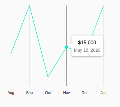
The end result will look like below:-
Alt Text

Stackblitz example:-

Sentry blog image

How I fixed 20 seconds of lag for every user in just 20 minutes.

Our AI agent was running 10-20 seconds slower than it should, impacting both our own developers and our early adopters. See how I used Sentry Profiling to fix it in record time.

Read more

Top comments (0)

Billboard image

The Next Generation Developer Platform

Coherence is the first Platform-as-a-Service you can control. Unlike "black-box" platforms that are opinionated about the infra you can deploy, Coherence is powered by CNC, the open-source IaC framework, which offers limitless customization.

Learn more

👋 Kindness is contagious

Please leave a ❤️ or a friendly comment on this post if you found it helpful!

Okay