
Let’s learn some of the best CSS tips and tricks to boost your workflow and design. These CSS properties will help any developer build a project quickly and efficiently.
I have included the CodePen link at the end of the article, where you can find all these examples in action.
With that said, let’s get started.🤩
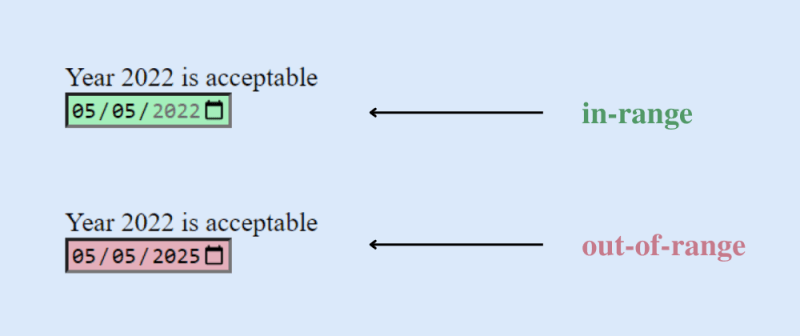
1. CSS :in-range and :out-of-range pseudo-classes
These pseudo-classes are used to style inputs within and outside specified range limits.
(a) :in-range
The input> element is in-range if its current value is between the bounds of the min and max attributes.
This pseudo-class makes it easy to determine whether a field’s current value is acceptable.
(b) :out-of-range
The input> element is out-of-range if its current value is outside the bounds of the min and max attributes.
It gives the user a visual indication if a field value exceeds its range.
CSS Code:
/* in-range */
input:in-range{
background-color: rgba(0, 255, 0, 0.25);
}
/* out-of-range */
input:out-of-range{
background-color: rgba(255, 0, 0, 0.25);
}
Output:
You should know that these pseudo-classes only apply to elements with a range restriction. Without this limitation, the element could not be in-range or out-of-range. Read more here.
2. grayscale( ) function
You can use the value 100% to convert images from color to black and white. When you set this value to 0%, your image will remain the same.
Using a value of 100% will convert your image to black and white. This means that there will be no color in the photograph.
You can use values between 0 and 100% to create a variety of different effects.
CSS Code:
.grayscale-image{
filter: grayscale(100%);
}
Output:

Image before and after applying the grayscale( ) function.
3. Glass Effect
You can add the Glass Effect to your next project using a few lines of code. Yes, it really is that easy. Glass effects are beautiful and add elegance to your design.
Glass.CSS is the most popular glassmorphism generator, where you can create CSS Glass Effects for your project for free. All you need to do is adjust some settings according to your needs and copy-paste the CSS code into your project.
CSS Code:
.glass-effect{
   -webkit-backdrop-filter: blur(6.2px);
   backdrop-filter: blur(6.2px);
   background: rgba(255, 255, 255, 0.4);
   border-radius: 16px;
   border: 1px solid rgba(255, 255, 255, 0.24);
}
Result:

4. Use the following CSS code to style text
These are some very basic text styling tips that everyone should know. However, there are many other advanced options available as well.
CSS Code:
p{
  font-family: Helvetica, Arial, sans-serif;
  font-size: 5rem;
  text-transform: capitalize;
  text-shadow: 2px 2px 2px pink, 1px 1px 2px pink;
  text-align: center;
  font-weight: normal;
  line-height: 1.6;
  letter-spacing: 2px;
}
5. CSS clamp( ) function
The CSS clamp( ) function restricts a value to a range between two upper and lower bounds. There must be a preferred value, a minimum value, and a maximum value.
Clamp( ) comes in handy when font sizes change depending on the viewport.
CSS Code:
p{
  font-size: clamp(1.8rem, 2.5vw, 2.8rem);
}
Want to learn more about the clamp function? Check out the explanation on the MDN web docs.
6. Center a div
The most important task for a developer is centering a div. There are so many other options for centering a div. In this example, we used CSS flexbox to center a div horizontally and vertically.
CSS Code:
div{
  display: flex;
  justify-content: center;
  align-items: center;
}
7. Gradual CSS Linear Gradient
To create a Gradual CSS Linear Gradient, simply use the CSS code below.
CSS Code:
div {
    background: linear-gradient(35deg, #CCFFFF, #FFCCCC, rgb(204, 204, 255));
    border-radius: 20px;
    width: 70%;
    height: 400px;
    margin: 50px auto;
  }
Result:

8. CSS Shake Effect
This "shake" animation effect shakes an input field when a user enters invalid input. It is simple but elegant. For instance, the input field will shake if a user enters numbers in a text field instead of letters.
HTML Code:
<input id="name" type="text" placeholder="Enter your name" pattern="[A-Za-z]*"/>
CSS Code:
input:invalid{
      animation: shake 0.2s ease-in-out 0s 2;
      box-shadow: 0 0 0.4em red;
}
  @keyframes shake {
      0% { margin-left: 0rem; }
      25% { margin-left: 0.5rem; }
      75% { margin-left: -0.5rem; }
      100% { margin-left: 0rem; }
}
Result:

9. Text Overflow
You can use this property to truncate overflowing text. It can be clipped and displayed with an ellipsis (...) or with a custom string.
CSS Code:
.text {
  white-space: nowrap;
  overflow: hidden;
  text-overflow: clip;
  width: 200px;
 }
div.text {
  white-space: nowrap;
  width: 200px;
  overflow: hidden;
  text-overflow: ellipsis;
  border: 1px solid #000000;
}
div.text:hover {
  overflow: visible;
}
10. 'column-count' Property
It specifies the number of columns into which an element should be divided.
CSS Code:
p{
column-count: 2;
}
Result

11. CSS Animations
Animation changes an element’s style gradually. It can only be used if keyframes are specified first. A keyframe describes how an animated element appears at a specific point in an animation sequence.
CSS Code:
div{
  width: 200px;
  height: 200px;
  background-color: blue;
  animation-name: square;
  animation-duration: 8s;
}
@keyframes square{
  from {background-color: blue;}
  to {background-color: black;}
}
12. Shadow Effects
Using CSS, you can add effects both to text and elements. Define properties as text-shadow and box-shadow. Use text-shadow to add shadow to text and box-shadow to add shadow to elements.
(i) text-shadow: It gives the text a shadow.
h1{
  color: blue;
  text-shadow: 2px 2px 4px #000000;
}
Result:

(ii) box-shadow: It is used to give the elements a shadow effect. The actual div in the example below is purple, and the box shadow is sky-blue and is set 10 pixels to the right and bottom.
div{
  width: 200px;
  height: 200px;
  padding: 15px;
  background-color: purple;
  box-shadow: 10px 10px skyblue;
}
Result:

13. CSS Clipping
Using the clip-path property, you can only show a portion of an element while concealing the rest.
CSS Code:
.bg{
  height: 100%;
  width: 100%;
  background-color: rgba(199, 62, 133, 0.9);
  clip-path: polygon(100% 0, 100% 0, 100% 51%, 0 100%, 0 90%, 0 52%, 0 51%);
  position: absolute;
}
Result:

Clippy-CSS **clip-path **maker is a quick and easy way to create complex shapes in CSS by clipping an element to a basic shape (circle, ellipse, polygon, or inset) or an SVG source.
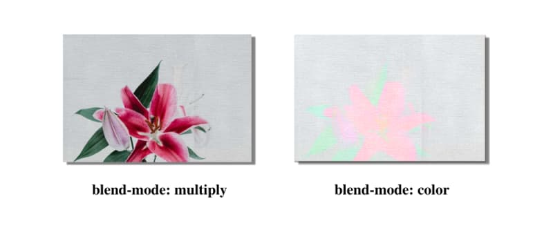
14. CSS background-blend-mode Property
This property describes how the background color and image (or two images) should blend.
A list of blend modes corresponding to each background image makes up the value. Blending mode specifies how background layers blend (color or picture).
You can make stunning backgrounds with the background-blend-mode property.
CSS Code:
div{
   width: 600px;
   height: 400px;
   background-repeat: no-repeat, repeat;
   background-position: center;
   background-image: url("flower.png"), url("background-image.png");
   background-blend-mode: color;
}
Result:
There are some other options available as well. Check this out on W3Schools if you want to learn more about this property.
15. Hue Rotate Animation
Hue-rotate animation can be added to websites’ hero sections and buttons. For example, the hero section of a weather forecasting website will look amazing with this.
CSS Code
button {
  background: linear-gradient(35deg, #8C52FF, #C669FF);
  animation: hue-rotate 3s linear infinite alternate;
}
@keyframes hue-rotate {
  to {
    filter: hue-rotate(85deg);
 }
}
Result

Finally
Thanks for reading! If you enjoyed it, please like it, comment below, and follow me, @ishratumar for more.
You can also follow me on Twitter for helpful tech-related tips and tricks.
And maybe you will love my CodePen and GitHub, where I have already shared some great web development-related tips and cheat sheets.
That’s all for this article; I hope it was helpful. :)
Happy learning ❣

Top comments (0)