
What is CSS Grid?
grid is a css feature that allows us to create page layouts using rows and columns. It kinda reminds me of the old days when we were using tables.
When using grid we always have a parent element and inside that parent element we have n child elements.
On the parent element is where we set the display: grid property and set the page layout establishing the number of rows and columns. This will define how the n child elements inside the parent element are placed in our layout.
Setting a grid container
First step is to create a parent element that will contain n child elements. To do that we have to use the display: grid or display: inline-grid property. Booth create a grid element but there’s a difference between them:
-
display: grid: creates a block level grid element. -
display: grid: creates an inline level grid element.
All the elements inside this grid container will become grid items that will be placed in our rows and columns.
Columns
The columns are the vertical lines of the grid. There’s multiple properties related to grid columns:
-
grid-template-columns: sets the size of each column and how many columns we want in our grid. -
grid-column-start: sets where the column starts in the grid. -
grid-column-end: sets where the column ends in the grid. -
grid-auto-columns: sets the default column size when it’s not specified.
Rows
The rows are the horizontal lines of the grid. As it happens with columns there’s multiple properties related to grid rows:
-
grid-template-rows: sets the size of the rows. -
grid-auto-rows: sets the default row size when it’s not specified.
Gaps
The gaps are the spaces between each row and columns.We have 3 different properties to set the gap:
-
column-gap: sets the gap between columns. -
row-gap: sets the gap between rows. -
gap: sets the gap for both rows and columns.
Lines
The lines between columns are called column lines and the lines between rows are row lines. We can use this to span columns through more than one column.
Example
Setting a 3x3 grid container where each element has a background color.
.container {
  width: 100vw;
  height: 100vh;
  display: grid;
  grid-template-columns: 1fr 1fr 1fr;
  grid-template-rows: 1fr 1fr 1fr;

  color: white;
}

.container__item {
  background-color: blueviolet;
  border: 1px solid red;
}
<div class="container">
      <div class="container__item">1</div>
      <div class="container__item">2</div>
      <div class="container__item">3</div>
      <div class="container__item">4</div>
      <div class="container__item">5</div>
      <div class="container__item">6</div>
      <div class="container__item">7</div>
      <div class="container__item">8</div>
      <div class="container__item">9</div>
</div>
This is the result:
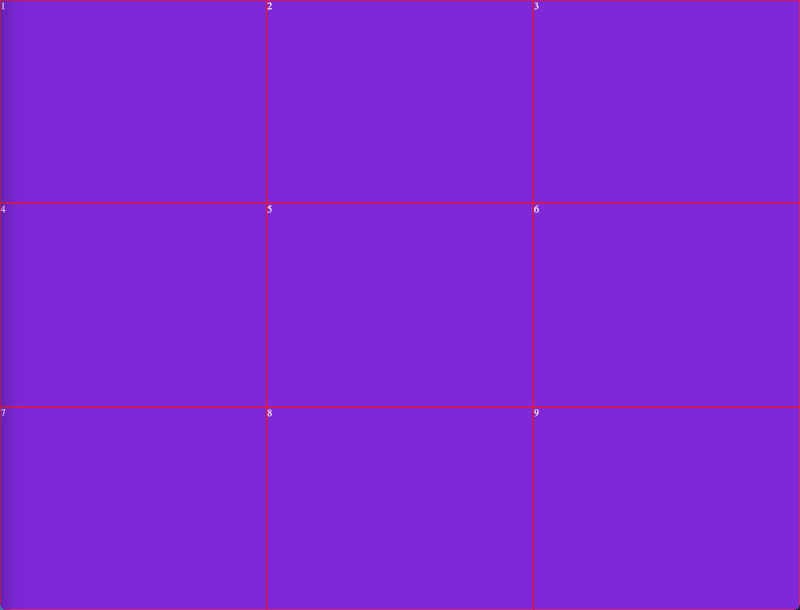
Not beautiful at all but it shows a grid exactly as I defined it in the .container class. 3 rows and 3 columns where each column and row takes 1 fraction of all the available space. I used fr to set the size for the rows and columns. It’s similar to %, the fr takes fractions of all the available space but you can use %, px, rem whatever you need.
Now I will apply some gap between columns and rows. To do so I will add the gap property on my .container class:
.container {
...
  gap: 5px;
...
}
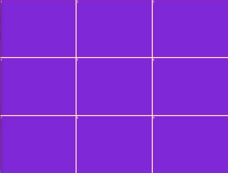
Another option is to set the gap specifically for rows and columns like this:
.container {
...
  column-gap: 5px;
  row-gap: 5px;
...
}
And the result is the same:
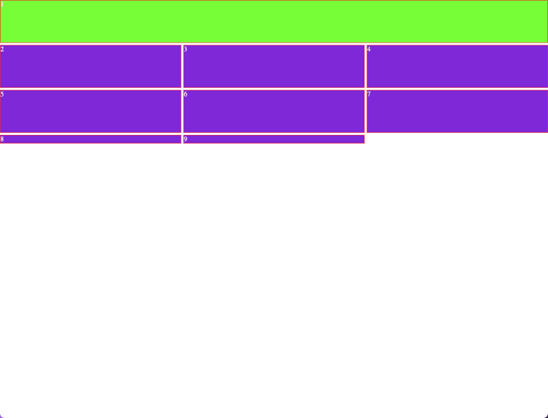
Now I will modify the columns so the first column takes the space of three columns. To do this I have to create a new css class and assign it to the first div.
.container__first__element {
  background-color: chartreuse;

  grid-column-start: 1;
  grid-column-end: 4;
}
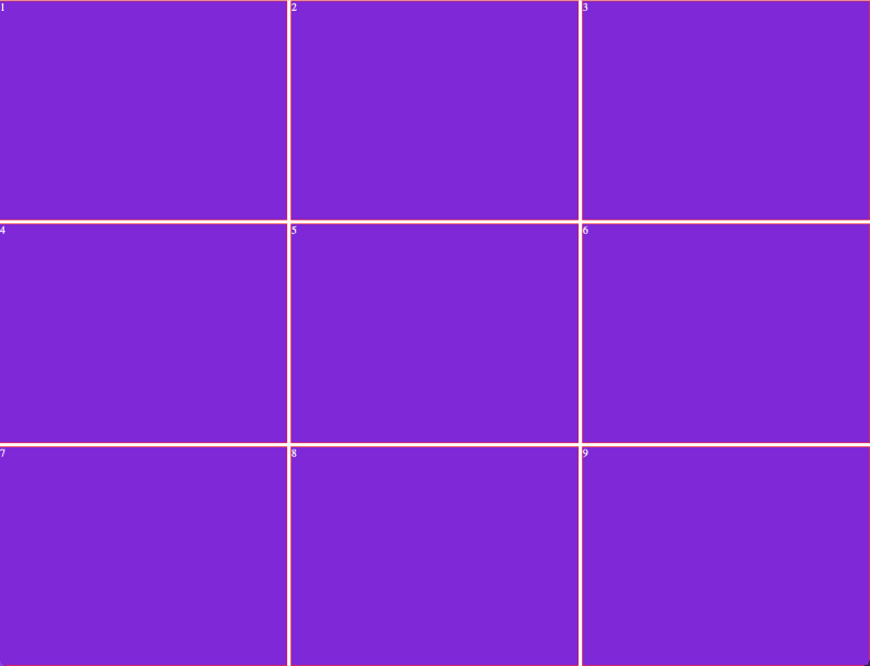
Also I modified the .container class to remove the height: 100vh and changed the grid-template-rows: 1fr 1fr 1fr to set the rows size to 100px and this is the result:
.container {
  width: 100vw;
  display: grid;
  grid-template-columns: 1fr 1fr 1fr;
  grid-template-rows: 100px 100px 100px;

  column-gap: 5px;
  row-gap: 5px;

  color: white;
}
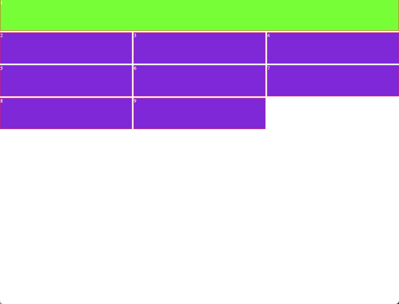
We can observe two thing here, the first element now takes 3 columns space and has a 100px row size as expected but this caused that now we don’t have 3x3 grid instead now this is a 3x4 grid and as I defined the size for 3 rows the fourth row now does not have a size.
To solve this we have two options: change the grid-template-rows to 4 columns or use the grid-auto-rows property I mentioned above to set a default size for when this things happen.
I will go for the second option:
.container {
  …
  grid-auto-rows: 100px;
  …
}
And now all the rows have the same size:
Now I will edit the .container class and rename the .container__first__element class to reuse my code to create a simple layout:
.container {
  width: 100vw;
  display: grid;
  grid-template-columns: 1fr 6.5fr 0.5fr;
  grid-template-rows: 50px 100px 100px;
  grid-auto-rows: 100px;

  column-gap: 5px;
  row-gap: 5px;

  color: white;
}

.container__item {
  background-color: blueviolet;
  border: 1px solid red;
}

.container__nav {
  background-color: chartreuse;
  color: black;

  grid-column-start: 1;
  grid-column-end: 4;
}

.container__sidebar {
    background-color: darkgoldenrod;

    grid-row-start: 2;
    grid-row-end: 6;
}
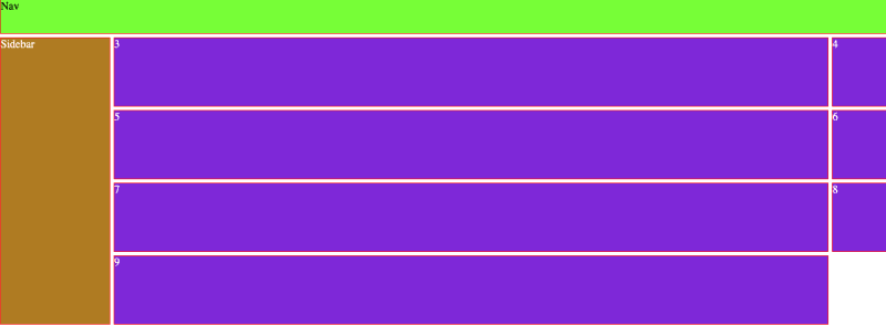
I know the colors are ugly but thanks to the grid it’s so easy to build the layout.
There’s a lot more grid functions but I will keep it to the next post.

Top comments (2)
The colors are a little ugly lol but, great article. Great explanation
Great post