
This is the latest in my series of screencasts demonstrating how to use the tidymodels packages, from starting out with first modeling steps to tuning more complex models. Today’s screencast is a short one! It walks through how we can use tidyverse and tidymodels functions to explore a model after we have trained it, using this week’s #TidyTuesday dataset on student debt inequality. 👩🎓
Here is the code I used in the video, for those who prefer reading instead of or in addition to video.
Explore the data
Our modeling goal is to understand how student debt and inequality has been changing over time. We can build a model to understand the relationship between student debt, race, and year.
library(tidyverse)
student_debt <- read_csv("https://raw.githubusercontent.com/rfordatascience/tidytuesday/master/data/2021/2021-02-09/student_debt.csv")

student_debt


## # A tibble: 30 x 4
## year race loan_debt loan_debt_pct
## <dbl> <chr> <dbl> <dbl>
## 1 2016 White 11108. 0.337
## 2 2016 Black 14225. 0.418
## 3 2016 Hispanic 7494. 0.219
## 4 2013 White 8364. 0.285
## 5 2013 Black 10303. 0.412
## 6 2013 Hispanic 3177. 0.157
## 7 2010 White 8042. 0.280
## 8 2010 Black 9510. 0.321
## 9 2010 Hispanic 3089. 0.144
## 10 2007 White 5264. 0.197
## # … with 20 more rows
This is a very small data set, and we can build a visualization to understand it better.
student_debt %>%
  ggplot(aes(year, loan_debt_pct, color = race)) +
  geom_point(size = 2.5, alpha = 0.8) +
  geom_smooth(method = "lm", se = FALSE) +
  labs(x = NULL, y = "% of families with student loan debt", color = NULL)
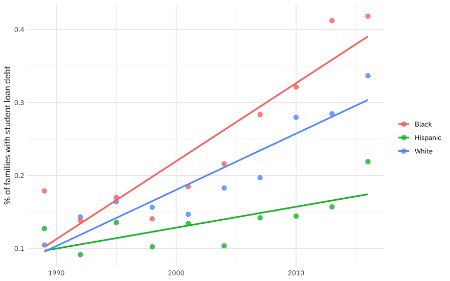
Notice that the proportion of families with student has been rising (dramatically!) but at different rates for different races/ethnicities.
Build a model
We can start by loading the tidymodels metapackage, and building a straightforward model specification for linear regression.
library(tidymodels)

lm_spec <-
  linear_reg() %>%
  set_engine("lm")
Let’s fit that model to our data, using an interaction to account for how the rates/slopes have been changing at different, well, rates for the different groups.
lm_fit <-
  lm_spec %>%
  fit(loan_debt_pct ~ year * race, data = student_debt)

lm_fit


## parsnip model object
##
## Fit time: 1ms
##
## Call:
## stats::lm(formula = loan_debt_pct ~ year * race, data = data)
##
## Coefficients:
## (Intercept) year raceHispanic raceWhite
## -21.161193 0.010690 15.563202 5.933064
## year:raceHispanic year:raceWhite
## -0.007827 -0.002986
What do we do with this now, to understand it better? We could tidy() the model to get a dataframe.
tidy(lm_fit)


## # A tibble: 6 x 5
## term estimate std.error statistic p.value
## <chr> <dbl> <dbl> <dbl> <dbl>
## 1 (Intercept) -21.2 2.58 -8.20 0.0000000204
## 2 year 0.0107 0.00129 8.29 0.0000000166
## 3 raceHispanic 15.6 3.65 4.26 0.000270
## 4 raceWhite 5.93 3.65 1.63 0.117
## 5 year:raceHispanic -0.00783 0.00182 -4.29 0.000250
## 6 year:raceWhite -0.00299 0.00182 -1.64 0.114
However, I find it hard to look at model coefficients like this with an interaction term and know what it is going on! This is also true of many kinds of models where the model output doesn’t give you a lot of insight into what it is doing.
Explore results
Instead, we can use augment() to explore our model in a situation like this. The augment() function adds columns for predictions given data. To do that, we need some data, so let’s make some up.
new_points <- crossing(
  race = c("Black", "Hispanic", "White"),
  year = 1990:2020
)

new_points


## # A tibble: 93 x 2
## race year
## <chr> <int>
## 1 Black 1990
## 2 Black 1991
## 3 Black 1992
## 4 Black 1993
## 5 Black 1994
## 6 Black 1995
## 7 Black 1996
## 8 Black 1997
## 9 Black 1998
## 10 Black 1999
## # … with 83 more rows
This is way more points than we used to train this model, actually.
Now we can augment() this data with prediction, and then make a visualization to understand how the model is behaving.
augment(lm_fit, new_data = new_points) %>%
  ggplot(aes(year, .pred, color = race)) +
  geom_line(size = 1.2, alpha = 0.7) +
  labs(x = NULL, y = "% of families with student loan debt", color = NULL)

This is a flexible approach, and if our model had more predictors, we could have made visualizations with small multiples. I have even made Shiny apps in the past to help understand what a very detailed model is doing. Keep this function in mind as you build your models!

Top comments (0)