
**INTRODUCTION TO CSS GRID**
CSS grid is a two dimensional layout style that afford us the ability to create grid and place them on a webpage, it also give to us the ability to insert an element inside the grid and place the element as we wish. It has a two directions with columns coming down and rows going across.
The easiest way to make a complex web design with different columns and multiple row is the css flex grid. It is superior to css flexbox but both can be used on same web design project.
**Grid Container**
The first thing is to take a div or an element and display grid, by displaying grid that open the ability to use grid on the div or the element.

**Display Grid **
To make the above markup a grid, you add display grid to the div with class of container, this won’t change the layout of the element on the webpage.

**Grid-Template-Columns**
To specify the number of columns needed inside a grid is very easy to achieve; you can decide to have one, two, three or four column.
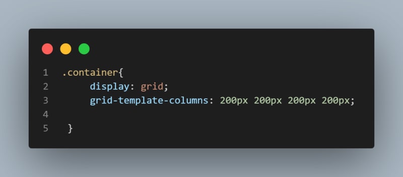

The above code shows that the container has 4 column grid of 200px each; we can as well make each column a different width.
To make the code in above snippet to look more enticing as we have repeated the use of 200px 4 times, we can set our grid-template-columns to the code below using a repeat function.

The first parameter inside the repeat function defines the number of repetition, while the second represent what to repeat; but to design your website to be responsive which is a core part of designing, instead of specifying the column in pixel or in percentage, there is a responsive unit in css grid which is fr.
The fractional unit calculates the available space in the grid container.


As you can see from the result, the first, third and fourth column has 1fr has value, while 2fr was set as value for the second column; we can as well use the repeat function on the fr unit.
**Grid-Template-Rows**
Similar to grid-template-columns, we have grid-template-rows which is primarily used to define the height and the number of rows in our grid container.

**Grid-Auto-Rows**
The grid property, grid-auto-rows affects rows when the size is not set initially.
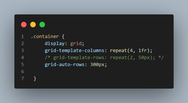

Like I said earlier, the grid-auto-rows will only affects the grid container if the row was not initially set, but it won’t have any effect if the row is set.

setting the grid-auto-rows as above means content inside the element is prone to overflow because we have set the fixed height; to prevent this occurrence, there is a feature that is known as minmax().
**Minmax().**
The minmax function embedded in css grid enable us to set the value of both our columns and rows as we desired. This function as you can deduce from its name takes two values the minimum and the maximum values.

The above code shows that the grid-template -rows was set with minmax() that set its minimum row value to 100px and set the maximum value auto.

** Gap.**
We can add gap or space between our column and rows in css grid using gap.

With gap property set to 10px, both the column and the rows will have a spacing of 10px.

With css grid, it is possible to change the position of an items to any rows or columns as you deem fit; this to me is why grid outperform flexbox as you can literally change your layout as you wish.
** Grid-column**
Grid-column is used to span the item along the column axis; with this property, you can conveniently place your items anywhere you want in the grid.

As you can see from the above code, the grid-column property set to .b0x-1 was set to start from line 1 and end at line 7 of the 6 column grid.

**Grid-rows**
This property is similar to grid-column, but instead of working on columns, the grid property grid-row works on rows.
It is used to place the items in any rows within the layout.

The code above will place the .box-1 to start at row 1 and end at line 4.
** Grid-Templates-Areas**
This is one of the most interesting property in css grid, with this property you can literally configure and reconfigure your layout by giving specific names to the area on your grid.


The above results shows that grid-template-areas was set on the grid container, with each row defined by an apostrophe (‘ ’) or quotation mark (“ “).
**Grid-Area**
Based on the above code, after the grid-template-areas has been set, the next step is to procced to the grid item in this case than main, section, aside and footer tags and set the grid area as appropriate.
See below for the code that produced above result.

**Justify-items**
This is use to align items in a grid along the row axis; the justify-items has a default value of stretch, but it does have three other values like start, end and center.
**align-items**
Similar to justify-items but, it is use to align items in a grid along the column axis; the justify-items has a default value of stretch, but it does have three other values like start, end and center.
**Justify-content**
Justify-content is used mainly when the grid size is smaller than the grid container, hence the property will be used to place grid content on row axis.
This property has a default value of start, but it has stretch, center, end, space-around, space-between, and space-evenly.
**align-content**
Just like justify-content, align-content is used mainly when the grid container has a fixed height, hence the property will be used to place grid content on column axis.
This property has a default value of stretch, but it has start, center, end, space-around, space-between, and space-evenly.
**align-self**
Align-self is used on the grid children itself, as it used to align the items along the column axis.
**justify-self**
Justify-self is used on the grid children itself, as it used to align the items along the row axis.

**Conclussion**
This is a quick round down of the popular css grid, and i hope you will find this article helpful.

Top comments (0)