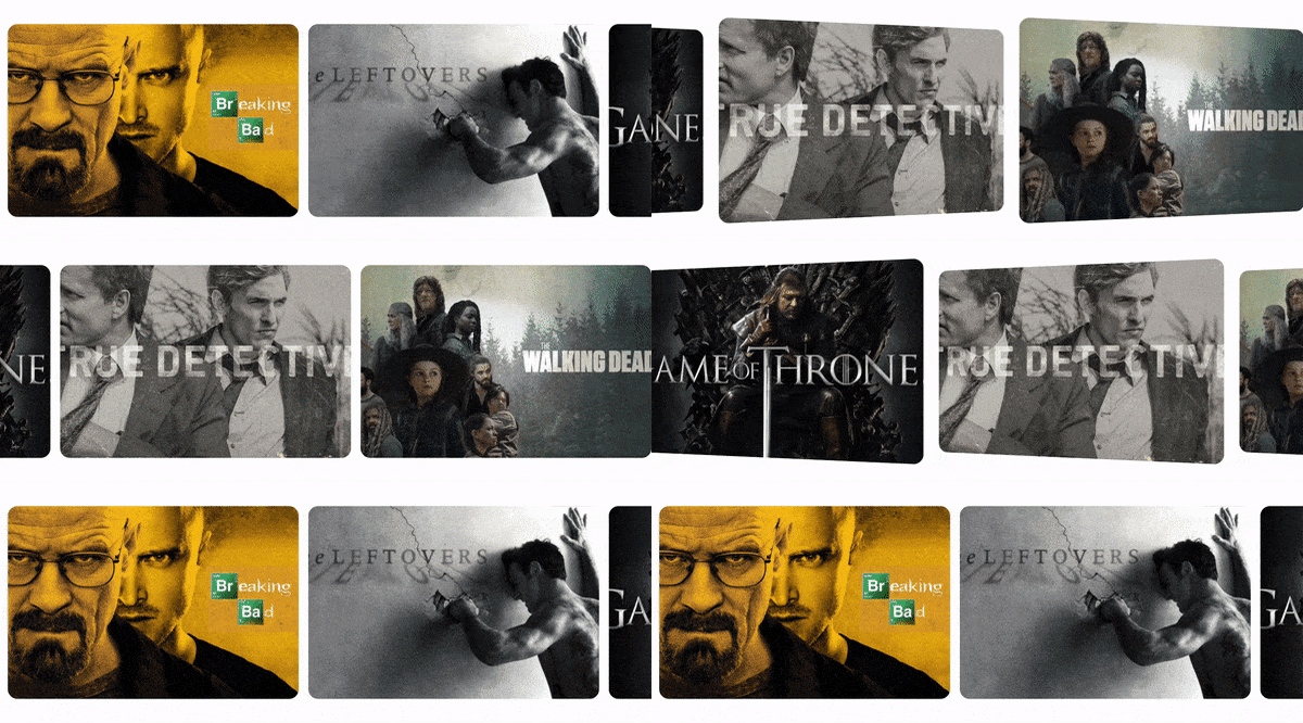
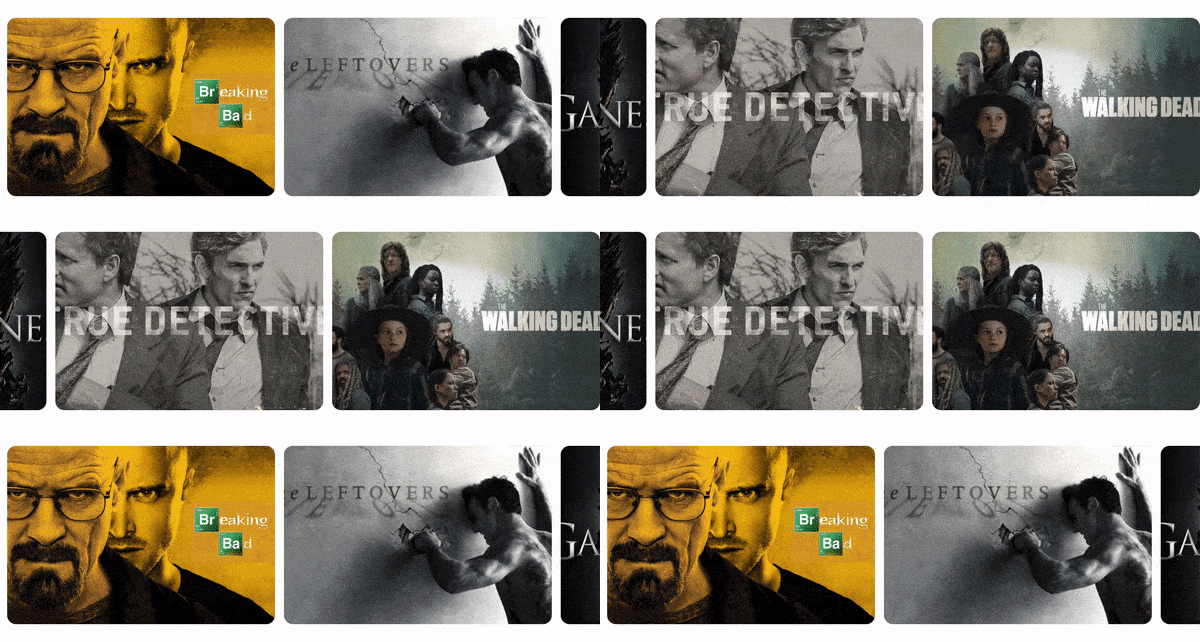
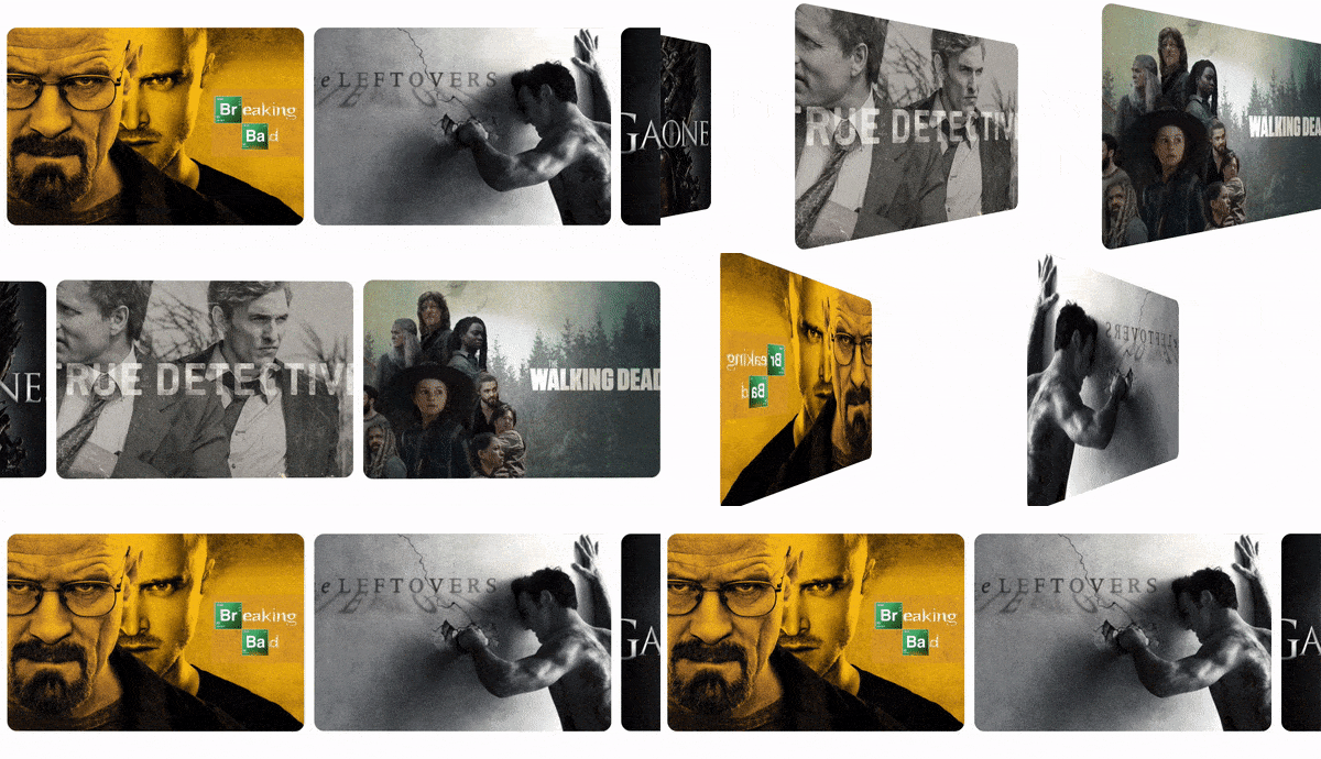
In this tutorial, we'll create a fun scroll animation in which items "flip" in the direction of the scroll. We're going to use react-spring for animating and react-use-gesture to tie animation to the scroll events. The native onScroll event handler won't do in this case, because we'll need additional information about scrolling that native onScroll handler doesn't provide - scroll delta in pixels, and whether the scrolling is in progress or not.
This is what we're going to build:
Basic setup
We'll start with the basic React component you can see below. The component renders a list of images from public folder, and sets them as background for div elements:
Next, we'll apply some styling. We need to make sure that the container takes up 100% of the width and it allows its children to overflow:
With the basic styling, our component will look like this:
Adding animation
Let's start by adding a rotation animation. First, we'll replace div element with animated.div. animated is a decorator that
extends native elements to receive animated values. Every HTML and SVG element has an animated counterpart that we have to use if we intend to animate that element.
Next, we'll use useSpring hook from react-spring package to create a basic animation that will run when the component is mounted. Eventually, we'll bind our animation to the scroll event, but for the time being, it will be easier to see the result of the changes that we make if animation simply runs on mount.
useSpring hook takes an object with CSS properties that should be animated. These properties should be set to end values of the animation, so if we want to rotate divs from 0 to 25 degrees, we set the transform value to rotateY(25deg). To set the initial values, we use from property which itself takes an object with CSS properties.
useSpring hook returns a style object that we need to set on the target component. We can see the updated code and the result below:
This animation looks flat because by default the rotation is 2-dimensional, it's rendered as if there were no distance between the user observing the animation and the rotation plane. perspective transformation allows us to move the observation point away from the rotation plane, and thus makes 2-dimensional animation look 3-dimensional:
Finally, we need to add vertical padding to the container div to make sure that children elements don't get cut off:
Binding animation to scroll
Before we start working with scroll events, we need to make a small change to how we use useSpring hook. There are two things to keep in mind:
- we need to be able to trigger animation manually
- we no longer need to run animation on mount
To address both of these issues, we'll use a different useSpring signature - instead of passing an object with CSS properties, we'll pass a function that returns an object with CSS properties. Previously, useSpring hook returned us a style object
. With the new signature, it will return a tuple, where the first argument is a style object, and the second argument is a set function that we can call anytime to trigger the animation.
We can also drop from property since this value will be determined based on the current rotation of the divs:
Now we can import useScroll hook from react-use-gesture package and bind it to the container div. The logic for handling scroll events is very simple - if the user is scrolling (event.scrolling === true), we want to rotate cards by the number of degrees equal to scroll delta on Y-axis (event.delta[0]); if scrolling stops, we want to reset the rotation angle to 0:
Animation works, but there is an undesired side-effect - if we scroll sharply, the Y delta will be quite big, which may cause cards to flip more than 90 degrees. I've tested different values and discovered that the animation looks best if the cards flip no more than 30 degrees. We can write a helper function to clamp the delta value so it never gets more than 30 and less than -30:
Now we can use this helper function to clamp Y delta inside useScroll hook and get the final result:
You can find a complete working demo of this interaction here.
PS: I also made the same interaction using framer-motion. working demo is available here.
If you want to get more tutorials like this one, make sure to subscribe to my newsletter.
Final thoughts
I would like to mention two decisions that stayed behind the curtain of this tutorial but had been made before making this particular animation.
The first decision concerns performance. To make the flip animation, we animated only transform property, which is one of the only two properties that are accelerated by GPU and that don't take time off the main thread (the other property is opacity). There's quite a lot we can achieve by animating only transform and opacity, and whenever possible, we should avoid animating any other CSS properties.
Secondly, we need to consider responsiveness. Horizontal scroll that we implemented works well on phones and tablets, but for larger desktop screens we might want to use a more common grid layout. With small CSS changes and a media query we can switch from flex to grid layout, and we don't have to change the animation at all - it will continue working on small screens that use flex layout, and it will be ignored on large screens since with grid layout we won't have horizontal scroll.


Top comments (1)
Great tutorial! Thanks for this!