
Written by Rose Chege✏️
Glassmorphism is a cool UI design trend that allows you to create an amazing illusion of glass in your application artwork. It also can provide a frosty effect that feels like a blurred or floating image. This creates a visual hierarchy in your UI, allowing you to draw attention to the content you intend to highlight.
Here's an example of a portfolio website header with the glassmorphism effect:
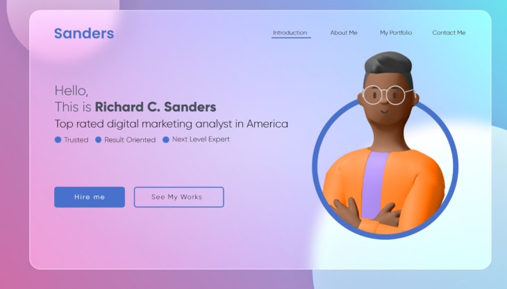
Glassmorphism achieves this by creating contrast with a semi-transparent background for the object that is positioned above the set background.
This guide will discuss the concept of glassmorphism and a step-by-step illustration of how you can achieve this effect in a React application. We will implement a simple to-do application coupled with the glassmorphism effect on the form and each task card.
Prerequisites
In order to understand this article, you should have the following:
- Working knowledge of React
- Working knowledge of Material UI
- Node.js installed on your computer.
Setting up a React application using Create React App
Create React App is a tool provided by the React team that allows you to bootstrap a single page application in React.
Navigate to a project directory of your choice and initialize the React application using TypeScript and the following command:
npx creat-react-app react-glassmorphism-app --template typescript
Then proceed to the newly created React app directory:
cd react-glassmorphism-app
And start the React development server to check if the bootstrapped boilerplate is working:
npm run start
On your default browser, the boilerplate React page will be loaded on http://localhost:3000/ to indicate that everything is in order.
Implementing the to-do form
To create a new task, we need to set up a form that will allow the user to add details of the task and then add it to the to-do list. Navigate to the src/App.tsx and implement a to-do form as illustrated below.
Import App.css at the top. We will use this file to add the CSS class to style the to do form and the task cards:
import './App.css';
Edit the render function and add a form with title and description fields as follows:
<div className="todos-container">
    <form className="form">
        <div className="form-group">
            <label htmlFor="title">Title</label>
            <input type="text" id="title" placeholder="Enter todo's title" name="title" required />
        </div>
        <div className="form-group">
            <label htmlFor="description">Description</label>
            <textarea id="description" placeholder="Describe the todo" name="description" required />
        </div>
        <div className="form-group">
            <button type="submit" class="form-submit-btn">
                Add todo
            </button>
        </div>
    </form>
</div>
This will create a todos-container that has a simple form. The form will have the fields title for adding a task title, description for adding the task description, and a submit button for submitting the details.
The next step is to style this form. Navigate to the src/App.css file and add the following styles.
To style the todos-container class:
.todos-container{
    /* Entire page width */
    width:100%;
    /* Entire page height */
    height:100vh;
    /* Responsive layout */
    display:flex;
    /* Display on top of the other */
    flex-direction: column;
    /* Display horizontally at the center */
    align-items: center;
    /* Smooth transition to bottom right with different colors */
    background-image: linear-gradient(to bottom right, #fc0345,#fc03b1,#4a03fc);
    /* To cover the entire screen */
    background-size:cover;
    /* Image position */
    background-position:center;
    /* To not repeat the image beyond it's scale */
    background-repeat:no-repeat;
}
To style the form class:
.form{
    /** Sizeable width for the form **/
    width:400px;
    /** Sizeable height for the form **/
    height:300px;
    /** Black color with opacity **/
    background-color:rgba(0,0,0,0.5);
    /** Responsive layout **/
    display:flex;
    /** One element on top of the other **/
    flex-direction:column;
    /** Vertically at the center **/
    justify-content: center;
    /** Smooth corners **/
    border-radius:10px;
    /** Top, bottom, right, and left spacing between form and it's content **/
    padding:20px;
    /** Spacing from the top **/
    margin-top:10px;
}
To style the form-group class:
.form-group{
    /** Bottom space between one form-group and the other **/
    margin-bottom:20px;
    /** Responsive layout **/
    display: flex;
    /** One element on top of the other **/
    flex-direction: column;
}
To style the label:
.form-group label{
    /** Medium font size **/
    font-size:16px;
    /** Visible color **/
    color:white;
    /** Bottom space between it and the input form **/
    margin-bottom:5px;
}
To style the form inputs:
.form-group input[type="text"],textarea{
    /** Size-able width of the input **/
    width:90%;
    /** Size-able height of the input **/
    height:40px;
    /** Smooth corners on all edges **/
    border-radius:5px;
    /** No line sorrounding the input **/
    border:none;
    /** Top, right, bottom, right spacing to where content starts **/
    padding:10px;
    /** Medium font **/
    font-size:16px;
    /** Visible color **/
    color:white;
    /** Dark background with some opacity **/
    background-color:rgba(0,0,0,0.5);
}
To style the submit form button:
.form-group .form-submit-btn{
    /** Take up the entire available width **/
    width:100%;
    /** Sizeable height **/
    height:40px;
    /** Smooth corners at all edges **/
    border-radius:5px;
    /** No line on the outline **/
    border:none;
    /** Greyish color **/
    background-color:rgba(255,255,255,0.5);
    /** Color of text **/
    color:black;
    /** Medium sized font **/
    font-size:16px
    /** Display a pointer when mouse is over it **/
    cursor:pointer;
}
Adding a glassmorphism effect to a React app
To add the glassmorphism effect to our form, we will add the following styles to our .form class:
A linear gradient as the background image:
/** Smooth transition to the bottom from a greyish to a less greyish color **/
background-image:linear-gradient(to bottom right, rgba(255,255,255,0.2), rgba(255,255,255,0));
A backdrop filter:
/** A blur effect behind the form **/
backdrop-filter: "blur(10px)";
A box-shadow:
/** Thick box shadow with a greyish background on the right, bottom, with a blurred shadow **/
box-shadow: 10px 10px 10px rgba(30,30,30,0.5);
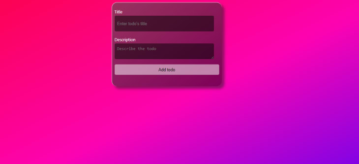
After adding these styles, refresh your previously http://localhost:3000/ opened tab. The form should apply the below glassmorphism effect:
Making the form responsive
To make the form responsive, we will get the user inputs and store them in a state in our component. Navigate to the src/App.tsx file and do the following:
Import the useState hook from react:
import {useState} from 'react';
Define an interface for the to-do. An interface will describe the structure of each task on the to-do list:
interface Todo {
    title: string;
    description: string;
}
Define state:
// our saved todos starting with an empty string
const [todos, setTodos] = useState([] as Todo[]);
// title of a todo starting as an empty string
const [title, setTitle] = useState('' as string);
// description of a todo starting as an empty string
const [description, setDescription] = useState('' as string);
Add an onChange event to the title field. The event will get the user's input and save it on the current title's state. Also, set the value of the title to be the current title on the state:
<input type="text" onChange={e => setTitle(e.target.value)} id="title" placeholder="Enter todo's title" name="title" value={title} required/>
Add an onChange event to the description field. The event will get the user's input and save it on the current description's state. Also, set the value of description to be the current description on the state:
<textarea id="description" onChange={e => setDescription(e.target.value) } placeholder="Describe the todo" name="description" value={description} required />
Construct a function to handle the form submission event:
const handleSubmit = (e: React.FormEvent<HTMLFormElement>) => {
    // Prevent executing the default form submission event
    e.preventDefault();
    // Structure our todo from the current state
    const todo = {
    title,
    description,
    };
    // Add the todo to the state
    setTodos([...todos, todo]);
    // Clean the title state
    setTitle('');
    // Clean the description state
    setDescription('');
};
Finally, connect the function to the form:
<form className="form" onSubmit={handleSubmit}>
Showing a task card with a glassmorphism effect
After saving the tasks, we need to show them to the user. We will be checking if our state has saved tasks. If it has, we map through them. If it does not, we show a message that we have no saved tasks.
After the form, we will add a condition to check whether we have saved tasks. If the tasks have been saved, we loop through them:
{
    todos.length > 0 ? (
        <ul className="todos-list">
        {
          todos.map((todo, index) => (
            <li key={index} className="todo-item">
              <h3>{todo.title}</h3>
              <p>{todo.description}</p>
            </li>
          ))
        }
      </ul>
    ) : (
        <p className="no-todos">No todos yet</p>
    )
}
At first, you will see the text No todosyet. However, if you fill in the form and submit it, you will be able to see your task. You should also note that when you refresh the page, you won't see the tasks you saved earlier because they are stored on the state.
Let's add some style to the no-todos class to make it more visible. Navigate to the src/App.css file and implement the following stylings:
.no-todos{
    /** White text color **/
    color:white
    /** Medium font **/
    font-size: 20px;
    /** Bold style **/
    font-weight: bold;
}
To style the todos-list class:
.todos-list{
    /** Top and bottom outer spacing of 10px and centered **/
    margin: 10px auto;
    /** No inner spacing **/
    padding:0px;
    /** No list style **/
    list-style:none;
    /** Half of the parent's width **/
    width: 50%;
}
To style the todo-item class:
.todo-item{
    /** Black with opacity **/
    background-color:rgba(0,0,0,0.5);
    /** Smooth transition from a greyish to a less greyish color **/
    background-image:linear-gradient(to bottom right, rgba(255,255,255,0.2), rgba(255,255,255,0));
    /* A blur effect behind the card */
    backdrop-filter: "blur(10px)";
    /** A think greyish shadow for the card to the right, bottom with a blurred shadow **/
    box-shadow: 10px 10px 10px rgba(30,30,30,0.5);
    /** Inner spacing between elements **/
    padding: 10px;
    /** Smooth corners on all edges **/
    border-radius:20px;
    /** Bottom spacing **/
    margin-bottom:10px;
}
Make sure your development server is still running, and your page should resemble this image:

Conclusion
The general glassmorphism idea is to have a semi-transparent blur on an object, giving the impression of frosted glass. It mainly uses the backdrop-filter to these blur properties. Other CSS properties such as colors, border radiuses, borders, and shadows can be modified to fit your application preferences. The glassmorphism effect complements standalone design components such as content cards, navigation bars, and sidebars.
I hope you found this article helpful!
Full visibility into production React apps
Debugging React applications can be difficult, especially when users experience issues that are hard to reproduce. If you’re interested in monitoring and tracking Redux state, automatically surfacing JavaScript errors, and tracking slow network requests and component load time, try LogRocket.

LogRocket is like a DVR for web and mobile apps, recording literally everything that happens on your React app. Instead of guessing why problems happen, you can aggregate and report on what state your application was in when an issue occurred. LogRocket also monitors your app's performance, reporting with metrics like client CPU load, client memory usage, and more.
The LogRocket Redux middleware package adds an extra layer of visibility into your user sessions. LogRocket logs all actions and state from your Redux stores.
Modernize how you debug your React apps — start monitoring for free.

Top comments (0)