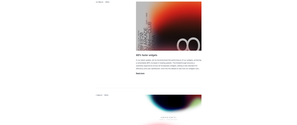
Happy March everyone! Today we are building super simple but useful sticky changelog.
Why sticky? You my wonder...
Clarity and Context: Dates in changelogs offer a clear timeline, helping understand when changes happened—essential for tracking software evolution.
Ease of Use: Sticky dates improve navigation in changelogs, making it easier to locate recent updates or specific changes without excessive scrolling.
Version Management: Visible dates assist in managing and comparing software versions, especially when they're closely tied to release dates.
Transparency and Trust: Regular updates with visible dates show active maintenance, building trust through transparency and a commitment to improvement.
Regulatory Compliance: For regulated projects, a detailed changelog with dates is crucial for compliance, serving as a record for audits or certifications.
User Engagement: A well-maintained changelog with visible dates keeps users informed about updates, encouraging them to engage with new features and improvements.
The main classes
lg:sticky: This class applies the sticky positioning to the element, making it stick to the top of its container when you scroll past it. The sticky behavior is only activated on larger screens (lg:prefix) to accommodate typical responsive design practices.top-0: This class ensures that the sticky element aligns at the top of the viewport when it becomes "stuck." It's crucial for defining the point at which the sticky behavior triggers.lg:pb-16: While not directly related to the sticky behavior, this padding class ensures there's space below the sticky element. It's important for maintaining a consistent layout and ensuring the sticky element doesn't overlap or clutter content below it when it sticks.grid grid-cols-1 lg:grid-cols-3 gap-12 lg:gap-32: These classes define the grid layout for the component. The sticky behavior works within the context of this grid, allowing the sidebar (where the date is shown) to stick while the user scrolls through the changelog entry. The responsiveness (lg:prefix) ensures the layout adjusts for different screen sizes.
<!-- Mapping through each entry in the changelogEntries array -->
{
  changelogEntries.map((entry) => (
    <!-- Main container for a single changelog entry, using CSS grid for layout -->
    <div class="grid grid-cols-1 lg:grid-cols-3 gap-12 lg:gap-32 ">
      <!-- Container for the date part of the entry -->
      <div>
        <!-- Sticky container for the date to ensure it sticks while scrolling on large screens -->
        <div class="lg:sticky lg:pb-16 top-0">
          <!-- Padding top for aesthetic spacing -->
          <div class="pt-8">
            <!-- Displaying the date of the entry, which is the one staying sticky -->
            <p>{entry.date}</p>
          </div>
        </div>
      </div>
      <!-- Container for the main content of the changelog entry -->
      <div class="lg:col-span-2 pt-8">
        <div class="flex-shrink-0">
          <!-- Your content -->
        </div>
      </div>
    </div>
  ))
}
And there you have it, folks—simpler than you thought, right?
By weaving this nifty trick into your project, you're not just tweaking a feature; you're taking a giant leap towards enhancing the user experience. It's these small changes that can make a big difference, transforming the mundane into something remarkable. So, go ahead, give it a try, and watch how a simple sticky changelog can elevate your project's UX to new heights. Here's to making the complex beautifully simple. Happy coding!


Top comments (0)