
With the matplotlib and seaborn libraries it's easy to make charts in Python, but the default settings can result in an ugly looking chart. This might not be a problem if you only need the chart for your own purposes but if you’re going to share it you may wish to improve its appearance and make it easier to interpret.
Improving the chart’s appearance can be done with some simple changes. However, the documentation can be overwhelming for those new to coding/python and often its not obvious where to add the various code snippets to your chart code.
In this post, I’ll show you, step-by-step, a simple example of how I improved the default bar chart from this:
…to this:

First, let’s import the libraries and create some dummy data to create the charts with.
# import libraries
import pandas as pd
import matplotlib.pyplot as plt
import seaborn as sns

# create and view data
severity = ["High", "Medium", "Low"]
freq = [10, 25, 50]
data = pd.DataFrame(list(zip(severity, freq)),
               columns =['severity', 'freq'])

# view the data
data
So, we have a data-frame containing 2 columns and 3 rows, showing the number of accidents for each level of severity (High, Medium, Low):

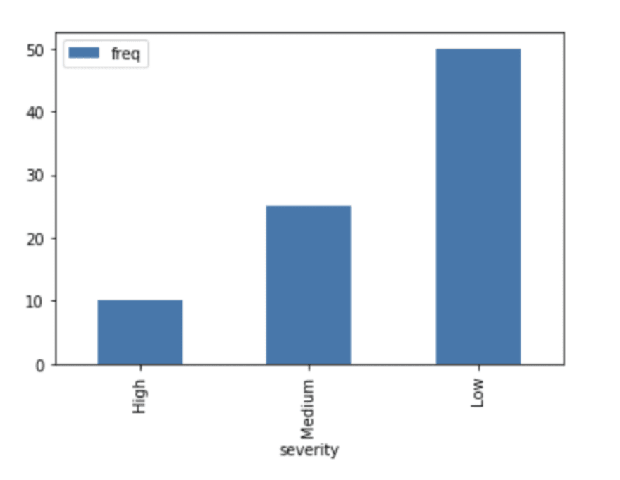
The Default Plots
Using just the matplotlib library, we can create a bar chart with this one, simple line of code:
# default matplotlib bar plot
data.plot.bar(x="severity", y="freq")
…but it doesn’t look great:

It outputs text above the chart that we don’t want, the x axis tick labels are vertical, and it just doesn’t look very professional.
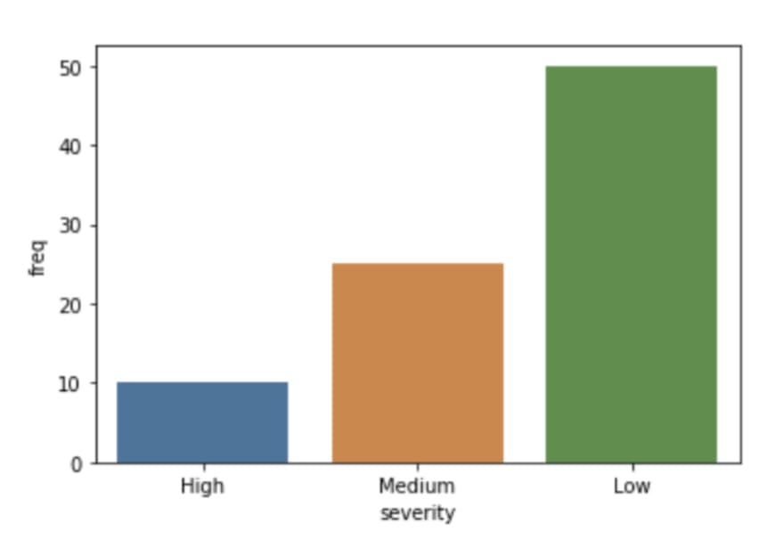
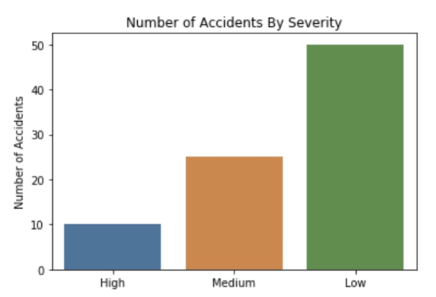
The seaborn default looks a little better:
# default seaborn bar plot
sns.barplot(data=data, x="severity", y="freq")

This also displays unwanted text above the plot but at least the x axis tick labels are horizontal and so easier to read. Still, there’s a lot that can be improved.
Remove the Unwanted Text
To remove the unwanted text above the plot, add a semicolon to the end of the code. This applies to both the matplotlib and seaborn plots. From this point, we’ll work on improving the seaborn plot.
# without the matplotlib text
sns.barplot(data=data, x="severity", y="freq");
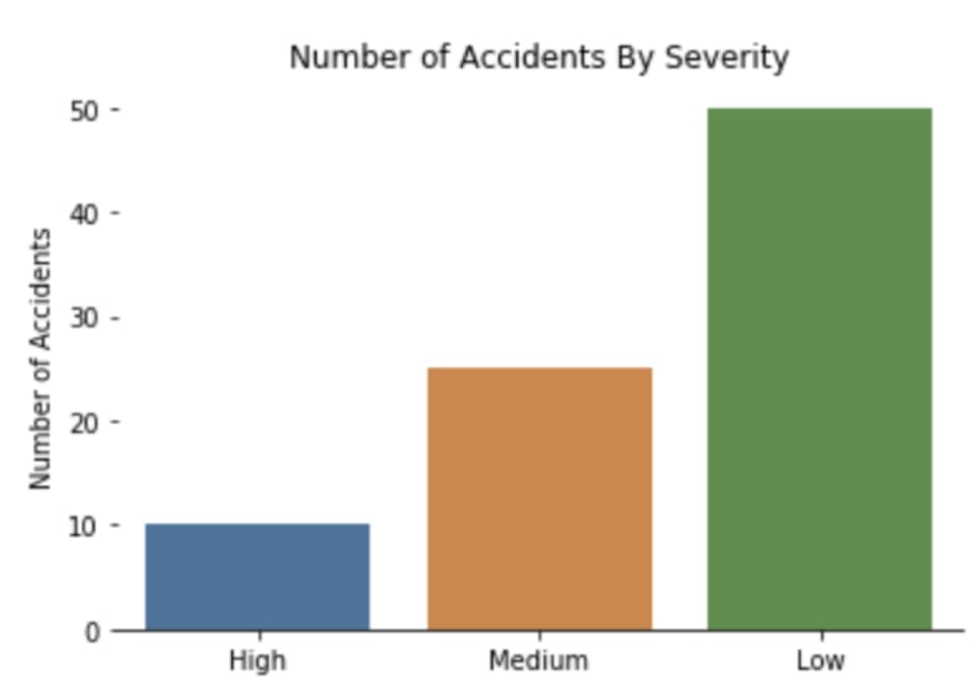
Change Axis Labels
Next, let’s change the axis labels to “Accident Severity” and “Number of Accidents” using plt.xlabel() and plt.ylabel().
# change the axis labels
sns.barplot(data=data, x="severity", y="freq")
plt.xlabel('Accident Severity')
plt.ylabel('Number of Accidents');
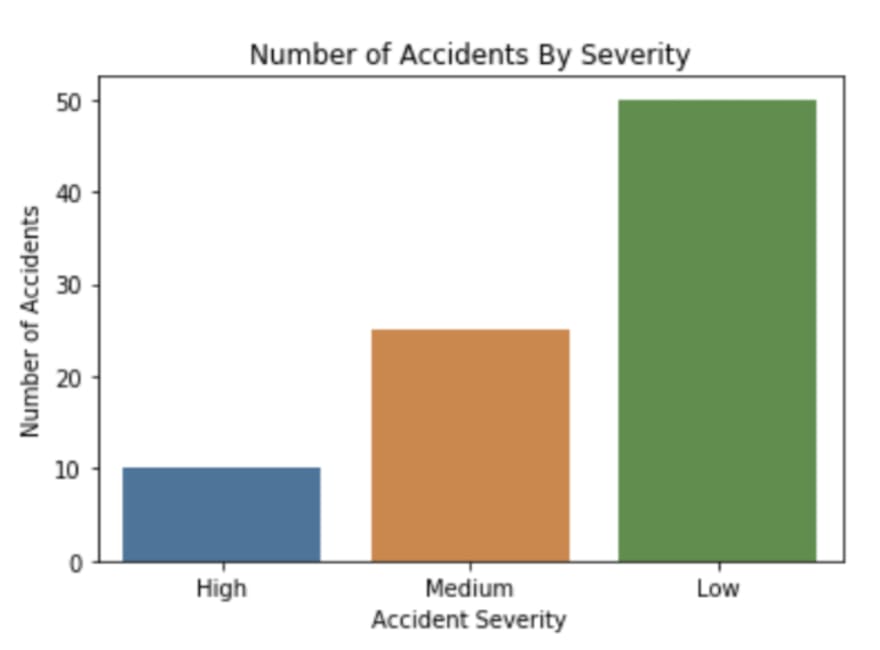
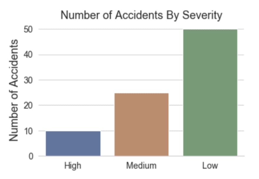
Add a Title
At the moment it’s not clear what the chart is about so let’s add a title using plt.title().
# add a title
sns.barplot(data=data, x="severity", y="freq")
plt.xlabel('Accident Severity')
plt.ylabel('Number of Accidents')
plt.title('Number of Accidents By Severity');
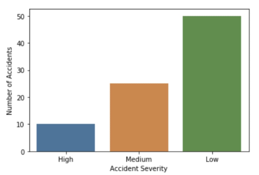
Remove X Axis Label
Now that we have a title, the x axis label is not really needed. Charts look better when there is less clutter. So let’s remove the x axis label by removing the text in the quotes.
If we just deleted the whole plt.xlabel() line then matplotlib would display the name of the dataframe column mapped to the x axis (“severity”) which is not what we want. So, instead, we use plt.xlabel(‘’).
# remove x axis label
sns.barplot(data=data, x="severity", y="freq")
plt.xlabel('')
plt.ylabel('Number of Accidents')
plt.title('Number of Accidents By Severity');
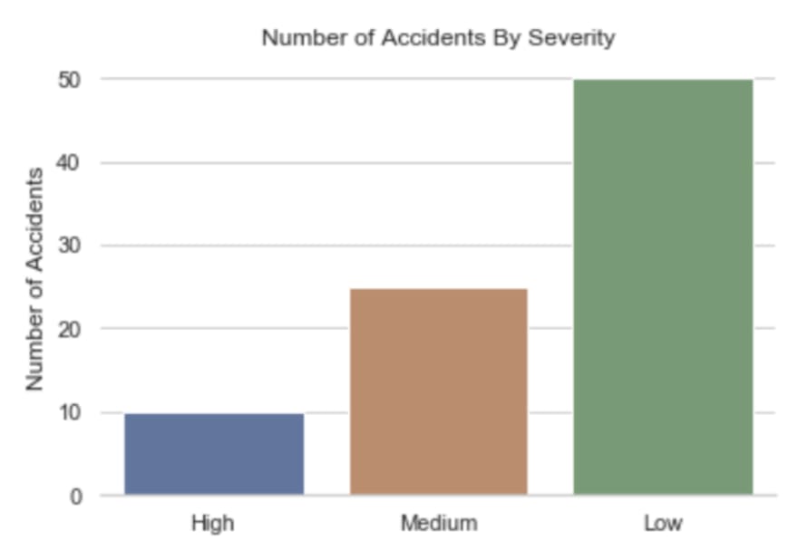
Remove Top and Right Border
Removing the top and right part of the border also helps to reduce clutter and makes the chart look “cleaner” and more modern. This can be done with sns.despine() like this:
# remove top and right border
sns.barplot(data=data, x="severity", y="freq")
plt.xlabel('')
plt.ylabel('Number of Accidents')
plt.title('Number of Accidents By Severity')
sns.despine();

Remove Left Border
We could go further and also remove the border on the left (the y axis). This approach can make the chart look even better and is used by many publications these days, like the Financial Times for example. The y axis border can be removed by adding left=True in sns.despine() like this:
# remove left border
sns.barplot(data=data, x="severity", y="freq")
plt.xlabel('')
plt.ylabel('Number of Accidents')
plt.title('Number of Accidents By Severity')
sns.despine(left=True);
Add Horizontal Grid Lines
This doesn’t look quite right now that we’ve removed the y axis line because the chart doesn’t have any gridlines. Let’s add horizontal grid lines so its easier to see the value of each of the bars. This can be done by adding sns.set(style=”whitegrid”) like this:
# add horizontal grid lines to the background
sns.set(style="whitegrid")
sns.barplot(data=data, x="severity", y="freq")
plt.xlabel('')
plt.ylabel('Number of Accidents')
plt.title('Number of Accidents By Severity')
sns.despine(left=True);
Make the Title and Axis Labels Bigger
To make the title and axis labels easier to read, let’s make them bigger by adding , size=18 to the list of parameters in plt.ylabel() and plt.title():
# Make the title and axis labels bigger
sns.set(style="whitegrid")
sns.barplot(data=data, x="severity", y="freq")
plt.xlabel('')
plt.ylabel('Number of Accidents', size=18)
plt.title('Number of Accidents By Severity', size=18)
sns.despine(left=True);

Make the Axis Tick Labels Bigger
Let’s also increase the size of the axis tick labels too. This can be done with plt.xticks and plt.yticks() like this:
# Make the axis tick labels bigger
sns.set(style="whitegrid")
sns.barplot(data=data, x="severity", y="freq")
plt.xlabel('')
plt.ylabel('Number of Accidents', size=18)
plt.title('Number of Accidents By Severity', size=18)
plt.xticks(size=14)
plt.yticks(size=14)
sns.despine(left=True);
Change the Colour of the Bars
It would be better if the colours of the bars were meaningful, and represented the severity. Let’s change the colours to red, orange and yellow using the palette parameter in sns.barplot().
# Change the colours of the bars
sns.set(style="whitegrid")
sns.barplot(data=data, x="severity", y="freq",
            palette=['red', 'orange', 'yellow'])
plt.xlabel('')
plt.ylabel('Number of Accidents', size=18)
plt.title('Number of Accidents By Severity', size=18)
plt.xticks(size=14)
plt.yticks(size=14)
sns.despine(left=True);
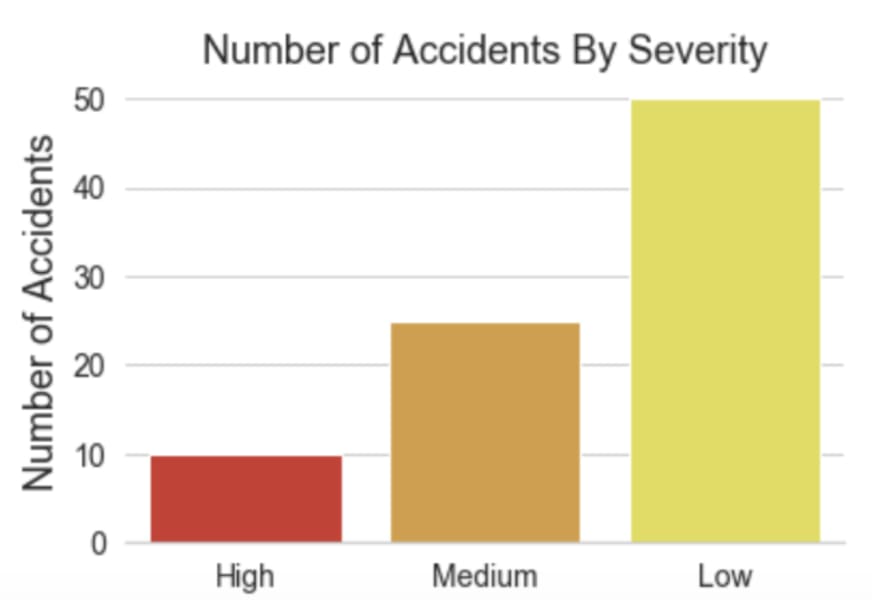
This is better but those shades of the colours hurt my eyes!
I tend to define colours using the hex values after choosing a particular colour using an online colour picker tool (just google “colour picker” and a tool is shown as the first result). You can slide the cursor to the exact colour and shade that you want and copy-paste the hex value to your code.

Here’s my updated code after replacing the colour names with hex values of the shades I wanted:
# Change the colours of the bars
sns.set(style="whitegrid")
sns.barplot(data=data, x="severity", y="freq",
            palette=['#eb3434', '#eb7a34', '#ebae34'])
plt.xlabel('')
plt.ylabel('Number of Accidents', size=18)
plt.title('Number of Accidents By Severity', size=18)
plt.xticks(size=14)
plt.yticks(size=14)
sns.despine(left=True);

Ahhh…that’s easier on the eyes!
Increase the Sharpness of the Chart
The resolution of the chart looks a bit low at the moment. To improve how sharp the chart looks, we can define the “dots per inch” of the chart display with plt.rcParams[‘figure.dpi’] = 360
# Increase the sharpness of the display
plt.rcParams['figure.dpi'] = 360
sns.set(style="whitegrid")
sns.barplot(data=data, x="severity", y="freq",
            palette=['#eb3434', '#eb7a34', '#ebae34'])
plt.xlabel('')
plt.ylabel('Number of Accidents', size=18)
plt.title('Number of Accidents By Severity', size=18)
plt.xticks(size=14)
plt.yticks(size=14)
sns.despine(left=True);

This looks much better! It’s a bit too big now though.
Change the Size of the Chart
To change the dimensions of the chart, define the width and height in fig, ax = plt.subplots(figsize=()). I’ve set the dimensions to a width of 12 and height of 4 like this:
# change the size of the plot
plt.rcParams['figure.dpi'] = 360
sns.set(style="whitegrid")
fig, ax = plt.subplots(figsize=(12,4))
sns.barplot(data=data, x="severity", y="freq",
            palette=['#eb3434', '#eb7a34', '#ebae34'])
plt.xlabel('')
plt.ylabel('Number of Accidents', size=18)
plt.title('Number of Accidents By Severity', size=18)
plt.xticks(size=14)
plt.yticks(size=14)
sns.despine(left=True);

Change the Colour of the Title, Axis Labels and Tick Mark Labels
I prefer to have the text in a dark grey rather than pure black, so I chose a dark grey that I liked using Google’s colour picker and changed the colour to #4f4e4e using the color parameters in plt.ylabel(), plt.title(), plt.xticks() and plt.yticks() like this:
# change the colour of the title, axis labels and tick labels
plt.rcParams['figure.dpi'] = 360
sns.set(style="whitegrid")
fig, ax = plt.subplots(figsize=(12,4))
sns.barplot(data=data, x="severity", y="freq",
            palette=['#eb3434', '#eb7a34', '#ebae34'])
plt.xlabel('')
plt.ylabel('Number of Accidents', size=18, color='#4f4e4e')
plt.title('Number of Accidents By Severity', size=18, color='#4f4e4e')
plt.xticks(size=14, color='#4f4e4e')
plt.yticks(size=14, color='#4f4e4e')
sns.despine(left=True);

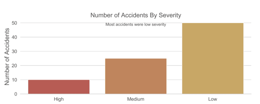
Add Text Annotations
It’s often helpful to add text annotations to charts to help the reader to understand what the key insight is that the chart is providing. Or perhaps there is something important about the chart that you need to communicate when the chart is being looked at when you’re not there to explain it. It’s not really needed in this chart but let’s add one as an example so you know how to do it. It can be done using plt.text() like this:
# Add a text annotation
plt.rcParams['figure.dpi'] = 360
sns.set(style="whitegrid")
fig, ax = plt.subplots(figsize=(12,4))
sns.barplot(data=data, x="severity", y="freq",
            palette=['#eb3434', '#eb7a34', '#ebae34'])
plt.xlabel('')
plt.ylabel('Number of Accidents', size=18, color='#4f4e4e')
plt.title('Number of Accidents By Severity', size=18, color='#4f4e4e')
plt.xticks(size=14, color='#4f4e4e')
plt.yticks(size=14, color='#4f4e4e')
plt.text(x=1, y=48, s='Most accidents were low severity',
                 color='#4f4e4e', fontsize=12, horizontalalignment='center')
sns.despine(left=True);
It’s often tricky to know what x and y co-ordinates to set for your text. I just put some numbers in and then change them through trial and error until the text is positioned where I want it.
Add Data Labels
At the moment, if the person viewing the chart wants to know how many accidents were medium severity, they have to visualise a line between the bar and the y axis and guess what the value is. This is relatively easy on this chart but on other charts this could be more difficult.
A good chart doesn’t make the reader work hard to get the information from it. One way we can make it easier for the reader is to add data labels, so it’s obvious what the values are.
Note: If there were lots of bars on the chart then this may not be a good idea as it could end up looking too cluttered. In that situation, it may be better to only add data labels for the “headline” bars e.g. the biggest and smallest, or the bar that you’re focussing on in your analysis (e.g. if its a bar chart showing sales for your team compared to other teams then you may wish to add a data label for the bar representing your team).
Data labels can be added using plt.text() like this:
# Add data labels
plt.rcParams['figure.dpi'] = 360
sns.set(style="whitegrid")
fig, ax = plt.subplots(figsize=(12,4))
sns.barplot(data=data, x="severity", y="freq",
            palette=['#eb3434', '#eb7a34', '#ebae34'])
plt.xlabel('')
plt.ylabel('Number of Accidents', size=18, color='#4f4e4e')
plt.title('Number of Accidents By Severity', size=18, color='#4f4e4e')
plt.xticks(size=14, color='#4f4e4e')
plt.yticks(size=14, color='#4f4e4e')
plt.text(x=1, y=48, s='Most accidents were low severity',
                 color='#4f4e4e', fontsize=12, horizontalalignment='center')
plt.text(x=0, y=2, s="10",
                 color='white', fontsize=18, horizontalalignment='center')
plt.text(x=1, y=2, s="25",
                 color='white', fontsize=18, horizontalalignment='center')
plt.text(x=2, y=2, s="50",
                 color='white', fontsize=18, horizontalalignment='center')
sns.despine(left=True);

Remove Y Axis Tick Labels
Now that we have data labels for all 3 bars, the y axis is somewhat redundant so let’s remove it. We’ll need to remove the y axis label, the y axis tick labels, and also the background grid lines.
The y axis label can be removed by setting
plt.ylabel()to an empty stringThe y axis tick labels can be removed by setting
plt.yticks()to 2 empty lists like this:plt.yticks([],[])We won’t need the background grid lines if we no longer have a y axis displayed. The changes described above will automatically remove the grid lines but you may wish to remove the
sns.set(style=”whitegrid”)line of code to keep your code tidy. I’ve just commented it out here.
# Remove y axis tick labels and y axis label
plt.rcParams['figure.dpi'] = 360
#sns.set(style="whitegrid")
fig, ax = plt.subplots(figsize=(12,4))
sns.barplot(data=data, x="severity", y="freq",
            palette=['#eb3434', '#eb7a34', '#ebae34'])
plt.xlabel('')
plt.ylabel('')
plt.title('Number of Accidents By Severity', size=18, color='#4f4e4e')
plt.xticks(size=14, color='#4f4e4e')
plt.yticks([], [])
plt.text(x=1, y=48, s='Most accidents were low severity',
                 color='#4f4e4e', fontsize=12, horizontalalignment='center')
plt.text(x=0, y=2, s="10",
                 color='white', fontsize=18, horizontalalignment='center')
plt.text(x=1, y=2, s="25",
                 color='white', fontsize=18, horizontalalignment='center')
plt.text(x=2, y=2, s="50",
                 color='white', fontsize=18, horizontalalignment='center')
sns.despine(left=True);

Save the Chart as an Image
That’s it! We now have a much more professional, clutter-free and easier-to-read chart that’s shareable with others.
If you’d like to use the chart in another application (e.g. Powerpoint) then you may want to save it as an image using plt.savefig() like this:
# save your chart as an image
plt.rcParams['figure.dpi'] = 360
#sns.set(style="whitegrid")
fig, ax = plt.subplots(figsize=(12,4))
sns.barplot(data=data, x="severity", y="freq",
            palette=['#eb3434', '#eb7a34', '#ebae34'])
plt.xlabel('')
plt.ylabel('')
plt.title('Number of Accidents By Severity', size=18, color='#4f4e4e')
plt.xticks(size=14, color='#4f4e4e')
plt.yticks([], [])
plt.text(x=1, y=48, s='Most accidents were low severity',
                 color='#4f4e4e', fontsize=12, horizontalalignment='center')
plt.text(x=0, y=2, s="10",
                 color='white', fontsize=18, horizontalalignment='center')
plt.text(x=1, y=2, s="25",
                 color='white', fontsize=18, horizontalalignment='center')
plt.text(x=2, y=2, s="50",
                 color='white', fontsize=18, horizontalalignment='center')
sns.despine(left=True)
plt.savefig('accidents.png');
There are many more aspects of how the chart looks that you can tweak, and many different types of chart of course, but hopefully that gives you enough to get you started. I recommend having a play around with chart settings and also looking at some popular professional publications that regularly contain charts to get some inspiration.
Below are links to some places that inspire me.
- Financial Times — e.g. their corona virus charts
- BBC — e.g. the 2019 UK general election results
- FiveThirtyEight — e.g. How (Un)Popular is Donald Trump?

Top comments (2)
Nice post NIC. Well done!
I've been doing some reports in R because it's my confort zone in doing charts and reports.
Using R there are some packages to construct beautiful tables, e.g. reactable, formatable and so on.
Do you know any similar package on Python? The ones I've seen so far are not even close to the ones I mentioned before.
See an example of reactable: glin.github.io/reactable/articles/...
Thanks for the post.
Eduardo
Thanks Eduardo.
I’ve not experimented with any table formatting packages so can’t recommend any I’m afraid. Maybe other readers will comment with their recommendations.