
Sometimes using flexbox layout could generate tons of css properties and the final result could be unreadable due to the properties generated.
I've maded a simple scss mixin to handle generic flexbox layouts, because I work on complex web applications and I have to made a lot of different layouts.
This mixin handles some (not all) flexbox properties, and covers the main cases with flexbox layouts:
/**
* FLEXBOX
* A mixin to rule complex flexbox layout
* @author nicolacastellanidev@gmail.com
*/
@mixin flexbox(
  $display: flex,
  $direction: row,
  $placeContent: null,
  $placeItems: null,
  $wrap: nowrap,
  $shrink: 0,
  $grow: 0,
  $alignContent: null,
  $justifyContent: null,
  $alignItems: null,
  $justifyItems: null) {

    display: $display;
    flex-direction: $direction;

    @if $placeContent == null {
      @if $alignContent   { align-content: $alignContent; }
      @if $justifyContent { justify-content: $justifyContent; }
    } @else {
      place-content: $placeContent;
    }

    @if $placeItems == null {
      @if $alignItems   { align-items: $alignItems; }
      @if $justifyItems { justify-items: $justifyItems; }
    } @else {
      place-items: $placeItems;
    }

    flex-wrap: $wrap;
    flex-shrink: $shrink;
    flex-grow: $grow;
}
this mixin will help you defining a flexbox-driven elements, for example:
/* now we can add flexbox layout with a single line of code */
.anchor-top {
  @include flexbox($placeItems: flex-start);
}

.anchor-bottom {
  @include flexbox($placeItems: flex-end);
}

.anchor-center {
  @include flexbox($placeItems: center);
}

.anchor-left {
  @include flexbox($placeContent: flex-start);
}

.anchor-right {
  @include flexbox($placeContent: flex-end);
}

.anchor-center-hor {
  @include flexbox($placeContent: center);
}
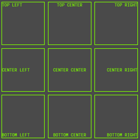
These classes can be used to handle html layouts, like this:
<div class="container">
  <div class="box anchor-top anchor-left">
    TOP LEFT
  </div>
  <div class="box anchor-top anchor-center-hor">
    TOP CENTER
  </div>
  <div class="box anchor-top anchor-right">
    TOP RIGHT
  </div>
  <div class="box anchor-center anchor-left">
    CENTER LEFT
  </div>
  <div class="box anchor-center anchor-center-hor">
    CENTER CENTER
  </div>
  <div class="box anchor-center anchor-right">
    CENTER RIGHT
  </div>
  <div class="box anchor-bottom anchor-left">
    BOTTOM LEFT
  </div>
  <div class="box anchor-bottom anchor-center-hor">
    BOTTOM CENTER
  </div>
  <div class="box anchor-bottom anchor-right">
    BOTTOM RIGHT
  </div>
</div>
The final result will be:
Check this pen for a live example:
I wish this article will help you <3 love you all


Oldest comments (3)
Another example would be great. This looks awesome tho.. will try it out!
Yeah of course, I'll try to cover the main flexbox cases
Hi Mike, thanks for your compliments ^ you can take a look to the codepen now, I've added other examples ;)