It is remarkable how far we've come in terms of python tooling for charting and visualization. I came into the python scientific computing ecosystem from R (user since 2015) and Matlab (user since 2013), and my experience has been largely pleasant. I wish I could say I've never looked back since, but the truth is that I have. For all the envy of Python's enormous ecosystem, scientific graphing in Matplotlib never felt as natural as it is with Matlab. This is a cruel irony as Matplotlib borrows heavily from the syntax of Matlab, a fact that isn't exactly subtle when you learn that the "Mat" in "Matplotlib" refers to Matlab and the library retains many of Matlab's plotting terminologies (i.e "markers").
My introduction to ggplot2
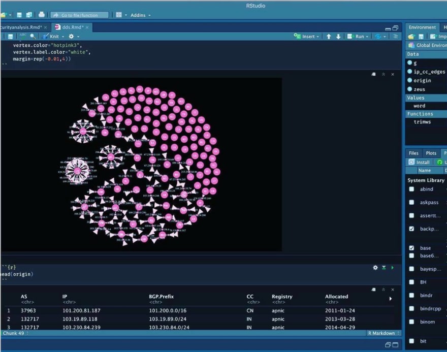
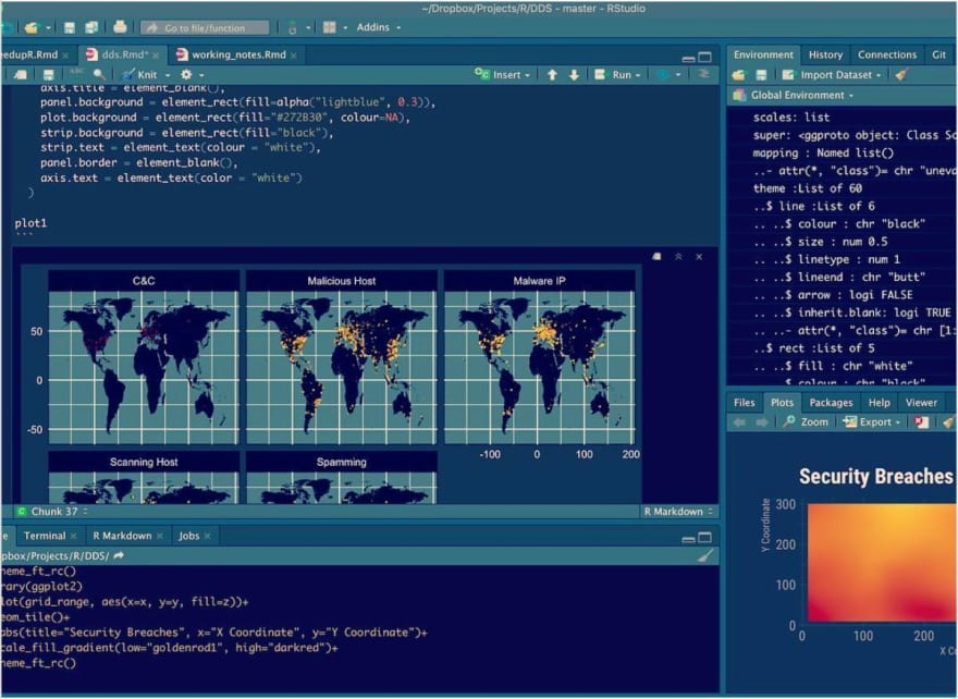
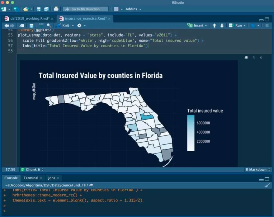
Attached above are some of the images I've created in R, with the trusty ggplot2 library.
I remember how I came across Hadley Wickham's ggplot2. I was relatively new to R and similar to Matlab, R has a rich feature set of built-in graphing utilities, catering to scientific computing users who needed to model complex simulations to statistical user who want a one-liner to produce a faceted plot (R users fondly call them "trellis plot"). Similar to Matlab, one didn't have to bother with importing external packages as R's core plotting library offers a lot out of the box.
Then I came across a challenge by Harvard's IQSS and I was rather intrigued. The challenge was about reproducing this plot on the Economist and the materials presented an introduction to ggplot2. I completed the challenge that weekend, and went ahead to reproduce a few more plots I found from the Economist as practice exercise, including this one.

ggplot2 is fantastic. It is ergonomic, natural, and intuitive. It is all of the above because it is an implementation of the grammar of graphics, which aims to bring a set of grammar to the art of the visualization.
ggplot2 was great, and I duly put my newfound skills to use by combining it with the shiny framework to produce visualization-heavy web dashboards like this one. When I taught data visualization, I only wanted to teach the ggplot system because it felt methodical, logical and highly organized.
The teaching experience never quite translate equally to the python universe. It wasn't just because ggplot2 is highly declarative -- the user is concerned only with "what" she wants to achieve, not "how" she wants it achieved. It wasn't just because ggplot2 adheres to a coherent system, known as the grammar of graphics. It wasn't just because ggplot2 is highly instructive -- it picks default values in ways that are seemingly minor but when compounded over many decisions, can mean the difference between an abhorrent mess and a convincing medium of message.

Altair
I know many Python developers, myself included, begrudgingly switch between the different ecosystems to get the best of what R and Python offer. Then I stumbled upon Altair in 2018, when Altair was in its early days (last few releases before the v2.0; current version is 3.x). I created my first web app with Altair and it is a project that I still maintain as it is actively used among our teaching staffs at Algoritma Data Science Education Center, a company I co-founded 6 years ago.
Altair is Jake Vanderplas's attempt to provide a Python wrapper over Vega-Lite / Vega.js (which in turn, is built on D3.js).
It adheres to the same grammar of graphics system. It is declarative. It is extensible and customizable.
On top of that, it does something that ggplot2 library couldn't: it emits JavaScript code, which means your graphics can be embedded in just about any HTML file. It runs in the browser and can support browser events like onMouseOver, onMouseOut, onClick etc, so charts created with Vega have that added interactivity and event binding that R plots couldn't.
This year, when Anaconda announced PyScript, I started a playlist that I initially named build with PyScript in which I build one web app per video, showcasing the different possibilities that come with it. In many of the interactive web dashboards throughout the PyScript series I have relied on the trusty Altair library:
- Visualizing MiBand runs
- Building an interactive data visualization dashboard
These videos demonstrates the utility of PyScript along with Altair to create user-friendly front-ends that are truly interactive and fun-to-use. Viewers love them, but I started to get comments that request for a separate series that cast the light on Altair. One that more centrally focus on the building blocks of Altair as a data visualization library.
With this, I spent the last two months conceptualizing and developing a video series that goes into the art and science of data visualization in Python, adopted from the data visualization curriculum developed by the University of Washington. The series will consist of 5 to 8 long-form videos, each focusing on a key aspect of data visualization and the accompanying mental models that go with it.
Here's part 1 of the video:
Data Visualization in Python: Altair 4.2 (altair-viz) Tutorial
Teaching visualization with Altair has been highly satisfying, and the data scientists where I work at are in agreement of its versatility; documenting my journey here so there is a point of reference and book-keeping for my future self has been equally refreshing.
Now, readers, if you'd love sharing with me, how do you decide on your data visualization / charting toolkit and how does it look like?

Top comments (0)