
In this tutorial, I'll show you how to create a dashboard for your application's structured logs in Kibana.
This is a follow-up to this article, which covers how to instrument your Go application \w structured logging for use by Kibana (in this tutorial).
We'll use Kibana v7.6 but any version you're using should work. It's just that your UI might look a bit different & you'll have to adjust.
Let's jump straight in! We'll stick to simple panels, which suite most of the use-cases you'd need.
The Starting Point
First, make sure you have docker and docker-compose installed.
For docker, follow the installation instructions for your platform here.
For docker-compose, follow the installation instructions here.
Afterwards, download this exercise’s repository on the kibana-dashboard-tutorial branch:
git clone --branch kibana-dashboard-tutorial https://github.com/preslavmihaylov/tutorialsWhat you already have is a Go application, which randomly produces logs for endpoints /payments/execute, /payments/list, /payments/authhold.
Starting from here, you will build a dashboard for effectively monitoring & analysing incoming traffic.
In the following section, I will walk you through how to achieve this step by step.
The Walkthrough
Boot up all containers
Invoke this command to bring up all containers:
docker-compose upFor all following steps, make sure you never execute docker-compose down.
That command will not only stop all containers but delete them as well.
If you're seeing some issues with booting up elasticsearch, here is a reference to some common issues & how to handle them:
elasticsearch exit code 78
elasticsearch exit code 137
Setup your application’s baseline saved search
Go to http://localhost:5601/app/kibana#/home and open the Discover tab.
First, expand the tab names in the bottom-left as they are unfamiliar at first:

Then, find the Discover tab in the top-left:

Set the index pattern if you haven’t already:

On the next step, choose @timestamp as a time filter:

Open the Discover tab again. This is what the initial view should look like:
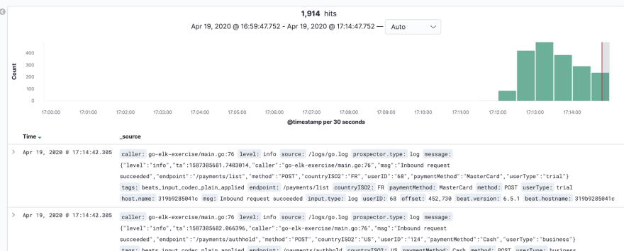
Currently, kibana shows all log lines from our application without any filtered fields. We can exclude all fields we don’t need:

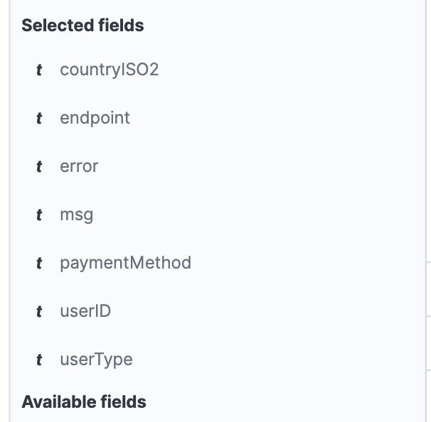
Next, select only the fields which make sense for our application.
Those are endpoint, method, countryISO2, userID, paymentMethod, userType, error, msg.
For each of them, click Add to add them to the selected fields in the visualised log:

In the end, this is what your Selected fields should be:
If you did these steps properly, this is an example of what your logs should look like:
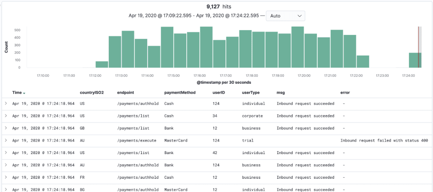
We will use this saved search as a baseline view for our dashboard.
Click Save at the top-left to later reuse this view for our dashboard:

This is one of the most useful views as it allows one to inspect the details of the events which happen in your application.
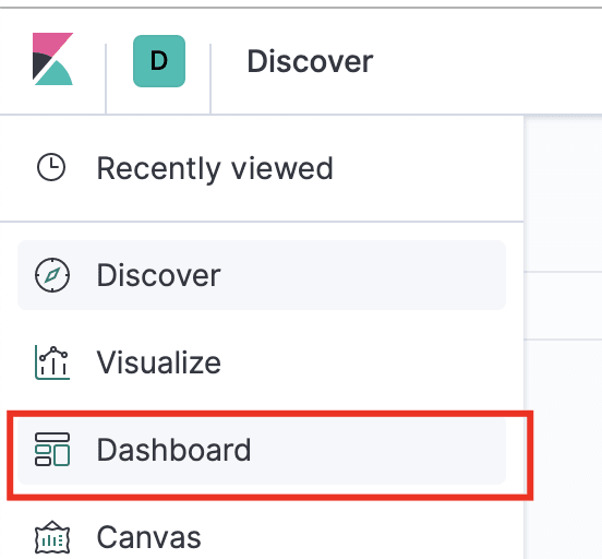
Setting up your initial Kibana dashboard
Open the Dashboard tab to create your first dashboard:
Follow the instructions on-screen:

After this, you should see an empty dashboard which doesn’t show anything:

Click the Add button at the top-left to add a new visualisation:
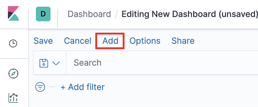
You should see the name of the saved search you created in the previous step. Choose that:
Next, resize it as you see fit and you should see the first panel in your dashboard:

This view is great for inspecting the details of all requests & using it for additional filtering on a given property.
However, we will need to add some more visualisations to be able to see aggregations of the data in our dashboard.
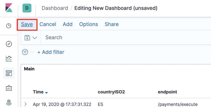
Save your new dashboard with a descriptive name and proceed to the next section:
Add a data table to monitor requests per endpoint
In this step, we will create a data table which will show how many requests we get per endpoint.
Click the Edit button at the top-left to edit the contents of the dashboard and select Add to create a new view.
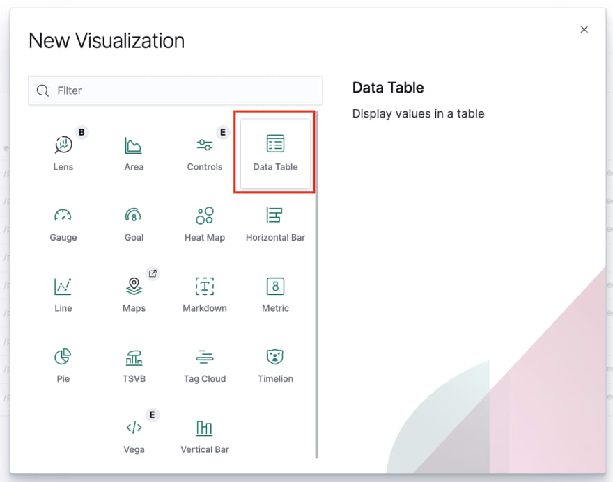
In the panel which pops up, create a new visualisation from the bottom-left:

Next, create a new data table:
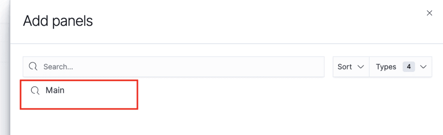
On the next screen, select your saved search’s name as the data source to use.
Afterwards, you should see a screen which simply shows the total count of requests in a table. This is because the table currently aggregates all requests & shows the total count for them.
We will aggregate the data in the table by the endpoint keys. This will show the count of each request per endpoint.
To do this, add a new Bucket which splits rows:

As an aggregation, use Terms. This is a simple aggregation which simply groups the data by the unique values for the key we’ll choose:

Aggregate by the endpoint key and use the following configuration:
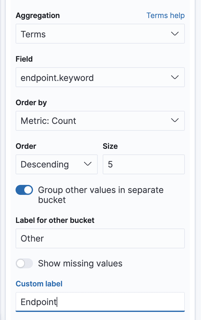
The Group other values in separate bucket will display all data which is too little and doesn’t fit in the table (the limit is 5 rows, which we specify) in a general “Other” bucket.
For example, if we had 7 different endpoint and five of them get 80% of the traffic, the 20% other values will be aggregated in a row called “Other”.
Now, click the Play button at the top of the window to see how your table looks. You should see the count of requests per endpoint:
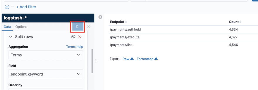
This view now looks quite useful. With it, we can track how much traffic we get per endpoint. Click the Save button at the top-left, give the new view a title (e.g. Calls by Endpoints) and rearrange your dashboard to look aesthetically pleasing:
Let’s now do the same for the rest of our significant fields.
Add a data table for all significant fields
In this step, add a new table, following the same steps as the previous one, for method, countryISO2, userType and paymentMethod.
There is no need to include a view for userID as the granularity of that field is typically way too big to make a sensible dashboard.
However, you can usually take that by making custom filters on some of the log lines in the saved search view.
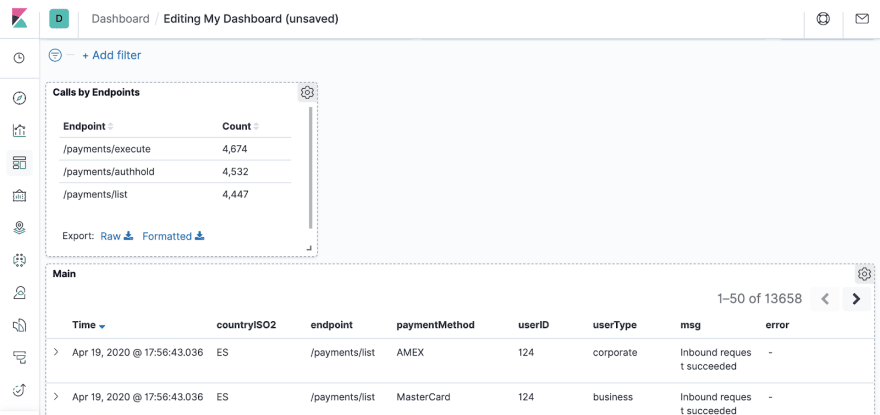
After you go through this, here is what the dashboard should look like:

Now, you can see aggregations for all significant data points you are interested in.
If you want to further inspect e.g. what payment methods one uses when calling the /payments/execute endpoint, you can “zoom in” on the data by filtering for that data.
Try it out and explore for yourself:

Here is a challenge for you, zoom in on the errors and identify which is the endpoint which has the most errors.
The scope of this exercise is creating the dashboard, but don’t worry. You will get to play with it in the following exercise.
Our dashboard already looks quite informative.
But there is one final touch it needs.
Add a histogram for tracking success/error rate
In this step, we will diverge from the good old data table and add a histogram to track the success-to-error ratio over time.
The rest of the views in the dashboard are typically used to find the root cause of an issue.
The view we’ll create now will enable us to quickly identify if there is an issue.
Create a new visualisation, but this time, select a Vertical Bar:

In the beginning, you will simply see a single bar with the total count of requests in the given time period.
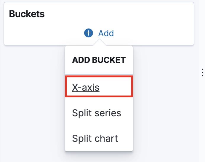
For starters, add an X-Axis which will create time intervals for each of the lines in the histogram. This will allow us to see the tendency of events over time.
This time, the selected aggregation is Date histogram on the @timestamp field:

Click the Play button and see how the view changes to reflect the count of events over time:

This is cool, but it would be useful if we could actually see how many of those requests are success and how many are errors.
To do this, let’s customize the existing Y-Axis to only aggregate successful requests.
First, change the Y-Axis aggregation from Count to Sum bucket.
Then, use Filters as the Bucket aggregation. This will allow us to use KQL (Kibana Query Language) to make any custom filter we like.
Add a filter which says select all messages which are not empty strings:
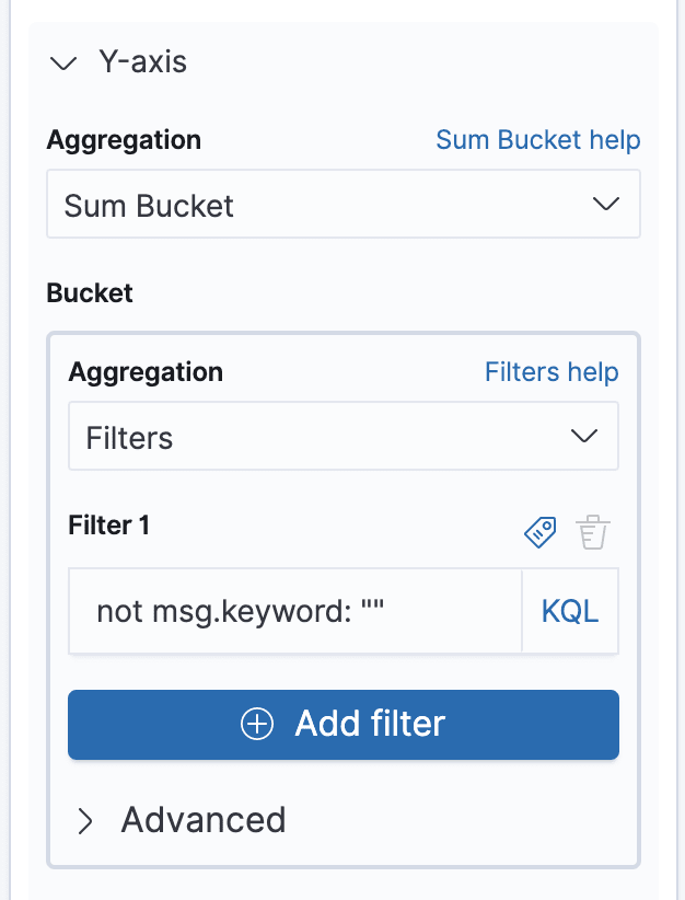
Next, add a custom label “Success” for this Y-Axis at the bottom of the panel.
Click the Play button to see the results. You should now see the number of successful requests every 30s. The default color, however, is a bit off, so change it at the top-right to green:
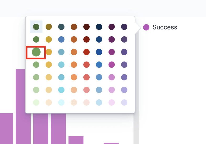
Now, it looks a lot better:

We aren’t done yet.
It’s now time to stack the errors on this Y-Axis as well.
Collapse the current Y-Axis settings and add a new one:

The setup for this Y-Axis is simpler.
Choose Sum bucket as an aggregation again and Terms as an aggregation for the bucket. Choose errors.keyword as the field to use.
Keep the rest of the settings as-is.

Add a custom label “Errors”, change the color to red and here’s what you get:

This is the success-to-error ratio, aggregated per 30s.
This view will now enable you to see the % of errors for all endpoints with a single glance.
You could also zoom in on the data again and see the % of errors per endpoint/payment method/userType/etc.
Save this view, add it to your dashboard, arrange it nicely at the top and gaze at your beautiful application dashboard:

Finale
Congratulations. 👏👏👏
You’ve successfully completed the tutorial.
You should now have a decent practice using Kibana to create basic dashboards for your application.
The final step of this exercise is to add such a dashboard for your real production application, buy a 146-inch monitor, attach it to the wall in your office, open your app’s dashboard, enter full-screen and enable Auto-refresh.
After you do this, all your colleagues from the other teams will stare at it enviously.
But unless you know how to effectively use Kibana for debugging real production issues, that’s all the value you’ll get from it - a shiny dashboard to show-off with in the office.
In the following tutorial, you’ll learn how to now capitalize on this dashboard and use it to instantly discover the root cause of production issues.

Top comments (0)