Learn the basic steps to setup a React application using Flexbox to make a responsive grid.
In our previous article, Creating a Responsive Layout in React, we started by learning how to setup a basic responsive layout in our React application using Flexbox and media queries. We used a React Hooks npm package to help with breakpoints and another package for helping with responsive images (picture tag). We also showcased the KendoReact Menu component, and by the end, we had a fairly responsive demo that we're going to build on in this article.
No different from UI, layout takes time and baby steps. We can keep building and working to refactor and improve what we already built, as well as learn some new techniques around responsive layout and slowly incorporate those ideas. The next thing we should work on in this application is bringing in some type of responsive grid. I would like to use another npm package to do this, it's called react-simple-flex-grid.
Our starting point will be a StackBlitz demo which is simply a fork of the demo where we left off in the last article. I would recommend making a fork of this demo if you plan to follow along. Otherwise, just read on and understand that you can open up any of the demos I provide to play with the code at any stopping point in the post. I will provide several demos at various points below.
Our application to start with should look like the image below:
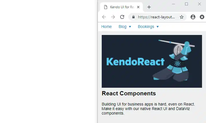
It's not going to win any awards, but we are not really focusing on look and feel yet, we are still getting our sea legs in this constantly moving and resizing responsive world. And we have already learned some very basic layout techniques to build on. With that said, in this part of the blog series I want to focus on creating a responsive grid that we can use in our application so that we don't have to bring in something like Bootstrap just to use their grid.
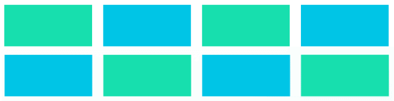
I'm going to mock-up something that we can try and build that will utilize this grid for many breakpoints. The idea will be a grid of logos from companies that use our product. This is a pretty standard thing that companies do on their website and the same concept can be applied to many different uses. I first need to get a number of logos that we can use. I will upload them to imgur so we can use them with StackBlitz easily. We will display these images in a grid showing four wide at a large resolutions, three wide at medium resolution and two wide at a small resolution.
I'm going to fork our demo and start working on our first set of changes.
First order of business is to create a list of companies in a .json file. Before we make the list of logos into a grid, we should first worry about writing some code that will map each company from our list of names into some markup in our JSX. Our companyList.json files will simply contain an array of objects. Each object is a company, and it has a name and an image url. I will upload an image for each company to imgur.com that we can use for our image.
Add a companyList.json file.
[
  { "name": "Nasa", "image": "https://imgur.com/RTFOOHR" },
  { "name": "Microsoft", "image": "https://imgur.com/yln0oYC" },
  { "name": "Phillips", "image": "https://imgur.com/ZHKnVr8" },
  { "name": "Fox", "image": "https://imgur.com/Hrzbo49" },
  { "name": "Sony", "image": "https://imgur.com/Ld5Ux3g" },
  { "name": "IBM", "image": "https://imgur.com/rg7RAdm" },
  { "name": "Toshiba", "image": "https://imgur.com/aj9vfmu" },
  { "name": "Volvo", "image": "https://imgur.com/hTkpXvw" }
]
We need to create a Companies.jsx page. These component files don't have to use the .jsx format, they could just as well use .js as the file extension. When I create a new component, I typically use .jsx.
import React from 'react';
import companyList from './companyList.json';

const Companies = () => {
  return (
    <div className="companies">
      {companyList.map(co => <div>{co.name}</div>)}
    </div>
  );
}

export default Companies;
Nothing too complex here, we import react and our company list. We create a functional component that simply maps over the companies list and sticks the name value inside of a div. This is repeated for each company, and now we can think about how we will go from this to building a flexible grid for each of the images instead.
Now let's add the following import to the main.js page:
import Companies from './Companies';
And then we'll display our Companies component below our information about Kendo UI. The div with the class name of kendo-details will now look like the code sample below:
<div className='kendo-details'>
    <h2>React Components</h2>
    <p>Building UI for business apps is hard, even on React. Make it easy with our native React UI and DataViz components.</p>
    <h2>Companies Using Kendo</h2>
    <Companies />
</div>
At this point in time and if you have been following along, your demo will match the StackBlitz below:
Let's Talk About the Images
The images in this list are 600 x 600 px and we don't want to show them at that resolution, so I wanted to just loop over the names to ensure our logic and code was working. I actually want to have a different image for each breakpoint, but let's take baby steps to get there. This would mean having 600 pixels be the size of our images to show above large breakpoints. 300 pixels would be the size of our images above the medium breakpoint and until the large breakpoint. And finally, our images on small would be 150 pixels wide.
But for now, we can just resize them to take up 100% of their space.
Let's add the package we want to use for a Flexbox grid solution: react-simple-flex-grid. I selected this package for its ease of use. I tried out several packages for React that provided a similar component model. Instead of creating divs, we will create <Row></Row> and <Col></Col> tags. This library, although simple, lets us do some complex stuff. To create a grid we are going to use only one Row. Inside that Row tag, we are going to repeat our a Col component for every item in our list. We can then provide instructions for each breakpoint.
Here is how I want to use their component API:
Working off the default 12 column Grid, I want:
- At XSmall: Each Col component will take up 6 columns of each row
- At Small: Each Col component will take up 4 columns of each row
- At Medium: Each Col component will take up 3 columns of each row
- At Large: Each Col component will take up 2 columns of each row
- At XLarge: Each Col component will take up 2 columns of each row
This Also Means:
- At XSmall: There will be 2 images per row
- At Small: There will be 3 images per row
- At Medium: There will be 4 images per row
- At Large: There will be 6 images per row
- At XLarge: There will be 6 images per row
To do this, we will update the piece of JavaScript that maps the companyList to generate what we need to use the components supplied by react-simple-flex-grid. By default, the breakpoints are:
- XSmall: 0-767
- Small: 768-991
- Medium: 992-1199
- Large: 1200-1599
- XLarge: 1600-infinity
With all of that in mind, just by glancing at the GitHub or NPM page for the react-simple-flex-grid, you should see that the JSX we need to write would be:
<Row gutter={40}>
  {companyList.map(co =>
    <Col
      xs={{ span: 6 }} sm={{ span: 4 }} md={{ span: 3 }}
      lg={{ span: 2 }} xl={{ span: 1 }}
    >{co.name}</Col>
  )}
</Row>
If we were to describe what our grid would look like above the medium breakpoint and below the large breakpoint, it would look like this:
But with just text inside each column, it looks nothing like what we want, so let's add the images. Update your code on the Companies component to return the following JSX:
const Companies = () => {
  return (
    <Row gutter={40}>
      {(companyList).map(co =>
        <Col
          xs={{ span: 6 }} sm={{ span: 4 }} md={{ span: 3 }}
          lg={{ span: 2 }} xl={{ span: 1 }}
        ><img src={`${co.image}.jpg`} width="100%"/></Col>
      )}
    </Row>
  );
}
At this point in time and if you have been following along, your demo will match the StackBlitz below:
Now that we have a better way of laying out our page, I want to rethink our Flexbox layout. The custom work we did with the media queries in our CSS is not that pretty and it's much better to write clear concise code, including CSS. When I look back at the navbar and main code, I can't imagine really understanding it unless I wrote it. Also I don't think our goal is to write the CSS we need for the grid ourselves. That could be an entire article in itself. What we want is some type of component that can abstract the details of building a Flexbox Grid and make that technology available in a simple React Component system. I'm never shy about throwing code away. So let's take out the trash.
I think that with this new simple grid system we can achieve a similar layout, plus we can get rid of some of the confusing CSS we wrote before and use these Row and Col components from React Simple Flex Grid instead. We will have some CSS code and it will contain some breakpoints, but let's use the breakpoints that come default in the React Simple Flex Grid. After playing with the screen at different sizes I think my initial idea to have several breakpoints at such small sizes is not exactly what I want in the end. So I am going to remove the breakpoint at 415 pixels. Let's take a look again at what the default breakpoints are for this Grid system.
- XSmall: 0-767
- Small: 768-991
- Medium: 992-1199
- Large: 1200-1599
- XLarge: 1600-infinity
Looking at this set of breakpoints, I think that we can get away with just having two Header graphics. One of them will show up until 768 pixels. Then we will switch to a smaller square image. I have made two new images to use:
Our small image will need to be 767 pixels in width, that's because 767 pixels wide will be the largest it can display before hitting that breakpoint at 768 pixels
Our medium-up image will be 300 pixels in width, because that seems like the largest I will want to display that image for now. We could always create another image to serve much larger screens but for the sake of brevity let's go back to just serving small vs medium and higher.
Small:

Medium-Up:

To save a lot of tedious steps I think the best way to present these new changes using the React Simple Flex Grid is for me to wave a magic wand and show you an updated StackBlitz example that has been refactored. But I will explain what I have done in this refactor:
My idea here is to use our React Simple Flex Grid component instead of the custom Flexbox code we came up with. It will clean up our CSS and our HTML. I will also move the Kendo UI information section into its own component called KendoInfo, just like Companies has its own component. Our main.js file should be fairly simple to look at. For this reason I will also put the Responsive image in its own component, so that it does not clutter the JSX.
Moving our ResponsiveImage component into a wrapper will also allow us to pass props to it, if needed. We won't do that now, but it's a good idea down the road. For instance, we could pass in an array of images each with a minimum width. This data could be used to generate the ResponsiveImageSize components inside the ResponsiveImage component. But for now, at least we have abstracted the code and moved it outside of the main.js file and segregated it.
Let's take a look at what our cleaned up main.js file looks like now:
const App = () => {
  const checkIfMediumPlus = useMediaPredicate("(min-width: 768px)");
  return (
    <Row gutter={40}>
      <Col xs={{ span: 12 }} sm={{ span: 2 }}>
        <MenuWrapper isMediumPlus={checkIfMediumPlus} />
      </Col>
      <Col xs={{ span: 12 }} sm={{ span: 10 }} >
        <Row gutter={0}>
          <Col xs={{ span: 12 }} sm={{ span: 3 }} md={{ span: 3 }}>
            <KendoImage />
          </Col>
          <Col xs={{ span: 12 }} sm={{ span: 9 }} md={{ span: 9 }}>
            <KendoInfo />
          </Col>
          <Col span={12}>
            <Companies />
          </Col>
        </Row>
      </Col>
    </Row>
  );
}
This is much easier for anyone to walk into and understand what is going on. So long as they have a basic understanding of how other 12 column grids work, or maybe they have worked with Bootstrap or Foundation in the past, this looks familiar.
As for the custom.css file, what I have done is set up a few breakpoints to match the react-simple-flex-grid defaults and I painstakingly went through each breakpoint and wrote some styles for each component. We also increase the text size overall when we bump up to medium and up. It's not perfect, but it's better than what we had before and easy to read and follow as you scan through the document.
.navbar {
  background-color: #fff;
}
.component-responsive-image img {
  padding: 1em;
  width: 100%;
}
.kendo-info {
  padding: 1em;
}
.companyList {
  padding: 1em;
  background-color: #efefef;
}

@media screen and (min-width: 0px) {
  .component-responsive-image img {
    padding: 0;
    width: 100%;
  }
  .companyList h2, .kendo-info h2 {
    margin-top: 0;
  }
}

@media screen and (min-width: 768px) {
  .navbar {
    height: 100vh;
    padding-top: 1em;
    background-color: #efefef;
  }
  .component-responsive-image {
    height: 100%;
  }
  .component-responsive-image img {
    padding: 1em;
    max-width: auto;
    height: 100%;
  }
  .companyList {
    background-color: #fff;
  }
  .kendo-info {
    font-size: 1.25em;
  }
}

@media screen and (min-width: 992px) {
  .kendo-info {
    font-size: 1.5em;
  }
}
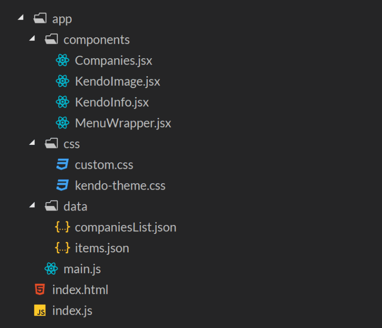
Finally, I have done some basic arranging of the files into respective directories:
Wrapping Up
That brings us to the end of this part of the series. So far, in our first article, we have gone over how to work with Flexbox manually as well as explored ready to use React Components from the ecosystem to help us achieve responsive behavior without doing all of the work manually. In this article we continued to lean on the ecosystem to find a simple and easy to use grid system so that we could create responsive layout and grids for other purposes like a gallery of images. I hope you feel like you know your way around Responsive React a little better now.
It always pays to know how this stuff works under the hood, however, there is no reason in this day and age to roll your own Flexbox grid - doing so once to get the basic understanding is great, but there are many components out there that can help you do that. It saves a lot of time and grief and it's not hard to change if you move to another solution.
Below is our final StackBlitz demo and the product of this refactoring exercise. If I were in charge of building this application out fully this would be a great place to start and we would have tools that can help us tackle everyday responsive behavior and layout in our application.

Top comments (0)