With Vue.js, you give your web apps a component-based architecture; the big user experience you're setting up is broken down into components, such as sliders, hero banners, dropdowns, and control panels. Because components can communicate with each other, a benefit to this architecture is that you can give each component a different piece of the app's logic it's responsible for, helping to organize your app. And you can reuse a component in different parts of it, like having two dropdown menus with different sets of items.
Another benefit, which is the one this tutorial will show you around, is that since Vue components have a uniform way of communicating (through props and events), that means you're not just limited to using components you wrote. If someone wrote and open-sourced a component that does something your app needs to do, you can use it in your app and spend more time focusing on designing the app as a whole, not on the details of how to get that piece of your app to work.
🐣 Starting our app with just our own components
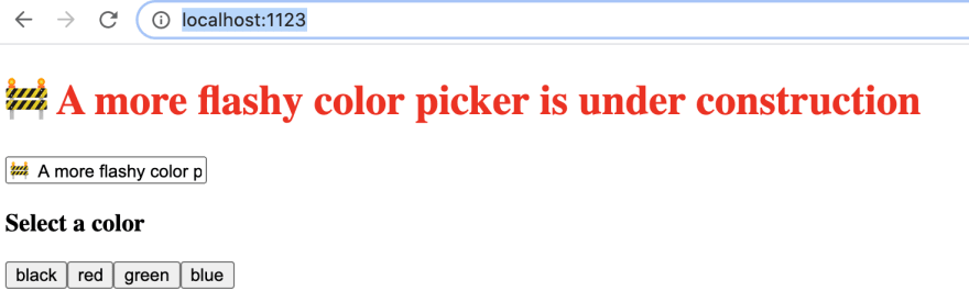
Let's start with a simple web app we made with just our own components. The app will have an input box for typing in a message, a big header for displaying the message, and buttons for picking the color of the text. It will look like this:
The source code we're starting with can be found here, so if you would like to follow along, clone the repository, go to follow-along, and edit code from there. If you read my pair of tutorials on going from plain Vue to single-file components and vue-cli, the code is taken from that app, so feel free to skip reading this section.
The file's we're interested in are:
-
src/components/ColorPicker.vue, which contains the set of buttons for picking the color of the display text. -
src/App.vue, which contains the app as a whole, including the display text and the input box for changing the text. This app uses also uses theColorPickercomponent.
Let's take a look at the components.
ColorPicker.vue
<template>
  <form>
    <h3> Select a color</h3>
    <button
      v-for="color in colors"
      :key="color"
      @click.prevent="selectColor(color)"
    >
      {{ color }}
    </button>
  </form>
</template>

<script>
export default {
  name: 'ColorPicker',
  props: ['colors'],
  methods: {
    selectColor(color) {
      this.$emit('color-change', color);
    },
  },
}
</script>
The main parts to focus on are that:
- It takes in an array of colors as a prop, and for each color, it displays a button.
- When you click one of those buttons, the ColorPicker component calls its
selectColormethod, emitting acolor-changeevent. That event contains information about which color the user picked.
We could break this down further into even more components, but I wanted to have only a couple components to think about in this tutorial.
App.vue
<template>
  <div class="whole-thing">
    <h1 :style="{color: color}">{{ message }}</h1>
    <div aria-label="message input">
      <input type="text" v-model="message" />
    </div>
    <color-picker
      @color-change="colorChange"
      :colors="['black', 'red', 'green', 'blue']"
    ></color-picker>
  </div>
</template>

<script>
import ColorPicker from './components/ColorPicker.vue';

export default {
  name: 'App',
  components: {
    'color-picker': ColorPicker,
  },

  data() {
    return {
      color: 'black',
      message: 'write a message',
    };
  },

  methods: {
    colorChange(color) {
      this.color = color;
    },
  },
}
</script>
The main parts to check out are:
- In the template, we use a
color-pickercomponent. We pass that component a list of colors for the user to choose from using thecolorsprop. - We listen for
color-changeevents that the color picker emits. - When we get a
color-changeevent, we use it to update thecolorfield on our App component's data, which then is passed to the big display header's:style.
🎨 More colors!
We've got our color picker, but why stop at just four colors to choose from? We should let users pick any color they want!
We could just do that by giving our app an input box that lets someone type in the hex code to the color they want to show, but hex color codes aren't that intuitive to think about. We want a color picker that's more fun to use, and lets the user see which color they're picking. And someone made just the kind of component we're looking for: radial-color-picker!
⚠️ Before we start using someone else's component, we should always check the license for the legal rules to using it. Go to the project's page on GitHub and check out LICENSE.
Luckily, this is licensed under the MIT license, which is highly permissive!
To get the component, run:
yarn add @radial-color-picker/vue-color-picker
Now, let's try using it in our app. In the <script> tag of ColorPicker.vue, make the following changes:
+ import ColorPicker from '@radial-color-picker/vue-color-picker';
+
  export default {
    name: 'ColorPicker',
-   props: ['colors'],
+   components: {
+     'radial-color-picker': ColorPicker
+   },
    methods: {
      selectColor(color) {
        this.$emit('color-change', color);
      },
    },
  }
We import vue-color-picker, and then register it under components so we can use it in our <template>, which we can do by replacing the <button v-for... tag with:
<radial-color-picker
  aria-label="color radial selector"
/>
We give the component an aria-label describing what this component is for accessibility. I'm still pretty new to web accessibility and want to learn a ton more, but experimenting with the ChromeVox screen reader, if you select this component while using a screen reader, it says "color radial selector". Even without this label, though, radial-color-picker does come with a default aria-label that has the screen reader say "color picker".
Finally, like many components, this component has some specialized CSS we need to import, so add this <style> tag at the bottom of ColorPicker.vue
<style>
@import '~@radial-color-picker/vue-color-picker/dist/vue-color-picker.min.css';
</style>
Now, run yarn serve, go to localhost:1123, and you'll see our radial color picker component we can play with:
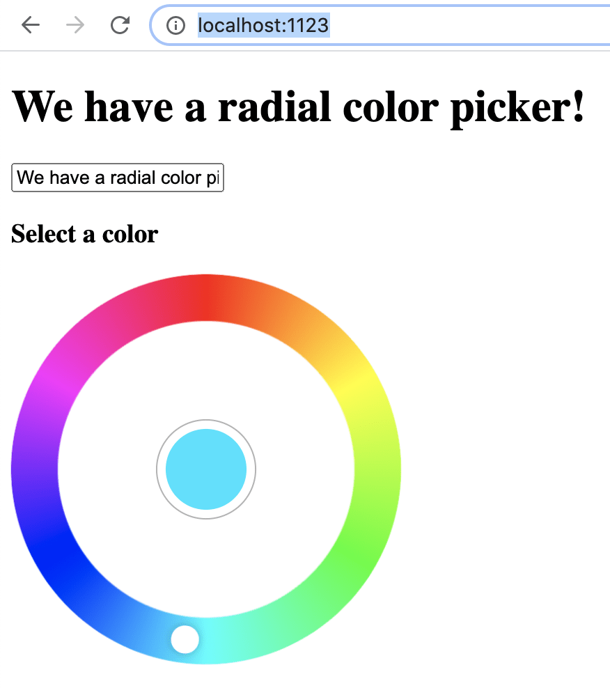
🤩 Awesome! I don't know about you, but this rainbow gradient gives me nostalgia for the Flash days of the Internet! We now have a pretty component to use for picking the color of our text!
One problem, though, if we pick a color, now the color of the text isn't updating. For that, we need events.
📡 Communicate using events
Our next step is to make this radial color picker component communicate with our ColorPicker.vue so it can update the data.color field on App.vue.
Vue components communicate with each other by passing props down to child components, and events up to parent components. If you recall, the original <color-picker> tag looked like this:
    <color-picker
      @color-change="colorChange"
      :colors="['black', 'red', 'green', 'blue']"
    ></color-picker>
And when someone clicked to select a color:
- the
ColorPickerwould send acolor-changeevent - that color-change event would be caught with the
@color-changedirective - the App component calls its
colorChangemethod, passing in the color the user selected, so we can update the text of the banner
So what we need is to find the event that gets emitted from the radial color picker when a new color is selected, and then make a v-on listener for that kind of event.
To find the event we want, luckily, vue-color-picker has reference docs explaining how this component is used. You can find them at radial-color-picker.github.io.
To see all the events the component emits, and all the props we can pass to it, go to the section titled config reference. A lot of Vue component libraries come with a reference section in their docs that tells you this information, similar to how a Godoc tells you about exported types and methods in a Go package.
In the config reference, we can see three events this component emits: input, change, and select. From the descriptions, input and change sound like the ones for when the user is picking a color for the text to display. I'm gonna go with input, so as the user is cycling through colors, the color changes on the header text.
So our radial-color-picker tag would now have an @input directive that will call our selectColor method.
<radial-color-picker
  aria-label="hue radial selector"
  @input="selectColor"
/>
There's just one other change we need to make: the docs say that we're not getting back a color like "green" or "orange", but rather a number from 0 to 359 for a hue value. So we need to take this hue value, use it to construct a hue-saturation-luminosity color (HSL), and then use that HSL color as the color of our <h1> tag.
  methods: {
-   selectColor(color) {
-     this.$emit('color-change', color);
+   selectColor(hue) {
+     this.$emit('color-change', `hsl(${hue}, 100%, 50%)`);
    },
  },
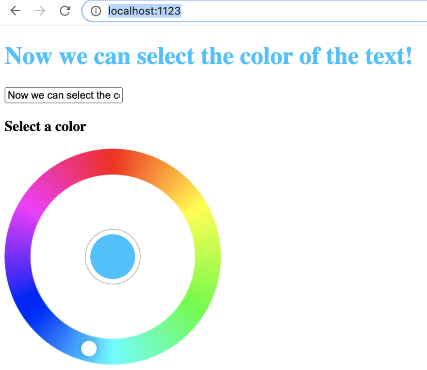
We use the satisfying JavaScript string interpolation syntax to create an hsl color string, and then our ColorPicker component emits that. In CSS, hsl(...) is a valid format for representing a color, so in App.vue that can be dropped into our <h1> tag's :style, and now our color picker works!
We've seen how we can install a Vue component, add it to our Vue app, and have it communicate with other components using events. Now, as a challenge, this radial color picker only lets us pick hue, but what if we wanted options to pick saturation and luminosity as well? If you're following along with this tutorial, try giving ColorPicker.vue a couple range sliders for picking the percent saturation and luminosity. Then, in addition to emitting a color with all three of these parts selectable, try adding saturation and luminosity to the color that the radial-color-picker displays in its center dot. As a hint, check out the config reference again for the radial color picker. There's some configuration to the component that will help you.
You can see the answer I came up with here.

Top comments (0)