Day 6 of 100 Days Data Science Bootcamp from noob to expert.
GitHub link: Complete-Data-Science-Bootcamp
Main Post: Complete-Data-Science-Bootcamp
Recap Day 5
Yesterday we have studied in detail Pandas in Python.
Let's Start
Matplotlib is a plotting library for the Python programming language and its numerical mathematics extension NumPy. It provides an object-oriented API for embedding plots into applications using general-purpose GUI toolkits like Tkinter, wxPython, Qt, or GTK. Matplotlib is a powerful tool for data visualization in data science and can be used to create a wide variety of plots, including line plots, scatter plots, bar plots, histograms, 3D plots, and more. Some of the key features of matplotlib include support for customizable plot styles and color maps, interactive plot manipulation, and a variety of export options for creating publication-quality figures.
Line Plot:
A line plot is a way to display data along a number line. It is useful to show trends over time or to compare multiple sets of data. It is created using the plot function in matplotlib, which takes in the x and y data as arguments. In the example I gave, the x data is an array of 100 evenly spaced points between 0 and 10 and the y data is the sine of x values.
import matplotlib as plt
x = np.linspace(0, 10, 100)
y = np.sin(x)
plt.plot(x, y)
plt.xlabel('X')
plt.ylabel('sin(X)')
plt.title('Line plot')
plt.show()
Scatter Plot:
A scatter plot is used to show the relationship between two variables. It is created using the scatter function in matplotlib, which takes in the x and y data as arguments. In the example I gave, x and y are arrays of random values generated using the random.normal function from numpy. It shows the correlation or distribution of data points.
x = np.random.normal(loc=0.0, scale=1.0, size=100)
y = np.random.normal(loc=0.0, scale=1.0, size=100)
plt.scatter(x, y)
plt.xlabel('X')
plt.ylabel('Y')
plt.title('Scatter plot')
plt.show()
Bar Plot:
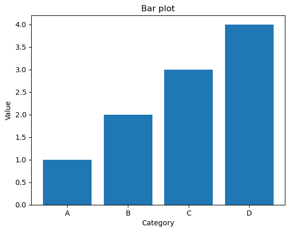
A bar plot is used to compare the values of different categories. It is created using the bar function in matplotlib, which takes in the x and y data as arguments. In the example I gave, x data is an array of categorical values ('A','B','C','D') and y data is an array of values.
x = np.array(['A', 'B', 'C', 'D'])
y = np.array([1, 2, 3, 4])
plt.bar(x, y)
plt.xlabel('Category')
plt.ylabel('Value')
plt.title('Bar plot')
plt.show()
Histogram:
A histogram is used to show the distribution of a single variable. It is created using the hist function in matplotlib, which takes in the data and the number of bins as arguments. In the example I gave, the data is an array of 1000 random values generated using the random.normal function from numpy and number of bins is 30. The histogram plot shows the frequency of values in different bins, where each bin represents a range of values.
x = np.random.normal(loc=0.0, scale=1.0, size=1000)
plt.hist(x, bins=30)
plt.xlabel('X')
plt.ylabel('Frequency')
plt.title('Histogram')
plt.show()
Box Plot:
A box plot is used to show the distribution and outliers of a set of data. It is created using the boxplot function in seaborn, which takes in the data and the variables to plot as arguments. In the example I gave, the data is an array of random values generated using the random.normal function from numpy.
import seaborn as sns

x = np.random.normal(loc=0.0, scale=1.0, size=100)
sns.boxplot(x=x)
plt.xlabel('X')
plt.title('Box plot')
plt.show()
Heatmap:
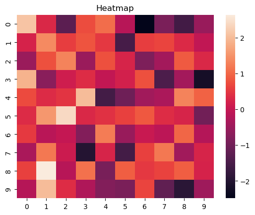
A heatmap is used to visualize large data with multiple variables. It is created using the heatmap function in seaborn, which takes in the data as an argument. In the example I gave, the data is a 2-D array of random values generated using the random.normal function from numpy. The color of the cells represents the value of each element in the matrix.
x = np.random.normal(loc=0.0, scale=1.0, size=(10, 10))
sns.heatmap(x)
plt.title('Heatmap')
plt.show()
Violin Plot:
Violin Plots are similar to box plots, but also display the probability density of the data at different values. They can be created using the violinplot function in seaborn
x = np.random.normal(loc=0.0, scale=1.0, size=100)
sns.violinplot(x)
plt.xlabel('X')
plt.title('Violin plot')
plt.show()
Swarm Plot :
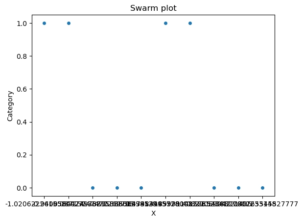
A swarm plot is used to show the distribution of a single categorical variable. It is created using the swarmplot function in seaborn, which takes in the data and the variables to plot as arguments. In the example I gave, the x data is an array of random values generated using the random.normal function from numpy and y data is an array of categorical values(0,1)
x = np.random.normal(loc=0.0, scale=1.0, size=10)
y = np.random.randint(0,2,size=10)
sns.swarmplot(x=x, y=y)
plt.xlabel('X')
plt.ylabel('Category')
plt.title('Swarm plot')
plt.show()
Pie Chart :
A pie chart is used to show the proportion of different categories in a single variable. It is created using the pie function in matplotlib, which takes in the data and the labels as arguments. In the example I gave, the data is an array of values representing the size of each category and the labels are the names of each category. Additionally, you can use the autopct parameter to add the numerical value of each slice on the chart.
sizes = [15, 30, 45, 10]
labels = ['Frogs', 'Hogs', 'Dogs', 'Logs']
plt.pie(sizes, labels=labels, autopct='%1.1f%%')
plt.axis('equal')
plt.title('Pie chart')
plt.show()
Stacked Bar Plot:
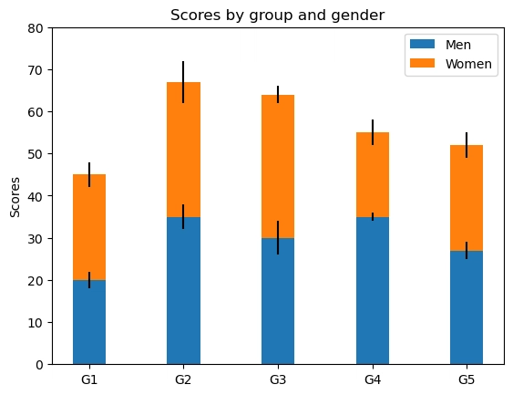
A stacked bar plot is used to show the breakdown of one variable by another. It is created using the bar function in matplotlib and bottom attribute of bar function. In the example I gave, Two sets of data are plotted as separate bars, one on top of the other, to show the breakdown of one variable by another. The legend is used to distinguish between the two sets of data.
N = 5
menMeans = (20, 35, 30, 35, 27)
womenMeans = (25, 32, 34, 20, 25)
menStd = (2, 3, 4, 1, 2)
womenStd = (3, 5, 2, 3, 3)
ind = np.arange(N)    # the x locations for the groups
width = 0.35       # the width of the bars: can also be len(x) sequence

p1 = plt.bar(ind, menMeans, width, yerr=menStd)
p2 = plt.bar(ind, womenMeans, width,
             bottom=menMeans, yerr=womenStd)

plt.ylabel('Scores')
plt.title('Scores by group and gender')
plt.xticks(ind, ('G1', 'G2', 'G3', 'G4', 'G5'))
plt.yticks(np.arange(0, 81, 10))
plt.legend((p1[0], p2[0]), ('Men', 'Women'))

plt.show()
In conclusion, Matplotlib and Seaborn are powerful libraries for data visualization in data science. They provide a wide range of options for creating different types of plots, from simple line plots to more complex heatmaps and violin plots. Each type of plot has its own strengths and can be used to effectively communicate different types of information.
When creating plots, it's important to consider the context of your data and the audience for your plots. Choosing the right type of plot depends on the nature of your data and what you want to communicate with your plot. Additionally, you should also pay attention to the details of the plot, like labels, scales, and colors, to make sure your plot is easy to read and understand.
Lastly, always keeping in mind the data you have and what are the important information you want to show, this will make sure that you choose the right type of plot and customize it to convey the correct information in a clear and efficient way.


Top comments (0)