
In today’s fast-paced and data-driven business landscape, the importance of data visualization cannot be overstated. Data visualization is important for organizations seeking clarity on the huge volumes of data they accumulate. It not only speeds up error identification, but it also empowers stakeholders to comprehend and act upon insights quickly.
This is when charts step in. Charts are necessary for converting complex data into simple and understandable visual illustrations. Using visual charts from reliable reporting tools like Bold Reports enables users to create engaging reports that can be used to analyze data and make informed decisions.
Why charts?
Charts are visual representations of data that help us understand information, but they are not the only way to do so. You should consider the following:
- Understand why you want a chart: Before creating a visualization, ask yourself what message or insight you want to share.
- The purpose of your visualization: Once you know why you want a chart, define what you want to achieve with it. Are you comparing data, tracking trends, or telling a story? Your objectives will shape your chart’s design.
- Choose the best chart to help you reach your objectives: Choosing the right chart type is important for clear communication. Different charts work best for different data and goals. Whether it’s bar charts, line graphs, pie charts, or heat maps, the right choice helps convey your message effectively.
Selecting the right type of chart
Choosing the right chart is important for clear data communication. Different charts suit different tasks–be it comparisons, distributions, or proportions. So, let’s explore how to make this decision effectively.
Comparison charts
The following chart formats are recommended for comparing separate categories (dimensions) with numerical values:
- Column charts
- Bar charts
- Stacked column charts.
- stacked bar charts.
Proportions
Proportions represent the relationships between different parts of a whole. Charts like pie and doughnut charts are used to visually illustrate data proportions, making it easier for users to understand.
- Pie charts
- Doughnut charts
- Pyramid charts
- Funnel charts
Analyzing data Distribution over time
The following chart formats are better for identifying data distribution across time and understanding outliers, trends, and data ranges:
- Area charts
- Line charts
- Stacked area charts.
- 100% stacked area charts
Column charts
A column chart allows you to compare values for a set of unordered items across categories through vertical bars ordered horizontally. It is also suitable to display negative values.
Best practices
- Use a column chart to compare a smaller amount of data across different categories; you can compare the market share of different companies or sales performance over time.
- Use column charts to identify trends in customer satisfaction or to show patterns in website traffic data.
The following example showcases a column chart visualizing the total number of product sales based on product category.
 Column chart
Bar charts
A bar chart allows you to compare values for a set of unordered items across categories through horizontal bars ordered vertically.
Best practices
- Bar charts are ideal when you have lengthy data labels and need to display and compare numerous categories, making it easier to read and compare labels that run vertically.
- It’s advisable to sort the values in descending order on a bar chart to effectively highlight and compare the data, with the largest categories at the top for clearer visualization.
The following bar chart shows the number of sales in each month. The retail industry can benefit from this information to better understand their sales trends and develop strategies to increase sales.
 Bar Chart
Stacked column charts.
A stacked column chart allows you to compare multiple measures through bars stacked one after the other vertically.
Best practices
- Use to Show Data Changes Over Time: Stacked column charts are particularly useful for visualizing data trends and changes over a time period, such as months, quarters, or years.
- Limit the Number of Series and Categories: To maintain clarity and ease of comparison, it’s generally advisable to limit the number of series (the different data sets) and categories (the time periods) displayed in the chart.
- Maintain Consistent Units of Measurement: Ensure that the data within the chart uses a consistent unit of measurement.
In this example, a stacked column chart is used to display the most popular search engines by month. Google is the most popular search engine by a large margin, followed by Bing and Yahoo.
 stacked column chart
Stacked bar charts.
A stacked bar chart allows you to compare multiple measures through bars stacked one after the other horizontally.
Best practices
- To maintain clarity and readability, avoid including too many categories or data series in a single stacked bar chart. If you have a large number of categories, consider grouping or aggregating them to prevent overcrowding.
- To maintain clarity and readability, avoid including too many categories or data series in a single stacked bar chart. If you have a large number of categories, consider grouping or aggregating them to prevent overcrowding.
The following stacked bar chart conveys that Product B has a higher sales percentage than Product A, and the percentage of sales is increasing over time.
 stacked Bar chart
Pie charts
A pie chart allows you to showcase the proportionality of each item to the total in the form of pie slices.
The following example demonstrates the use of a pie chart to illustrate the increasing trend in mobile browser usage.
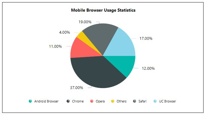 Pie chart
Doughnut charts
A doughnut chart allows you to showcase the proportionality of each item to the total in the form of doughnut slices. It works best to display data with a small number of categories.
The following doughnut chart showcases daily living expenses as the highest category of spending for people. Financial institutions can benefit from the following chart to optimize risk management and profitability.
 Doughnut chart
Pyramid charts
A pyramid chart is a triangle diagram that allows you to make proportional comparisons between values showcased in a progressively increasing manner. Pyramids consist of various segments, each representing a data point.
The following pyramid chart example showcases the importance of eating a variety of foods from different food groups to maintain a healthy diet. The food industry can benefit from this information by developing and marketing products that meet this need.
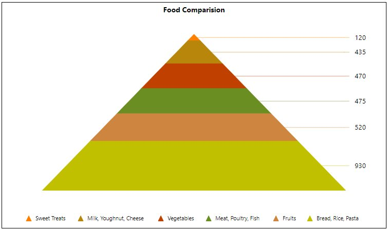 pyramid chart
Funnel chart
A funnel chart shows values across multiple stages in a process by highlighting different stages with different colors. The following funnel chart shows that the number of website visitors decreases at each stage of the funnel, from qualified visitors to closed visitors.
 Funnel chart
Area chart
An area chart allows you to compare values for a set of unordered items across categories through filled curves ordered vertically.
The following area chart example provides a quick understanding of the increasing efficiency of oil-fired power production over time. The energy industry can benefit from this information to improve their operations and reduce costs.
 Area chart
Line chart
A line chart allows you to showcase trends for analysis over a time period with data points connected using straight lines.
The following example of a line chart conveys that the efficiency of oil-fired power production is increasing, as shown by the upward trend of the lines for four countries (England, France, Germany, and India).
 Line chart
Stacked area chart.
A stacked area chart allows you to compare multiple measures through filled curves stacked one after the other vertically.
Best practices
- Comparing Total Values Across Categories Over Time: Stacked area charts are excellent for comparing the total values of different categories over a time period.
- Handling Null or Zero Values: It’s a good practice to represent null or zero values explicitly by inserting empty data points. This helps maintain the integrity of the chart and provides a more accurate representation of the data.
The following stacked area chart example showcases industrial production growth in four countries: Indonesia, Russia, the United States, and Bangladesh, but US and Russia have seen the fastest growth.
 stacked area chart.
The following 100% stacked area chart shows the percentage of sales by year; it shows how much each salesperson completed for each year.
 100% Stacked Area Chart
Smooth line chart
The smooth line chart allows you to showcase trends for analysis over a time period with data points connected using smooth lines. The following smooth line chart example is useful for understanding the average temperature in a particular location—such as France, Germany, and London—throughout the year.
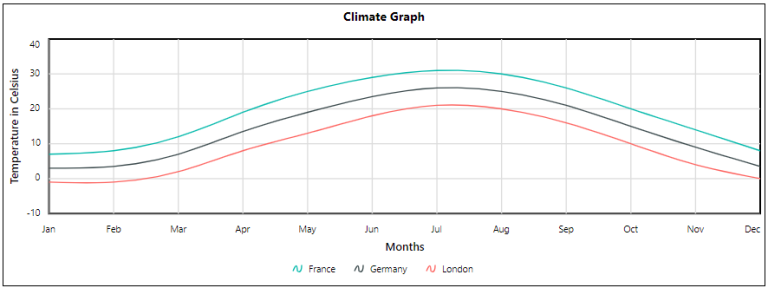 Smooth Line Chart
Conclusion
We hope this post has given you a better understanding of chart types and their applications so that you can select relevant charts for your data. To explore more, look through our demo samples and documentation site. If you have any questions, please post them in the comments section. You can also contact us through our contact page, or if you already have an account, you can log in to ask your support question.
Bold Reports offers a 15-day free trial without any credit card information required. We welcome you to start a free trial and experience Bold Reports. Try it and let us know what you think! Stay tuned for new releases by following us on Twitter, Facebook, LinkedIn, and Instagram for announcements.


Top comments (0)