
The article was originally post on the Bugfender blog.
Frankenstein’s monster isn’t known for its personality. Grunts, gurgles, and groans make up the majority of its communication after his creator first flips the switch. But in the classic novel the creature becomes intelligent and articulate after a long time in the wilderness. It earns an identity.
Now, we managed to build a product and a website rather than a human. When we launched Bugfender as an experiment we weren’t sure whether it was going to take off. It did, and we were pleased.
Discover how Bugfender gained 9.5 million users in 3 years.
But like Frankenstein, we realized something was missing–a personality.
Why Products Need Personality
Imagine you’re a fly on the wall. You hear people say this about you:
“Quite the hothead
It hurts to hear it–you, like most people, want to be perceived positively. But chances are you already recognize there’s some truth there, and you deal with it.
Now you hear this:
“Absolutely zero personality
Now that’s a kick in the face. At least the first comment shows there’s some substance to you. But zero personality?
Why do we get hung up on personality? Because we’re social creatures with an innate need to interact with one another. Personality is how we set ourselves apart as humans, how we find connections with like-minded people, how we form tribes. Without it, we’re just a bunch of processes–robots, essentially. We need to interact with robots. But most people aren’t necessarily drawn to them.
No wonder Apple designed Siri to crack jokes. It bridges the gap between a necessary interaction with a product and a pleasurable one. If you get that right, users will come back to that experience over and over.
Many websites aim to present a product in the most effective way possible. But websites themselves are the product.
Do you want to be known as the site with zero personality? We didn’t–so we took action.

Creating a Unique Concept
We started out by thinking what not to do. We looked at sites providing services similar to ours and came up with an “avoid at all costs list:
- App developers love working with code and logs, right? Show them lots of images of those things.
- Add stock images of mobile and laptop screens. Ideally without humans.
- If you do have to show humans, just show images of men.
- Apply a safe, corporate color-scheme and design.
- Write serious-sounding, humorless copy.
- Explain what your product does–but don’t take risks by trying a tell a story.
- The user: everyday people and developers
- The problem: bugs and issues
- The solution: Bugfender
Any storytellers out there will know that writing 101 teaches you to set out your protagonist, challenge them with a problem, then send in a solution that swoops in to save the day. We realized we had the ingredients to a compelling story–three universally identifiable roles that would help Bugfinder discover its unique identity and stand out from the competition.
The next question was: how do we tell that story?
We were quickly drawn to vintage cartoons and pop art. Classic comic books thrive on the idea of the trusty superhero. Applying that to a bug-splattering Bugfender hero would be simple. But so often, the helpless victim is a damsel in distress. We were set on changing that–our hero would be Blair, a female destroyer of bugs helping millions of developers all over the world.

The old Bugfender website
Applying Thoughtful Design
Personalities come in different colors. But what’s the equivalent color of “zero personality applied to websites? Black text on a white background–and lots of it. You might as well be reading Google Doc.
We decided to apply a pop art inspired grey background to our header. Warhol would be proud. And we didn’t want to delay telling our story until visitors clicked on the “about section. Heros belong on the front cover–that’s exactly where we introduced Blair to website visitors.
What about the words? If you already have compelling copy–good job. But the truth is, most people don’t read online. They skip, scan for, and select the information needed to complete a task at hand. Those tasks vary, but let’s face it–nobody is eagerly reading everything on your website as if it were the surprise 8th book in the Harry Potter series.
That’s where great graphics come in to tell a compelling story. We’re naturally drawn to them, and they’ll have a lot more impact if they look great and get across the essence of your service. We decided to show the global nature of our service, the problem, and the solution we’re providing.
Take another look at the image of our old website above. Notice anything that’s missing?
Every website owner wants visitors to do something. It might be signing up to a newly formed marching band. Perhaps it’s buying a lot of flatpack Swedish furniture you don’t really need. For us, it’s getting people to try Bugfender. Whatever the aim, it’s known as a conversion. But how do you encourage people to convert if you don’t show them how? In the old Bugfender website, there were no visible call-to-action buttons (CTAs) when you landed on the page.

The new Bugfender home page
The red stands out. We scattered the CTAs in strategic places, providing just the right amount of opportunities for the user to take action. Too few and you risk missing out on potential customers, too many your site visitor feels bombarded.
Who doesn’t like pressing buttons? Unfortunately, in the pixelated world, you can’t actually press a button–and we miss out on that satisfying feeling of something moving as our finger applies pressure. So we added hover effects to the CTAs to recreate that sensation, at least on a visual level.
By the time we got round the the website redesign we already had bunch of people who really liked our product. We wanted to show others we could solve their problems too, so we added some social proof to build trust right from the start.

Displaying our users’ logos and testimonials
Design decisions in the bag, it was time to get to work on the engine that powered the new Bugfender site.
Laying Down Firm Foundations
We had Pablo–our designer–to work on the concept and designs. Luckily, we also have a guy with one foot in the marketing world, and one in the engineering world.
Adam, one of our Frontend Engineers and all-round Marketeer, worked on the new site:
“Making a great website isn’t just about the design or effective, informative copy–it’s also the way the information is presented. Trying to get headings to stand out and text to appear clearly on any sized screen is tough.”
So how did we do it?
First, we decided to use WordPress to power our blog. Why? Because it’s a great tool. Developers using Bugfender would use modern browsers, so we could steam ahead without worrying too much about lack to support for IE8 (tell us we’re wrong here!)
We used inline SVG images where possible to reduce the number of server request and shave seconds off page load times. As a vector, SVG images are tiny and can scale up–reducing the need for retina images. We also optimized .jpg and .png images by resizing and compressing them.

Using inline svg images to save on http requests
For our web layout model we plumped for flexbox. We built everything from scratch for the new site, and didn’t want to deal with heavy frameworks like Bootstrap or Foundation. Plus, flexbox now comes with great support.
We even used the opportunity to build a new flexbox grid and release it as an open-source project called Eixample–dedicated to a district in Barcelona with a grid pattern street design.
Here’s Adam again:
“The codebase is very modularized, meaning we can easily reuse many sections of the website across many templates. We can knock up new templates quickly, reliably, and without adding a lot of extra code.”
Results
New isn’t always better. Just ask Coca Cola. There’s no point changing the recipe if people don’t like the taste.
So, did the redesign have a positive impact?
Yes.
Over the past year, we’ve seen the average number of hits per day increase from 1000 to around 3000.

Our website page views increased and stabilized and from around 1000/day (left/2016) to 3000/day (right/2017)
Bounce rate–the percentage of visitors that enter a site then leave rather than continue viewing more pages–has gone down, thanks to improved navigation and readability.
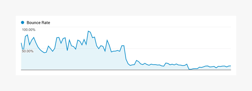
We saw a significant drop in our website's bounce rate when the new site was launched
We’ve also had more people reading entire blog articles and more shares, contributing to a steady increase in the number of paying users.

A steady increase in active customers due to our rebranding and new marketing efforts
Personality Found
A half-hearted approach to brand identity gets half-hearted results. By focusing on the problem we solve, carving out a story people can relate to, and bringing that story to life in a unique way through thoughtful design, we injected Bugfender with a huge dose of personality. Back it up with a solid engineering, and you might just come away with a winning platform for growth.
The article was originally post on the Bugfender blog.

Top comments (0)