Let's talk about website forms user experience
Website forms are something we complete all the time. Whether we are registering for a new account on a brand new service, completing digital paperwork for a medical appointment, or even applying for a job. We interact with forms a lot, and as a developer it's our job to create these forms, but we need to do better for the user experience.
Website forms are the digital replacement for paper forms. For example, to apply for a job more than 10 years ago, you would have to visit the company and ask for an application for employment. This paper form would then be completed and returned, usually along with a resume. This process today is entirely online for most employers.
One key difference from the transition to digital forms was the requirement to duplicate information.
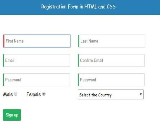
Example of a Bad User Experience HTML Form
This example was taken from a HTML Forms YouTube snapshot where new developers are taught to duplicate registration fields.
Even Google requires duplicate password entry but has a 'Show Password' option.
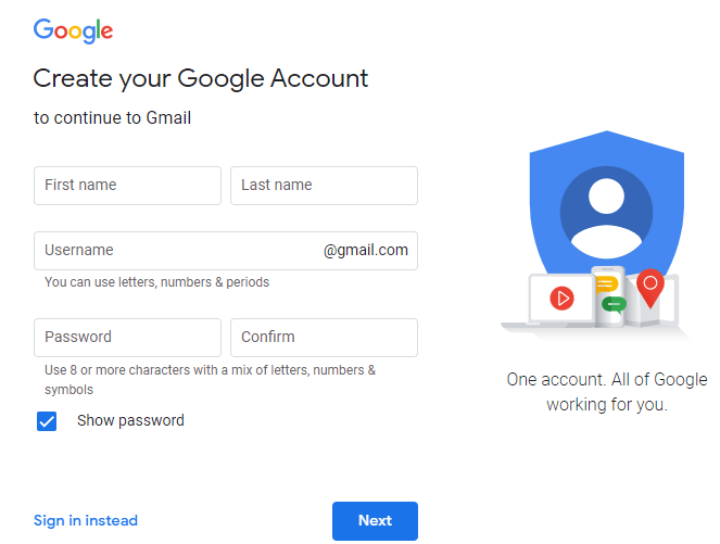
Example of a Good User Experience HTML Form
Here is the current Sign Up page for SignUpGenius a website for gathering signups such as RSVP.

Here is Instagram's current signup page
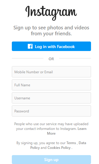
What separates the good from the bad?
The User Experience
When a user only has to input the minimum necessary information to begin using your service or product, and doesn't have to duplicate any information, it's a great first impression and user experience.
At some point in HTML forms over the years, developers started requiring the user to enter some information twice. Every single week I come across a website that requires me to enter something two times, even when I can see the first one I typed on the screen. Most times, I'll just copy the first field and paste it into the second, but is that 'confirm' field even necessary?
The most common confirm fields that I find are Username, Email, Password, Account Number and Address. I've never filled out a paper form where I had to hand-write my email two times or my account number two times.
User Experience
Have you ever witnessed a user registering for a website or service and get frustrated when they click submit and then form validation runs and an error message appears that something they entered two times didn't match? Their first impression of your company has now taken a negative tone as they become frustrated just trying to register for your service.
Additionally, the size of forms plays a huge role in whether people actually complete the registration. A user is less likely to submit a registration form with 15 fields, then they would be with 2 fields.
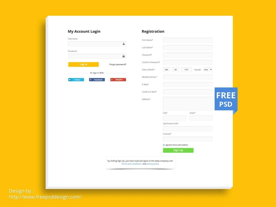
Example
Let's have a look at an registration form design template example. This template is daunting to the end user, look at all the information that must be filled out just to register. There are also two confirm fields requiring duplicate entry.
Why is this?
In my opinion, this practice came about in the early days of website forms when the target audience was less tech savvy and prone to typos. Not to say that this is entirely resolved today, but the design fundamentals have come a long way where confirmation of input can be removed. A typo in an email can pose a problem as the user would not receive any email communication from the service, like an activation link.
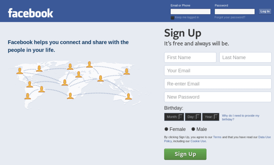
Large companies such as Facebook only recently dropped the requirement to duplicate the email on their sign up form, but many websites still use this old logic.
Suggestions for Resolution
A large amount of forms these days are completed using auto-fill technology where users are on a personal device and a lot of the information is saved to their browser, or an extension, etc. I also personally copy and paste a lot of information from my password manager which eliminates the need for duplicate entry.
Some key changes in technology to reduce errors are the ability to reveal information typed into a password field, and auto-fill. Allowing a user to double check their password by revealing the input field eliminates the need to enter it twice.
Password Confirmation Field
All forms should have the option to reveal the password so that a user can double check the entered password if manually entering. The confirm password field should be eliminated.
Email Address Confirmation Field
The requirement to enter the email a second time should be eliminated entirely. If the email address is absolutely critical then perhaps a checkbox the user must click to acknowledge their email is correct but they should not be forced to re-enter.
Account Numbers / Routing Numbers Confirmation Fields
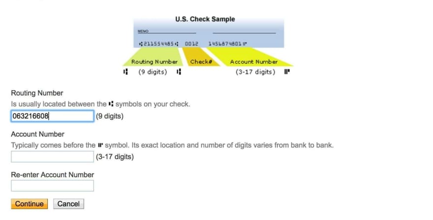
Online transactions via ACH or EFT require entry of financial institution routing and account numbers. Most sites ask for both fields to be entered twice, or at least the account number to be entered twice. If the information is revealed on the screen or can be revealed for confirmation, then there is no need to force a user to enter it a second time.
Conclusion
HTML forms are all about user experience. This is how we get information from users into our website and we want to make sure the users provide clear and accurate information without frustration.
If you are creating HTML forms, consider alternatives to adding 'confirm' input fields. Look at the end user perspective and determine if it's truly necessary to make your client enter the same thing multiple times. I personally despise having to type something two times in a row.
If you feel it's necessary that the user double-check entered information such as an account number, a checkbox is a simple alternative on the form to have the user confirm they entered it correctly, without having to enter it twice.
Go forth and create awesome HTML forms with great user experiences.
If you have thoughts on this, I'd love to hear your comments!




Top comments (0)