Hello Coders, Today's Blog i will show you how to Create Responsive Sliding Sign in & Sign up Form Using HTML,CSS & Javascript
This is One of the Best project for as New & Intermediate Programmers This project really Improve your Understanding skills.
Nowadays you can see every Business Website Needs to Sign in &Sign Up Form I will Design the Beautiful sliding Login & Signup Animation Using Javascript
Sign up Form use to Create a New Account for a new users for a website and a Login form is Existing User details of a registered user into their particular account
There are so many websites use this types of Sign in & Sign Up form Because this form is Looking Nice 👍 & User can easily fill out this form. We will Combine sign in & up form in Single page Also the Form Sliding with Smooth animation
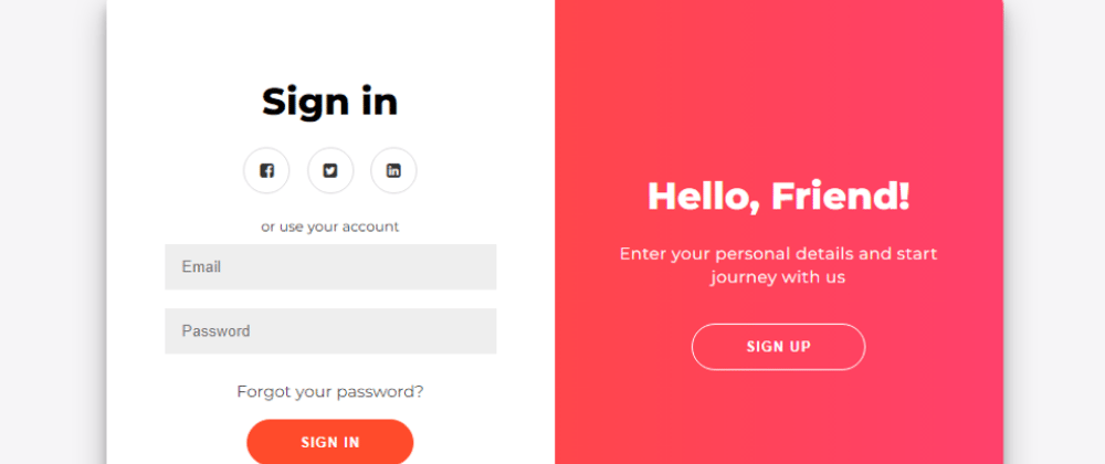
First of All I Will show you projects preview that you can easily understand what I'm Saying...
I Hope you can enjoy this projects I will step by Step Guide you to build this Responsive Sliding Sign in & Sign up Form Using HTML,CSS & Javascript. Also I will Explain code in written format. If you have seen Project Preview Video then you can Continue Reading the Post
File Structure :
First you can create a Folder that Name is Folder is Sliding Form After Creating Folder Add HTML File as name is Index.html & Add CSS File name is Style.css Also I've Write Some JavaScript Code in HTML File
To Create Responsive Sliding Sign in & Sign up Form Using HTML,CSS & JavaScript follow the given steps line by line:
Create a folder You can name this folder whatever you want, and inside this folder, create the mentioned files.
Create an index.html file. The file name must be index and its extension .html
Create a style.css file. The file name must be style and its extension .css
To start, add the following HTML codes to your index.html file to create the basic layout of the project.
HTML & JS CODE :
<!DOCTYPE html>
<!-- created by Coder Vicky || www.codervicky.com  -->
<html lang="en">
<head>
    <meta charset="UTF-8">
    <meta http-equiv="X-UA-Compatible" content="IE=edge">
    <meta name="viewport" content="width=device-width, initial-scale=1.0">
    <title>Sign in/up Form</title>
    <link rel="stylesheet" href="style.css">
    <link rel="stylesheet" href="https://stackpath.bootstrapcdn.com/font-awesome/4.7.0/css/font-awesome.min.css">
</head>
<body>
<div class="container" id="container">
  <div class="form-container sign-up-container">
    <form action="#">
      <h1>Create Account</h1>
      <div class="social-container">
        <a href="#" class="social"><i class="fa fa-facebook-square"></i></a>
        <a href="#" class="social"><i class="fa fa-twitter-square"></i></a>
        <a href="#" class="social"><i class="fa fa-linkedin-square"></i></a>
      </div>
      <span>or use your email for registration</span>
      <input type="text" placeholder="Name" />
      <input type="email" placeholder="Email" />
      <input type="password" placeholder="Password" />
      <button>Sign Up</button>
    </form>
  </div>
  <div class="form-container sign-in-container">
    <form action="#">
      <h1>Sign in</h1>
      <div class="social-container">
        <a href="#" class="social"><i class="fa fa-facebook-square"></i></a>
        <a href="#" class="social"><i class="fa fa-twitter-square"></i></a>
        <a href="#" class="social"><i class="fa fa-linkedin-square"></i></a>
      </div>
      <span>or use your account</span>
      <input type="email" placeholder="Email" />
      <input type="password" placeholder="Password" />
      <a href="#">Forgot your password?</a>
      <button>Sign In</button>
    </form>
  </div>
  <div class="overlay-container">
    <div class="overlay">
      <div class="overlay-panel overlay-left">
        <h1>Welcome Back!</h1>
        <p>To keep connected with us please login with your personal info</p>
        <button class="ghost" id="signIn">Sign In</button>
      </div>
      <div class="overlay-panel overlay-right">
        <h1>Hello, Friend!</h1>
        <p>Enter your personal details and start journey with us</p>
        <button class="ghost" id="signUp">Sign Up</button>
      </div>
    </div>
  </div>
</div>
<script>
  const signUpButton = document.getElementById('signUp');
const signInButton = document.getElementById('signIn');
const container = document.getElementById('container');

signUpButton.addEventListener('click', () => {
  container.classList.add("right-panel-active");
});

signInButton.addEventListener('click', () => {
  container.classList.remove("right-panel-active");
});
</script>


</body>
</html>
Next, add the following CSS codes to your style.css file to make the layout look better. These codes will style the layout and give it a visually appealing appearance.
CSS CODE :
@import url('https://fonts.googleapis.com/css?family=Montserrat:400,800');

* {
  box-sizing: border-box;
}

body {
  background: #f6f5f7;
  display: flex;
  justify-content: center;
  align-items: center;
  flex-direction: column;
  font-family: 'Montserrat', sans-serif;
  height: 100vh;
  margin: -20px 0 50px;
}

h1 {
  font-weight: bold;
  margin: 0;
}

h2 {
  text-align: center;
}

p {
  font-size: 14px;
  font-weight: 100;
  line-height: 20px;
  letter-spacing: 0.5px;
  margin: 20px 0 30px;
}

span {
  font-size: 12px;
}

a {
  color: #333;
  font-size: 14px;
  text-decoration: none;
  margin: 15px 0;
}

button {
  border-radius: 20px;
  border: 1px solid #FF4B2B;
  background-color: #FF4B2B;
  color: #FFFFFF;
  font-size: 12px;
  font-weight: bold;
  padding: 12px 45px;
  letter-spacing: 1px;
  text-transform: uppercase;
  transition: transform 80ms ease-in;
  cursor: pointer;
}

button:active {
  transform: scale(0.95);
}

button:focus {
  outline: none;
}

button.ghost {
  background-color: transparent;
  border-color: #FFFFFF;
  cursor: pointer;
}

form {
  background-color: #FFFFFF;
  display: flex;
  align-items: center;
  justify-content: center;
  flex-direction: column;
  padding: 0 50px;
  height: 100%;
  text-align: center;
}

input {
  background-color: #eee;
  border: none;
  padding: 12px 15px;
  margin: 8px 0;
  width: 100%;
}

.container {
  background-color: #fff;
  border-radius: 10px;
    box-shadow: 0 14px 28px rgba(0,0,0,0.25),
      0 10px 10px rgba(0,0,0,0.22);
  position: relative;
  overflow: hidden;
  width: 768px;
  max-width: 100%;
  min-height: 480px;
}

.form-container {
  position: absolute;
  top: 0;
  height: 100%;
  transition: all 0.6s ease-in-out;
}

.sign-in-container {
  left: 0;
  width: 50%;
  z-index: 2;
}

.container.right-panel-active .sign-in-container {
  transform: translateX(100%);
}

.sign-up-container {
  left: 0;
  width: 50%;
  opacity: 0;
  z-index: 1;
}

.container.right-panel-active .sign-up-container {
  transform: translateX(100%);
  opacity: 1;
  z-index: 5;
  animation: show 0.6s;
}

@keyframes show {
  0%, 49.99% {
    opacity: 0;
    z-index: 1;
  }

  50%, 100% {
    opacity: 1;
    z-index: 5;
  }
}

.overlay-container {
  position: absolute;
  top: 0;
  left: 50%;
  width: 50%;
  height: 100%;
  overflow: hidden;
  transition: transform 0.6s ease-in-out;
  z-index: 100;
}

.container.right-panel-active .overlay-container{
  transform: translateX(-100%);
}

.overlay {
  background: #FF416C;
  background: -webkit-linear-gradient(to right, #FF4B2B, #FF416C);
  background: linear-gradient(to right, #FF4B2B, #FF416C);
  background-repeat: no-repeat;
  background-size: cover;
  background-position: 0 0;
  color: #FFFFFF;
  position: relative;
  left: -100%;
  height: 100%;
  width: 200%;
    transform: translateX(0);
  transition: transform 0.6s ease-in-out;
}

.container.right-panel-active .overlay {
    transform: translateX(50%);
}

.overlay-panel {
  position: absolute;
  display: flex;
  align-items: center;
  justify-content: center;
  flex-direction: column;
  padding: 0 40px;
  text-align: center;
  top: 0;
  height: 100%;
  width: 50%;
  transform: translateX(0);
  transition: transform 0.6s ease-in-out;
}

.overlay-left {
  transform: translateX(-20%);
}

.container.right-panel-active .overlay-left {
  transform: translateX(0);
}

.overlay-right {
  right: 0;
  transform: translateX(0);
}

.container.right-panel-active .overlay-right {
  transform: translateX(20%);
}

.social-container {
  margin: 20px 0;
}

.social-container a {
  border: 1px solid #DDDDDD;
  border-radius: 50%;
  display: inline-flex;
  justify-content: center;
  align-items: center;
  margin: 0 5px;
  height: 40px;
  width: 40px;
}
That’s all, now you’ve successfully Create Responsive Sliding Sign in & Sign up Form Using HTML,CSS & JavaScript. If my code doesn’t work or you’ve faced any problem, please download the source code files from the given download button. It’s free and a .zip file will be downloaded then you’ve to extract it.


Top comments (0)