
At Astara Connect we deal with millions of data points per month related to our tracking assets (cars, vans, bikes, and any other type of vehicle). When you have tons of data points, one way to start working is by analyzing them visually. Why? Because it will help us to see clusters, patterns, and groups of data.
So, our first goal is to display a large amount of data that is potentially complex and includes a spatial component. Such scenarios are commonly found in a variety of contexts. Technologies like eye tracking, dwell time or click behavior analysis are widely used to optimize web services leveraging data about user preferences and behavior.
Geospatial data sets reflecting traffic flow or weather phenomena are omnipresent in the news, but furthermore commonly used in planning, research, education, politics, etc. Moreover, there is a plethora of scientific fields like nanotechnology or microbiology that use heat maps to generate new insights from all varieties of data.
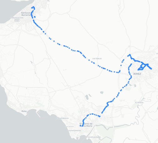
Figure 1. Visualizing a single car’s trajectory by plotting individual waypoints. Source: Astara Connect
A major part of geospatial information is GIS data, our main data source when we work with traffic and mobility-related phenomena. Which approach would we choose to visualize them? One could start by simply plotting all data points. In Figure 1 we plot the trajectory of a single car during a typical morning. While this approach is straightforward and useful for small data sets, it quickly becomes chaotic and computationally inefficient with increasing data set size.
Consider, for example, the traffic of a large vehicle fleet. Then we speak about an order of magnitude of 1 million data points - per day. Let’s look at what happens during one morning in Madrid (Figure 2).
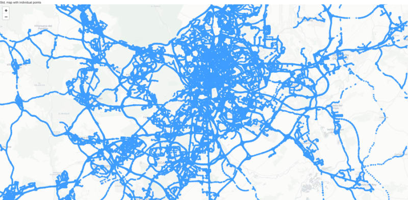
Figure 2. Visualizing the trajectories of an entire car pool by plotting individual waypoints. Source: Astara Connect
Such an image is of little use. Its calculation and rendering are computationally expensive, and we won’t obtain many insights from it. In most cases, it is actually not necessary to plot all points. There are likely much more elegant ways of visualization.
Displaying all points vs. Displaying a Heat Map
Prior to the advent of computers, professionals who worked with numerical data, such as statisticians and accountants, had to find ways to cope with the challenge of connecting a vast number of values. One method involved color-shading the key values in tables and matrices and then piecing them together to identify distinct patterns. Heat maps evolved from this long-standing practice of matrix displays (Wilkinson & Friendly, 2008).
Fun fact: Many of us may actually remember how a similar visualization technique was used by the alien in the movie Predator while hunting Arnold Schwarzenegger (Figure 3). While we at Astara Connect have much friendlier intentions when studying vehicles and their drivers, we can still learn a lot from the alien's trick. By the way, the movie was released in 1987 - an astonishing 36 years ago!

Figure 3. Alien using thermal vision to hunt its prey in “Predator” (1987). Source: georgeromeros.tumblr.com.
Returning to data science, heat maps generated by infrared cameras and similar technologies are thermograms. They display the intensity of the infrared radiation emitted from an object or a person. The way they are plotted allows us to immediately understand the entire temperature distribution pattern. From this pattern we can obtain insights such as the location of heat spots, like Arnold Schwarzenegger in a forest, but also for example thermal losses in building walls.
While the heat map's historical origin is actually unrelated to heat, it is the most intuitive example, and hence we will use this name. We can abstract the concepts and use them for displaying many other data sets.
Technical background
Mathematically speaking, a spatial heat map is a color-coded 2D density plot. There are two different main classes of heat maps: grid and spatial heat maps.
A grid heat map displays the color variations across a predefined 2D matrix. An example is the above thermograph (Figure 3), in which each pixel is associated with a single temperature point.
On the other hand, a spatial heat map does not use a predefined grid. Instead, the data points themselves define where the color spots are placed across a continuous 2D surface. The click heat map is a clear example of this type (Figure 4).

Figure 4. Click heat map showing where Wikipedia users tend to click. Source: Wikipedia CC BY-SA 3.0.
Conceptually, the creation of such a plot consists of two main steps:
First, every data point is associated with a specific location, for example, an (x,y) location on a screen or a pair of GPS coordinates. Around this location, the data point radiates a small amount of intensity in form of a numeric value. These values are totaled together across all data points, creating a continuous map of intensity.
In the second step, the numeric values are displayed with the help of a color map. Often, one chooses color gradients associated with heat, from blue (cold) to red (hot). However, the color should be chosen to display the data best and correctly.
In principle, we can show the same information using both a grid heat map and a spatial heat map, but depending on the context and the way of data collection, one or the other is likely to be more convenient. For example, a digital photosensor collects data across a grid, while in traffic data sets the position is part of the data point. With traffic data being the core of Astara Connect, in the following lines, we will focus on spatial heat maps.
Creating spatial heat maps in Python
Astara Connect's backend is written in Python 3. This gives us access to a huge pool of powerful data science libraries. Besides popular packages like Pandas and Numpy, there are many specialized ones for GIS data, like Shapely or Geopandas.
For heat maps, there are different Python packages available which greatly simplify their creation and customization. While popular visualization packages like Matplotlib and Plotly also include heat map functionalities, there are some dedicated ones for such tasks, like Seaborn and Folium. Seaborn is a great choice when it comes to grid heat maps whereas the focus of Folium lies on spatial heat maps. In the following, we will work with spatial heat maps and hence have a closer look at Folium.
Folium is a Python wrapper for Leaflet, a widely used JavaScript library for creating versatile interactive maps.
Folium contains wrappers for different leaflet plugins, which we can use to create heat maps of various types. Let’s start with a static Heat map.
At Astara Connect, and generally in the context of mobility, we deal with large amounts of traffic data that we want to analyze to generate insights. So, to start, let’s plot the movements of a single car.
We will need the GPS data (latitude, longitude):
data_single_car =
[[37.876495, -5.620123], [37.875622, -5.618808],
...,
[37.842555, -5.762402], [37.842592, -5.762413]]

Create a map base layer:

import folium

map_h = folium.Map(
    location=location,
    tiles="CartoDB positron",
    zoom_start= 12,
    min_zoom = 6,
    max_zoom = 18)

Add a heat map layer to the map:

from folium.plugins import HeatMap

HeatMap(data_single_car,
        radius=12,
        blur=20,
        min_opacity=.2,
        gradient = gradient
        ).add_to(map_h)

Save the map:

hm_name="Heat_Map_Astara_Connect.html"
map_h.save(hm_name)
The above code basically transforms the geospatial information (GPS location and point density) into a heat map.

Figure 5. Visualizing a single car’s trajectory using a Folium heat map. Source: Astara Connect
First of all, one can clearly identify the route taken by the vehicle. Additionally, for each spot along the route, the color indicates the local data point density. In a first approximation, this data point density is proportional to the vehicle dwell time. This means that the color reflects how much time vehicles spend in certain areas. In this example, “colder” color tones (blue) reflect brief visits, like taking a road once or twice. The longer or the more frequently a site was visited, like when searching for the last available parking spot within a city center, the color becomes gradually more intense and warmer (eventually yellow and red). Strictly speaking, there are other effects that can cause local or temporal variations in data point density. For example, GPS signal strength can be affected by obstacles such as tunnels or vegetation, which have to be taken into account accordingly.
Such a map lets us immediately identify activity hot spots without plotting all individual paths. Zooming into one of these hot spots still reveals the individual paths that altogether produce the red color (see inset). The color coding allows us to grasp an extra bit of information on a large scale; otherwise, we wouldn’t be able to see all the details. In this case, we have been looking at a single vehicle’s trajectory containing about 6000 data points. Real traffic, however, is created by the combination of hundreds or thousands of vehicles at the same time.
So let’s repeat the same procedure for about 2 million points and explore the full potential of heat maps.
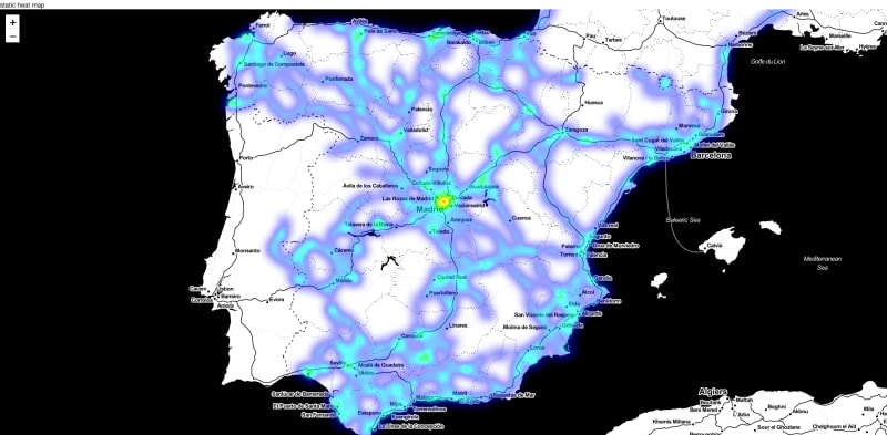
Figure 6. Visualizing the trajectories of an entire car pool during one week using a Folium heat map. Source: Astara Connect
We obtain a complete heat map while still being lightweight and interactive. Keep in mind that plotting this data set point by point would create a 2 GB file! This enables us to extend the analysis to data from entire fleets collected over more extensive periods. The more data, the better.
Folium can create leaflet maps of various types using different freely available tiles. In this way, we can highlight geographical or urban features and blend in one or multiple of our data sets. Depending on the specific use case, this helps us to identify correlations between hot spots of traffic-related metrics (for example, traffic density, traffic flow, local emissions, or air quality) and natural or urban features, such as road planning, construction sites, environmental zones, etc.

Figure 7. Creating Folium heat maps with different map styles. Source: Astara Connect
Dynamic Heat Maps
While static heat maps are already very useful and will cover many of our needs, we can get the most out of our data by leveraging some of the advanced plug-ins that come with Folium.
Many data sets have a temporal component. In the context of mobility, we are confronted with different temporal variations, each with a characteristic time scale. For example, during a winter commuting trip, the drivers’ behavior will correlate with local weather conditions. Throughout the day, traffic density will reach its peak at rush hours when people are commuting and will be lower at night times. Throughout the year, overall traffic flow will be lower around Christmas but can be locally higher when an important highway is closed for reconstruction. Over even more extended periods, traffic noise can correlate with the availability of electric charge stations. Nevertheless, authorities can now leverage mobility data analytics to make data-driven decisions in real-time. For instance, they can opt to implement temporary measures such as opening a lane in the opposite direction or determining the direction of a High-Occupancy Vehicle (HOV) lane, to effectively address any issues that may arise.
By adding a temporal component to heat maps, we could study these phenomena's spatial and temporal aspects. Folium comes with a plugin called Heat MapWithTime, which combines the previously described spatial heat map functionalities with temporal data.
The procedure for creating such dynamic heat maps is brief as follows.
We first separate the data points into certain time intervals in order to discretize the data for display. Vehicle positioning data is usually sampled at a data rate of up to several points per minute, but we will display the heat map evolution at a lower frame rate. We will see that playing with this will allow us to focus on different time scales.
In the second step, the data is displayed using the Folium plug-in for dynamic heat maps.
To start, we will create a heat map that covers one week of traffic data. We will sample this data set once each 24 h. In this way, we can observe the evolution of daily traffic throughout the weekdays.
Like in the previous case, we start with the GPS data:
data_fleet =
[40.388369, -3.67176], [40.388361, -3.67178], [40.424472, -3.726995],
...,
[37.383244, -6.062695], [40.29323, -3.979344], [36.511531, -4.635684]]

In addition, we will need the corresponding datetimes for creating the time index:
data_fleet_ts =
[2022-11-28 00:00:04+00:00, 2022-11-28 00:00:06+00:00, 2022-11-28 00:00:11+00:00,
...,
2022-12-04 23:59:36+00:00, 2022-12-04 23:59:38+00:00,2022-12-04 23:59:56+00:00]

Set parameters on how to downsample the data.
week_days = 7
interval_sec = 86400
total_time = 86400*week_days

Create the time index:

import numpy as np

time_index = []
for _time in np.arange(interval_sec, total_time+interval_sec, interval_sec):
    time_index.append(_time)

Transform datetime entries to relative timestamp and allocate them to index slots

import datetime
import math

geoms_ts_list = []
geoms_ts_sample_ids = []
ref_ts = data_fleet_ts.timestamp_UTC[0].timestamp()

for index, row in data_fleet_ts.iterrows():
    row_ts = data_fleet_ts.timestamp_UTC[index].timestamp()-ref_ts
    geoms_ts_list.append(row_ts)
    geoms_ts_sample_ids.append(math.floor(row_ts/interval_sec))


Create downsampled data set:

current_sample_id = 0
geoms_time_plot = []
geoms_time_plot_sample = []
weight = 0.05
weight *= 120/interval_sec

for idx, sample_id in enumerate(geoms_ts_sample_ids):
    if sample_id == current_sample_id:
        geoms_time_plot_sample.append([data_fleet[idx][0], data_fleet[idx][1], weight])
    elif sample_id == current_sample_id+1:
        geoms_time_plot.append(geoms_time_plot_sample)
        geoms_time_plot_sample = [[data_fleet[idx][0], data_fleet[idx][1], weight]]
        current_sample_id += 1
    if idx == len(geoms_ts_sample_ids)-1:
        geoms_time_plot.append(geoms_time_plot_sample)
    if geoms_ts_list[idx] >= total_time:
         break

Create heat map:

Transform timestamps in a human readable time:
time_index_display = [str(datetime.datetime.fromtimestamp(_time+ref_ts-interval_sec)) for _time in time_index]

Compute heat map

import folium

map_time = folium.Map(
    location=[40.4,-3.7],
    tiles="CartoDB positron",
    zoom_start= 6,
    control_scale=True
)

from folium.plugins import HeatMapWithTime

HeatMapWithTime(data=geoms_time_plot,
                index = time_index_display,
                auto_play = True,
                max_speed = 10,
                radius = 12,
                blur = .8,
                min_opacity = 0,
                max_opacity = .8,
                ).add_to(map_time)

Save the map:

name = "HeatMapWithTime_AstaraConnect.html"
map_time.save(name)
Figure 8. Dynamic Folium heat map showing a car pool’s daily traffic throughout the week. Source: Astara Connect
The animation covers an entire week from Monday to Sunday. In the beginning, we can observe a red hot spot in the Madrid city center. During the last two days, the weekend, the red spot disappears.
Let’s have a look at a second example. By adjusting the downsampling parameters, we can play with the time scale of the heat map. In order to visualize traffic evolution during one day, we set them in the following way:
Set parameters how to downsample the data.
week_days = 1
interval_sec = 600
total_time = 86400*week_days
Figure 9. Dynamic Folium heat map showing a car pool’s traffic throughout a day. Source: Astara Connect*
This example shows the movement of plenty of vehicles on Monday. One can identify different spots of activity and how they change throughout the day.
With these two examples, we can see how heat maps can be used to visualize different aspects of the same data set. As always, there are many more options to customize these heat maps. The Folium documentation contains more information.
And, last but not least, there are other Python packages to be explored!
What can we get from mobility heat maps?
Mobility is a field that both produces large amounts of data and benefits from the insights obtained from them. Exploring correlations between traffic-related metrics, such as traffic flow, contamination levels, local emissions, and local fuel consumption, and external factors like urban or geographic features, weather conditions, or administrative measures requires the right tools.
Heat maps are a great way to visualize geospatial data sets. They condense many data points down to a color-coded map, which is intuitive to understand and lightweight for convenient handling.
Making use of heat maps and other tools, we can draw data-driven conclusions for optimizing routing and driver experience while at the same time minimizing CO2 emissions and the costs of mobility.
Article generated by Astara Connect tech team.

Top comments (0)