
With Plotly, you can control almost every aspect of your graph layout, from setting the x and y labels to configuring the thickness of the plot lines. But this often results in verbose code. Plotly Express takes away that verbosity.
What is Plotly Express?
Plotly Express (also called PX) is a concise, high-level Python library for data visualization. A sub-module of the larger Plotly library, plotly.express is a wrapper for plotly.py, providing a more simplified and intuitive interface for exploring data and generating charts.
Plotly Express reduces the amount of code needed to create basic charts. A graph you would create with a single line of code in Plotly Express would take between 5 and a 100 times as many lines of code to create in Plotly.py.
Plotly Express has more than 30 functions — scatter, line, bar, choropleth, sunburst, histogram, etc — for creating different types of figures. And they're all designed to be as simple to remember as possible. What’s more? Plotly Express comes with plenty of built-in datasets that you can use for your learning and experiments.
We’ll be exploring gapminder(), a dataset of World Bank Indicators, such as life expectancy and GDP per capita, for more than 170 countries (from 1998–2007).
(To learn more about other built-in datasets — such as iris, a dataset of flowers, and tips, a restaurant dataset — you can read the data package documentation.)
In this article, we’ll focus on learning how to create various colorful and interactive graphs — all in single function calls! —with Plotly Express using gapminder.
Installation
First, install Plotly.py if you don't have it already. You can install Plotly with pip:
python -m pip install plotly
or with conda:
conda install -c plotly
Plotting simple graphs with Plotly Express
Start by importing plotly.express (usually as px). Once you do this, you’ll have access to all the plotting functions, built-in datasets, and colorscales in the Plotly ecosystem.
For our first example, let's make a scatter plot showing the population and GDP per capita of African countries for 2007 (using our gapminder dataset):
import plotly.express as px
africa_data = px.data.gapminder().query("continent=='Africa'").query("year==2007")
fig = px.scatter(africa_data, x="gdpPercap", y="pop")
fig.show()

We called gapminder() and passed it two column names, “continent” and “year”, using the query argument. This tells PX that we want data only for a specific continent and year. We assigned the object returned to the variable "africa_data". In the next line, we called the scatter function, passed it "africa_data", and set the x values to "gdpPercap" and the y values to "pop", both of which are column names in gapminder. The resulting image is a figure showing the population and GDP per capita of every African country in 2007, with each dot representing a country.
Our graph doesn’t look very meaningful yet. To improve it, we’ll add colors to the dots to make the countries distinguishable. We’ll also give our graph a title:
import plotly.express as px
-- snip --
fig = px.scatter(africa_data, x=“gdpPercap”, y=“pop”, color=“country”, title=“Africa’s Population and GDP Per Capita”)
fig.show()
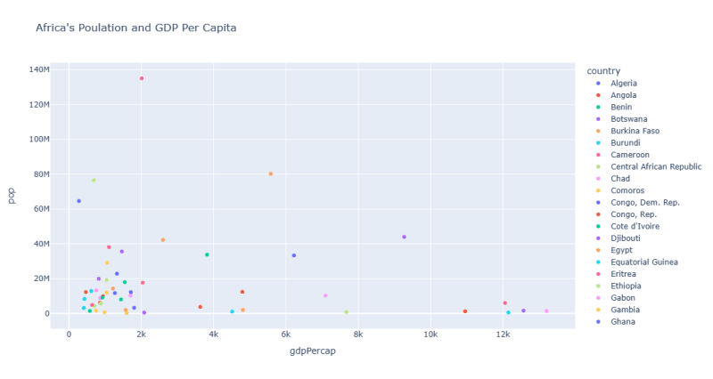
We added the arg color and passed “country” to it. PX handled the rest of the detail, such as assigning a default color to each country and creating a legend. Now our graph looks more meaningful.
Plotly Express offers you a lot of customization options for modifying your data series. For instance, to make our graph easier to read and a bit more understandable, let’s increase the size of the dots by the population of each country:
import plolty.express as px
-- snip --
 fig = px.scatter(africa_data, x=“gdpPercap”, y=“pop”, color=“country”, size=“pop”, size_max=50, hover_name=“country”, title=“Africa’s Population and GDP Per Capita”)
fig.show()

We passed “pop” to size so that the more the population of a county, the bigger its dot. We then set the maximum size of the dot to 50. (Size 50 works fine on my screen; a higher or lower value may be better on yours.) We also added hover_name to the plot and set it to “country” so that we can easily identify which dot is which country.
Note: The graph is interactive even without hover_name: mousing over any dot would reveal the country, population size, and GDP per capita.
The plot looks great now. But we can make it look better by using descriptive names for the x and y axes. We currently have “gdpPercap” and “pop" — both of which, to be honest, are very unsightly. Fortunately, PX lets you set your own label names, using the labels arg. It's basically a dict in which the key is the original label and the value is the label you want to replace it with.
import plotly.express as px
-- snip --
 fig = px.scatter(africa_data, x=“gdpPercap”, y=“pop”, color=“country”, size=“pop”, size_max=50, hover_name=“country”, title=“Africa's Population and GDP Per Capita", labels={“pop”: “Population”, “gdpPercap”: “GDP per Capita”, “lifeExp”: “Life Expectancy”})
fig.show()

We now have a nicer-looking graph with labels that are easy to read and understand. Using descriptive names as labels is good accessibility practice.
Plotting an animated choropleth map with one function call
Because gapminder is geographic data, we can further experiment with it by creating an animated choropleth map using PX’s choropleth()function and animation_frame argument. To make our map more colorful and interactive, we’ll use the entire gapminder dataset, not just for a specific continent and year:
import plotly.express as px
df = px.data.gapminder()
fig= px.choropleth(df, locations="iso_alpha", color="lifeExp", hover_name="country", animation_frame="year",
              color_continuous_scale="Plasma_r", range_color=[40, 70], title="Gapminder Life Expectancy", projection="natural earth")
fig.show()

Let's analyze our code line by line:
First, notice that we’re now using the entire gapminder dataset, which we defined as “df.”
We then called choropleth, passed “iso_alpha” (the country-codes column in gapminder) to the locations arg, and mapped color to “lifeExp.” We dropped the “pop” variable because it's hard for choropleth to handle two variables; it's better suited for mapping one variable at a time (in our case “lifeExp”) across a geographic area, showing the variable's level of intensity or unevenness throughout the given regions.
We added color_continuous_scale, which is a PX arg that uses colors to represent continuous data — the same way we use the x and y axes to represent continuous values. Next, we set our colorscale arg to Plasma and added r at the end. This tells PX to reverse the order of the colorscale. Blue now represents a higher intensity, instead of the other way around. (You can omit the "r" if you like the default order of the colorscale; I just prefer mine reversed.)
They're at least 94 built-in color names you can use to set the color_continuous_scale arg. Here's the code to see a list of them:
import plotly.express as px
all_color_names = px.colors.named_colorscales()
print(all_color_names)
Next, we included the range_color arg, which handles the range of our colorscale, as shown in the colorbar beside our map.
Finally, we passed “natural earth” to projection. Projection is a PX arg that draws flattened geo maps according to the type you specify. For a full list of available projection types, check Plotly’s map configuration and styling page, under the subheading “Map Projections.”
Congratulations! You’ve learned the fundamentals of Plotly Express. You created a basic scatter plot using the built-in gapminder dataset. You added colors to the little points on the plot and scaled their sizes according to the population of each country. You also added descriptive names and an informative title to make your figure more readable and easier to understand. You then produced a colorful, animated, choropleth map. Best of all, you created all of these with just single-line function calls!
Note: The images in this article are static. But if you type in the code snippets correctly and run them, PX should display an interactive graph on your default web browser. You can also write your figure directly into an HTML file, which can be viewed interactively on a web browser. Just replace fig.show() with fig.write_html(“path_to_file//filename.html”) — although the resulting file from this method is usually large, up to 5Mb.
For a detailed documentation on how to use the write_html function — including how to control the size of the resulting file — just run the help command, like this:
import plotly.graph_objects as go
help(go.Figure.write_html)
That’s all for an intro to the short and sweet Plotly Express.
For a more detailed discussion on the Plotly Express module and what makes it special, read the official release article from 2019.
Ready to dive in and give PX a spin? Browse through this gallery of examples of some of the things you can do with PX or check the reference documentation.
Thank you so much for reading!😊 Would love to hear about the amazing things you plan to do with Plotly Express.

Top comments (0)