
Hello Friend👋
Let's do some coding practice together by building a modal component.
Full disclosure: I'm still learning ReactJs and Vite and TailwindCSS and many more things. Lol...
What You'll Learn
- How to create a React app with Vite
- How to statically position an element relative to a browser window using TailwindCSS
- How to create a custom hook
What We Will Build
Excited? Let's begin!
Step 1: Setup
There's been a lot of buzzes lately about creating ReactJs apps with Vite so let's give that a try shall we?
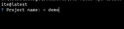
First, we create a Vite project with the command below
npm create vite@latest
Then you'll be asked to name your project like so:
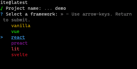
Next, select the framework for this tutorial like so:
And that's all the setup you need for now.
Step 2: Start the server
Now we will install the dependencies we need and start the server using the commands below:
npm install && npm run dev
Now, when you open up your browser and enter the address: http://localhost:3000/ you should see this:
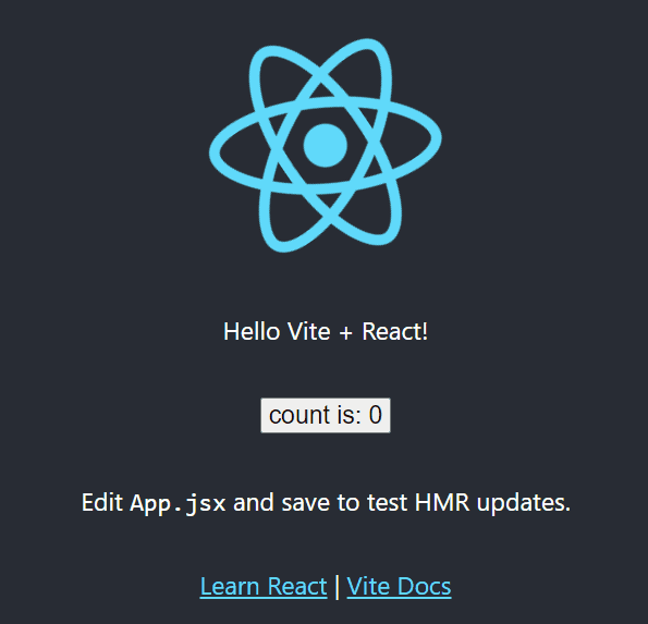
If this is your first time creating a React app with Vite then congrats! (It's my first time too 😁)
Step 3: Add TailwindCSS to your project
We will use TailwindCSS to style our app so let's add it to our project with the command below:
npm install -D tailwindcss postcss autoprefixer
and another command below:
npx tailwindcss init -p
This will create two new files, postcss.config.js & tailwind.config.js, in the root directory of our project.
Now on the tailwind.config.js file, remove all the code in it and replace it with:
/** @type {import('tailwindcss').Config} */
module.exports = {
  content: ["./src/**/*.{js,jsx,ts,tsx}"],
  theme: {
    extend: {},
  },
  plugins: [],
};
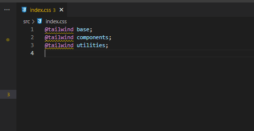
Then finally in this step, locate your index.css file in the root directory, delete all the codes in it and add these 3 lines of code at the top:
@tailwind base;
@tailwind components;
@tailwind utilities;
By now your root directory should look like this:

and your index.css should look like this:
Now, let's check if we've properly added TailwindCSS to our project.
Stop your server and restart it with the command below:
npm run dev
Now go to http://localhost:3000/ and this is what your app will look like now:

Notice any changes?
Yes, the style on the button: "count is: 0" and on the links "Learn React | Vite Docs" has changed.
This shows that Tailwind has been added successfully. If you don't notice any change on yours, please refer back to the instructions above and try to find out what you didn't do correctly.
To read more about Vite please refer to this article by Victoria Lo
You can also use TailwindCSS official doc to learn how to add Tailwind to a React app
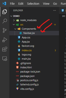
Step 3: Getting our hands dirty
Create a Components folder inside the src directory and then create a file Navbar.jsx.
Your folder structure should look like this:
Now open the Navbar.jsx file and paste the code below into it:
import React from "react";

export default function Navbar() {
  return (
    <nav className="flex items-center justify-between flex-wrap bg-teal-500 p-4">
      <div className="flex items-center flex-shrink-0 text-white mr-6">
        <svg
          className="fill-current h-8 w-8 mr-2"
          width="54"
          height="54"
          viewBox="0 0 54 54"
          xmlns="http://www.w3.org/2000/svg"
        >
          <path d="M13.5 22.1c1.8-7.2 6.3-10.8 13.5-10.8 10.8 0 12.15 8.1 17.55 9.45 3.6.9 6.75-.45 9.45-4.05-1.8 7.2-6.3 10.8-13.5 10.8-10.8 0-12.15-8.1-17.55-9.45-3.6-.9-6.75.45-9.45 4.05zM0 38.3c1.8-7.2 6.3-10.8 13.5-10.8 10.8 0 12.15 8.1 17.55 9.45 3.6.9 6.75-.45 9.45-4.05-1.8 7.2-6.3 10.8-13.5 10.8-10.8 0-12.15-8.1-17.55-9.45-3.6-.9-6.75.45-9.45 4.05z" />
        </svg>
        <span className="font-semibold text-xl tracking-tight">
          Tailwind Shop
        </span>
      </div>
      <div className="block">
        {/** lg:hidden */}
        <button className="flex items-center px-3 py-2 border rounded text-teal-200 border-teal-400 hover:text-white hover:border-white">
          <svg
            className="fill-current h-3 w-3"
            viewBox="0 0 20 20"
            xmlns="http://www.w3.org/2000/svg"
          >
            <title>Menu</title>
            <path d="M0 3h20v2H0V3zm0 6h20v2H0V9zm0 6h20v2H0v-2z" />
          </svg>
        </button>
      </div>
    </nav>
  );
}
Now find the App.jsx file, delete all the codes in it and paste the code below:
import React from "react";
import Navbar from "./Components/Navbar";

export default function App() {
  return (
    <>
      <Navbar />
    </>
  );
}
Explanation
- Just in case this is your first time using TailwindCSS...
On the Navbar.jsx file, you must have noticed some codes like this: className="font-semibold text-xl tracking-tight"
This is how we use TailwindCSS in our code. Tailwind has classes that when added to the className attribute of an element, it changes the styling of that element.
For example, font-semibold will change the font-weight of an element to font-weight: 600; in vanilla CSS.
In our use case, we added font-semibold to the span element that holds Tailwind Shop text in the navbar. Try changing font-semibold to font-extrabold and notice the difference.
- Use of empty tags:
<></>
On the App.jsx file, we placed the Navbar component in an empty tag:
<>
      <Navbar />
</>
If this is your first time seeing an empty tag, don't worry, it won't give an error. You can read about it here
Now go back to our app on the browser and notice the changes:
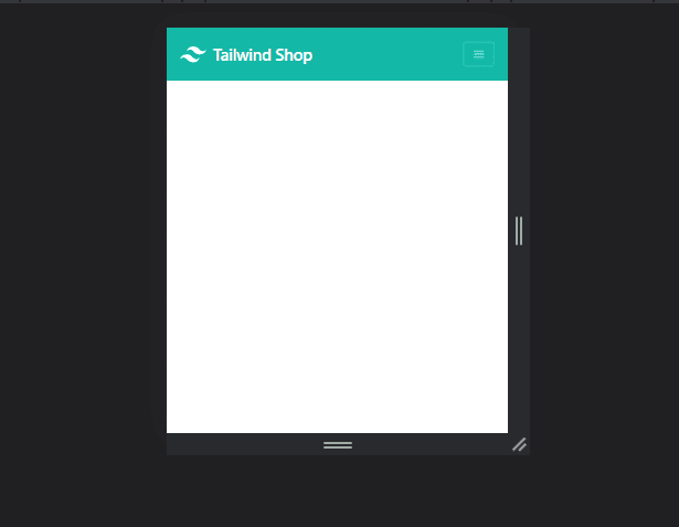
Good, we are getting there.
We are creating something that looks like an e-commerce web app (because e-commerce web apps love using modals 😁)
Now let's create a product card that a user can click on.
Inside the Components folder, create a Product.jsx file and paste this code to it:
import React from "react";

export default function Product(props) {
  return (
    <div className="max-w-xs rounded overflow-hidden shadow-lg my-4">
      <img
        className="w-full"
        src="https://cdn.shopify.com/s/files/1/1626/8507/products/classic-dad-hat-pink-front-620a928e93e58_345x550.jpg?v=1644860054"
        alt="Sunset in the mountains"
      />
      <div className="flex justify-between px-6 py-4">
        <div className="font-bold text-xl">The Coldest Sunset</div>
        <div className="font-bold font-mono text-xl text-red-700">$35</div>
      </div>
    </div>
  );
}
Now let's import it into our App.jsx component like this:
import React from "react";
import Navbar from "./Components/Navbar";
import Product from "./Components/Product"; // just added

export default function App() {
  return (
    <>
      <Navbar />
      {/* just added */}
      <div className="flex justify-center">
        <Product />
      </div>
    </>
  );
}
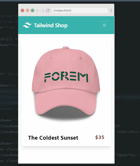
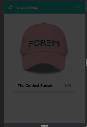
Our web app should look like this now:
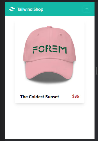
Cool right?
Step 4: Creating our modal component
Create a new file in Components directory (or folder) with the name Modal.jsx.
Paste this code into it:
import React from "react";

export default function Modal(props) {
  return (
    <div className="static">
      <div className="fixed h-screen w-screen bg-black z-10 top-0 opacity-75"></div>
    </div>
  );
}
Now import the modal into App.jsx component as well:
import React from "react";
import Navbar from "./Components/Navbar";
import Product from "./Components/Product";
import Modal from "./Components/Modal"; // just added

export default function App() {
  return (
    <>
      <Navbar />
      <div className="flex justify-center">
        <Product />
      </div>
      {/* just added */}
      <Modal />
    </>
  );
}
You should see this on our web page now:
Notice any change?
Our page has suddenly become dark. Why? Where is the modal?
Explanation
- We are not done yet
- Before adding the actual content of the modal, we added an element that will cover the entire screen whenever our modal is on display.
- This element has a dark opacity (
opacity-75) that's why our web page looks dark currently
Notice that the parent element in the modal component has static added to the className:
<div className="static"> ...
and the element that covers the entire screen has fixed added to its className attribute:
<div className="fixed h-screen w-screen bg-black z-10 top-0 opacity-75">...
This is a simple way to position an element relative to the browser window using TailwindCSS.
Two things to note:
- The direct parent of the element you want to position should have a
staticclass added to it - While the element you want to position will have a
fixedclass added to it.
Easy right?
See the Tailwind docs for positioning elements to learn more.
Now let's add the modal content
Edit Modal.jsx component like this:
import React from "react";

export default function Modal(props) {
  return (
    <div className="static">
      <div
        className="fixed h-screen w-screen bg-black z-10 top-0 opacity-75"
      ></div>
      { /** Just added */}
      <div className="fixed top-0 right-0 left-0 z-20 flex justify-center">
        <div className="mx-4 my-4 bg-white">
            <div className="flex justify-end">
                <button
                    className="border-2 text-red-900 px-2 m-2"
                >
                    X
                </button>
            </div>
            <div className=" bg-white">
                <img
                    className="w-full"
                    src="https://cdn.shopify.com/s/files/1/1626/8507/products/classic-dad-hat-pink-front-620a928e93e58_345x550.jpg?v=1644860054"
                    alt="Sunset in the mountains"
                />
                <div className="flex justify-between px-6 py-1">
                    <div className="font-bold text-xl">The Coldest Sunset</div>
                    <div className="font-bold font-mono text-xl text-red-700">$35</div>
                </div>
                <div className="flex justify-around items-center px-2 py-1">
                    <button className="border-2 px-2">-</button>
                    <div className="font-bold font-mono text-xl text-red-700">Quanity: 1</div>
                    <button className="border-2 px-2">+</button>
                </div>
                <div className="flex justify-around items-center px-2 py-1">
                    <button className="border-2 px-2 py-1 rounded bg-green-500 text-white font-bold font-mono text-lg">Add to Cart</button>
                </div>
            </div>
        </div>
      </div>
    </div>
  );
}
Check the web app:
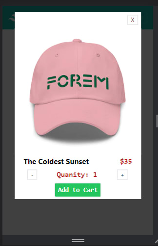
Great! Our modal is showing!
Now we will need to add logic so that our modal only shows up when we want to view it.
Step 5: Adding logic to our modal using Custom Hooks
The fun part is here. Let's take it slowly now.
- Create a new folder for our custom hooks. Name the folder Hooks
- Inside the Hooks folder (directory), create a new file with the name
useToggle.js - Note: it's
useToggle.jsand notuseToggle.jsx. This is because there will be nojsxcode in this file (script). - Copy and paste the command below into
useToggle.js:
import { useState } from "react";

export default function useToggle() {
  const [on, setOn] = useState(false);

  const toggler = () => {
    setOn((on) => !on);
  };

  return { on, toggler };
}
Explanation
- We imported
useState, a hook that comes with React that allows us to save data in state inside a function component. - What we are saving in state:
const [on, setOn] = useState(false);
We are saving a boolean named on and right next to it is setOn a function that lets you update the value of on.
- We then create
toggler, an arrow function that will callsetOnto update the value ofon - Lastly, we return
onandtogglerinside an object wrapping them in curly braces ({}).
Now let's use useToggle in our App, Product and Modal components.
In App.js, import useToggle.js:
import useToggle from "./Hooks/useToggle";
The retrieve (or destructure) on and toggler from useToggle like so:
const { on, toggler } = useToggle();
Now let's use the value of on to conditionally show Modal like this:
{on && <Modal toggler={toggler} /> /** just added */}
What the above code means is this:
-> whenever on is true, render (or display) the <Modal /> component
All the code in App.jsx should be:
import React from "react";
import Navbar from "./Components/Navbar";
import Product from "./Components/Product";
import Modal from "./Components/Modal";
import useToggle from "./Hooks/useToggle"; // just added

export default function App() {
  const { on, toggler } = useToggle(); // just added

  return (
    <>
      <Navbar />
      <div className="flex justify-center">
        <Product toggler={toggler} />
      </div>
      {on && <Modal toggler={toggler} /> /** just added */}
    </>
  );
}
Now Modal will only show when on is true.
View your web app, notice now that the modal has disappeared?

But how will we bring it back to the page when we need it?
We pass toggler as a prop to both the Product component and the Modal component.
Like this:
<Product toggler={toggler} />
and
<Modal toggler={toggler} />
Now on Product.jsx add an onClick event so that will call toggler whenever the product component is clicked on:
Do this:
import React from "react";

export default function Product(props) {
  return (
    <div
        onClick={() => props.toggler()} // just added
        className="max-w-xs rounded overflow-hidden shadow-lg my-4"
    >
// the rest of the code should be the same
Then in Modal.jsx, add an onClick event to the X button so that it calls toggler whenever it is clicked on.
Do this:
import React from "react";

export default function Modal(props) {
  return (
    <div className="static">
      <div className="fixed h-screen w-screen bg-black z-10 top-0 opacity-75"></div>
      {/** Just added */}
      <div className="fixed top-0 right-0 left-0 z-20 flex justify-center">
        <div className="mx-4 my-4 bg-white">
          <div className="flex justify-end">
            <button
              onClick={() => props.toggler()}
              className="border-2 text-red-900 px-2 m-2"
            >
              X
            </button>
          </div>
// the rest of the code should be the same
Make sure to save all the files we just edited.
Step 6: View the App
We are done!
Head back to the browser and see the magic unfold:

Nice isn't it?
Congrats! We've successfully built a working modal component in an e-commerce app.
Read More:
- React Hooks
- Vite + React + TailwindCSS by Musa Ahmed
- Custom Hooks by Simple Coder
- useState Hooks by Medusa's blog
- This whole series on React Hooks by Victoria Lo
Thanks for reading.
I'll be using this modal example to also explain React Context API and the difference between Context API and Custom Hooks.
Do keep in touch. See ya ✌️

Top comments (0)