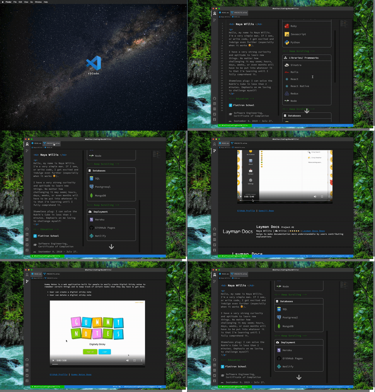
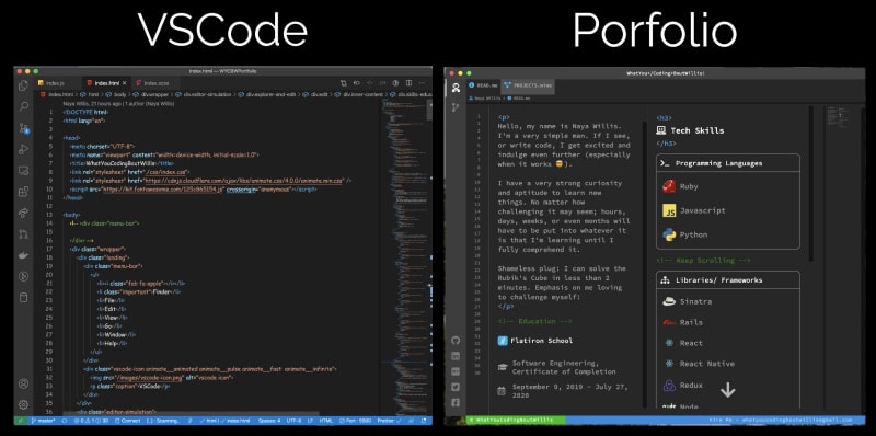
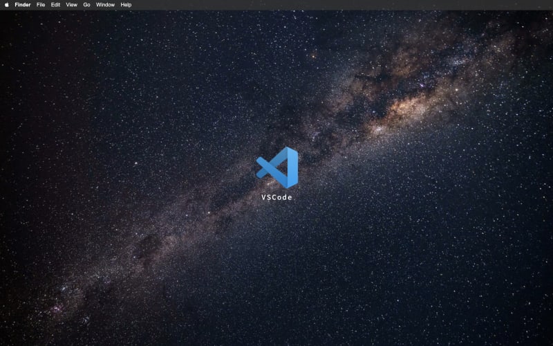
I would like to introduce you all to my portfolio called WhatYouCodingBoutWillis! It took me a good 4 to 5 days to complete this and I can happily say I'm proud of how it came out. My intention was to make my portfolio look as similar as possible to VSCode. I thought that it would be clever to go this route because most of us as developers use VSCode to make the magic happen. I used basic HTML/SCSS/JS to accomplish this, along with some other tools for icons and animations.
Overview
What I enjoyed the most
I actually enjoyed every moment of it to be honest. But, if I must choose something specific, I'd say I enjoyed the styling. It was a bit "loopy" as I was creating this because I had to look at VSCode to design my portfolio to look like VSCode, while writing the code inside VSCode 🤯. So, there were often times where I would click inside the VSCode editor clone that I created in the browser thinking that I can make the changes from there 😅.
More on the tech used
HTML
I used HTML for the content which was pretty straightforward. I also included font-awesome to make use of their wide selection of icons. Such as the social icons, the icons you see next to the tabs in the editor header, and the explorer on the left.
SCSS
I used SCSS to accomplish the almost "spitting image" look of my portfolio to VSCode itself.
JS
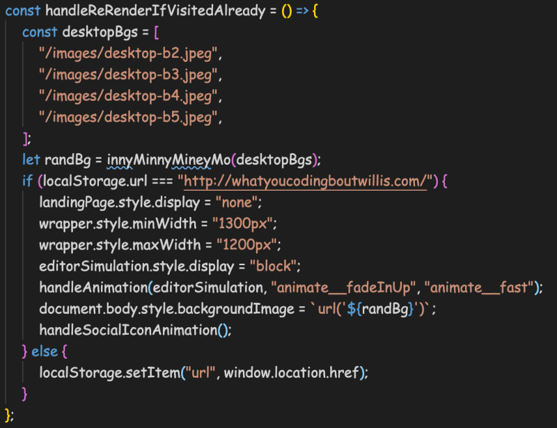
I used JS to handle the interactivity and animations. Animations such as when you first load the app and you see the social icons at the bottom left of the explorer drop down. I also add the url to localStorage so that you wont keep being directed to the landing page >
I felt that this was a bad UX for a user to keep having to click on the VSCode icon just to see my portfolio. So I set it up where they would only have to see the landing page once. I used JS and localStorage to check if a user already visited the site and if they did then they'll just be redirected to my portfolio instead. Here's a code snippet of this logic.
Also, I implemented a little feature where the "Desktop Wallpaper" changes randomly upon visiting the site. I got these images from Pexels. Check it out! For the animations I used Animate.css. This is a very simple one to use.
Issues I wish to address
Though there aren't many, but there are some things I wish to make changes to. Specifically, my code. There is a lot of repetition. This repetition was ok for me to get this up and running so I plan on doing a major refactor to get rid of some duplicate code. I mean, look at this ...
const handleTabClick = () => {
    Array.from(tabs).forEach((tab) => {
        tab.addEventListener("click", (e) => {
            if (e.target.classList.contains("readme")) {
                user.style.borderLeft = "2px solid #fff";
                astronautIcon.style.color = "#fff";
                readme.style.display = "block";
                readme.style.backgroundColor = "#272727";
                readmePath.style.display = "block";
                nayaImageContWithCaptionMax.style.display = "block";
                nayaImageContWithCaptionMin.style.display = "block";
                skillsEducation.style.display = "block";

                // turn off git stuff
                git.style.borderLeft = "none";
                gitIcon.style.color = "#7e7e7e";
                gitProjects.style.backgroundColor = "#505050";
                projectsPath.style.display = "none";
                myProjectsContainer.style.display = "none";

                // turn off contact stuff
                contactMe.style.borderLeft = "none";
                contactIcon.style.color = "#7e7e7e";
                contactPath.style.display = " none";
                contact.style.backgroundColor = "#505050";
            } else if (e.target.classList.contains("git-projects")) {
                // turn on user > projects
                git.style.borderLeft = "2px solid #fff";
                gitIcon.style.color = "#fff";
                gitProjects.style.display = "block";
                gitProjects.style.backgroundColor = "#272727";
                projectsPath.style.display = "block";
                myProjectsContainer.style.display = "block";
                lineNumbers.style.display = "none";

                //turn off user stuff
                user.style.borderLeft = "none";
                astronautIcon.style.color = "#7e7e7e";
                readme.style.display = "block";
                readmePath.style.display = "none";
                readme.style.backgroundColor = "#505050";
                nayaImageContWithCaptionMax.style.display = "none";
                nayaImageContWithCaptionMin.style.display = "none";
                skillsEducation.style.display = "none";

                // turn off contact stuff
                contactMe.style.borderLeft = "none";
                contactIcon.style.color = "#7e7e7e";
                contactPath.style.display = " none";
                contact.style.backgroundColor = "#505050";
            } else if (e.target.classList.contains("contact")) {
                contactMe.style.borderLeft = "2px solid #fff";
                contactIcon.style.color = "#fff";
                contact.style.display = "block";
                contact.style.backgroundColor = "#272727";
                contactPath.style.display = "block";

                // turn off project stuff
                git.style.borderLeft = "none";
                gitIcon.style.color = "#7e7e7e";
                gitProjects.style.backgroundColor = "#505050";
                projectsPath.style.display = "none";
                myProjectsContainer.style.display = "none";

                // turn off user
                user.style.borderLeft = "none";
                astronautIcon.style.color = "#7e7e7e";
                readme.style.display = "block";
                readmePath.style.display = "none";
                readme.style.backgroundColor = "#505050";
                nayaImageContWithCaptionMax.style.display = "none";
                nayaImageContWithCaptionMin.style.display = "none";
                skillsEducation.style.display = "none";
            }
        });
    });
};
😳...
This is one got damn method. I can definitely do better than this. But, a wise former tech lead of mines said "It's ok to get it working first then refactor later", so I don't feel too bad.
Plans for my portfolios future
First and foremost, I am going to design the mobile version of my portfolio. Then eventually, I plan to make this a full blown Node/React app. I also, obviously plan to add more projects to it that are highly accessible (actual url links to the application, etc).
Ok, I'm done talking, here's the link WhatYouCodingBoutWillis. Leave your comments and feedback below, thanks, and I appreciate it!


Top comments (22)
So good!
I love your idea! I saw a similar idea before, but the different is that he made a game: peteroravec.com/
This is DOPE. lol. That's the thing about us developers. We get to be creative as can be
It's amazing. My two cents.
How about changing the background. It really doesn't match the VS Code.
And I have a question? How do you keep yourself motivated for your own projects. I started one this April but I hardly commit one day a week.
I try to just tune out everything else that isn't important and get what I have to get done, done. Sometimes it's hard though. But, you can do it.
That is pretty cool!! Was it hard to change the vscode source code to reflect your program?
Can you elaborate a little please? I feel like I understand but I don't ha
Sure :-) did I get it right that you used the vscode source code to compile your own tool? And that you did so by changing the source code? If so, was it difficult?
Oh no. My this is a 100% clone from scratch. From <!DOCTYPE> to the closing html tag. I wrote my own source code to accomplish everything you see.
Looks amazing 🔥
Thanks Shripathy
Well It is quite nice idea and nice work. keep it up!!
Thanks Dhirendra
Amazing creativity! Just awesome!
I did something similar to this by using HTML, CSS and JS to put my portfolio in a terminal... Yours is much cooler though! w-henderson.github.io
wow, I like the animation
This is so cool.
Thanks Jai
I actually never heard of that, I'll definitely look into that
What a great idea! I especially like the fact you've got the mini-map in there :)
Lol, I thought it'd be cool to add that ha. I basically just took a literal screenshot of w.e code I can see and used that.
Some comments may only be visible to logged-in visitors. Sign in to view all comments. Some comments have been hidden by the post's author - find out more