Hi guys, I just published my new side project and I'd love to have some feedback 😊. I built it in 5 days, focussing only on the essentials.
I had a breeze making this and getting it ready for a demo in the shortest possible amount of time. This is the link: https://www.cow-pilot.io/. I would really love to hear what you think about it.

It is built with React, hosted on Heroku. It's already a win for me, because in the process I learned about styled components, a library that makes styling much, much easier than plain CSS.
I also learned about react-beautiful-dnd, which is an awesome library for drag and drop by the guys who made Trello. They have an eggcellent course on egghead.io to help learn it. I don't like video courses much usually, but this one is really well made and helped build the foundation of my app.

Top comments (42)
Hi,
Nice work! Looks like you included a lot of functionality in a small space of time.
I’ve had a look at the demo in Safari on iOS and just wanted to suggest a few things:
The hamburger menu on the tasks page and the arrow to submit a task on the task creation page cannot be focused using a screen reader. I haven’t tried on desktop but it may be that these are not keyboard operable either. Idealy use a native
<button>element. Otherwise, if these are custom buttons created from<div>or<span>elements or similar, you need to ensure they can receive DOM focus usingtabindex=“0”. See the Mozilla tabindex article. Note that you will also have to build in the appropriate roles, states and device independent event listeners too. See Developing a Keyboard Interface in the WAI-ARIA Authoring Practices 1.2The filter items in the navigation menu itself are not exposed as links. The iOS screen reader, VoiceOver, only announces them as plain text (I was able to open the menu, then turn the VoiceOver screen reader on to access these). Again, these are likely created using generic
<div>elements so ideally use a native anchor element (<a href=“#”>) or add the ARIArole=“link”. If taking the latter approach you still need to build in the appropriate behaviours as previously mentioned.Also, when viewing the demo, content behind the demo page is not hidden from assistive technologies. So I can still place screen reader focus (VoiceOver) on the landing page elements while viewing my tasks or creating a task. I saw others mention a modal so perhaps this fills the entire screen on iOS and elements behind are not hidden. One method is to use
aria-hidden=“true”on a container that is a sibling of the modal container. You would also have to restrict keyboard focus. See the description of a modal in the WAI-ARIA Authoring Practices 1.2Particularly on the create a task page, there appears to be poor contrast with the placeholder text and the button text. As a minimum you should aim for 4.5:1 for regular size text and 3:1 for larger size text (18pt or 24px / 14pt bold or 19px bold). See Contrast (Minimum) in the Web Content Accessibility Guidelines 2.1
Visually the buttons to complete tasks look like checkboxes so it is a little disorientating that the task immediately disappears when these are tapped. It would be clearer if visually these were more obviously buttons. However, the ability to select multiple tasks and then press another button to complete them would be a useful feature.
I would also say that it seems a bit counterintuitive that the back arrow is used to submit the task rather than cancel. I would either swap these buttons around so the arrow signifies forward progression, or ideally explicitly label it as ‘submit’ or similar.
Hi,
thanks you so much for taking the time to review my project and write all of this down. Let me check all the details and I will reply later.
Regarding the back button, usually the modal is closed when clicking outside of it. There is no save button, all changes are immediate. On small screens like a mobile phone, it is not possible to click outside, so I added the arrow button. Should I change it to close instead of the arrow to make it more intuitive?
So the arrow I’m referring to is the one used to submit the task. Personally i found it a little counter intuitive as being on the left and pointing to the left made me think it was a back button to dismiss the modal. The poor contrast on the grey cancel button also made it less obvious (ironically Dev.to has the same issue with their Preview button🙃)
I don’t think using an arrow is inherently wrong (So long as it had a text alternative such as using hidden text or an
aria-label) although having a visible text label would remove any ambiguity, but I do think it would make more sense if the arrow was on the right and pointed to the right. The cancel button would then be on the left.Hey there, noticed a few minor things that you should be able to fix pretty quickly. It's quite nitpicky though.
cancelaction.console.logs:DOther than that pretty neat for a few days of side-project'ing. What are your future plans with the site? Monetize or open source?
Cheers from the opposite side of germany
Hi Alexander,
thanks a lot, those are great suggestions! I already fixed some items during my lunch break (who needs food, right?!):
Changing the date while creating a new task messes up the drag and drop. I was not able to fix it quickly, so I disabled it for the demo. I agree it should be possible to change it and I will work on it for the beta.
I want to monetize it later, when it's finished. I will probably make it freemium with attachments and more for the premium version.
I will check out the rest after my workday is over, thanks again!
Pretty sweet! The icons look pretty nice and the draggable feature is super smooth :D
I'm learning React and the MERN stack right now. What technologies did you use to make this? How will you set up user authentication? Are you using Firebase?
Thanks :-)
Thanks! I found the icons on svgrep.com.
The demo and landing page are built with React and hosted on Heroku. That's the only way I know at the moment to deploy a React app, I haven't tried Firebase so far :).
If you are learning React I highly recommend fullstackopen.com. They also explain how to deploy a React app to Heroku. If you have any questions about it, let me know!
Apart from the two libraries mentioned in the post I only used React Router, so that the url changes when you switch between Home and Try the Demo.
I am planning to use Auth0 for authentication. It's free up to 7.000 users and easy to set up. They have a sample app for React that you can download and play with. Again, if you have any questions, just let me know.
Thanks for the advice and resources. I’m actually using Firebase to deploy the Frontend and heroic for the API/backend. It works pretty well.
Best of wishes!
UX can be improved. Try to destroy any traditional popup modals and traditional form inputs. It's not easy fighting with the
forms-monster. You can always open up a new UI prototyping project with eitherAdobe XD,FigmaorFramerand invite people on the board for collaboration.Hi Loouis, thanks for checking it out! Which traditional popups do you mean? Calendar and select?
That orange modal is a very interesting color choice I must say.
Since you know the due date on some of the tasks would be nice if you could see the tasks in a calendar view. Personally I like looking at calendar to get a good sense of time.
Other than that for 5 days of work it looks good so far so good job. :)
Thanks a lot for your feedback!
The color sort of just "happened" during testing and then it stuck. I'm not married to it, should I change it? Making it white looks so strange to me after looking at orange for several hours 🤣
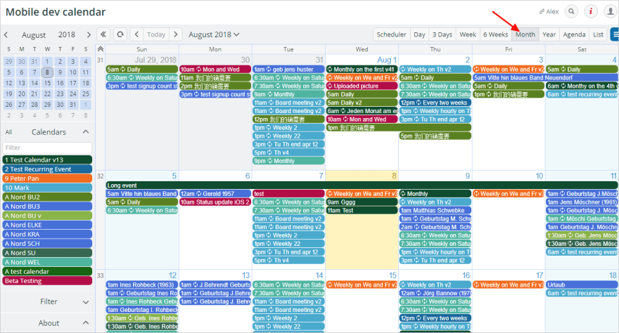
A calendar view could be nice. Do you mean something like this?
If it was me I would change the orange color and go with a neutral color. Perhaps take a look at some css frameworks and see what color choices they use for their modals. Yes a calendar view just like that! I would like that way better.
I already changed it to white. Thanks again for the suggestion.
The calendar view might take a while. I like the idea, but will put it in the backlog for now.
Really nice, I'll not point any bugs or stuffs like that, because major of people already did that, what I want to propose is, since this is a side project and you are learning stuffs, try to build your own drag and drop, will be challenging and funny and you'll learn how to do It :D
Hi, thanks a lot for checking it out. I "wasted" almost a whole day on this before I started searching for a library. :)
I already had a working solution with HTML5-DND (codepen.io/mrnbck/pen/RwWbYgm) but I couldn't get the animation to work for the "removed" item. I later learned that modern dnd works differently and not with the HTML5-API. Maybe I will get back to it later :)
Hey, I tried your side project and to be honest the design is super clean and looks good and kind of matches the theme I guess you were trying to achieve. Here are some things you can add and improve:
Other than that I really like the project.
Hi Nav, thanks a lot for taking a look!
You are right, I am already working on the database. The demo is just for a first impression to convince users to sign up.
I am using MongoDB as database, the implementation is almost finished. I was planning to use Auth0, since it's free for up to 7.000 users and I already have a working solution for another project. Using Google/Github etc. for authentication is still on my bucket list, thanks for mentioning it.
It should be possible to offer both at the same time, if I maintain my own userdatabase, right? I can only offer 1 social login with Auth0, but not several.
When both database and authentication are ready I will start sending out emails to the people who requested an invitation.
This is awesome. I am in the process of building something similar but more tracker focused and habit forming. I really like the functionality of what you built here. Looks good. Keep up the great work.
Thanks a lot for the feedback, I really appreciate it.
Good habits are so important, learning about them has improved my life a lot. I'm curious to see what you will build.
Unable to create new task. Always ask for Title for new task.
dev-to-uploads.s3.amazonaws.com/i/...
Hi Ankit, thanks for taking a look. Did you try entering a title?
Hi Marian,
Your project is awesome. I just checked again and now I'm able to add new task also. Have you noticed image url I attached in the query. I was seeing different UI back than.
Thank you.
Hi Ankit,
Thanks for having another look. Sorry, I actually missed your screenshot, because I was on mobile. In your screenshot you had to click on "Save" to submit the title.
You are right, it's changed now after other feedback that I received. The title is now changed instantly when you type it and you no longer have to click "Save" to submit it.
Okay, Got you. I missed that button. Now It's more user friendly.
Great work.
Nice. Since it's a side project, you can publish it here too: mysideproject.rocks
Will do, thanks for sharing! Did you build this?
No.