
This tutorial is the fourth chapter of our implementation of an AirBnB clone in React Native. In previous chapters, we’ve successfully implemented email authentication with Firebase. In case you need to get caught up, here are links to parts 1–3:
- AirBnB Clone with React Native Part 1: Home Screen UI
- AirBnB Clone with React Native Part 2: Login Screen UI
- AirBnB Clone with React Native Part 3: Email Authentication with Firebase
In part 4, we’re going to continue from where we left off, implementing a notification feature for the authentication process. In summary, we’re going to create an alert bar at the bottom and change the background color that shows the Firebase validation notification.
So, let’s get started!
Create a notification component
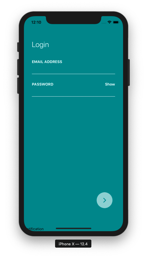
First, we’re going to create a simple component named Notification inthe Notification.js file. Here, we need to create a simple class named Notification that extends to the component module of React. For now, we’re just going to render text using a Text component wrapped inside the View component, as shown in the code snippet below:
Next, we’re going to import our Notification component into our Login component in the Login.js file, as shown in the code snippet below:
import Notification from "../components/Notification";
Then we need to initialize or render our Notification component after the Login button initialized in the NextArrowButton component, as shown in the code snippet below:
As a result, you’ll get the text in the Notification component displayed at the bottom of the screen, as shown in the emulator screenshot below:
Looking for new ways to elevate your mobile app’s user experience? With Fritz, you can teach your apps to see, hear, sense, and think. Learn how and start building with a free account.
Send a message from parent to child component
In this step, we’re going to work on the Notification component and send props from the parent component (i.e. the Login component) and receive the props in child component (i.e. the Notification component). Here, we’re going to send error message from the Login component to the Notification component as props.
For that, we need to add two Text components in the Notification component for title and message, in which we receive the data as props from the Login component. The code to handle this is shown in the snippet below:
Then, we need to send data (i.e. props title and message) from the parent component (i.e. Login component), as shown in the code snippet below:
As a result, we get the following screen where title and message from the Notification component are imported to the Login component and are displayed at the bottom of the screen:

Styling the Notification component
Here, we’re going to add some style to our Notification component in order to make it look more appealing. We’re going to use the Stylesheet component imported from the react-native package to define the styles required. Then, we need to bind those styles to our component, which are being rendered as shown in the snippet below:
We can see that the styles are bound to the View and Text components. And the result of adding styles is shown in the emulator screenshot below:

The error text and the message in the above screenshot still appear out of place at the bottom of the screen. So we need to add more style to the container in order to position the Notification component correctly in the Login screen.
For that, we’re going to wrap the outermost View component with another View component and bind it with the wrapper style, as shown in the code below:
As a result, we get a more refined look at our Notification component at the bottom of the Login screen, as shown below:

Adding a close button
Next, we’re going to add a close button in order to hide the notification. For that, we’ll use the FontAwesome icon bundle from the react-native-vector icons package.
If you haven’t installed the vector icons package, you can simply run the following command in your project repository:
Using npm:
npm install react-native-vector-icons
The react-native-vector-icons package provides customizable icons for React Native with support for NavBar/TabBar/ToolbarAndroid, image source, and full styling.
Here we’re going to use the FontAwesome icon bundle and wrap the icon around TouchableOpacity in order to make the icon clickable.
First, we need to import the FontAwesome icon bundle from the react-native-vector-icons package into the Icon component using the following piece of code:
import Icon from "react-native-vector-icons/FontAwesome";
Then we need to add the Icon component to the notification container wrapped by TouchableOpacity, as shown in the code snippet below:
Here, we can see that the Icon component with the icon named times is added with the color prop as light gray. Then we need to add style to the TouchableOpacity component to make it stick right in the Notification component. The style we’re adding is closeButton, which is provided in the code snippet below:
Last but not least, we need to add a blank function called closeNotification to handle the onPress event from the TouchableOpacity component, as shown in the code snippet below:
The function consists of an alert method in order to check if the function triggers properly when the close button is pressed. The result of adding the close ‘x’ button is shown in the emulator screenshot below:
The next revolution in mobile development? Machine learning. Don’t miss out on the latest from this emerging intersection. Sign up for weekly updates from our crew of mobile devs and machine learners.
Handling the close notification
Here we need to handle the close notification event from the parent component (Login). So we need to create a function in the Login component, which is triggered when we press the close notification button in the Notification component.
First, we need to create a function in the Login component named handleCloseNotification, which is triggered when we press the close button in the Notification component. The function implementation is given below:
Then, in the Notification component imported in the Login component, we need to set a prop function to trigger the handleCloseNotification function:
Now, in the Notification component, we receive the handleCloseNotification event from the parent component using props and trigger the function inside the closeNotification function using the code in the following snippet:
Now we can see that an alert is triggered by the parent component. When we press the close button, the closeNotification function is triggered in the Notification component, which triggers the handleCloseNotification prop and sends the trigger message to the handleCloseNotification function in the Login component. As a result, we see the following result in the emulator screen:

Hiding or showing the notification
Here we’re going to implement the hiding and showing of the error notification. In order to control the notification’s appearance, we’re going to use simple props that send state from the Login component to the Notification component.
In Login.js, i.e. our Login component, we need to create a state to handle the notification state. The state variable to handle the notification state is formValid, as coded in the snippet below:
Then we need to add the state to the render function to send it to the Notification component, as shown in the code snippet below:
In the code snippet above, we’ve created a new variable named showNotification, which sets its value as either true or false depending upon the formValid state. Then, we need to send the showNotification variable as a prop to the Notification component, as shown in the code snippet below:
Next we need to handle the state on the Notification container by adding marginBottom to make the view disappear or hide from the visible area, depending on the state value that’s received from the Login component.
In order to do that, first, we need to receive the showNotification prop from the Login component, and then set the value of the bottom variable to 80 or 0, depending on the showNotification prop value.
Then, we need to bind the bottom variable value to the marginBottom style integrated into the outermost view of the Notification component, as shown below:
Now we can hide or show the notification container from the parent component.
Using the close button to hide notification
Now we can control the close button manually. But in order to actually use the close button, we need to add some function to handle the showNotification state.
Let’s first test the close button functionality by refreshing the emulator and pressing the close button. We can see the result in the emulator simulation below:
Finally, we can close the notification.
Bringing it all together
At this point, we’ve implemented a notification bar that we can show or hide as we’d like.
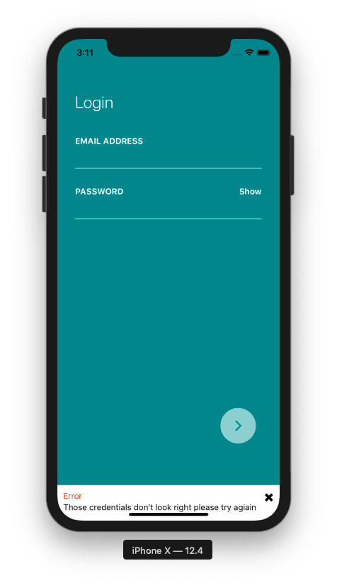
Next, we need to use a response from Firebase control in place of the hardcoded error message. So when we get an error from Firebase control, we need to show that error message in the Notification bar at the bottom. The code to implement this is shown in the code snippet below:
Then we need to assign the error state to the message prop of the Notification element in the Login component in order to send it to the Notification:
And to handle the close function, we switch the trigger state to make the notification bar hide by default.
Now we can see the result in the emulator simulation below:

As we can see, the notification error message works perfectly.
Adding animation and changing the background color
Lastly, we’re going to add an animation to make the notification component slide in and slide out. And then, we’re going to toggle the background color of the Login screen when the notification is triggered.
Changing the background color
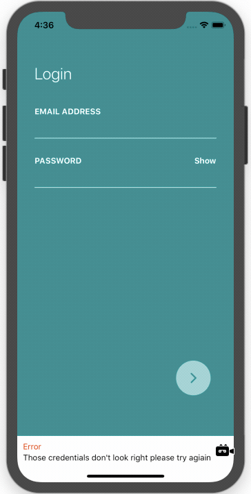
Here, when the error notification shows up, we want to change the background color in the Login screen. For that, we use the formValid state to toggle between two main colors, i.e. dark green and dark orange, and set it up to the main wrapper, i.e. the KeyboardAvoidingView component in the Login component. The code for this is provided in the snippet below:
Now let’s test to see if it works:

As we can see, the screen color changes successfully in the above simulation. Now let’s add our animation.
Animation: slide in and slide out
Here we want to add a slide in and slide out animation to the Notification container.
First, to implement animation, we need to import Animate and Easing components from the react-native package in the Notification component:
Then we need to initialize the Animate.value method to the positionValue variable. After that, we need to create a function named animateNotification and initialize an animation timing method, Animated.timing, which helps to define the animation styles. For more information on animation properties, you can check the official documentation here.
The first parameter in the timing function is the positionValue, and the second parameter is the animation config option, shown in the code snippet below:
Now in the Notification component, we need to replace the bottom variable values with the initialized animation value using the showNotification function to toggle between show and hide.
Then we need to replace our normal View component with the Animation View component. Finally, we need to replace the marginBottom value with the Animated.Value that we defined in the constructor.
Now, let’s try it out:

As we can see, the slide in and slide out animation works perfectly.
This completes our tutorial of implementing the authentication notification feature in our AirBnB clone app using React Native.
Conclusion
In this tutorial, we learned how to implement a notification bar during user authentication.
We also learned how to pass data between parent and child components in React Native. In the implementation of the notification bar, we got a step-by-step guide for displaying an error message from the Firebase server. Lastly, we learned how to control the styles dynamically with the state variable and how to add animations.
All the code for this tutorial is available in this GitHub repo. In the next chapter, we’re going to continue to implement our AirBnB clone app with a Firebase Email Register Screen.
Disclosure
This post includes affiliate links; I may receive compensation if you purchase products or services from the different links provided in this article.
Resource
AirBnB React Native Clone by Cubui
Editor’s Note:Heartbeat is a contributor-driven online publication and community dedicated to exploring the emerging intersection of mobile app development and machine learning. We’re committed to supporting and inspiring developers and engineers from all walks of life.
Editorially independent, Heartbeat is sponsored and published byFritz, the machine learning platform that helps developers teach devices to see, hear, sense, and think. We pay our contributors, and we don’t sell ads.
If you’d like to contribute, head on over to ourcall for contributors. You can also sign up to receive our weekly newsletters (Deep Learning Weekly andHeartbeat), join us onSlack, and follow Fritz onTwitter for all the latest in mobile machine learning.

Top comments (1)
What do you think if you use function components with React hooks instead? :)